Basic Principles of UI Design
Estimated Time: 30 minutes
When designing UI’s there are some basic principles that should be kept in mind to ensure that designs are seamless and easy to understand/navigate. Depending on who you ask some might say there are 8, 10 or 12 principles. In this lesson, we’ll focus on 8 basic principles that will help you design clean, seamless and easy to navigate UI’s. The principles we’ll be focusing on are; alignment, balance, color, contrast, hierarchy, proximity, repetition and space.
Alignment
We touched on alignment briefly under typography but what does alignment mean in the context of UI design as a whole? That's what we’ll discuss here. Alignment refers to how elements (images, illustrations, buttons, icons, text, etc) in a design are ordered and how they connect/relate to each other. Elements can either be left, right or center aligned. Having aligned elements gives the users a place to snap their focus to and dictates to them, in what order, they should consume the content in your design. An example of a webpage using this principle is below.

Image 1
In the example above, the webpage has left, right and center aligned elements. At the top of the webpage we see that the text and buttons are aligned to the left while the illustration is aligned to the right. In the second section, we see that Digismoothie's clients' logos are center aligned on the page. In section three, the text and button are aligned to the right while the illustration is aligned to the left (just like at the top of the webpage), this switches though in section four where the text and button are aligned to the right and the illustration is aligned to the left. This shows how all through the design elements are aligned and have order. We can also see that the designer didn’t use just one type of alignment all through the design (which there’s nothing wrong with) rather the alignment switched back and forth as the page progressed (i.e text started off left aligned, then center aligned, then left aligned again, then right aligned).
Balance
Balance refers to how all the elements (images, illustrations, buttons, icons, text, etc) in a design work together in harmony. It also refers to how easy it is for users to intuitively navigate through a design. A design which has elements that aren’t balanced will be uncomfortable to look at. Examples of things that could make a design unbalanced are; using icons that are too thick compared to the font they’re paired with, using illustrations that don’t match the message your design/product is trying to convey, using a different font style somewhere in a design that has not been used anywhere else in that design, etc. Some examples of balanced designs are below.

Image 2
In Image 2, the elements circled in blue are all headings so they have the same style. The display text at the top of the page is slightly different (it's bigger) but other than that they’re all black, bold and of the same typeface. The red line shows how users will start off reading the text on the right then viewing the illustration on the left but as they move down, they’ll view the illustration on the left then read the text on the right. I guarantee that if there were more rows in that sections, they would follow the same pattern of text and illustrations switching positions.

Image 3
In Image 3, the button color is purple meaning that purple is either a primary or secondary color for the brand. We can also see that different shades of purple are prominent in the illustration. This is a good example of balance across elements (buttons & icons).

Image 4
In image 4, we can see four cards which have each of their elements underlined in either blue, red or green. The blue, red and green elements are all in the same positions and have the same styles in all the cards. This shows that they are different alternatives of the same element (i.e discount code card). So when a user sees an element with the same style and layout on that app they can assume they are looking at discount codes. We can also see the icons on the bottom circled in orange. Each of the icons is a line icon. If we were to replace one of the icons with a filled one, we’d notice that all of a sudden the design of the page looks slightly off.
These are all examples of how designs can be balanced.
Color & Contrast
We’ve spoken extensively about color and contrast in the previous lesson so we won't go into too much detail here. As was mentioned previously, color has the ability to communicate on a psychological, physical and emotional level so it’s a very powerful part of design. Having a good understanding of color theory, how colors complement each other and color contrasts are important when designing functional, seamless and beautiful UI’s.
One thing to keep in mind here is that contrast in design isn’t always in relation to color. Contrast can refer to contrasting typefaces (i.e using a serif typeface for headers/page titles and a sans-serif typeface for body text) or contrasting font weights (i.e using a heavy font weight for the selected option in a menu and a light one for the deselected options). These are examples of how contrast can be used to show differences between two of the same elements.
Hierarchy
We’ve spoken about hierarchy under typography but it doesn’t just apply to typefaces, it applies to all elements in a design. Hierarchy involves structuring and presenting elements in a way that the information is consumed in the order, you as the designer, expect it to be. The most important information/elements should stand out the most and the least important should stand out the least. For example the major call to action (button) on an e-commerce website page might be “Add to Cart”, that same page may also contain a “View Product Details” call to action. Hierarchy can be used to show that the “Add to Cart” button is the major call to action by making “Add to Cart” a filled button and making “View Product Details” a text button (filled buttons stand out a lot more than text buttons). Examples of hierarchy can be seen below.
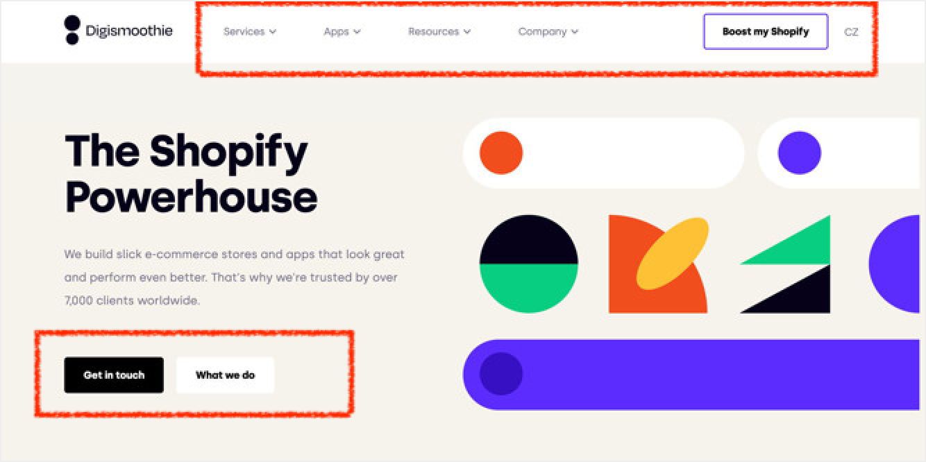
Image 5
In image 5, the navigation buttons in the menu at the top of the page are written in gray text but the major call to action (CTA) - “Boost my Shopify” - is a filled button with black text and a purple border. This shows that the “Boost my Shopify” button has higher hierarchy than the navigation buttons and is most likely the first button users will notice in the navigation menu. The two buttons in the top sections of the webpage are also good examples of hierarchy. The primary call to action is “Get in touch” so that's the most obvious button and is the first button from the left. The second, less pronounced button is “What we do”. Both buttons are filled buttons showing that their functions are similar in importance, by using color though, the one which is slightly more important is made more prominent.

Image 6
In image 6, two of the icons at the bottom are gray while one is purple. The purple icon shows which page the user is currently viewing while the gray icons show the other two pages in the app. The purple icon is more noticeable than the gray ones and therefore has higher hierarchy meaning it’s most likely the icon users will see first.
Proximity
Proximity refers to how closely related two elements in a design are. As with other principles, it applies to different types of elements - bodies of text, icons, illustrations, buttons etc. How close or how far elements are from each other shows how related or unrelated they are respectively. Proximity doesn’t just apply to the space between elements though. It can also be how similar two elements look in a design. For example, if a filled, blue button with the call-to-action “Add Photos” is used for adding photos to an app, a filled, blue button could also be used for adding videos or adding friends in the same app. Due to the fact that both these buttons have similar functions - adding things - they’re closely related and therefore can/should look the same. Examples of proximity are shown below.

Image 7
In image 7, the red lines show how proximity is used to show that the overline, heading and body text are related to each other. Proximity is also used to show that even though the two paragraphs are separate, they’re still closely related. The first paragraph is the “First City to Visit” and the second paragraph is the “Second City to Visit”, both paragraphs contain overline, heading and body text. The display text on the other hand (Best in Travel) is further away from the two paragraphs but not far enough for us to assume that it's not related. This tells us that it's the overarching title for this whole body of text.

Image 8
In image 8, the red line shows how bodies of text that are not related to each other are separated by quite a bit of space. The green line shows how bodies of text that are similar to each other but still separate are much closer. The blue line shows how text that are pieces of the same body of text are very close to each other. The orange rectangles show how proximity of the design of two elements shows that they have similar functions but are different. All the elements in the orange rectangles are buttons that lead to other parts of the website. The text is gray because they’re less important than the other things on the page. In one section though, ghost buttons are used while in the other text buttons are used. This shows that even though these elements are similar, the ghost buttons are still more relevant than the text buttons. This is a good example of how proximity of the design of elements can show that they’re related but still slightly different.
Repetition
Repetition refers to consistent use of fonts, colors, space, icon styles, illustration styles, button styles, etc in a design. Repeating elements or the styles of elements helps users build familiarity with a design and also the brand as a whole. If posts were to be pulled out from Facebook, Instagram, Twitter and TikTok feeds you’d most likely be able to tell which post is from where because of how often you’ve seen posts on these platforms and the fact that all posts within a platform have exactly the same style. The goal with repetition is to make using your design second nature to the user. When repetition of styles, functions, interactions, etc is done well in a design, users become so familiar with the design that no one needs to explain to them how to use it. Even if a new feature suddenly pops up in the app one day, they can probably figure out how to use it without any help because they’re familiar with using the older features. We see this in many apps nowadays with interactions such as; pull down to refresh, swipe left for “No” and right for “Yes”, long press for menu options, etc. These are all interactions that have been repeated across many apps so users don’t necessarily need to be told how they work. An example of repetition is below.

Image 9
In image 9, the red lines show how the styles of posts are repeated on Medium. The design of “Trending” posts are the same but slightly different from the posts further down the page - difference being that the posts further down the page have excerpts from the actual articles. Frequent Medium users will be quite familiar with this layout of posts and will expect it all through the site.
Space
Space may sound weird as a design principle but it's definitely important. Leaving enough space between and around elements in a design helps to direct users' focus and allow other principles like proximity, repetition, contrast, color, balance, alignment, etc to shine. This doesn't mean designs should be full of empty space, that can look equally as unappealing as not having enough space. Space should be used tactically to make design easier to process and digest. It also adds an element of simplicity to designs. The simpler a design is the better. Examples of how space can be used to make other principles stand out can be seen in many of the images shared in this lesson.
Summary
Understanding these 8 principles and how they come together to uplift your designs are important to designing seamless, intuitive and beautiful user interfaces. Even for people who may not have an eye for design or a creative edge, applying these principles is enough to help anyone create good designs. These principles are also useful as a basis when trying to critique or analyze other people's designs. It’s important to note that these principles are guides. An early stage designer would be best off sticking with these principles, an expert though, might not follow all these principles or tactically experiment with intentionally breaking some of them.