Color
Estimated Time: 30 minutes
Color Psychology
Color is a major aspect of UI design. It has the ability to heavily influence how people view; your design, physical and digital products and brands in general. Even in our everyday lives, color is used to give signals and feedback in places where text and images are not convenient as means of communication. It’s generally understood around the world that at a traffic light, red means stop, yellow means get ready and green means go. This is an example of how color can be used to provide certain signals without the use of words or images. In this chapter you’ll learn how different colors affect people physically and emotionally, how the meaning behind colors can change depending on culture/region and how to effectively use color in UI design. To kick things off, watch the video below about the psychological effects of colors.
For a deeper divide into the positive and negative effects of colors read the article below.
Cultural differences in Color
It’s important to note that even though colors have certain psychological, physical and emotional effects on us, their meaning can differ based on things such as cultural differences and region.
In western cultures red conveys extreme caution, love, aggression, strength, etc but in China red is seen as a sign of goodluck and happiness. It’s also the color of their flag and of Chinese New Year. In India red is seen as a color of purity which is why it’s common for brides to wear red during their wedding ceremonies. Imagine a hypothetical situation in which you invite your friend from China to your wedding. They can’t make it unfortunately, so in an effort to express how excited and happy they are for you they pen a letter to you in a red envelope. In Chinese culture it’s common for loved ones to give each other red envelopes during Chinese New Year to wish each other goodluck. You aren’t aware of this though so on getting the envelope you start to wonder why your friend would send you a red letter. Do they wish you a horrible married life, did you offend them somehow? Why would your friend send you such a bad omen on your wedding day? Of course we now know that this isn't the case and that your friend was trying to wish you love and happiness but this is a good example of how cultural differences can affect the meaning we place on certain colors.
As a designer it’s important to note the cultural differences of the meanings behind colors when designing for international audiences. These cultural differences can play a huge role in how products and brands come off to their target audience. So what does this mean for companies that start off with a specific brand color in one market and are trying to move into another market where their brand color may not be so appealing? This doesn’t mean that the company should change their brand colors just to enter the new market. To get around this, they can make the secondary color more prominent than the primary in the design of products that will be used in the new market. Alternatively, they can use a toned down version of the primary color or reduce the use of color altogether and rely heavily on images and illustrations (e.g Airbnb). This is all to say that as we design products, we should be sensitive to how certain aspects of our design, such as color, can have a major impact on how products/ brands are viewed. For more on cultural differences between colors please read the article below.
Color Formats
Colors come in different formats depending on where they are being used. In digital/screen design we use RGB values or HEX codes. In print design we use CMYK or Pantone.
RGB stands for Red, Green and Blue. All colors seen on screens are created by combining different values of these three colors. The values for these three colors can range from 0 - 255. R=0, G=0, B=0 is black while R=255, G=255, B=255 is white. HEX codes are directly correlated to RGB values, the only difference being that HEX codes are shorter and easier to remember. So R=0, G=0, B=0 is the same as HEX code #000000 (black) and R=255, G=255, B=255 is the same as HEX code #FFFFFF (white). As you design UI’s you will most often come across HEX codes. It's important to note that HEX codes always have 6 numbers.

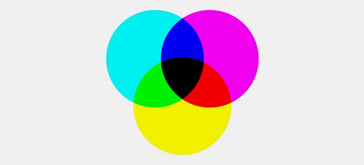
CMYK stands for Cayenne, Magenta, Yellow and Key (black). All colors seen on printed material are created by combining different values of these four colors. CMYK values range from 0 - 100. C=0, M=0, Y=0, K=0 is white while C=0, M=0, Y=0, K=100 is black. Black can also be represented by C=60, M=60, Y=60, K=100. Pantone color formats represent the exact ink mixture required to create particular colors. They are used in cases where colors need to match across different forms of media. Pantone is usually only used by large printers which makes it expensive to print.
CMYK and Pantone colors do not translate directly to RGB values/HEX codes. If you’re given CMYK values to use in digital/screen design use a color converter online to figure out what the corresponding RGB values/HEX codes are.
Using Color in UI design and Accessibility
We’ve covered the psychological, physical and emotional effects of colors, the different cultural/regional meanings behind colors and color formats. Finally we’ll cover how to effectively use color in UI design.
Colors are great at raising the quality and vibrance of designs but when too many colors are used together it can overwhelm viewers and make designs look tacky. Best practice is to use a maximum of two (at the very most three) colors in your UI design. The two (or three) colors you pick need to work well together and complement each other. White, black and gray are seen as neutral colors and should not be included when counting the number of colors used in a design. Assuming you picked two colors to use in your design, one of the colors would be designated primary and the other, secondary. A good rule of thumb is to use neutral colors in 60% of your design, your primary color in 30% of your design and your secondary color in 10% of your design. The vibrance and quality of your designs will depend on how well you’re able to mix neutral, primary and secondary colors. It’s important to note that within your neutral, primary and secondary colors you can have multiple variants. So if your primary color is blue and secondary is yellow, you can have multiple variants of the blue and yellow color you’ve chosen. These variants can be used for shadows, hover states, disabled buttons, secondary buttons, etc.
So how do you pick colors that work well together and complement each other? Some people have an eye for this and will just pick colors themselves while others prefer to be more systematic and use tools such as color wheels. Colors wheels are great for figuring out which colors complement each other well and also for creating color variants. There are many color wheel tools online but Adobe has a great one which provides you with complementary, monochromatic, analogous, triad and many more color combination options.
Another important factor when picking colors is accessibility. We’ll talk more about accessibility and useful tools for picking accessible colors in week 4 but it's important to mention it here because it should be factored in at the beginning of your color selection process. We cannot predict the condition of everyone who will interact with our designs once they’ve been built and deployed therefore we need to make sure that our designs are accessible to everyone, no matter what condition they have or what medium they choose to interact with our designs. Some people are visually impared and a substantial percentage of the population are color blind. Based on this, we need to ensure that the colors we choose contrast well with each other and the background color (most likely white) of our designs. There are many tools available which help check color contrast to ensure that most people, including those with visual impairments, can distinguish between colors in our designs. As mentioned previously, you’ll find out about these tools in week 4.
For more on color, please check out:
Summary/Takeaways
- Each color has a different psychological, physical and emotional effect on us.
- Manipulating the tint, hue and saturation of colors can change how colors affect us psychologically, physically and emotionally.
- The meaning behind colors can change depending on culture/region.
- Colors can be represented in different formats. RGB values or HEX codes for digital/screen design and CMYK and Pantone for print design.
- Use no more than two (at the very most three) colors in your UI design. Neutral colors and color variants are not included when counting the number of colors used in your design.
- If you can’t pick out colors that work together yourself use a color wheel tool.
- Make sure the colors you pick are accessible by ensuring they complement and contrast well with each other and the background.