Product Management and Design
CSF007
6 ECTS Credits
Welcome to Product Management and Design
What you'll learn
This course will teach you how to build products users want and love. It gives you a foundation in the tools and practices of modern product management and interaction design. You will collaborate with peers to apply these product development skills to real user challenges.
The course begins with a focus on user research. You'll learn and apply the design thinking framework to product development. You'll learn to define user needs through user interviews and market analysis, to translate those needs into product specifications, and define metrics to test product success. Next you'll learn to create and test design prototypes (wireframes, user journeys). You'll learn key concepts in UI/UX design including information hierarchy, and typography and color. You will create high-fidelity UI mockups using industry-standard tools. You’ll conduct usability tests to gauge the effectiveness of your designs.
Working with your peers, you will practice the complementary and collaborative roles of PMs and UX designers in early product development. You’ll also practice giving design critiques to other teams, and responding to feedback on your designs. By the end of the courses, your team will have a user-tested, refined, and development-ready spec for a web or mobile application.
Learning Outcomes
By the end of the course, you will be able to:
- Apply at least one product ideation framework (e.g. design thinking) to identify product opportunities
- Conduct qualitative concept tests, and make product decisions based on user feedback
- Create basic wireframes to describe a user journey
- Write product requirements documentation that describe the purpose, features, and metrics of success for a software product
- Design high-fidelity mockups for an application, and build interactive UI prototypes using industry-standard tools
- Analyze and assess a design, and give actionable feedback for improvement
Meeting Times
All times are listed in GMT, please convert to your local timezone.
- Class time: Wednesdays, 5 - 6:30pm GMT
- Office hours: Mondays, 5 - 6pm GMT
Instructors
Folarin Lawal, folarin.lawal@kibo.school
Ope Bukola, ope@kibo.school
Weekly Topics
- Week 1: Software development teams and design thinking
- Week 2: User experience research
- Week 3: User interface design basics
- Week 4: More user interface design
- Week 5: Review week
- Week 6: Product requirements
- Week 7: User flows
- Week 8: Prototyping
- Week 9: Continuous design life cycle
- Week 10: Final project
Course Tools
- Google Docs/Sheets/Slides
- Figma
- Gradescope
- Woolf
Live Classes
This page will be updated weekly with the recordings from the live classes.
Below is the live class schedule.
| Week | Date | Class Topic | Recording | Slides |
|---|---|---|---|---|
| 1 | Jan 11 | Introduction to Design Thinking | YouTube | Slides |
| 2 | Jan 18 | Generating & Processing Ideas | YouTube | Slides |
| 3 | Jan 25 | Concept testing | YouTube | Slides |
| 4 | Feb 1 | Design critiques | YouTube | Slides |
| 5 | Feb 8 | Guest speakers and AMA | YouTube | Slides |
| 6 | Feb 15 | Minimum Viable Product | YouTube | Slides |
| 7 | Feb 22 | IA & User flows | YouTube | Slides |
| 8 | Mar 1 | Usability testing | YouTube | Slides |
| 9 | Mar 8 | Pitching | YouTube | Slides |
| 10 | Mar 15 | No class - check Discord for office hours! | N/A | N/A |
Assessments and Grading
There are six assessments in the course, including the final project. The majority of your assessments are milestones toward your final project. Because your work in this course builds on itself, it is critical that you work on projects throughout the term, and not wait until the end.
Assessment and Grading Summary
The table below summarizes how your grades for the course is calculated.
| Assessments | Percent of Course Grade | Due Date (by 11pm GMT) |
|---|---|---|
| Class participation | 10% | N/A |
| Peer collaboration | 5% | N/A |
| Concept Creation | 10% | Mon January 23 |
| Final project milestone 1: concept test report | 20% | Mon February 6 |
| Design replication | 5% | Mon February 13 |
| Final project milestone 2: app design | 20% | Thur March 2 |
| Final project | 30% | Mon March 20 |
Late submissions
- Late submissions will incur a 10% penalty for each week that the assignment is late
- Every missed class will reduce your class participation grade by 10%
- The last day of the term is Friday March 17, and the last day on which any submissions will be accepted is Monday March 20.
Assessment Details
Below is a summary of each assessment. Each assessment will have a corresponding page in the course with more details.
Concept Creation (10%)
Choose an "How Might We" problem and create concepts for user testing
Design replication (5%)
Replicate the design of one screen of a mobile app
Final Project Milestone 1: concept testing (20%)
Refine your product concepts, then conduct user tests with 3-5 users in the target audience. Submit a research report summarizing the results of your concept tests and planned changes to your product vision.
Information Architecture (5%)
Create the information architecture for your product.
Final Project Milestone 2: App Design (20%)
Design at least four screens of your product from scratch, and submit in Figma.
Final Project (30%)
In collaboration with 1-2 team members, you will design a solution to a given user problem. You will work on the solution throughout the course and will need to submit three artifacts for your final project:
- A complete product requirements document
- A prototype, built in Figma, with original UI designs for your product
- A recorded presentation explaining the problem, user research and product development process, and final product vision
Class participation (10%)
You are expected to attend and participate in live class each week. Classes allow you you to practice what you learn in the lesson content, and to give and receive peer feedback.
How to Submit Your Assignments
All assignments must be submitted in Gradescope. You will also need to submit a copy in the Woolf platform for your academic record.
Assignment - Create concepts
Throughout this class, you will work on building a product to solve a user problem. Your final project is to produce development-ready specs (product requirement document, UI designs and prototypes) for the product. Most of your assignments will build towards your final project. In this first assignment, you'll pick a "How Might We" problem statement to focus on for the rest of the course, then begin generating ideas in the form of "Can We."
Throughout the course, you will work with your squad members. If your squad has 3 or fewer members, you will be on one team. If your squad has 4 or more members, you will split up into two teams. Each project team must have 2 or 3 people.
Part 1: Ideate solutions to a HMW problem statement
Choose a HMW question to focus on
Look through the list of HMW questions below and select one that you will design a product for this term. If there is another problem/idea you are keen to develop a product for, message your instructors in Discord (via private message) with a custom "Wildcard" HMW problem statement. You must obtain instructor approval if you want to work on an idea of your own.
How Might We
- Help people learn and practice their native language
- Help African artisans sell merchandise to global audiences
- Help secondary school students discover and learn about potential career paths
- Help young (and young at heart) people learn and practice the latest dance moves
- Help religious communities engage their members digitally
- Help busy university students live healthier (physical, emotional, social) lives
- Wildcard: come up with your own HMW statement to work on
Brainstorm ideas, i.e., "Can We"
Brainstorm potential solutions for your chosen HMW. Your solution should start with "Can We." You should brainstorm a minimum of 30 ideas, including at least 10 "bad ideas." Some tips for brainstorming:
- Try to find synchronous time for your brainstorm. If you don't have time you can brainstorm asynchronously in Discord.
- Creative block? Try the Crazy 8s activity described in lesson 1.6
Part 2: Create concepts for testing
In this part of the assignment, you will create concepts for your How Might We. You will eventually test these concepts with your classmates, and with real users in the target demographic. To complete the assignment following the steps below.
- Create a Google Slides deck for your concept. The title slide should include
- Concept Name
- The "HMW" problem statement
- Full name of each team member
- Then, each slide should include a concept (more on that below)
- Revisit the solutions ("Can we") that you brainstormed to your HMW concept. Group similar ideas together to create product "concepts" then create a slide for each concept. You should have 4-6 product concept slides. Each concept slide should include:
- A written headline that describes the category of idea. Optionally, you may add a written subtitle with more information
- 2 - 4 product feature ideas, represented by both an image and some text
For examples of product concepts, review:
- Bookworm, a set of concepts for the problem: "How might we encourage people to read more books"
- The intro to concept testing video, and slides from lesson 2.4
Submission
(1) Update the slide permission so that anyone at Kibo School with the link can comment

(2) Submit your assignment in Gradescope
- Each team member must submit separately
- Watch this video to learn how to submit using online assignment type in Gradescope
- In addition to a link to your slides, you will answer the following questions about your collaboration:
- Summarize your individual contribution to this group assignment/project.
- How balanced were the efforts of the group members? Did everyone do his or her fair share of work?
- If you had done this by yourself, would the outcome have been better or worse?
- Given the choice, would you work with the same group again?
- (Optional) Is there anything else you want to share with instructors about the way your team worked together?
(3) Download and submit a PDF copy of your concept deck in Woolf
Project - Conduct Concept Tests with Real Participants
From previous lessons and in-class activities, your squad should have:
- Chosen a “How Might We”
- Ideated solutions in the form of “Can We”
- Created concepts based on your “Can We”
- Tested these concepts with your classmates
For this project, you’ll test your concepts with people outside of the course and Kibo School (real participants). The goal is for you to experience how to create research assets, recruit research participants, conduct research, and generate actionable insights from feedback.
You are required to conduct 3-5 concept tests with different participants in your target audience. During a concept test, one team member will act as a facilitator by guiding the participant through the concept test. The other team member(s) will take notes and support in whatever capacity is needed. Each squad member should facilitate at least one concept test.
Tools
It’s important that you organize and gather the tools you need to make your tests as seamless as possible for you and participants. Below are the tools you’ll need to carry out your concept test successfully:
- Your concepts in Google slides
- Your test script in Google docs. The script will narrate what the facilitator will say, the questions which will be asked during the interview and will be for taking notes during the interview.
-
- Make a copy of this interview guide
-
- Share the copy with all members of your squad, and work to edit and create the guide
- Google Calendar which you will use to schedule dates and times for your concept tests with participants
- Zoom to conduct concept tests and record the interview. Note that your Google Meet education account does not support recording as that is a paid features, so we recommend using Zoom. Alternatively, you may choose to conduct your testing live in person. In this case, it is recommend to use a recorder on your phone or computer to capture what participants say and do.
Part 1: Recruit research participants
Suggested Deadline: January 28, 2023
Finding and scheduling participants will take time, so you should begin recruting participants right away, before you finalize your concepts and interview guide.
Feel free to recruit participants from wherever you can. The most important thing is that you agree on a time and date that’s comfortable for both participants and your squad members. As you recruit participants:
- Let them know what you're recruiting them for (concept testing) and how much of their time you need (each test should last 30 mins)
- Send calendar invites that include the date, time and link that will be used for the video call
- Send a reminder the day before to ensure participants show up
Part 2: Conduct Concept Tests
During the live test, your participant will give feedback on your concepts. A few tips:
- Ask some background questions to probe the participant's experience of the problem
- As you ask questions, avoid asking closed questions that influence participant's responses
- Give participants enough time to respond but also make sure they don’t take too much time, remember you only have 30 mins.
Part 3: Write a research report
After finishing your concept tests, you will write a research report summarizing your process and findings. The report should include:
- The "HMW" problem statement and summary of hte problem
- The roles each of your squad member held during each concept test
- The number of people that participated in your concepts tests
- The dates and times of your concept tests
- The script you used and questions you asked
- A summary of the feedback you got during your concept tests
- The takeaways you generated from the feedback you got
Use this template to create your concept test report. Please keep the test report to no more than 3 pages.
Submission
Ensure your concept test report is set to enable anyone at Kibo to comment on the document
(1) Submit your assignment in Gradescope
- Each team member must submit individually
(2) Submit a collaboration evaluation
Submit this form to summarize your contribution and that of your team members. The form will ask you to answer the following questions about your collaboration:
- Summarize your individual contribution to this group assignment/project.
- How balanced were the efforts of the group members? Did everyone do his or her fair share of work?
- If you had done this by yourself, would the outcome have been better or worse?
- Given the choice, would you work with the same group again?
- (Optional) Is there anything else you want to share with instructors about the way your team worked together?
(3) Download and submit a PDF copy of your report in Woolf
Assignment - Design Replication
Brief
In the last two chapters you’ve been introduced to UI design, UI design principles and designing for mobile and web. Under the “Inspiration and Resources” section we’ve also covered how important it is to seek out sources of inspiration and replicate/copy other designs/designers.
For this assignment, you’ll be expected to replicate one app or website screen from a product of your choice as we did during the live lesson. This is an individual assignment. The goal is for you to;
- Familiarize yourself with the different features and functionalities within Figma
- Get comfortable designing the elements/components that are necessary for you to properly replicate designs
- Train your eyes to spot differences/inconsistencies in designs
Hints and Guidiance
- Take a screenshot of the app or full web page you plan on replicating
- Post the screenshot in Figma and resize as needed
- Create your design right next to the screenshot so that you can constantly compare your design with it as you progress
Submission
(1) Update the permissions of your Figma file so that anyone with the link can view
To do so:
- Click on the "Share" button in the top right hand corner of Figma
- In the modal that pops-up, ensure that the "Anyone with the link" option is set to "Can View" rather than "can edit"
- Finally, click on the "Copy link" button at the bottom of the modal
(2) Submit your assignment in Gradescope
Submit the link to your design on Gradescope
(3) Download and submit a PDF copy of your design in Woolf
Assignment - Create Designs for your Project
Brief
By now, your team has:
- Completed the concept test report, and have a product direction
- Completed the individual design replication assignment and praticed UI design with Figma.
For this project, your squad will design and submit at least four pages of your proposed solution. Your solution should be either a website or mobile application. The solution your squad decides to move forward with should be based on the takeaways you got from participants’ feedback.
Guidance
- Before beginning the visual design
- Sketch out the pages you want to design using Figjam or another whiteboard collaboration tool. The sketches don't have to look good. They need to clearly highlight the feature/s you're designing so that as a squad, you all understand how your solution will work.
- Agree on the design direction with your team before you start designing in Figma. This will reduce disagreements once you're designing the UI.
- Design direction to agree on include your solutions name, the brand colors for your solution, the typeface for your brand, etc.
- Once you have a design direction, jump into Figma and start designing
- Decide on an approach to split up the work
- Each member of the squad must design at least one page
- The rest of the design may be split up however you wish. For example, one person may be delegated to design the rest of the pages while others focus on other aspects of the final project. But it is critical that each person design at least one page
Submission
(1) Update the permissions of your Figma file so that anyone with the link can view
To do so:
- Click on the "Share" button in the top right hand corner of Figma
- In the modal that pops-up, ensure that the "Anyone with the link" option is set to "Can View" rather than "can edit"
- Finally, click on the "Copy link" button at the bottom of the modal
(2) Submit your assignment in Gradescope
Submit the link to your design on Gradescope. Note that this is a Gradescope group assignment and so one person should submit and choose your team members
(3) Submit a collaboration evaluation
Submit this form to summarize your contribution and that of your team members. The form will ask you to answer the following questions about your collaboration:
- Summarize your individual contribution to this group assignment/project.
- How balanced were the efforts of the group members? Did everyone do his or her fair share of work?
- If you had done this by yourself, would the outcome have been better or worse?
- Given the choice, would you work with the same group again?
- (Optional) Is there anything else you want to share with instructors about the way your team worked together?
(4) Download and submit PDF copies of your designs in Woolf
Final Project - PRD, Prototype and Presentation
The final project is worth 30% of your final grade for the course. Late submsissions will not be accepted so please submit on time or early.
Product Design and Presentation
In collaboration with your team members, you will design a solution to a given user problem. You need to submit three artifacts for your final project:
- A complete product requirements document (15% of grade)
- A prototype, built in Figma, with original UI designs for your product (10% of grade)
- A recorded presentation (maximum of 7 minutes) explaining the problem, user research and product development process, and final product vision (5% of grade)
Collaboration recommendations
The final project has many moving pieces, so you should plan your strategy and collaboration. Below is a suggested approach which you may feel free to modify to better suit your team.
Determine how you will split up the work
The final project has three major deliverables (PRD, Design, Video). Decide who will be the owner for each deliverable. The owner does not need to do all the work, but should be in charge of creating a timeline, splitting up the work, ensuring the work is done, and putting together the final artifact.
Part 1: Agree on a product direction and start the PRD
As a team, determine a direction for your product. To do so:
- Copy the roadmap template from lesson 6.3
- Use the template to determine what feature(s) will go into your MVP, MMP and MLP and your roadmap
- You do not have to submit the template though you may link to it in your PRD if you wish
- Copy this PRD template . This is the suggested template to use for your final project, but you may also choose to use a different format.
- Here is an example of a completed PRD using the template
- You may choose to a use different PRD template if you wish. Whatever format you choose must include the following
- Summary of the problem, solution, and roadmap
- Background section that briefly describes the problem your product is solving
- Links to supporting documents including your Figma designs and concept test report
- List of major features with brief descriptions
- Roadmap that list what you will release when
- Draft the background section of the PRD
Part 2: Complete design prototype
You have started working on designs for your final project in the App Design project. You will now finish your designs. The finished product requires:
- Designing the remaining major UI screens for your solution
- The UI screens you design should show how users will interact with/flow through the major features in your product
- You do not have to design every single screen and should leave out the basics (e.g account, profile, password reset, etc). Instead focus on the primary features and interactions of your app
- Building an interactive prototype in Figma. The prototype should allow someone to click through your app and mimic its behavior
Part 3: Complete the PRD
Complete the PRD for the MVP version of your product. Suggested order to work on the PRD is:
- Background
- Roadmap
- Detailed requirements
- This is a list of all the features in your MVP as well as descriptions of how each feature should work
- Technical requirements
- Summary and Supporting documents -- leave this until the end when you have finished the rest of the parts
Part 4: Record a pitch video
You will be recording a product pitch. The audience for this pitch are potential collaborators or investors. The pitch should clearly demonstrate:
- The problem your product solves
- Your team
- The UI designs and main functionality
- Why you believe your product will gain traction
- Your "ask" of the viewer
When finished, upload your pitch video to YouTube.
Submission
(1) Submit in Gradescope
- This is a group assignment and one group member should submit for the entire team. A few notes on artifacts
- Ensure your PRD is set to enable anyone at Kibo to comment on the document
- Ensure that your YouTube video is unlisted and viewable in YouTube
(2) Submit a collaboration evaluation
Submit this form to summarize your contribution and that of your team members. The form will ask you to answer the following questions about your collaboration:
- Summarize your individual contribution to this group assignment/project.
- How balanced were the efforts of the group members? Did everyone do his or her fair share of work?
- If you had done this by yourself, would the outcome have been better or worse?
- Given the choice, would you work with the same group again?
- (Optional) Is there anything else you want to share with instructors about the way your team worked together?
(3) Download and submit the following to Woolf
Each team member should submit the following to Woolf:
- A PDF copy of your PRD
- A PDF copy of your designs. See video instructions for how to get a PDF copy of design files
- File of your video presentation
(4) Submit your course evaluation
We want your candid feedback on the course. We are "iterating toward greatness" can can only do so if we get a bit better each time. Your honest opinion on what worked well and what can be improved is critical. If you have not already done so, plese take 10 minutes to submit the course evaluation. Thank you for your time! 🙏🏿
Software Development Team
Welcome to Week 1!
Learning Outcomes
After completing this lesson, you will be able to:
- Explain the role of product managers and product designers on digital product teams
- Describe the design thinking process and stages, and explain the benefits of using design thinking to solve problems
- Formulate problem statements using the "How Might We" framework
- Apply one or more ideation techniques to generate potential solutions to a problem
Sections
Empathise and Define: How Might We
Software is a team sport
Estimated Time: 30 minutes
The Myth of the Lone Coder
Popular culture sometimes presents a certain image for how software is built: a lone genius, typically a (white) guy in a hoodie, is hunched over a computer with coffee or diet coke. He codes furiously and some time later, dishelved but victorious, emerges with a website or app that changes the world and makes him a billionaire.
🚩🚩🚩
While this might make for good television, it couldn't be further from the the truth of how successful digital products are built. In reality, designing, building and launching successful products requires the input and collaboration of many individuals that make up the product team, as well as external stakeholders. Software product development is a team sport!
Research: Software Teams
Review the list below of roles one might find on a software development team. Pick at least one role you are unfamiliar with. Spend 5-10 minutes to research the role, then write a 1-2 sentence explanation of what this person does in a team.
- Product manager
- Product owner
- DevOps engineer
- UX Designer
- UI Designer
- Software architect
- QA Engineer
- Business analyst
Post your explanation in the padlet below.
Note: In order to see and interact with the padlet, you will need to be logged in to your padlet account!
What is Product Management?
Estimated Time: 30 minutes
Product management is one of the most in-demand roles in technology companies. Yet, it is an often misunderstood role. Product management has a complex history, and the role varies considerably between and within companies.
One common abstraction is to describe Product Managers (PMs) as "CEOs of the Product." This is somewhat true because PMs act as the overall lead and connect various functions like engineering, design, sales, marketing, etc. However, unlike a CEO, companies usually do not roll up to PMs, and there are many stakeholders with equal or greater decision-making authority than a PM. Nevertheless, PMs must provide clear direction and leadership for their products.
The role of a PM
Two useful definititons of the role of a PM are below:
From the video, article, and definitions, we learn that a PM's job is to drive impact. PMs collaborate with others to figure out what product will deliver value to users and the business. They then collaborate to build, test and launch that product. Product managers operate at the intersection of the user, the technology, and the business.
A useful summary of a PM's role - and one we'll use throughout this course, is that the product manager's job is to build the right thing and build the thing right.
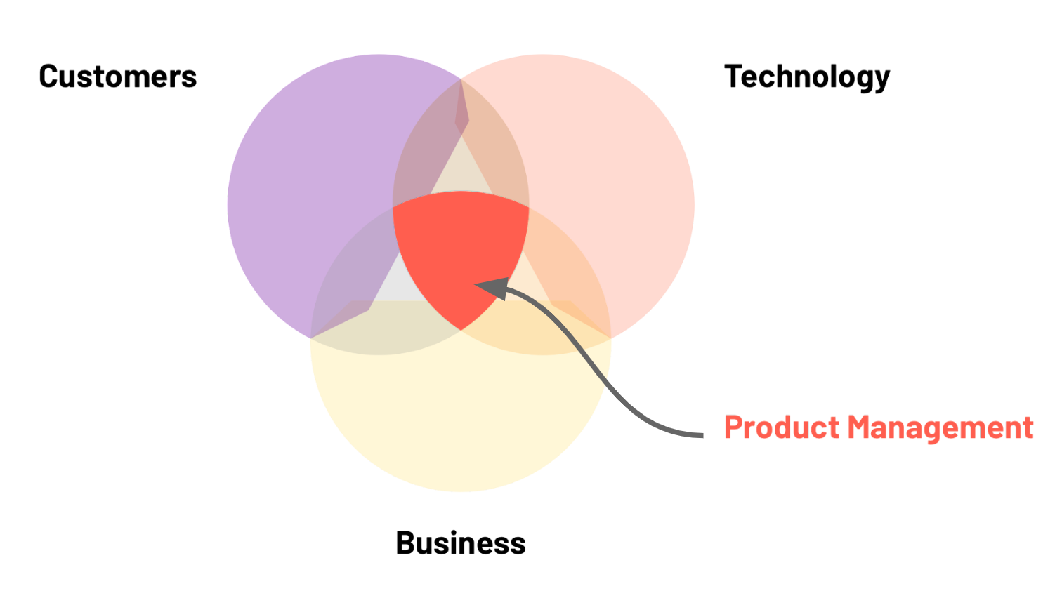
Building the right thing meanst discovering and identifying the right product. PMs must deeply understand the needs of the user and the market, and translate that understanding into a valable product.
Building the thing right means using resources appropriately, and aligning various stakeholders to build the product in a way that maximizes user and business value. Much of the PM role is considering and making tradeoffs that shape the product in a specific direction.
When people say PMs are CEOs of the product, that's because being a PM requires many of the same skills that CEO does, i.e., the ability to align a team, define a clear vision and strategy, and execute the strategy.
Computer Science as preparation for PM
In the early to mid 2000s, the path to becoming a product manager was unclear. Today, many big technology companies hire Associate Product Managers straight from university. While being technical is not a requirement to be a PM everywhere, studying computer science is an excellent preparation for an impactful product career.
Optional Resources
Becoming a product manager
How to Become a Product Manager (According to 3 Experts Who Are)What is Product Design?
Estimated Time: 30 minutes
A product designer creates the overall look and functionality of a product. A common misconpception about designers is that they exist to make software products beautiful. While there is an aesthetic component to design, beauty is a small part of a designer's job. Good design is focused on both form and function.
Designers ask questions like:
- For whom is this product being built and why? Does it meet a user need?
- How will this product be used? What is the user's context?
- What are the potential risks or challenges associated with using this product?
- Is this product satisfying or delightful to use?
Design is not just about making something that looks good. It is about making products that are work well and look good.
UI Designer or UX Designer?
In product design, it's common to hear about User Interface (UI) design and User Experience (UX) Design. UI and UX design are related but distinct fields within the design discipline.
-
UI or User Interface design is concerned with the interface of the product which is the part with which the user interacts. For software products, this is often screens, buttons, voice interfaces or other features that let users interact with a product. UI design is the process of designing how the digital interfaces look and behave, and covers visual and interacitve elements of products such as colors, typography, buttons, scroll functions, andmianos, etc.
-
UX or user experience design is concerned with a user's experience with the product, and ensuring that the user interaction with the product is relevant, enjoyable and accessible. A UX designer might focus on
- Value proposition and ensuring the product solves a real problem for the user
- User journey, and understanding how the user discovers the product and the touchpoints the user has with the product
- Onboarding and ensuring the user is sucessful from their first interaction with the product
- User education, and ensuring that explanatory texts, messaging, and support is clear
In many product teams, one individual plays both roles. Large teams may have many UX designers and UI designers responsible for different aspects of the product.
Another important design function is User Researcher. User researchers collect and analyze data to improve the product. We'll learn more about user research in upcoming lessons. Just as with UI and UX design, there may or may not be a dedicated user researcher on a team. In teams where there is not a dedicated user research, the research function is typically played by the Product Manager, or shared between a PM and a designer.
PM and Design collaboration
Remember that good software product development is about building the right thing and building the thing right, and it's the PM's job to help identify the right thing. This is a collaborative task that involves many people. One of the PM's key collaborators in building the right thing is the designer.
In the product definition phase, product managers and designers work together on various activities including:
- Ideating product features
- Conducting user research and testing
- Analyzing proposed solutions
- Refinining product solutions, creating, testing, and refining prototpyes
Introduction to Design Thinking
Estimated Time: 30 minutes
In the previous lesson, we said that a product manager’s job is to collaborate with the team to build the right thing and build the thing right.
But how do PMs and designers know the right thing to build? Building new products is an inherently creative endeavor. Some people argue that innovation is driven by singularly gifted visionaries (e.g., Steve Jobs) who see a future that others cannot imagine. They might agree with Henry Ford, the developer of the assembly line and mass automobiles who allegedly said:
Intuition is helpful in product design. But, to build the right thing, an innovator must understand the people for whom the product is being built. This understanding comes from empirical analysis, observation, and yes, asking people what they want. Ford famously stubbornly stuck to his vison for automobiles and, as a result, his company lost market share to General Motors and others who spent more time understanding their customers needs.
Building impactful products is extremely difficult, and even the best companies in the world struggle to do it consistently. You may have heard of famous flops like Google Glass, Apple Newton, Amazon Fire Phone, or Facebook's Libra coin. Product fail for many reasons, but chief among them is that they don't solve a real customer problem. One way to build products that meet user needs is to apply the principles of design thinking to product development.
What is Design Thinking?
As stated in the video
- Design thinking starts with people
- When using a design thinking, innovators attempt to find solutions that:
- Are constructive
- Improve users' lives
- Are feasible to produce
- Make business sense

Design Thinking Process
Design Thinking Principles
In their paper Understanding Innovation: Design Thinking Christoph Meinel and Harry Leifer of the Hasso-Plattner-Institute of Design at Stanford University (d.school) describe four principles of design thinking:
-
The human rule: design is social in nature — problems must be solved in a way that satisfies human needs and acknowledge the human elements in all technologies.
-
The ambiguity rule: ambiguity is inevitable — experiment at the limits of our knowledge, the limits of our ability to control events, and with the freedom to see things in a different light.
-
The re-design rule: all design is re-design — technology and social circumstances are constantly evolving. We need to understand how our human needs were met in the past.
-
The tangibility rule: making ideas tangible facilitates communication — this directly refers to creating prototypes.
Design Thinking Process
The video describes five stages of design thinking
- Empathize: research your user's needs to better understand the problem you are trying to solve.
- Define: with the information gathered from research, define or state the problem
- Ideate: generate many potential ideas that might solve the problem, and look for alternative solutions
- Protoype: experiment with various solutions. Create inexpensive prototypes that you can share with users
- Test: rigorously test prototypes and use the results to refine your problem statement and/or solutions
Though it can be helpful to think of designing thinking as occcuring in steps, the process is rarely linear in practice. The design process is iterative, and you will combine the phases and adapt them to suit your specific needs.

Why Design Thinking Matters
Design thinking helps us craft impactful products. The world is increasingly complex, so we need a way to undersand and address rapid changes to user environments. Design thinking:
- Reduces the time it takes to get a new product to market, which ultimately saves money
- Improve customer retention and loyalty: by building with users, you engage them and increase their ownership and buy-in of the product
- Fosters collaboration: design thinking encourages us to collabroate across company silos and with our users
- Increases innovation: by asking us to challenge assumptions, design thinking builds our creative muscles
As stated in the introductory video, the way to learn design thinking is to try it. For the rest of the course, we'll apply design thinking to go from a product problem to a viable solution.
Optional Resources
Understanding Design Thinking
IDEO's design kit is an excellent repository of tools and case studiesWhat Exactly is Design Thinking
Plattner, Meienel, Leifer's Design Thinking paper
Creative applications of design thinking
Empathise and Define: How Might We
Estimated Time: 1 hour
Throughout the rest of this course, we'll apply the principles of design thinking to develop a software product. We'll engage in an iterative process of developing empathy, defining problems, ideating, then prototyping and testing numerous solutions. The first two steps of design thinking - empathize and define - focus on understanding the user's problem and defining a clear problem statement. In this lesson, we explore a framework for articulating clearly defined problems: How Might We. This method takes insights from users and frames a question to answer a problem.
Empathise: talking to and understanding users
Define: creating problem statements
Problem statement are one of the outputs of the "Define" stage of design thinking. Once you begin talking to users and building empathy, you may see many potential problems to address. A well-constructed problem statement is vital for staying focused in the design process. To navigate the often ambigious design process, design teams must constantly come back to the problem they are trying to solve. Without a well-constructed problem statement, it's easy to start building solutions that try to solve too many problems.
A good problem statement is:
Centered on the user
Problem statements are generated from research insight about users and their needs
Assumption free
Problem statements should not make assumptions about the users nor the optimal solutions
Well-scoped
Problem statements should be broad enough to provide creative freedom, but narrow enough that they are practical
In the next section, we'll learn about "How Might We," a framework for drafting good problem statements for design.
How Might We: turning problems into opportunities for design
From the video and reading, we learn:
Why create HMWs?
To help launch impactful brainstorms by creating a seed that is broad enough to enable a wide range of solutions
How to generate HMWs?
Start with user research. Conduct or review user research then look for aspects of it that can help complete the sentence, "How might we..."
What's the right level of scope?
A successful HMW statement is neither too narrow to hinder braninstorming nor too broad to foster actionable ideas.
Practice writing a problem statement
Ideate: Can We?
Estimated Time: 1 hour
After crafting a problem statement, the next step in the design thinking process is to ideate. The goal is to generate many potential ideas that might solve the problem, including some alternative or strange solutions. In a design sprint, the section where the participants generate ideas follows "How Might We" and is refered to as "Can We?"
The blockers to creative ideation
Coming up with many ideas can be hard. Many of us have been told that we're not the "creative type." But, the idea that creativity is the domain of a select few is wrong. We all have creative potential and with the right mindset and activities, we can come up with interesting and useful ideas.
Ideation techniques
There are numerous activities that can help to overcome blockers and generate ideas. Atomic’s Design Thinking Toolkit has numerous activities for the ideation phase including:
SCAMPER
The SCAMPER method is a brainstorming technique to come up with new ideas by applying a set of creative thinking strategies to a design problem. Starting with an existing solution, a team can apply the SCAMPER technique by answering the following questions:
Substitute: What can be changed or replaced in the design?
Combine: How can elements be combined or merged in the design?
Adapt: How can the design be adapted from something else?
Modify: How can the design be altered or modified in some way?
Put to other uses: How can the design be used in a different way?
Eliminate: What can be removed from the design?
Reverse: How can the design be reversed or turned upside down?
Rearrange: How can the elements of the design be rearranged in a different order?
Crazy 8s

Crazy 8s is a design thinking technique that involves quickly sketching out 8 different ideas for a design problem in just 8 minutes. The goal is to generate a large number of ideas in a short amount of time, without worrying about the quality of the ideas. This technique is useful for overcoming creative blocks. It can also be a fun and energizing activity for teams to do together. Learn more about crazy 8s and download tempaltes in the design thinking toolkit.
2x3s
The 2x3 activity involves creating 2 different ideas for a design problem and then developing 3 different versions of each idea. This technique is useful for exploring different variations of an idea and for narrowing down a set of potential solutions to a design problem. The 2x3 activity is a bit more focused/structured than crazy 8s. While crazy 8s are about generating as many ideas as possible, 2x3 is more focused on exploring variations of an idea to narrow down on a potential solution. Learn more about 2x3 and download tempaltes in the design thinking toolkit.
Wrap up
Assignment
After finishing this lesson, you should complete Part 1 of the assigment on Creating Concepts.
What We Learned
- Software is a team sport. Developers collaborate with numerous individuals collaborate to build and launch successful products
- Product managers lead software teams to deliver impactful products. A PM's job is to align the team to build the right thing and build the thing right
- Product designers ensure that products function well and are delightful to use. UI design is concerned with the interface (look and feel) while UX design is focused on experience of using the product
- Design thinking is a useful framework for user-centric product design. It involves five steps which occur iteratively and continously throughout the design process: empathize, define, ideate, prototype, and test.
User Experience (UX) Research
Estimated Time: 3 hours
Introduction
Learning Outcomes
After completing this lesson, you will be able to:
- Understand the basics of UX research and how research supports product development
- Understand how and when to use different UX research methods
- Plan, and conduct concept tests with participants
- Analyze the results of UX research and distill research findings into actionable insights
Sections
Preparing for Class
Estimated Time: 15 minutes
Sign up for Figma and practice FigJam
Figma is a collaborative design tool and one the most widely-used professioanl design tools today. During this class, you will use Figma to create wireframes, high-fidelity designs and prototpes. You will also use FigJam, an online whiteboarding and collaborative tool that is part of Figma. We'll use FigJam in class. You can also use it with your teammates for live or async brainstorm.
To prepare for the next class, you need to sign up for Figma and practice using FigJam. Important: please watch the video below before signing up as it is important you follow the sign up steps for an education license.
After watching the video, you should:
- Sign up for Figma with your Kibo account
- Visit figma.com
- Select "Get started" in the top right then "Continue with Google"
- Click this link to join the PMD class team
- Create a FigJam file in the "FigJam How To" project and rename it to your name, e.g., "Ope's FigJam"
- Practice using FigJam! You should be comfortable adding sticky notes, text, using marker and stamps, and using the select and hand tools
- This article and the video linked within will give you more information and guidance
See you in class!
User Experience Research Basics
Estimated Time: 30 minutes
What is User Experience Research?
User experience (UX) research is the process of studying the behaviors, needs, attitudes and motivations of users in order to improve the design of software, services or products. UX researchers conduct various types of research, including interviews, surveys, usability tests in order to gather data from users and identifies opportunites for impact.
Quantitative vs. qualitative research
Two main types of UX research methods are quantitative and qualitative.
Quantitative research
Quantiative UX research collects and analyzes numerical data. This can include surveys, A/B testing, usage logs, or other methods that provide data for statistical analysis. Quantitative research is useful to
- Generate data from a large sample size
- Make generalizations about a large population
- Test hypotheses and identify trends or patterns in user behavior
Some questions a researcher might answer with quantiative research include:
- How many active users does the product have each day or each month?
- What share of people find the call to action on the page?
- What is the average satisfaction level of users with the product or service?
Qualitative research
Qualitative research is less focused on collecting and analyzing numerical data. Instead, the goal of qualitative research is to understand the underlying reasons behind user behavior and preferences, and explore the subjective experiences of users. This type of research is often used to:
- Identify trends or patterns that may not be immediately apparent from numerical data
- Gain a deeper understanding of user motivations and behaviors
Qualitative research typically involves conducting interviews, focus groups, observations, or other activities that allow researchers to probe users' thoughts and experiences in greater detail. Qualitative research often involves smaller sample sizes and is used to generate detailed insights into user behavior and preferences.
Attitudinal vs. behaviorial research
Another set of research methods is attitudinal vs. behaviorial. The difference in these two approaches draws from the insight that what people say and believe (their attitudes) are often different from what they actually do (their behavior). To build the right thing, it's important to understand both what users believe and how they behave.

Attitudinal research
Attitudinal research aims to understand the attitudes and beliefs of a user. It typically involves conducting surveys, interviews, or other methods that allow researchers to explore people's attitudes and beliefs in greater detail. This type of research is often used to:
- Identify potential problems or issues with a product or service
- Gauge the effectiveness of marketing campaigns
- Understand the underlying reasons behind user attitudes and beliefs
Behaviorial research
Behavioral research aims to understand the actions and behaviors of users in relation to a particular product or service. It typically includes studies of how users interact with the product or service, how they navigate through different features or pages, or how they respond to different design elements. Behavioral research might involve using tools like heat maps or click tracking software. This type of research is often used to:
- Inform the design of specific user flows, e.g., onboarding
- Personalize product experience, e.g., by providing user-specific recommendations
- Identify areas for improvement in a product or service
UX Design principle: Mix it up!
💡 When conducting research, use a mix of both quantitative and qualitiative research, as well as a mix of attitudinal and behavioral approaches. This enables you to get the clearest and most naunced view of a design problem.
Optional Resources
UX Research at real companies
How instagram's culture of ux research positively impacts customer experience: takeaways from forrester cxsfUX Reseaarch at Gitlab
User Research Methods
Estimated Time: 1 hour
In the previous lesson, we learned about broad approaches to UX research. In this lesson, we'll focus on techniques for UX research. The aim of this lesson is to provide an overview of different user research tactics. In future lessons and your final project, you'll have the opportunity to put some of these techniques into practice.
The video included a lot of information, and may have mentioned many research techniques you're unfamliar with -- do not worry! The aim of this lesson is not to learn every single research technique but to help you understand the wide array research techniques available. A professional UX researcher learns them over time to build his or her toolkit.
An important insight from the video is that different techniques work for different parts of product development. The video breaks up product development into four stages below
- Discovery
- Explore
- Test
- Listen
The stages above map well to the design thinking methodology. Roughly:
- Discovery 🤝🏽 Empthasize
- Explore 🤝🏽 Define / Idea
- Test 🤝🏽 Prototype / Test
- Listen: this can be linked to multiple part of the design thinking process
Common UX Research Techniques
As stated above, numerous UX research techniques exists. Below are some common types of which you should be aware.
User interviews: user interviews are one-on-one conversation with a user to understand the user's experience and opinions. User interviews may be highly structured where the researcher asks specific set of questions, or a more unstructured conversation. They can be conducted in-person or via phone or video.
Field studies: field studies take place in the user's context. In field studies, the researcher directly observes user behavior. In Ope's work at Google Classroom, she often conducted field studies by standing in the back of classrooms for hours, and watching how teachers and students interacted.
Diary study: diary studies are used to collect qualitiative data about a user over a long period of time. Users typically self-report their data, and they are called diaary studies because participants are keeping a "diary" or log over time. For Google Classroom, we conducted a 1-week diary study with university students where we asked them to record short video reflections throughout the day for a week to better understand their lives day-to-day.
Focus groups: focus groups a discussion of typically 5-9 users moderated by a researcher. Focus groups may be useful to encourage users to feel more comfortable and willing to share. Plus, the interaction among group members may bring out different ideas than a one-on-interview.
Surveys: surveys are a series of questions posted to many users. In Google Classroom, we used a survey method called "HaTs" (Happiness Tracking Surveys) which asked about 2,000 users each week in the product to answer the same 10 questions. Over the years, we built a robust, statisically meaningful understanding of the product
Card sorting: in a card sorting activity, participants are given a set of cards, each with a piece of content (such as a label) written on it. They are then asked to organize the cards into categories. Card sorting helps researchers understand how users categorize information, which can be used to improve the navigation, labeling and organization of applications.
Concept testing: a product discovery test where participants react to early ideas for a product or features. Concept tests are covered in more detail in lesson 2.4
Usability testing: a product test where participants interact with a product prototype. During this test, a moderator usually asks partcipants to perform certain tasks, then observes the participants' behavior and feedback
A/B testing: sometimes referred to as split testing, A/B testing is a randomized testing process where two or more versions of a product are shown to users to determine which performs better
Again, the above is not a comprehensive list of UX research techniques, but a list of some of the more common ones.
UX Research and User-Centered Design
Recall that the product development life-cycle typically covers numerous phases. UX Research has a role to play in all of them. Depending on the stage of product development, you can employ different UX research techniques.
Emphathize
This stage is almost entirely research dependent. Qualitative research methods can be helpful as you better understand your users. Good techniques to use in this stage include user interviews, field studies or other methods that foster nuanced understanding.
Define
In this phase, you are defining or stating the problem. Good research techniques at this stage include user studies or focus groups.
Ideate
In this phase, you are generating many potential ideas that might solve the problem, and looking for altenrative or idiosyncratic solutions. Research techniques that help here might include:
- Focus groups with groups of users to co-create and ideate
- Concept testing to get user feedback on high-level direction
Test
In this stage, you rigorously test prototypes and use the results to refine your problem statement and/or solutions. Research techniques that may be particularly useful here include:
- Usability testing
- A/B testing
UX Research Principle 2: Don't Skip Research
💡 The right research technique to deploy will depend on your specific product's lifecycle and the resources you have available. One important principle is key though: don't skip research!
User research quiz
Optional Resources
Understanding UX Research Methods
Video: How to do user research that has real impact, Michael Margolis, UX Research Partner at Google VenturesVideo: 5 Qualitative Research Methods Understanding the Top 9 UX Research Methods & Techniques
Conducting User Research
Estimated Time: 30 minutes
This lesson explains how to create a UX research strategy and how to conduct user interviews.
How to craft a UX research strategy
Conducting useful research requires a plan. A UX research strategy is a guiding plan that outlines the why, when, and how of your research. A well-crafted strategy helps ensure the research you conduct will actually help build a meaningful product.
A strategy should outline:
- Why the research is necessary, and the expected value to your team
- The individual research projects and techniques that will be used
- A research timeline and plan
- A plan to disseminate and share research results
Step 1: who is your research for?
All UX research should ultimately be for the benefit of the user. That said, there are likely stakeholders within the team or business who will use the research. This might be a business leader who needs to determine if a product direction is worth pursuing, a product manager who wants to decide which features should be built or discarded, or an engineer who wants to figure out where to invest in technical improvements. The first step in a well-crafted research strategy is to clearly articulate the primary stakeholder(s) for the output.
Step 2: what are you researching?
Just as there might be various stakeholders who will use the research, the what of the research might vary as well. You might be researching a feature idea, or an existing product feature. Determining what you are researching and the key questions you want answers to are critical steps.
Step 3: Gather the team
Determine who will part of conducting the research. This might include dedicated UX researchers, UX designers, product managers, engineers, and more.
Step 4: Create a research plan
A research plan outlines the entire process of research. It typically includes:
- The problem statement
- Research objectives
- Research methods
- Timeline
- Research participants
- Research materials
- Plan to share findings
Conducting user interviews
For the rest of this class, most of the research we'll conduct will be in the form of user interviews. We will conduct two types of user interviews
- Concept tests to test early feature ideas
- Usability tests to test UI functionality
As the video explains, when conducting user interviews, you should:
- Start with a friendly introduction that explains the point of the interview
- Ask context questions to get background information about the user
- Introduce the prototype, and ensure the user feels comfortable giving feedback and doesn't feel like they're being tested
- Give user some tasks, and pay attention to their feedback
- Debrief with the user, and try to get overall summary of the interview
Note: the video above works well when conducting a usability test. The general steps are the same for a concept test, but will vary as we won't be testing a specific app
Reflect: interview mistakes to avoid
Interviewing takes practice. As an interviewer, you may be more prone to certain mistakes depending on your personality. Consider the mistakes you would make, and strategies that will help you avoid them.
Optional Resources
Tips on user interviews
How to Conduct a User Interview That Actually Uncovers Valuable InsightsWriting a discussion guide for user interviews
Introduction to Concept Testing
Estimated Time: 30 minutes
This lesson introduces concept testing, a UX research method that allows you to validate early ideas and discern product direction.
What is a concept test?
Access the slides from the video here
Benefits of concept testing
- Deepen understanding: engage users to better understand the problem
- Reduce risks: test ideas early and save time before full design
- Discover new insights and opportunities
When to run a concept test
Concept tests are useful in the discovery stage of product development, when you are trying to figure out which ideas are worth moving forward with. The slides format shown in the video is not the only way to do a concept test, but it's the one we'll use in this class.
How to run a concept test
The steps to running a concept test are the same as the ones outlined in the previous lesson on conducting user reseach:
- Determine your goals
- Recruit participants
- Create an interview guide. This is a template for interviewing.
- Conduct the test
- Analyze and summarize your results
Optional Resources
Understanding UX Research Methods
How to Conduct a User Interview That Actually Uncovers Valuable Insights
Wrap up
Assignment
After finishing this lesson, you should:
- Complete Part 2 of the assigment on Creating Concepts and submit the assignment
- Complete Part 1 of the Final Project Milestone 1: Concept Testing
What We Learned
- UX research enables product teams to gather data from and about users, and to identify opportunities for impact
- Concept testing is a research method to get user feedback on potential solutions early in the design process
- UX research principles
- When conducting research, use a mix of both quantitative and qualitiative research, as well as a mix of attitudinal and behavioral approaches. This enables you to get the clearest and most naunced view of a design problem.
- The right research technique to deploy will depend on your specific product's lifecycle and the resources you have available. One important principle is key though: don't skip research!
UI Design Basics
Estimated Time: 3 hours
Introduction
Learning Outcomes
After completing this lesson, you will be able to:
- Understand typography and how its used in UI design
- Understand color and how its used in UI design
- Understand the basic principles of UI design and how they help in designing seamless, intuitive and beautiful user interfaces
- Use basic features in Figma and have created your first design
Sections
Typography
Estimated Time: 30 minutes
What is Typography?
Typography is a part of UI/UX (user interface and user experience) design that involves the use of typefaces ( or font families) to create readable, usable and user-friendly interfaces/experiences. Good typography enhances users’ digital experiences, optimizes usability, catches users’ attention and has the potential to increase conversion rates. We’ll go into more detail about usability and conversion rates later on in this course.
Useful Typography Terms
Typeface
Typeface, which is also known as a font family, refers to the faces of physical letter blocks. Typefaces are composed of fonts, much like an album is composed of tracks or a book is composed of chapters. Typefaces include multiple font weights which share styles across all their characters, numbers and symbols. Arial, Times New Roman and, yes, even Comic Sans are all typefaces.
There are many types of typefaces but for this course we’ll focus on the two which are most prevalent in UI design which are Serif and Sans Serif.
Serif and Sans Serif Typefaces
Serif’s are typefaces which have strokes on them. While sans-serifs are typefaces which do not have strokes. A good way to remember this is that “serif” translates directly into “stroke” while “sans-serif” translates directly into “no stroke”. Below are examples of serif and sans-serif fonts.
- Examples of serif fonts are EB Garamond, Merriweather, Noto Serif and Source Serif Pro.
- Examples of sans-serif fonts are Roboto, Open Sans, Poppins and Noto Sans.
An image showing the difference between serif and sans-serif fonts is below.

Exercise
There are 10 fonts listed below. Search for the fonts on google fonts and separate them into serif and sans-serif fonts. Once you’ve separated them check the answers below to see how you did.
Lato, Arvo, Raleway, Domine, Martel, Oswald, Rokkitt, Prata, Inter, Ubuntu
Check the Answers
- Serif: Arvo, Domine, Martel, Rokkitt, Prata
- Sans-serif: Lato, Raleway, Oswald, Inter, Ubuntu
Fonts
Fonts are the different weights within a typeface (font family). If you were to choose Roboto as a typeface then Roboto regular, medium and bold would be the fonts.
Line Spacing
Line spacing is the vertical height between two lines of text. Typically line spacing should be between 130% - 180% of the font height (when in doubt go for 150%).
Kerning
Kerning is the space between each character in a word.
Tracking
Tracking is the uniform horizontal space between characters in words in a block of text. The main difference between tracking and kerning is that kerning refers to the space between two characters while tracking refers to the space between all characters in a word.
Weight, Height and Size
Weight refers to the thickness of a font, height is the vertical space the font occupies and size is how big the font is. These three aspects of a font can be manipulated to show hierarchy within your UI or to bring/reduce focus on certain bodies of text in your UI. We’ll touch more on font hierarchy below.
Principles of Typography
Typography plays an important role in UI/UX design. How typefaces are styled, structured and laid out can make navigating your designs either pleasurable or uncomfortable. Most people do not fully read text while navigating digital products rather they scan through. Reflect back on your experiences while using websites and apps, you may find that you also scan through bodies of text rather than reading them. Based on this, it's important that the typefaces we use are styled, structured and laid out in ways that make navigating text in our designs as easy and seamless as possible. Below are guidelines that will help improve typography in your UI design.
Hierarchy
Hierarchy can be used to show the order and importance of text on a page. Size, weight, color, contrast and the placement of fonts are great ways to clearly show hierarchy in content. The larger and bolder a font is, the more recognizable it is. If a large, bold, full colored font is placed at the top of a page, it's most likely the title of that page. If a small, light weight, gray font is placed somewhere close to the bottom of the page, it's most likely a footnote which is not as relevant as the rest of the content on the page. Below are some examples of font hierarchy.
 Image showing heirarchy in a body of text
 Image showing how heirarchy directs in what order users read text
We’ll discuss how color can be used to show hierarchy below.
Alignment
Text alignment is how text is positioned on the page. There are four types of text alignment; left, right, centered and justified. The most common text alignments used in UI design are left, right and centered. Justified text alignment is not used in UI design because it forces text to fit into a container which leads to words having unequal spaces between each other. An example of each of the text alignment styles is below.

Another thing to remember is that depending on what audience you are designing for, different types of alignment may be expected. For example, while English speakers expect text to be left aligned since we read from left to right, Arabic speakers may expect text to be right aligned since they read from right to left.
Color & Contrast
Color and contrast are good ways to further show the hierarchy and importance of text on a page. Full color (dark gray or black) is usually used for important text on a page (titles, headings and body content). Colored text is usually used for links and buttons. Grayed out text is usually used for footnotes or less important content on a page. It's important to note that using full black (hex code #000000) text on a full white (hex code #FFFFFF) background can be jarring/uncomfortable to the eye because the contrast is too high. Rather, use a toned down black color or a very dark gray color for body text to reduce the text contrast with the background. An example of how color and contrast can be used to show text hierarchy is shown in the image below.

Consitency
It’s important to ensure that you use consistent typefaces all through your designs. This creates a pattern which helps users instantly recognise what they’re reading. For example, if you used Poppins Bold, 32px as the page title and Poppins Regular, 16px as the body text on a page of a website you’re designing then these font weights and sizes should be maintained for all page titles and body text in your design.
Some designers prefer to use more than one typeface in their designs. Often times they may combine a serif and sans-serif font. This can be a powerful way to show hierarchy and can really uplift the look and feel of your design, this should be done with caution though. The fonts from the typefaces you use need to have intention behind them, this will further help to build a recognizable pattern for users. For example, you may decide to use a serif typeface for all page titles and section headers and then a sans-serif typeface for body content and meta content in your design. Please do not use more than two typefaces in a design. It’s also important to note that not all typefaces work well with each other. Some typefaces complement each other better than others. Before combining two typefaces, do a quick search to see if they work well with each other.
White Space
White space is the space between elements or in this case bodies of text. White space, when used correctly, can be a great way to show how bodies of text are related to each other and also to give some balance to your design. It also makes text in your design less cluttered and more readable/scannable. The images below show how white space can be used to improve the balance and show relatability between text.
 Image showing how white space can help scannability of text and show how text blocks are related to each other.
 Another image showing how white space can improve text scannability
Typography in Development
When designing UI’s you may want to download typefaces (font families) that aren’t stored locally on your computer or the design tool you’re using. You will also need to share the typefaces you use in your designs with your development team. It’s important to know what kind of font file formats work with your design tools and in development.
The three most common font file formats for UI design and development are:
- .OTF - Open Type Format
- .TTF - True Type Format
- .WOFF - Web Open Format Font
When you download font files and are trying to share them ensure that they are either .OTF or .TTF. .WOFF is sometimes used as well, but .OTF and .TTF are the most versatile and common formats.
Some fonts are free while others are paid. At this stage it’s advisable to use only free fonts. Some great sources of free fonts are; google fonts, adobe fonts and font squirrel. There are many other font libraries which you can check out through a quick google search. Please avoid the urge to download 10’s of fonts (many designers do this when they start off, myself included 🙈). For now, the fonts in your design tool should be enough, if you need any other fonts during the course we’ll let you know.
Summary/Takeaways
- Serif and sans-serif typefaces are the two main types of typefaces used in UI design and development.
- Serif typefaces have strokes while sans-serif typefaces have no storkes.
- Size, weight, color and placement are great ways to show hierarchy of text in your design.
- Body text should be no less than 16px for readability.
- Use a line spacing between 130% - 180% depending on the typeface. When in doubt use 150%.
- Dont not use full black (hex code #000000) on full white (hex code #FFFFFF) backgrounds.
- Text in your UI designs should either be left, right or center aligned.
- Use no more than two typefaces in your designs.
- When combining two typefaces in your design, check to make sure they complement each other.
- Use white space to show which blocks of text are more related to each other and which are less.
- When downloading fonts or sharing font files with developers ensure the files are either .OTF or .TTF.
Useful Links on Typography
Other Useful Links on Typography
Reflect
We’ve covered quite a bit of material on typography - don’t worry you’re not expected to know it all off-head. Before moving on to the next lesson, spend a few minutes reflecting on what typography is, what typography terms you remember, the principles of typography and what formats typefaces come in.
Color
Estimated Time: 30 minutes
Color Psychology
Color is a major aspect of UI design. It has the ability to heavily influence how people view; your design, physical and digital products and brands in general. Even in our everyday lives, color is used to give signals and feedback in places where text and images are not convenient as means of communication. It’s generally understood around the world that at a traffic light, red means stop, yellow means get ready and green means go. This is an example of how color can be used to provide certain signals without the use of words or images. In this chapter you’ll learn how different colors affect people physically and emotionally, how the meaning behind colors can change depending on culture/region and how to effectively use color in UI design. To kick things off, watch the video below about the psychological effects of colors.
For a deeper divide into the positive and negative effects of colors read the article below.
Cultural differences in Color
It’s important to note that even though colors have certain psychological, physical and emotional effects on us, their meaning can differ based on things such as cultural differences and region.
In western cultures red conveys extreme caution, love, aggression, strength, etc but in China red is seen as a sign of goodluck and happiness. It’s also the color of their flag and of Chinese New Year. In India red is seen as a color of purity which is why it’s common for brides to wear red during their wedding ceremonies. Imagine a hypothetical situation in which you invite your friend from China to your wedding. They can’t make it unfortunately, so in an effort to express how excited and happy they are for you they pen a letter to you in a red envelope. In Chinese culture it’s common for loved ones to give each other red envelopes during Chinese New Year to wish each other goodluck. You aren’t aware of this though so on getting the envelope you start to wonder why your friend would send you a red letter. Do they wish you a horrible married life, did you offend them somehow? Why would your friend send you such a bad omen on your wedding day? Of course we now know that this isn't the case and that your friend was trying to wish you love and happiness but this is a good example of how cultural differences can affect the meaning we place on certain colors.
As a designer it’s important to note the cultural differences of the meanings behind colors when designing for international audiences. These cultural differences can play a huge role in how products and brands come off to their target audience. So what does this mean for companies that start off with a specific brand color in one market and are trying to move into another market where their brand color may not be so appealing? This doesn’t mean that the company should change their brand colors just to enter the new market. To get around this, they can make the secondary color more prominent than the primary in the design of products that will be used in the new market. Alternatively, they can use a toned down version of the primary color or reduce the use of color altogether and rely heavily on images and illustrations (e.g Airbnb). This is all to say that as we design products, we should be sensitive to how certain aspects of our design, such as color, can have a major impact on how products/ brands are viewed. For more on cultural differences between colors please read the article below.
Color Formats
Colors come in different formats depending on where they are being used. In digital/screen design we use RGB values or HEX codes. In print design we use CMYK or Pantone.
RGB stands for Red, Green and Blue. All colors seen on screens are created by combining different values of these three colors. The values for these three colors can range from 0 - 255. R=0, G=0, B=0 is black while R=255, G=255, B=255 is white. HEX codes are directly correlated to RGB values, the only difference being that HEX codes are shorter and easier to remember. So R=0, G=0, B=0 is the same as HEX code #000000 (black) and R=255, G=255, B=255 is the same as HEX code #FFFFFF (white). As you design UI’s you will most often come across HEX codes. It's important to note that HEX codes always have 6 numbers.

CMYK stands for Cayenne, Magenta, Yellow and Key (black). All colors seen on printed material are created by combining different values of these four colors. CMYK values range from 0 - 100. C=0, M=0, Y=0, K=0 is white while C=0, M=0, Y=0, K=100 is black. Black can also be represented by C=60, M=60, Y=60, K=100. Pantone color formats represent the exact ink mixture required to create particular colors. They are used in cases where colors need to match across different forms of media. Pantone is usually only used by large printers which makes it expensive to print.
CMYK and Pantone colors do not translate directly to RGB values/HEX codes. If you’re given CMYK values to use in digital/screen design use a color converter online to figure out what the corresponding RGB values/HEX codes are.
Using Color in UI design and Accessibility
We’ve covered the psychological, physical and emotional effects of colors, the different cultural/regional meanings behind colors and color formats. Finally we’ll cover how to effectively use color in UI design.
Colors are great at raising the quality and vibrance of designs but when too many colors are used together it can overwhelm viewers and make designs look tacky. Best practice is to use a maximum of two (at the very most three) colors in your UI design. The two (or three) colors you pick need to work well together and complement each other. White, black and gray are seen as neutral colors and should not be included when counting the number of colors used in a design. Assuming you picked two colors to use in your design, one of the colors would be designated primary and the other, secondary. A good rule of thumb is to use neutral colors in 60% of your design, your primary color in 30% of your design and your secondary color in 10% of your design. The vibrance and quality of your designs will depend on how well you’re able to mix neutral, primary and secondary colors. It’s important to note that within your neutral, primary and secondary colors you can have multiple variants. So if your primary color is blue and secondary is yellow, you can have multiple variants of the blue and yellow color you’ve chosen. These variants can be used for shadows, hover states, disabled buttons, secondary buttons, etc.
So how do you pick colors that work well together and complement each other? Some people have an eye for this and will just pick colors themselves while others prefer to be more systematic and use tools such as color wheels. Colors wheels are great for figuring out which colors complement each other well and also for creating color variants. There are many color wheel tools online but Adobe has a great one which provides you with complementary, monochromatic, analogous, triad and many more color combination options.
Another important factor when picking colors is accessibility. We’ll talk more about accessibility and useful tools for picking accessible colors in week 4 but it's important to mention it here because it should be factored in at the beginning of your color selection process. We cannot predict the condition of everyone who will interact with our designs once they’ve been built and deployed therefore we need to make sure that our designs are accessible to everyone, no matter what condition they have or what medium they choose to interact with our designs. Some people are visually impared and a substantial percentage of the population are color blind. Based on this, we need to ensure that the colors we choose contrast well with each other and the background color (most likely white) of our designs. There are many tools available which help check color contrast to ensure that most people, including those with visual impairments, can distinguish between colors in our designs. As mentioned previously, you’ll find out about these tools in week 4.
For more on color, please check out:
Summary/Takeaways
- Each color has a different psychological, physical and emotional effect on us.
- Manipulating the tint, hue and saturation of colors can change how colors affect us psychologically, physically and emotionally.
- The meaning behind colors can change depending on culture/region.
- Colors can be represented in different formats. RGB values or HEX codes for digital/screen design and CMYK and Pantone for print design.
- Use no more than two (at the very most three) colors in your UI design. Neutral colors and color variants are not included when counting the number of colors used in your design.
- If you can’t pick out colors that work together yourself use a color wheel tool.
- Make sure the colors you pick are accessible by ensuring they complement and contrast well with each other and the background.
Other Useful Links on Color
Other Useful Links on Color
Basic Principles of UI Design
Estimated Time: 30 minutes
When designing UI’s there are some basic principles that should be kept in mind to ensure that designs are seamless and easy to understand/navigate. Depending on who you ask some might say there are 8, 10 or 12 principles. In this lesson, we’ll focus on 8 basic principles that will help you design clean, seamless and easy to navigate UI’s. The principles we’ll be focusing on are; alignment, balance, color, contrast, hierarchy, proximity, repetition and space.
Alignment
We touched on alignment briefly under typography but what does alignment mean in the context of UI design as a whole? That's what we’ll discuss here. Alignment refers to how elements (images, illustrations, buttons, icons, text, etc) in a design are ordered and how they connect/relate to each other. Elements can either be left, right or center aligned. Having aligned elements gives the users a place to snap their focus to and dictates to them, in what order, they should consume the content in your design. An example of a webpage using this principle is below.

Image 1
In the example above, the webpage has left, right and center aligned elements. At the top of the webpage we see that the text and buttons are aligned to the left while the illustration is aligned to the right. In the second section, we see that Digismoothie's clients' logos are center aligned on the page. In section three, the text and button are aligned to the right while the illustration is aligned to the left (just like at the top of the webpage), this switches though in section four where the text and button are aligned to the right and the illustration is aligned to the left. This shows how all through the design elements are aligned and have order. We can also see that the designer didn’t use just one type of alignment all through the design (which there’s nothing wrong with) rather the alignment switched back and forth as the page progressed (i.e text started off left aligned, then center aligned, then left aligned again, then right aligned).
Balance
Balance refers to how all the elements (images, illustrations, buttons, icons, text, etc) in a design work together in harmony. It also refers to how easy it is for users to intuitively navigate through a design. A design which has elements that aren’t balanced will be uncomfortable to look at. Examples of things that could make a design unbalanced are; using icons that are too thick compared to the font they’re paired with, using illustrations that don’t match the message your design/product is trying to convey, using a different font style somewhere in a design that has not been used anywhere else in that design, etc. Some examples of balanced designs are below.

Image 2
In Image 2, the elements circled in blue are all headings so they have the same style. The display text at the top of the page is slightly different (it's bigger) but other than that they’re all black, bold and of the same typeface. The red line shows how users will start off reading the text on the right then viewing the illustration on the left but as they move down, they’ll view the illustration on the left then read the text on the right. I guarantee that if there were more rows in that sections, they would follow the same pattern of text and illustrations switching positions.

Image 3
In Image 3, the button color is purple meaning that purple is either a primary or secondary color for the brand. We can also see that different shades of purple are prominent in the illustration. This is a good example of balance across elements (buttons & icons).

Image 4
In image 4, we can see four cards which have each of their elements underlined in either blue, red or green. The blue, red and green elements are all in the same positions and have the same styles in all the cards. This shows that they are different alternatives of the same element (i.e discount code card). So when a user sees an element with the same style and layout on that app they can assume they are looking at discount codes. We can also see the icons on the bottom circled in orange. Each of the icons is a line icon. If we were to replace one of the icons with a filled one, we’d notice that all of a sudden the design of the page looks slightly off.
These are all examples of how designs can be balanced.
Color & Contrast
We’ve spoken extensively about color and contrast in the previous lesson so we won't go into too much detail here. As was mentioned previously, color has the ability to communicate on a psychological, physical and emotional level so it’s a very powerful part of design. Having a good understanding of color theory, how colors complement each other and color contrasts are important when designing functional, seamless and beautiful UI’s.
One thing to keep in mind here is that contrast in design isn’t always in relation to color. Contrast can refer to contrasting typefaces (i.e using a serif typeface for headers/page titles and a sans-serif typeface for body text) or contrasting font weights (i.e using a heavy font weight for the selected option in a menu and a light one for the deselected options). These are examples of how contrast can be used to show differences between two of the same elements.
Hierarchy
We’ve spoken about hierarchy under typography but it doesn’t just apply to typefaces, it applies to all elements in a design. Hierarchy involves structuring and presenting elements in a way that the information is consumed in the order, you as the designer, expect it to be. The most important information/elements should stand out the most and the least important should stand out the least. For example the major call to action (button) on an e-commerce website page might be “Add to Cart”, that same page may also contain a “View Product Details” call to action. Hierarchy can be used to show that the “Add to Cart” button is the major call to action by making “Add to Cart” a filled button and making “View Product Details” a text button (filled buttons stand out a lot more than text buttons). Examples of hierarchy can be seen below.
Image 5
In image 5, the navigation buttons in the menu at the top of the page are written in gray text but the major call to action (CTA) - “Boost my Shopify” - is a filled button with black text and a purple border. This shows that the “Boost my Shopify” button has higher hierarchy than the navigation buttons and is most likely the first button users will notice in the navigation menu. The two buttons in the top sections of the webpage are also good examples of hierarchy. The primary call to action is “Get in touch” so that's the most obvious button and is the first button from the left. The second, less pronounced button is “What we do”. Both buttons are filled buttons showing that their functions are similar in importance, by using color though, the one which is slightly more important is made more prominent.

Image 6
In image 6, two of the icons at the bottom are gray while one is purple. The purple icon shows which page the user is currently viewing while the gray icons show the other two pages in the app. The purple icon is more noticeable than the gray ones and therefore has higher hierarchy meaning it’s most likely the icon users will see first.
Proximity
Proximity refers to how closely related two elements in a design are. As with other principles, it applies to different types of elements - bodies of text, icons, illustrations, buttons etc. How close or how far elements are from each other shows how related or unrelated they are respectively. Proximity doesn’t just apply to the space between elements though. It can also be how similar two elements look in a design. For example, if a filled, blue button with the call-to-action “Add Photos” is used for adding photos to an app, a filled, blue button could also be used for adding videos or adding friends in the same app. Due to the fact that both these buttons have similar functions - adding things - they’re closely related and therefore can/should look the same. Examples of proximity are shown below.

Image 7
In image 7, the red lines show how proximity is used to show that the overline, heading and body text are related to each other. Proximity is also used to show that even though the two paragraphs are separate, they’re still closely related. The first paragraph is the “First City to Visit” and the second paragraph is the “Second City to Visit”, both paragraphs contain overline, heading and body text. The display text on the other hand (Best in Travel) is further away from the two paragraphs but not far enough for us to assume that it's not related. This tells us that it's the overarching title for this whole body of text.

Image 8
In image 8, the red line shows how bodies of text that are not related to each other are separated by quite a bit of space. The green line shows how bodies of text that are similar to each other but still separate are much closer. The blue line shows how text that are pieces of the same body of text are very close to each other. The orange rectangles show how proximity of the design of two elements shows that they have similar functions but are different. All the elements in the orange rectangles are buttons that lead to other parts of the website. The text is gray because they’re less important than the other things on the page. In one section though, ghost buttons are used while in the other text buttons are used. This shows that even though these elements are similar, the ghost buttons are still more relevant than the text buttons. This is a good example of how proximity of the design of elements can show that they’re related but still slightly different.
Repetition
Repetition refers to consistent use of fonts, colors, space, icon styles, illustration styles, button styles, etc in a design. Repeating elements or the styles of elements helps users build familiarity with a design and also the brand as a whole. If posts were to be pulled out from Facebook, Instagram, Twitter and TikTok feeds you’d most likely be able to tell which post is from where because of how often you’ve seen posts on these platforms and the fact that all posts within a platform have exactly the same style. The goal with repetition is to make using your design second nature to the user. When repetition of styles, functions, interactions, etc is done well in a design, users become so familiar with the design that no one needs to explain to them how to use it. Even if a new feature suddenly pops up in the app one day, they can probably figure out how to use it without any help because they’re familiar with using the older features. We see this in many apps nowadays with interactions such as; pull down to refresh, swipe left for “No” and right for “Yes”, long press for menu options, etc. These are all interactions that have been repeated across many apps so users don’t necessarily need to be told how they work. An example of repetition is below.

Image 9
In image 9, the red lines show how the styles of posts are repeated on Medium. The design of “Trending” posts are the same but slightly different from the posts further down the page - difference being that the posts further down the page have excerpts from the actual articles. Frequent Medium users will be quite familiar with this layout of posts and will expect it all through the site.
Space
Space may sound weird as a design principle but it's definitely important. Leaving enough space between and around elements in a design helps to direct users' focus and allow other principles like proximity, repetition, contrast, color, balance, alignment, etc to shine. This doesn't mean designs should be full of empty space, that can look equally as unappealing as not having enough space. Space should be used tactically to make design easier to process and digest. It also adds an element of simplicity to designs. The simpler a design is the better. Examples of how space can be used to make other principles stand out can be seen in many of the images shared in this lesson.
Summary
Understanding these 8 principles and how they come together to uplift your designs are important to designing seamless, intuitive and beautiful user interfaces. Even for people who may not have an eye for design or a creative edge, applying these principles is enough to help anyone create good designs. These principles are also useful as a basis when trying to critique or analyze other people's designs. It’s important to note that these principles are guides. An early stage designer would be best off sticking with these principles, an expert though, might not follow all these principles or tactically experiment with intentionally breaking some of them.
Introduction to Figma
Estimated Time: 90 minutes
So far we’ve covered typography, color and basic principles of UI design. With these in mind, it’s time to get your hands dirty and start designing user interfaces (UI’s). There are quite a few interface design tools out there - Adobe XD, Sketch, Figma and Invision Studio just to name a few. For the purpose of this course though, we’ll be using Figma. Figma is currently the most powerful, versatile and collaborative UI design tool in the market. It allows designers to; design, prototype, collaborate on live documents, leave design reviews as comments, create and maintain design systems and so much more. To top these all off, it has a strong community which shares free files and resources, all within Figma.
Figma for UI Design
By now you should be slightly familiar with Figma from our live class in Week 2. We used Figjam to create and process ideas for a problem. Figjam is just one of the many ways Figma can be used to ideate, design and collaborate with team members. In this lesson we’ll be using Figma for UI design which is another major function of Figma. You should already have a Figma account but if for some reason you don't have one please sign up (it’s free).
Some helpful tips on using Figma are:
- You can design directly in your browser or download the Figma desktop app.
- Figma is a cloud based design tool meaning that it requires an internet connection to save your work (it autosaves after every edit you make).
- Best practice is to download the app so that even if you don’t have an internet connection you can still design and save your work on your PC.
- You can design using the Figma desktop app without an internet connection. Figma will save your work once your internet connection is restored.
- If you design without an internet connection on the desktop app, make sure you don’t close Figma until you’ve connected to the internet and your work has been saved.
- The desktop app is available for both Windows and Mac.
Creating your First Design in Figma
Now that you have your Figma set up, the next thing is to familiarize yourself with the interface, tools and features. What better way to do this than to jump straight into designing. The video below will show you how to navigate the interface and use the basic tools and features required to create designs in Figma. By the end of the video you’ll be able to:
- Start a Figma project
- Navigate the interface
- Create frames (artboards)
- Create and edit basic shapes such as circles and rectangles
- Add and edit text
- Use color
- Re-order, align and group layers
- Import and edit images
Take your time walking through the video and make sure you understand everything that's shared. This will be the foundation of the rest of the work we do in Figma during this course. Once you’ve finished creating the design in the video, share the link to your design in the "My First Figma Design" channel on Discord.
Wrap up
Assignment
After finishing this lesson, you should:
- Complete Part 2 of the Final Project Milestone 1: Concept Testing and conduct concept tests
- Complete Part 3 of the Final Project Milestone 1: Concept Testing and write and submit a concept test report
What We Learned
- Typography, useful typography terms, principles of typography and how typography is used in design and development
- Color psychology, the importance of cultural difference in color, color formats and how color is used in UI design
- Basic principles of UI design
- How to use Figma
UI Design Continued
Estimated Time: 3 hours 30 minutes
Introduction
Learning Outcomes
After completing this lesson, you will be able to:
- Design for Android and iOS mobile platforms
- Understand the differences between designing for Android and iOS platforms
- Design for the web and create responsive web designs at different breakpoints
- Articulate the use of and importance of design systems
- Describe the tactics of and importance of accessiblity in UI design
Sections
Design for Mobile (Android & iOS)
Introduction to Design Systems
Design for Mobile (Android & iOS)
Estimated Time: 30 minutes
In this lesson we’ll cover UI design for mobile devices. As you likely know, Android and iOS are the primary operating systems (OS) used on most mobile devices in the world today. Android is owned by Google and iOS owned by Apple. The two companies regulary publish guidelines that help designers and developers build software for their platforms. Android's guidelines are called “Material Design Guidelines” while iOS’ guidelines are called “Human Interface Guidelines”.
Designing for Android - Material Design
Material Design is a set of guidelines published by Google. These guidelines provide best practices to help designers and developers build usable and beautiful products on Android devices. The best way to understand Material Design is to explore these guidelines yourself. Before doing this, here are a few good-to-knows about Material Design.
- Spaces and sizes are always a factor of 8px. Spaces and sizes of components can be 4px, 8px, 16px, 24px, 32px and so on.
- Visual cues such as shadows and background fills are used to show elevation - elevation is the distance between components and the background along the z-axis.
- Components must have a minimum tap target size of 48px x 48px. This means that any component a human is expected to interact with (touch, swipe, etc) must be no smaller than 48px x 48px.
- Material design has its own set of recommended icons.
- Navigation is usually done through tabs at the top of the screen.
These points are covered extensively on the Material website. There is a lot of content on the site, so the points above are the key highlight. Review the three links below to understand how to design products that meet Google’s Material Design guidelines. While viewing the links you’ll notice that there are other aspects of Material Design that are not linked in this lesson, e.g., “Foundations" and “Develop”. You may review these if you wish, but they are not reuqiredfor this lesson.
Designing for iOS - Human Interface Guidelines
Human interface guidelines are published by Apple. These guidelines provide best practices to help designers and developers build usable and beautiful products on Apple devices. Apple’s guidelines have fewer constraints than Google’s. Instead, it asks designers to focuses on the four points below when designing for iOS:
- Help users focus on primary tasks and content by limiting the number of onscreen controls while making secondary details and actions discoverable with minimal interaction.
- Adapt seamlessly to appearance changes — like device orientation, Dark Mode, and Dynamic Type — letting people choose the configurations that work best for them.
- Enable interactions that support the way people usually hold their device. For example, it is more comfortable to reach a control when it’s located in the middle or bottom area of the display, so it’s especially important to let people swipe to navigate back or initiate actions in a list row.
- With people’s permission, integrate information available through platform capabilities in ways that enhance the experience without asking people to enter data. For example, you might accept payments, provide security through biometric authentication, or offer features that use the device’s location.
There are no specific icons or size/spacing factors so designers have to come up with these themselves. Personally, I use spacing factors of 6px when designing for iOS, some designers use 5px. Components in iOS are expected to have a minimum tap target size of 44px X 44px.
Just like with Material Design, the best way to understand Human Interface guidelines is to explore them yourself. A link to the guidelines is below. You’ll notice that there are also links to guidelines for iPadOS, macOS, tvOS and watchOS. You may review these if you wish, but they are not reuqiredfor this lesson.
These are the foundational knowledge required to design for Android and iOS. Everything else you need to learn can only come from continuously designing user interfaces.
It’s important to note that these are just guidelines. Products sometiems violate these guidelines. rThis doesn’t mean these products are designed poorly. Rather, it may be a case where the designers understand the guidlines and know how and where they can make customizations. It's also important to note that not all products have different versions of their applications for Android and iOS. Some products have one design which is built and deployed on both Android and iOS. This is not necessarily wrong to do, and is often a way to save on cost and time, and manage limited resources.
To wrap things up, let's review the key differences between Material Design and Human Interface Design which are highlighted in the article below.
Reflect
We’ve covered quite a bit of content on designing for mobile. Before moving on to the next lesson, spend a few minutes reflecting on material design and human interface guidelines and, what the differences between them are. What are the most important things to remember when designing for both platforms? What rules do you need to adhere to and which ones can be broken?
Design for Web
Estimated Time: 1 hour
In this lesson we’ll cover all things to do with UI design for websites. Designing for web is slightly more difficult that designing for mobile, mainly because there’s more screen real estate and less interactions to work with. Users can click, swipe, long press, pinch, zoom, etc when interacting with mobile interfaces while on the web, users can click, drag, long press and double click. There are also no specific guidelines, space/size factors or icons when designing for the web. Based on this, a few good-to-knows when designing for web have been highlighted below:
- Feel free to use icons, images and illustrations from anywhere as long as the styles match and create balance in your design.
- Use any size/spacing factor that you’re comfortable with as long as it's reasonable. I use either 6px or 8px since that's what I use for mobile (keeps things simple).
- Click targets should be no smaller 24px x 24px.
Other than these and the basic principles of UI design covered in chapter 3, there aren’t many other considerations you need to make when designing for the web. We’ll cover anything else you need to know during the user experience (UX) part of this course, you’ll also pick up more useful tips and guides as you spend more time designing.
Responsive Web Design
As of August 2022, about 54% of global website traffic was on mobile devices while about 46% was on desktop. This tells us that websites were accessed more on mobile devices than on desktops. This is the result of a trend that has been growing over the last decade where more people are able to gain access to the web using mobile devices since they are cheaper than desktops.
It means designers have to create responsive web designs. Responsive web designs are designs that change and adapt based on the devices/screen sizes used to access them. You may have noticed this yourself but just in case you haven't, check out the exercise below.
Layout Grid
Layout grids allow designers to create layouts that change dynamically based on the device/screen size used to access a website. In theory this means that based on the layout of a design at one screen size, it's relatively easy to predict how the layout will change at other screen sizes. This leads many early stage designers to believe that if they create their design on one screen size, it can be adapted later in development to respond to multiple screen sizes, unfortunately this is not the case. Best practice is for designers to layout their designs at multiple screen sizes (often called breakpoints). These breakpoints act as guides for the development team which tells them what range of screen sizes a particular layout should hold before changing to a different layout. More details on breakpoints will be shared in the sub-section below. Layout grids consist of columns, gutters and margins, they are also useful for aligning and separating content in UI design. Please watch the video below to learn what columns, gutters and margins are and how to create a layout grid in Figma.
Designing for Different Breakpoints
As mentioned above best practice when designing for web is for designers to layout their designs at multiple breakpoints (screen sizes). Depending on the team you’re working with you may need to layout your designs on anywhere from 3 - 5 different breakpoints. In cases where you're the only designer working on a product, 2 breakpoints should be acceptable (as long as your team is onboard with this). So what sizes should your break points be?
Depending on if you’re laying out your designs on 5 or 3 breakpoints, your largest screen width (frame size in figma) could be either 1920px or 1440px respectively - personally, I use 1440px as my largest breakpoint. The smallest breakpoint is usually 360px. You’ll often hear/read that a mobile-first approach should be used when designing for web. This means that when designing for web, designs for the smallest mobile breakpoint (360px) should be done first before designing for the largest (1440px or 1920px). This is due to the stats shared above about global website traffic on mobile devices vs desktops. Personally I do the opposite, I design for the largest breakpoint (1440px) then work backwards to mobile. This is mainly because I find designing for mobile easier than web and from my experience I’ve found that many designers do the same. There's no right or wrong way to do this, as long as all breakpoints agreed upon by your team are designed whichever one you start with should be fine. Some other breakpoints you may come across are 1280px, 1024px, 720px, 600px, etc.
As you layout your designs at different breakpoints the layout grid you use will need to change to match the breakpoint you’re designing for. Please watch the video below for how to layout your designs at different breakpoints and how to create layout grids for different breakpoints.
Resources and Inspiration
We’ve spent the last two chapters introducing you to UI design, design principles and designing for mobile and web. Even with all this information it can still be difficult to create different/unique designs that aren’t only functional but also aesthetically pleasing for the many products you may design in the future. A good starting point when creating visual designs for a UI’s, is to take a look at some sources of inspiration. These sources of inspiration can be helpful when deciding on a visual direction for your UI designs and also in showing you the possibilities of features and functionalities you can use in your design. Below is a list of a few places I go for inspiration:
- Dribbble
- Site Inspire
- Awwwards
- Bestfolios Case studies
- Google Search
The list above is not exhaustive, there are many others out there, these are just the ones that I use when I start working on a new UI design. Some of the sources of inspiration listed focus on beauty over function (dribbble and awwwards). Replicating UI designs seen on these platforms may not be feasible when designing interfaces everyday people are expected to interact with. They can also be a nightmare to implement for developers. Ensure that whatever features, functionalities and aesthetic styles you bring into your designs from your sources of inspiration are common and relatively straightforward to implement. It's important to note that UI design isn’t a competition about who can come up with the most unique/creative designs. It’s about ensuring that users can achieve their desired goals with the features and functionalities of the product and that it’s also aesthetically pleasing to use. In short, form and function come first, then comes aesthetics. With this in mind, know that it's completely ok, in fact expected, for you to copy from other designs, designers, sources of inspiration, etc. All designers copy and there are little to no new or unique usable UI designs.
With sources of inspiration covered, you’ll also need resources such as; images, icons, illustrations, etc for your design. Bookmarks.design is an amazing bank of platforms that provide all these resources including sources of inspiration, videos, communities, design tools, etc. If you’re ever looking for anything UI design related, most likely bookmarks.design has a link to a platform that provides the service. Some honorable mentions of platforms I use are:
- Unsplash, Pexels, Burst for photos and videos
- Flaticon, Icons8, The noun project for icons
- Lukasz Adam, Undraw, Humaaans for illustrations
These platforms are all accessible on bookmarks.design as well.
Reflect
We’ve covered quite a bit of content on designing for web. Before moving on to the next lesson, spend a few minutes reflecting on why responsive design is important, how layout grids help create responsive designs and why designing for different breakpoints is important. Also think about the resources you may need and where you can find them.
Introduction to Design Systems
Estimated Time: 90 minutes
Design systems are a regularly updated library of reusable components (buttons, typescales, forms, inputs, etc) standards, guidelines, interactions, etc that help effectively and efficiently design and build usable and aesthetically pleasing products. Design systems vary from company to company. The maturity of a design system correlates directly to the maturity of a company and the importance it places on design.
Design System Pros
There are many benefits of a well implemented design system. The benefits include:
-
Increasing design and development speed - Because design systems are made up of reusable components, designers and developers no longer need to worry so much about inconsistencies. They’re able to use the same components over and over again as they add to/iterate on products without worrying about components, patterns, interactions, etc not matching up with a previous/live version of the product. This allows designers and developers to design, test, iterate and build much quicker than if they needed to design and build individual components everytime they work on something new. This is especially true for companies which have many digital products and want to ensure that they maintain a consistent language/theme across them all (e.g Google with their search, docs, sheets, meet, calendar, etc).
-
More time to spend on complex problems - With the increase in design and development speed, designers and developers have more time to focus on more impactful parts of a products’ user experience such as user journeys, information architecture, new features, etc.
-
Consistent language across companies products - As mentioned above, companies with many products can leverage design systems to maintain consistent language and themes across their suite of products. This makes it easy for different design and development teams, working on different products, under one company, to work in parallel and not produce completely different products.
-
Reference point and educational piece for new and existing designers, developers and content creators - design systems provide guidelines that help new designers, developers, content creators, etc quickly get up to speed with design and development at a company. They also provide a reference point for existing designers, developers and other members of cross functional teams within companies.
Design System Cons
Based on the section above, you may be thinking, “design systems are great, I can’t see any reason why designers and developers shouldn’t create/use design systems”. Well, like most things in life, design systems also have disadvantages. The disadvantages are:
-
Creating and maintaining design systems requires a lot of resources - Like the design process itself, design systems don't have a final deliverable which can be completed, handed off, then left alone to move onto other tasks. They constantly evolve based on feedback from the teams that use them and therefore need dedicated resources to monitor, gather feedback and update them.
-
Getting team members familiar with design systems can be difficult - Team members making use of a design system will need good instructions and time to understand it. Even existing team members who have been introduced to a new version of a design system they’ve been working with need to understand the updates and how these updates affect the design of the product going forward.
In your early days as a designer you may not work with mature design systems, you may not even work with design systems at all. This is because smaller companies don’t have the time and resources to build good design systems. To combat this, some experienced designers have their own personal design systems which they’ve developed over time. These personal design systems can be really helpful when working with companies or teams that don’t have one.
The article below is a comprehensive guide to design systems and will explain everything you need to know about design systems at this stage. Please make sure you go through it and watch the videos linked in the article.
Introduction to Accessibility
Estimated Time: 30 minutes
As explained in the video above, web accessibility involves ensuring that websites and applications are usable for all users including those with disabilities, impairments and/or limitations. Ensuring colors used in your design meet the minimum contrast ratio specified by WCAG, adding descriptive tags to images for users using screen readers and ensuring the purpose of links can be identified by the link text are just a few examples of steps designers and developers can take to make websites and applications more accessible.
Accessibility isn’t just about designing for people with disabilities though, it’s also about the mediums through which people interact with websites/applications. Some companies allow users to interact with their products across web, mobile, smartwatches, etc. As the mediums through which people interact with these companies’ products change, the experiences across these mediums also need to be optimized. This is what accessibility is about, making sure that all people have equal access to digital products regardless of what disabilities/impairments/limitations they have or what medium they choose to use.
Web Content Accessibility Guidelines (WCAG) are a set of regularly updated guidelines published by the World Wide Web Consortium (W3C) that provide a benchmark against which the accessibility of websites and applications can be evaluated. There are three levels; A, AA and AAA. Websites/applications with an accessibility rating of AAA are considered to be very accessible, this is the highest level achievable, while websites/applications with an accessibility rating of A are considered to be slightly accessible. Websites/applications that totally ignore accessibility will not reach A level of compliance, this can negatively affect seo rankings, brand image, etc. As an early stage designer, it may be difficult to get your team to agree to meet AA or AAA level of WCAG compliance. In these cases, best practice would be to encourage your team to at least meet A level compliance of WCAG. As your team and its resources mature, you can then push for AA level compliance and much later, AAA level.
Implementation and Resources
Web Content Accessibility Guidelines 2.0 (WCAG 2.0)
Above is a link to the official WCAG 2.0 (the second iteration of WCAG). The document covers everything about WCAG 2.0 including; what WCAG 2.0 is, what the guidelines are, how to meet the guidelines at A, AA and AAA levels of compliance, etc. It's an exhaustive document on WCAG 2.0 meaning it can be difficult to go through. Based on this, a link to a summarized checklist has been added below which highlights the guidelines which need to be met to reach A and AA levels of compliance. For this lesson, you only need to go through the checklist document. You can go through the actual WCAG 2.0 document later on so you know what each level of compliance entails.
As mentioned previously, the link above highlights what guidelines need to be met to reach A and AA levels of compliance of WCAG 2.0. From the checklist, you may notice that most of the implementations that need to be made to comply with WCAG 2.0 need to be made by developers. This is because, as mentioned at the beginning of this course, building successful products requires collaboration. As well as the many other things designers and developers need to collaborate on, they also need to collaborate on accessibility.
Collection of Useful Resources on Accessibility
Above is a link to a collection of useful resources (articles and tools) for accessibility. The collection includes links to tools you can use for checking color accessibility and other articles and documentations that are useful as you get more familiar with building accessibile digital products.
Wrap up
What We Learned
- How to design for both Android and iOS mobile platforms
- How create responsive web designs at different breakpoints
- Where to get inspiration and resources you’ll need when designing
- What design systems are and why they’re useful
- What accessibility is and why it's important that digital products prioritize accessibility
Assignment
After finishing this lesson, you should:
- Complete Part 3 of the Final Project Milestone 1: Concept Testing if you haven't already done so
- Complete the design replication assignment
Week 5: Review and guest speakers
Estimated Time: 30 minutes
Introduction
Learning Outcomes
There is no new lesson content for this week. Instead, use this week for review and catch-up. During the live class, you will hear from two guests who studied computing and now work as product managers and designers so that you can:
- Understand how PMs and Designers interact with product teams
- Understand how computer science background impacts professional journeys of PMs & Designers
We will also leave about 30 minutes during live class for questions & answers with Folarin & Ope. Please bring any questions you have about previous lesson materials or assignments.
Guest speakers
Feyi Olabiyi
Feyi is Senior Product Manager at Shopify in Canada. She earned a B.Eng in Information and Communication Technology from Covenant University in Ogun state Nigeria.
Great Ndidi
Great is a Staff Product Designer at Wise in London. He earned a BSc in Computer Science from University of Port Harcourt in Rivers state Nigeria.
Assignment
This week, you should:
-
Complete any past-due assignments. Please ensure you have submitted your work in Gradescope and in Woolf. You should have submitted:
- Concept creation assignment due January 23
- Final project milestone 1: concept test report due February 6
-
Work on upcoming assignments
- Design replication assignment due February 13
Product Requirements
Estimated Time: 2 hours
Introduction
Learning Outcomes
After completing this lesson, you will be able to:
- Explain why and how building minimum viable products (MVPs) help in software product development
- Describe the lifecycle of a software product, and how product managers and designers plan for product evolution over time
- Understand the structure of and draft a product requirements document that aligns stakeholders
Sections
Documenting product requirements
Build, Measure, Learn
Estimated Time: 30 minutes
Build, Measure, Learn

When we think of successful products like Google Search, Facebook or Spotify, it's easy to forget their modest beginnings. The first version of Facebook, then called "The facebook" launched in 2004 and was restricted to students at Harvard. Its only feature was a profile page and the ability to friend someone. Many of the features we now associate with social networking, from photo sharing to News Feed or status updates, only came many years after the original launch.
Figuring out what should go in the first version of a product can be daunting.
Around 2008, Eric Reis proposed the "lean startup methodology." This approach helps startups use rapid experiments to validate their assumptions about their customers and markets. One of its key principles is the "Build, measure, learn" cycle.
How Build, Measure Learn works
- Build: create a product or feature. The idea is to get something tangible to test as quickly as possible, even if it is not fully polished or complete
- Measure: After building, the next step is to measure how well the product performs by gathering data on how users interact with the product, and getting feedback from users or customers
- Learn: Use the data and feedback to make changes. This can involve making improvements, abandoning ideas that aren't working, or pivoting to a different product.
The "build, measure, learn" cycle is repeated continuously to build a product that meets the needs of users as effectively as possible.
The case for "Learn, Measure, Build"
User-centric design starts with learning about users, before building and testing prototypes. By starting with learning, you can ensure that you are building and measuring the right things. That's why the design thinking process begins with empathizing with the user and defining the problem.Moreover, the "learn, build, measure" sequence aligns more closely with the scientific method, which involves making observations, forming hypotheses, testing hypotheses, then analyzing results. This can help to make the process of product development more systematic and structured, and lead to more reliable and accurate results. That being said, there is no one "right" way to think about the "build, measure, learn" cycle, and the sequence of steps can vary depending on the specific needs and goals of a business or product.
The danger of big bang delivery
What's wrong with buiding out an entire product, then launching the final version? This approach, sometimes called "big bang delivery" might seem reasonable.
Using the big bang approach, all of the features of a software product are delivered to the user at once, rather than being released in stages. There are some potential advantages to big bang delivery, including:
-
Reduced development time: by delivering everything at once, there is less time spent on development
-
Reduced costs: reduce costs by eliminating the need for multiple releases, which can involve additional development and testing
-
Improved user experience: by delivering everything that the user needs all at once, there is less waiting and fewer interruptions to the user's workflow.
🛑🛑🛑🛑🛑
While the benefits above are theoretically nice, they rarely materialize in real life. Lean methodology is hugely popular because most of the time, there are major drawbacks to big bang delivery, including:
- Deployment risk: the larger the feature set beging delivered, the greater the chance of encountering bugs or other issues that negatively impact the user's experience
- Estimation/prediction risk: predicting how long it will take to build software is hard. It's also hard to figure out all the features/functionality users will need, which can lead to missed opportunities or an incomplete product
- Concentrated risk: if everything is delivered at once, there is no opportunity to course correct or pivot
As a result, big bang delivery is not generally a good approach for software development. Instead, modern teams use iterative development and phased rollouts. They focus on first delivering a "minimum viable product" or MVP, i.e., a stripped-down version of a product that can be released to users to gather data and feedback as quickly as possible. It is not intended to be a fully-fledged product, but rather a means of testing and gathering data on the product's core value proposition.
In the next lesson, we'll explore one of the trickiest parts of lean software development: crafting the ideal MVP.
Crafting the MVP
Estimated Time: 30 minutes
First impressions matter and in many aspects of life, carefully tending to the first impression is critical.
Yet, in software product development, we have to balance our desire for polish with our desire to learn. The only way to truly learn if a product will meet user needs is to give the product to users. So, most software teams today follow a lean approach which advocates for releasing a bare-minimum version of the product, learning from users, then iterating based on user feedback. In the last lesson, we discussed the danger of big bang delivery and advocated for small iterative releases. In this lesson, we'll explore how to craft an MVP.
The Skateboard

The drawing above is adapated from a popular blog by Henrik Kniberg where he explains how to think about the concept of an MVP. It addresses one of the most common questions about MVPs -- how to deliver value in an iterative manner. Kniberg argues that you should think about your product development like the image on the bottom, where you MVP is a skateboard, rather than the image on the top. Watch the video below to learn more about why.
We learn a few key lessons about MVPs from the video:
- The MVP is the earliest testable product. The main goal at this point is to learn
- Think big, but deliver in small, functionally valuable increments
- Iterative approach helps us find the simplest way to solve the customer's problem, and often leads to different but better products than originally envisioned
Ideate: what's the skateboard?
Post your answer in the padlet below.
Note: In order to see and interact with the padlet, you will need to be logged in to your padlet account!
Expand here to see the answers
- Spotify started with just one function: streaming individual songs. There were no playlists or downloads - Airbnb began with the founders renting their living room during a design conference, and setting up a mattress for guests to sleep on - Uber began as a service that allowed users to send a text to book a cab. In all of these examples, the barebones approached allowed the product team to learn and see if a more fully-fledged idea was worth pursuingOptional Resources
Understanding MVPs
Making Sense of the MVP[UX Research at Gitlab](https://about.gitlab.com/handbook/product/ux/ux-research/)
Product Roadmaps
Estimated Time: 30 minutes
In the previous lesson, we learned about the MVP or minimum viable product. The main goal of an MVP is to enable product teams to launch a first version to test with real users. In this lesson, we'll discuss how to move beyond an MVP and plan versions of you product that users are willing to pay for with their money and time.
Beyond the MVP
MVP, MMP, MLP....what?!?
As explained in the video:
- 🚀 An MVP is the version that goes beyond a prototype and helps the team collect validated data from customers with a minimal amount of effort
- 💰 An MMP or minimum marketable product includes a "baseline" or mimimum set of features required for a product of its class
- 🫶 An MLP is a version of your product that delights the user and helps you gain a loyal following. It concentrates on differentiated features that are important to users
Introduction to product roadmaps
The document that explains which features your product will include, when, and why is called a product roadmap.
Product managers create and maintain roadmaps. A good roadmap will:
- Describe the product strategy and vision
- Guides development and execution of product strategy
- Aligns the product team
- Facilitates discussions of options for the product
- Communicates with internal and external stakeholders
Planning a product roadmap is tricky, and it takes years of working as a product manager to master this. You may recall the image below from the lesson on What is Product Management:

Determining the roadmap for the product is an important decision and impacts many stakeholders. PMs have to make a case for a strategy and align the company on the strategy based on:
- The user needs, and features that matter most to users and customers
- The business needs, the sustainability of the business, and the competitive environment
- The technology resources available
Tips for building a roadmap
- Focus on why: talk to your early adopters regularly. Find out why they use the product, and how it makes them feel. Use qualitative research methods that help you gain a depth of understanding, not just yes/no surveys
- Understand what makes you lovable: as a new product, it is unlikely that you will have feature parity with all of the incumbents. So, it's important to discover your unique value proposition, align your team on it, and build from a position of strength.
- Iterate and stay lean: every feature you add a product has a compounding cost. As you build your roadmap, especially in the early years, consider what truly is the minimum required to delight your users and build as little as possible
For early stage products, simple roadmaps without dates that focus on key themes are best. Here is a simple roadmap template that you may use for your projects. Note that the template has two features per stage for illustrative purposes only! Your roadmap may have more or fewer features in each state of development.
Product Requirements Document
Estimated Time: 30 minutes
A key part of a product manager's role is leading the engineering and design teams to launch product features. The document used to drive alignment among these team members is the product requirements document (PRD).
Why documentation matters
In general, product managers spend a lot of time writing and maintaining product documentation. These documents help internal teams understand the product vision, strategy, features, go-to-market approach, and more. PMs write different types of documentation, including:- One-pager: these are short documents that explain a product or feature idea. One-pagers are useful to summarize a product. Here is a great template of a 1-pager by product leader Lenny Rachitsky
- Product requirements document (PRD): PRDs help create a shared understanding of the product. PRDs are used by various stakeholders including:
- UX designers to understand the product vision and create wireframes and designers
- Engineers to inform and guide their engineering work. At large companies like Google, software engineers will often use the PRD to create an "Engineering Design document," a more technical document that refers back to the PRD and outlines technical design of the product
- QA (quality assurance) team members to write test cases and ensure the finished product meets the requirements
- Product marketers to understand the vision, and create campaigns or launch plans
PRD Overivew
Writing a PRD
A PRD attempts to answer 3 critical questions:
- Why are we building this product?
- What should the product do?
- How do we measure the success of the product?
Some companies or teams have very specific templates they use for PRDs. In others, the exact format varies. Regardless, there are certain sections which are common to most PRDs, such as:
- Problem the product is trying to solve
- Summary of the proposed solutions
- Goals of the solution
- Key features or user flows
- Launch release milestones
- Success Metrics
Here are a few examples of PRDs templates from different companies
Maintaining a PRD
The best PRDs are "living documents," i.e., they are regularly updated and maintained throughout the lifecycle of a product. As teams discuss and build, it's very common for the original idea to morph. Strong PMs update PRDs (on a daily or weekly basis) to ensure it remains a good source of truth for the what, why and how of the product. Consequently, PRDs often start out relatively small (perhaps just a bit longer than a 1-pager) then evolve as the team begins to build and clarifies the requirements.Read it: find information in a PRD
Reading PRDs is a useful way to learn to write one. Review the PRD for Product Hunt, a platform for discovery new tech products. Then answer at least one of the questions below.
Wrap up
Assignment
After finish this lesson, you should:
- Complete Final Project Miestone 2: App Design
- Begin working on Part 1 of the Final Project
What We Learned
- Build, Measure, Learn is a useful product development framework in which teams build a product or feature, measure how well it performs, then use results to make improvements
- The minimum viable product or MVP is the earliest testable version of a product that solves a problem. Its primary goal is to learn
- Teams must go beyond MVPs to think about a version of the product that meets market expectation (Minimum Marketable Product or MMP) and a version of the product that delights the user with differentiated features (Minimum Lovable Product or MLP)
- A product requirements document is an important document that aligns stakeholders, and answers three key questions:
- Why are we building this product?
- What should the product do?
- How do we measure the success of the product.
Information Architecture & Users Flows
Estimated Time: 60 minutes
Introduction
Learning Outcomes
After completing this lesson, you will be able to:
- Create information architecture diagrams that shows how products’ pages, features and functionalities relate to each other, and can be accessed by users
- Create user flows that show the steps users take to achieve their goals using a product
Sections
Information Architecture (IA)
Estimated Time: 30 minutes
Information architecture (IA) is a crucial aspect of UX design. It helps to organize and structure content on a website or application in an intuitive and meaningful way that makes it easy for users to access and navigate digital products. At its core, IA is about understanding how users think and how they will interact with a product. When done correctly a good IA may contribute to:
- A good brand and product image
- An increase in users
- Better click through rates
- Increased conversions and in-turn an increase in revenue
IAs are usually represented using tree like diagrams. PMs, designers and engineers use these diagrams to clearly map out how a product should be designed and built so that it's easy for users to find what they are looking for and understand how all the pieces of a digital product fit together.
IA Diagrams
As stated above IA diagrams a great way to map out how a product should be organized and structured. The image below shows an example of simple and intuitive IA diagram for an online grocery delivery product. Spend a couple minutes going through the image. Pay attention to how the designer grouped and structured the features and functionalities.
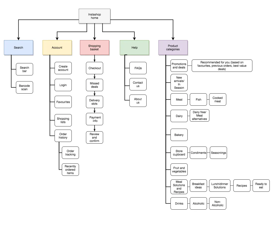 Site map designed by Amy Shepheard for a online grocery delivery product in development
From the image we can see that; search, account, shopping basket, help and product categories are features which can be accessed from the home page. Within each of these features users can access; related features, carry out a range of functionalities or view products/information by category. This is a good example of how information, features and functionalities can be organized and structured in an intuitive and meaningful way so that it’s easy for users to navigate and find what they are looking for.
Creating IA Diagrams
Video Summary/Takeaways
Before creating an IA diagram:
- Define the company goals with the product
- Define users’ goals with the product
- Analyze the IAs of similar products to understand what users expect
- Define your content
The steps involved in creating an IA diagram are:
- Categorize, prioritize, then group content
- Create a sitemap based on your content groups
- Outline all the possible ways users can access your content groups (i.e some content groups may be accessed through multiple paths in your product)
- Create and refine content labels
Testing IAs
Designers usually create IAs based on their assumptions of users' mental models. These assumptions may be influenced by the IAs of: competitors products, previous products they’ve designed, products they interact with in their daily lives, etc.
These assumptions are often correct, but there are times when it's trickier to figure out the most logical/meaningful way to organize and structure content. When faced with this challenge, testing out a proposed information architecture is a great way to determine if it matches users’ mental models. The two most common ways to test IAs are card sorting and tree testing.
Card Sorting
Card sorting helps designers discover how users understand and categorize information. It involves asking participants to sort cards containing different items into labeled groups. The results can then be used to figure out how best to group and label information in a way that makes the most sense to users.
Tree Testing
Tree testing helps designers determine how easy it is for users to find what they're looking for in a product. It involves presenting participants with an IA then giving them tasks to accomplish e.g “where would you look for information about pricing?” or “how would you find answers to questions you may have about this product?”. Participants are observed to determine how they go about finding the information.
While we won't go into the details in this lesson, note that card sorting and tree testing can be done in different ways, for different reasons and through different mediums.
IA Practice
Post your answer in the padlet below.
Expand here to see the answers
- Status
- Calls
- Communities
- Chats
- Settings
User Flows
Estimated Time: 30 minutes
User flows help to map out the steps a user will take to achieve a specific goal (e.g., making a purchase, obtaining information, sending a message, etc) using a product. Depending on the product, user flows can either be simple or complex. As a designer, the goal should always be to simplify a users’ journey to achieving a goal.
User flows are a powerful asset in a designers toolbox because, in addition to mapping out the steps to achieve a goal, they also help to identify which areas in a user's journey through a product can be improved. By identifying pain points in the user experience, the overall usability of products can be progressively improved.
Creating User Flows
There’s a little practice exercise in the video. Please try out the practice before going on to view the solution.
Video Summary
The three key questions that should be answered before creating users flows are:
- Who is the user?
- What is their goal?
- What are the steps they need to take to achieve their goal?
User flows are useful because they:
- Communicate design from the perspective of the user to engineers, PM’s and other stakeholders.
- Outline out all the potential use cases for features in a product. This helps other team members such as engineers plan how they're going to build the product.
User Flow Practice
Post your answer in the padlet below.
Expand here to see the answers
- Open WhatsApp
- View “Chats” page
- Click search
- Type in contacts name and search
- View search results
- Click contacts name in search results
- View conversation with contact page
- Click on input field/add/camera/voice note
- Compose message
- Click send icon
or
- Open WhatsApp
- View “Chats” page
- Click on compose icon
- Scroll to search for contacts name or click search, type in contacts name then view search results
- View search results
- Click contacts name
- View conversation with contact page
- Click on input field/add/camera/voice note
- Compose message
- Click send icon
or
- Open WhatsApp
- View “Chats” page
- Scroll to search for contacts name
- Click contacts name
- View conversation with contact page
- Click on input field/add/camera/voice note
- Compose message
- Click send icon
Wrap up
What We Learned
- Information architecture (IA) diagrams help designers clearly map out how a product should be organized and structured so that it's easy for users to find what they are looking for and understand how all the pieces of a digital product fit together.
- What to do before creating an IA diagram.
- The steps involved in creating an IA diagram.
- How to test IA diagrams using card sorting and tree testing.
- User flows help to map out the steps a user will take to achieve a specific goal using a product. They also help to identify which areas in a user's journey through a product can be improved.
- Who is the user?, what is their goal? and what are the steps they need to take to achieve their goal?, should be defined before creating user flows.
Assignment
After finishing this lesson, you should:
- Complete Final Project Miestone 2: App Design
- Continue working on Part 1 of the Final Project
Prototyping
Estimated Time: 60 minutes
Introduction
Learning Outcomes
After completing this lesson, you will be able to:
- Use various prototyping techniques and tools to validate your ideas
- Create interactive wireframes using Figma
- Conduct usability tests to measure the effectiveness of user interfaces
Sections
Prototyping
Estimated Time: 30 minutes
Prototyping is the process of creating scaled down versions of ideas or products. It provides a low-risk way to test, validate and refine designs before investing significant resources to build them. You may recall that prototyping is the fourth stage of design thinking as shown in the image below.

The benefits of prototypes include:
- Enable designers to get feedback early from users: by testing prototypes with users, designers can gain valuable insights into how users interact with products and identify areas for improvement.
- Align stakeholders around the design: by creating tangible prototypes that stakeholders can interact with, designers can better communicate their designs and get buy-in from stakeholders.
- Save time and resources: by identifying and addressing design problems early, designers can avoid costly and time-consuming changes later on.
Now that we understand their benefits, let's look at the different types of prototypes which can be used to test, refine and validate ideas/designs.
Low, Medium and High Fidelity Prototypes
Prototyping Quiz
Summary and Takeaways
From the video and reading, we learn:
- The three types of prototypes are; low fidelity, medium fidelity and high fidelity.
- Low fidelity prototypes are best used in the early stages of the design process where a lot of ideas are still up in the air and there’s still a lot of experimentation going on. They allow us to make changes to ideas/designs easily and quickly.
- Medium fidelity prototypes are best used during the wireframing stage of the design process. They’re great for testing user flows and broad functionalities.
- High fidelity prototypes are best used when you have a good idea of what is going to be built. They're good for fine tuning designs when getting a product ready for launch.
Usability Testing
Estimated Time: 30 minutes
Usability testing is a research method used to evaluate how well a product performs for its intended users. It usually involves observing users as they perform a series of tasks with a product prototype, and asking them to provide feedback on their experience. During usability tests, designers typically:
- Record user's interactions with the prototype
- Ask follow-up questions to gather feedback
- Take notes on any issues or design problems that arise
You may recall usability testing as one of the common research techniques mentioned in the user research lessons covered in week 2. The goals of usability testing are to:
- Identify any problems or issues that users may encounter when interacting with a product
- Understand if the design is usable and intuitive enough for users to accomplish their goals
- Gather feedback that can be used to improve the user experience
Benefits of Usability Testing
Usability testing helps to:
Identify design problems and issues that users may encounter: by observing users as they interact with the product, designers can identify areas where the user experience could be improved and make data-driven decisions to improve the product's design.
Gather feedback from real users: usability testing allows designers to gather feedback from real users, who can provide valuable insights into how a product will be used and how it can be improved.
Priorite design changes: by identifying the most significant design problems and issues, designers can prioritize changes that will have the greatest impact on the user experience.
Ensure that the product is user-centered: by focusing on the user's experience with the product, designers can ensure that the final product is user-centered and meets the needs of its intended audience.
Next, we'll explore what usability testing is, the difference between user testing and usability testing, how to conduct usability tests, and types of usability testing.
Usability Testing Quiz
Summary and Takeaways
From the video and reading, we learn:
- User testing is the process of validating the demand for a product while usability testing is the process of evaluating whether users can achieve certain goals using a product prototype.
- Usability tests can be carried out in a number of ways. They can be; moderated or unmoderated, remote or in-person and explorative or comparative.
- Moderated usability tests are administered by a researcher/facilitator either in person or remotely using a conferencing tool like Zoom or Google Meet. Unmoderated usability tests are carried without a researcher/facilitator.
- Explorative usability tests are open ended. Participants are asked to give their opinions or express emotional impressions.
- Comparative usability tests involve asking users to pick which of the options presented to them they prefer.
- Depending on your testing goals, you’ll need to carry out a mix of the different types of usability test. One option could be carrying out an exploratory, moderated, in-person usability test. Another could be carrying out a comparative, unmoderated, remote usability test.
Wrap up
What We Learned
- Prototypes provide a low-risk way to test, validate and refine ideas/designs before investing significant resources into building a product.
- The types of prototypes and when to use them
- Usability testing is a research method used to evaluate how well a product performs for its intended users.
- Usability testing involves observing users as they perform a series of tasks with a product prototype and asking them to provide feedback on their experience.
- What the goals and benefits of usability testing are
- The different ways usability tests can be carried out
Assignment
After finishing this lesson, you should:
- Complete Final Project Miestone 2: App Design
- Continue working on Part 1 of the Final Project
- Start working on Part 2 of the Final Project
Managing Products
Estimated Time: 2 hours
Introduction
Learning Outcomes
After completing this lesson, you will be able to:
- Describe the basics of agile software development and understand iterative software development
- Understand product metrics, and define actionable metrics
- Create a clear and concise pitch for a new software product
Sections
Agile Software Development
Estimated Time: 30 minutes

We began this with an assertion that software is a team sport!
Even though there can be some friction (remember the image above?), building great products requires collaboration and engagement with users and team members. In this lesson, we explore how agile development helps software teams collaborate well.
What is Agile?
Agile software development is an approach to software development that emphasizes building and shipping small pieces of working functionality.
Key Learnings
-
Agile development is an iterative approach to software development. Agile teams focus on delivering a working product incrementally. They value collaboration, flexibility, and rapid iteration.
-
Agile is so popular that there is an "agile manifesto" which describes its core principles including:
- Individuals and interactions over processes and tools
- Working software over comprehensive documentation
- Customer collaboration over contract negotiation
- Responding to change over following a plan
- Agile teams typically work in short cycles called sprints or iterations. Each sprint results in a working product, which the team uses to solicit feedback from stakeholders and to refine and plan the next sprint.
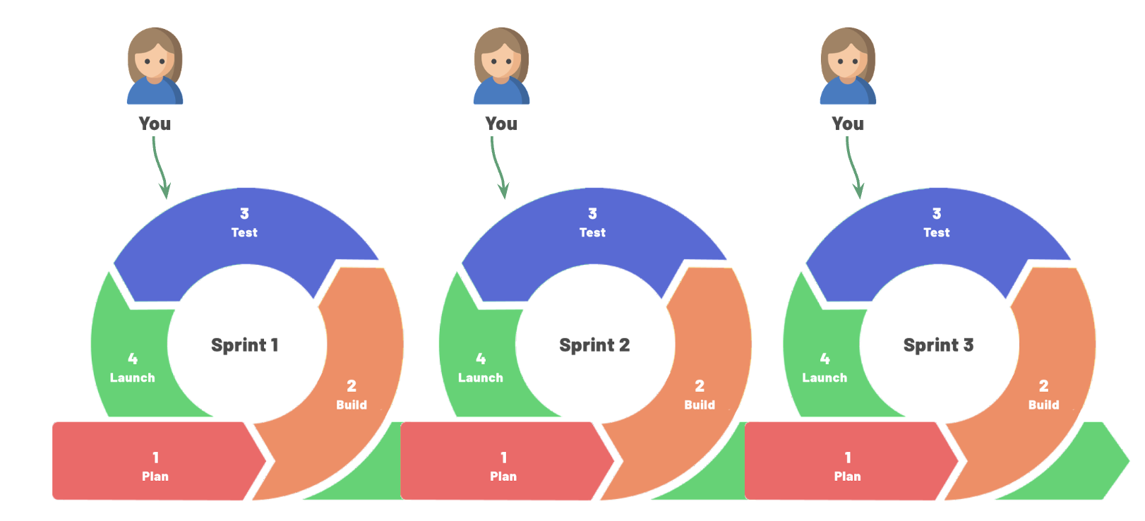
Why Iterative Development Matters
Iterative development is at the heart of agile and it helps to promote:
- Faster time-to-market: By delivering working products incrementally, agile teams can release products faster and get customer feedback sooner.
- Increased flexibility: Agile teams can respond to changing requirements and customer needs quickly, making it easier to pivot if necessary.
- Improved collaboration: Agile teams work closely together and with stakeholders throughout the development process, fostering collaboration and communication.
- Continuous improvement: Agile teams use feedback from stakeholders to continuously improve the product, resulting in a better end product.
Alternatives to Agile
While agile development is extremely popular, it's not the only option. One alternative to agile is waterfall development. Waterfall is a traditional project management approach that involves a linear sequence of phases, including planning, design, implementation, testing, and deployment. Each approach has its own advantages and disadvantages, and the best approach for a given project depends on various factors such as project scope, team size, and available resources.
Agile sprints
An agile sprint is a short, focused period of development that typically lasts 1-4 weeks. During a sprint, the development team works to deliver a specific set of features or functionalities. The sprint begins with a sprint planning meeting, where the team reviews the backlog of user stories and selects the stories that they will work on during the sprint.
User stories are a critical part of the sprint planning process. User stories describe a specific feature or functionality from the perspective of the user or customer. They typically follow a simple format: "As a [user], I want to [do something], so that I can [achieve a goal]." User stories help to define the scope of the work to be done during the sprint and ensure that the team is working on features that are valuable to the customer. Some examples include:
- As a logged-in user, I want to update my profile so that my information is complete
- As a student, I want to see a list of all assignments and due dates, so that I know what to work on next
Steps of an agile sprint
-
Sprint planning: the team selects user stories to work on during the sprint, estimates the effort required, and determines how much work they can realistically complete.
-
Sprint execution: the team works together to develop and test the features outlined in the user stories. They hold daily stand-up meetings to discuss progress and any obstacles they are facing.
-
Sprint review: the team demonstrates the working software to stakeholders and receives feedback.
-
Sprint retrospective: the team holds a retrospective meeting to review the sprint, identify areas for improvement, and make changes to improve their process for the next sprint.
Roles in an agile sprint
Different team members contribute to the success of an agile sprint. Below is a summary of what various team members do during a sprint
Product Manager or Owner: defines and prioritizes the backlog of user stories, and ensures the team is working on features that deliver value
UX designer: create wireframes, prototypes, or other designs to guide development, and works with development team to ensure that the design is implemented correctly
Software engineers: build and deliver working software during the sprint, including coding, testing and deployment
Scrum Master: facilitates sprint planning and retrospective meetings, and helps the team to continuously improve their process. In some teams, the product manager or a senior engineer plays the role of scrum master
Stakeholders: Stakeholders are the people who will be using or affected by the software being developed. They provide feedback on the working software during the sprint review and may provide input on user stories during the sprint planning process.
Test your understanding
Complete the quiz below to test your understanding of agile development
Product Metrics
Estimated Time: 30 minutes
🗣 "If you can't measure it, you can't improve it"
We previously discussed crafting MVPS and using the "Build, Measure, Learn" framework to iterate towards a useful product. For iterative development to deliver customer and business value, software teams have to measure the right things, then learn from them. In this lesson, we explore how to determine the right product metrics to measure.
Measuring the right metrics and drawing useful insights can be challenging. Product teams often make two mistakes when it comes to metrics
- They rely on vanity metrics
- They are data rich but insight poor
Metrics mistakes
Vanity metrics
Vanity metrics may be impressive on the surface but do not provide meaningful insights into the performance of the software. Some examples are:
-
Pageviews: pageviews can be misleading because a website may get a lot of visitors, but it doesn't indicate whether users are actually engaging with the content on the site.
-
Downloads: the number of downloads for a mobile app can be a vanity metric if many users download the app but few actually use it
-
Sign-ups: the number of sign-ups for a service can be a vanity metric if many users sign up but few actually become regular users
-
Social media followers: having a large number of social media followers doesn't necessarily translate into meaningful engagement with the product
-
Time spent on site: the amount of time users spend on a website can be a vanity metric since it doesn't necessarily indicate whether users are finding what they need or taking desired actions.
These metrics may provide some indication of reach, but what makes them "vanity metrics" is that they don't necessarily tell us if the product is meeting the goals of the user or business.
Data rich but insight poor
Being data-rich but insight-poor means that an organization has access to large amounts of data, but is not able to extract meaningful insights. In other words, the organization may be collecting data but cannot use it effectively to inform decision-making or drive improvements.
Avoiding mistakes with actionable metrics
The two metrics mistakes above have the same solution:
Measuring what matters means:
- Tracking metrics that are tied to specific business goals or user needs. These "actionable metrics" help teams understand how the software is performing and how it can be improved.
- Tracking metrics consistently and accurately. If the data being collected is inaccurate or incomplete, it may be difficult to draw meaningful conclusions or make informed decisions based on that data. So, good teams ensure they collect data well.
- Analyzing data regularly: Having access to high-quality data is not enough. Organizations will need to have the skills and make the time to analyze that data effectively.
🤔 What Matters for this Product?
Pitch
Estimated Time: 30 minutes
Throughout this class, you've learned how to build products, with an emphasis on building the right thing. We finish with a brief discussion of pitching product ideas. Pitching is a key skill for product managers and designers. You may find yourself pitching to:
-
Attract investors or stakeholders: if you are seeking funding for your product or idea, you need to be able to pitch it effectively to investors. If you are at a company and seeking permission to work on a new product feature or idea, you may need to pitch to executives to allow you to invest time in the project.
-
Convince customers: You need to be able to articulate the benefits of your product to convince potential customers to buy or use it.
-
Recruiting team members: you need to be able to pitch your idea to convince potential team members to work with you
-
Differentiating yourself from competitors: A good pitch can help you stand out from your competitors and position your product or idea as unique and valuable.
For all the reasons above, learning how to create a compelling pitch is critical
How to Pitch
Below, you will watch a video from Y Combinator's Startup School describing how to pitch.
Y Combinator (YC) is a startup accelerator that provides seed funding, mentorship, and resources to early-stage companies. It is one of the most well-known accelerators in the world. Airbnb, Dropbox, and Stripe are among the most well-known YC companies.
YC runs Startup School , an online program that provides resources to early-stage startups. It is free of charge and open to startups from all over the world. The video below is from a Startup School lecture on how to pitch. The video is geared towards pitching investors and it is long (~ 28 minutes). Still it provides excellent insight on pitching, and is well worth the time to watch!
Video Notes
From the video, we learned that a good pitch is clear, concise, and creates a foundation for curiosity.
A good pitch answers:
- What are you making?
- What is the problem?
- Who is the customer?
A good pitch is
- Legible: a legible idea can be understood by people who know nothing about your business
- Problem-focused: people need to understand the problem you're solving
- Conversational: you should be able ot explain to your mom and have her understand it. It includes no jargon
A good pitch avoids:
- Ambiguity: don't use abstract descriptions. Aim to be so clear that your mom can understand it!
- Complexity: don't weave multiple storylines or ideas together in your description
- Mystery: remove jargon, suggestions, or anything that typical users won't undersatnd
- Ignorable language: avoid language that users will ignore, such as marketing speak, mba speak, jargon and buzzwords
Wrap up
Assignment
After finish this lesson, you should:
- Complete the Final Project
What We Learned
- Software is a team sport! Software product teams use agile development to ship small pieces of working functionality, and collaborate well together
- To determine the right metrics to evaluate a product, measure what matters and avoid two common data mistakes:
- Relying on vanity metrics
- Being data rich but insight poor
- A great pitch answers three questions as clearly as possible:
- What are you making?
- What is the problem?
- Who is the customer?
Final Project - PRD, Prototype and Presentation
The final project is worth 30% of your final grade for the course. Late submsissions will not be accepted so please submit on time or early.
Product Design and Presentation
In collaboration with your team members, you will design a solution to a given user problem. You need to submit three artifacts for your final project:
- A complete product requirements document (15% of grade)
- A prototype, built in Figma, with original UI designs for your product (10% of grade)
- A recorded presentation (maximum of 7 minutes) explaining the problem, user research and product development process, and final product vision (5% of grade)
Collaboration recommendations
The final project has many moving pieces, so you should plan your strategy and collaboration. Below is a suggested approach which you may feel free to modify to better suit your team.
Determine how you will split up the work
The final project has three major deliverables (PRD, Design, Video). Decide who will be the owner for each deliverable. The owner does not need to do all the work, but should be in charge of creating a timeline, splitting up the work, ensuring the work is done, and putting together the final artifact.
Part 1: Agree on a product direction and start the PRD
As a team, determine a direction for your product. To do so:
- Copy the roadmap template from lesson 6.3
- Use the template to determine what feature(s) will go into your MVP, MMP and MLP and your roadmap
- You do not have to submit the template though you may link to it in your PRD if you wish
- Copy this PRD template . This is the suggested template to use for your final project, but you may also choose to use a different format.
- Here is an example of a completed PRD using the template
- You may choose to a use different PRD template if you wish. Whatever format you choose must include the following
- Summary of the problem, solution, and roadmap
- Background section that briefly describes the problem your product is solving
- Links to supporting documents including your Figma designs and concept test report
- List of major features with brief descriptions
- Roadmap that list what you will release when
- Draft the background section of the PRD
Part 2: Complete design prototype
You have started working on designs for your final project in the App Design project. You will now finish your designs. The finished product requires:
- Designing the remaining major UI screens for your solution
- The UI screens you design should show how users will interact with/flow through the major features in your product
- You do not have to design every single screen and should leave out the basics (e.g account, profile, password reset, etc). Instead focus on the primary features and interactions of your app
- Building an interactive prototype in Figma. The prototype should allow someone to click through your app and mimic its behavior
Part 3: Complete the PRD
Complete the PRD for the MVP version of your product. Suggested order to work on the PRD is:
- Background
- Roadmap
- Detailed requirements
- This is a list of all the features in your MVP as well as descriptions of how each feature should work
- Technical requirements
- Summary and Supporting documents -- leave this until the end when you have finished the rest of the parts
Part 4: Record a pitch video
You will be recording a product pitch. The audience for this pitch are potential collaborators or investors. The pitch should clearly demonstrate:
- The problem your product solves
- Your team
- The UI designs and main functionality
- Why you believe your product will gain traction
- Your "ask" of the viewer
When finished, upload your pitch video to YouTube.
Submission
(1) Submit in Gradescope
- This is a group assignment and one group member should submit for the entire team. A few notes on artifacts
- Ensure your PRD is set to enable anyone at Kibo to comment on the document
- Ensure that your YouTube video is unlisted and viewable in YouTube
(2) Submit a collaboration evaluation
Submit this form to summarize your contribution and that of your team members. The form will ask you to answer the following questions about your collaboration:
- Summarize your individual contribution to this group assignment/project.
- How balanced were the efforts of the group members? Did everyone do his or her fair share of work?
- If you had done this by yourself, would the outcome have been better or worse?
- Given the choice, would you work with the same group again?
- (Optional) Is there anything else you want to share with instructors about the way your team worked together?
(3) Download and submit the following to Woolf
Each team member should submit the following to Woolf:
- A PDF copy of your PRD
- A PDF copy of your designs. See video instructions for how to get a PDF copy of design files
- File of your video presentation
(4) Submit your course evaluation
We want your candid feedback on the course. We are "iterating toward greatness" can can only do so if we get a bit better each time. Your honest opinion on what worked well and what can be improved is critical. If you have not already done so, plese take 10 minutes to submit the course evaluation. Thank you for your time! 🙏🏿