Typography
Estimated Time: 30 minutes
What is Typography?
Typography is a part of UI/UX (user interface and user experience) design that involves the use of typefaces ( or font families) to create readable, usable and user-friendly interfaces/experiences. Good typography enhances users’ digital experiences, optimizes usability, catches users’ attention and has the potential to increase conversion rates. We’ll go into more detail about usability and conversion rates later on in this course.
Useful Typography Terms
Typeface
Typeface, which is also known as a font family, refers to the faces of physical letter blocks. Typefaces are composed of fonts, much like an album is composed of tracks or a book is composed of chapters. Typefaces include multiple font weights which share styles across all their characters, numbers and symbols. Arial, Times New Roman and, yes, even Comic Sans are all typefaces.
There are many types of typefaces but for this course we’ll focus on the two which are most prevalent in UI design which are Serif and Sans Serif.
Serif and Sans Serif Typefaces
Serif’s are typefaces which have strokes on them. While sans-serifs are typefaces which do not have strokes. A good way to remember this is that “serif” translates directly into “stroke” while “sans-serif” translates directly into “no stroke”. Below are examples of serif and sans-serif fonts.
- Examples of serif fonts are EB Garamond, Merriweather, Noto Serif and Source Serif Pro.
- Examples of sans-serif fonts are Roboto, Open Sans, Poppins and Noto Sans.
An image showing the difference between serif and sans-serif fonts is below.

Exercise
There are 10 fonts listed below. Search for the fonts on google fonts and separate them into serif and sans-serif fonts. Once you’ve separated them check the answers below to see how you did.
Lato, Arvo, Raleway, Domine, Martel, Oswald, Rokkitt, Prata, Inter, Ubuntu
Check the Answers
- Serif: Arvo, Domine, Martel, Rokkitt, Prata
- Sans-serif: Lato, Raleway, Oswald, Inter, Ubuntu
Fonts
Fonts are the different weights within a typeface (font family). If you were to choose Roboto as a typeface then Roboto regular, medium and bold would be the fonts.
Line Spacing
Line spacing is the vertical height between two lines of text. Typically line spacing should be between 130% - 180% of the font height (when in doubt go for 150%).
Kerning
Kerning is the space between each character in a word.
Tracking
Tracking is the uniform horizontal space between characters in words in a block of text. The main difference between tracking and kerning is that kerning refers to the space between two characters while tracking refers to the space between all characters in a word.
Weight, Height and Size
Weight refers to the thickness of a font, height is the vertical space the font occupies and size is how big the font is. These three aspects of a font can be manipulated to show hierarchy within your UI or to bring/reduce focus on certain bodies of text in your UI. We’ll touch more on font hierarchy below.
Principles of Typography
Typography plays an important role in UI/UX design. How typefaces are styled, structured and laid out can make navigating your designs either pleasurable or uncomfortable. Most people do not fully read text while navigating digital products rather they scan through. Reflect back on your experiences while using websites and apps, you may find that you also scan through bodies of text rather than reading them. Based on this, it's important that the typefaces we use are styled, structured and laid out in ways that make navigating text in our designs as easy and seamless as possible. Below are guidelines that will help improve typography in your UI design.
Hierarchy
Hierarchy can be used to show the order and importance of text on a page. Size, weight, color, contrast and the placement of fonts are great ways to clearly show hierarchy in content. The larger and bolder a font is, the more recognizable it is. If a large, bold, full colored font is placed at the top of a page, it's most likely the title of that page. If a small, light weight, gray font is placed somewhere close to the bottom of the page, it's most likely a footnote which is not as relevant as the rest of the content on the page. Below are some examples of font hierarchy.
 Image showing heirarchy in a body of text
 Image showing how heirarchy directs in what order users read text
We’ll discuss how color can be used to show hierarchy below.
Alignment
Text alignment is how text is positioned on the page. There are four types of text alignment; left, right, centered and justified. The most common text alignments used in UI design are left, right and centered. Justified text alignment is not used in UI design because it forces text to fit into a container which leads to words having unequal spaces between each other. An example of each of the text alignment styles is below.

Another thing to remember is that depending on what audience you are designing for, different types of alignment may be expected. For example, while English speakers expect text to be left aligned since we read from left to right, Arabic speakers may expect text to be right aligned since they read from right to left.
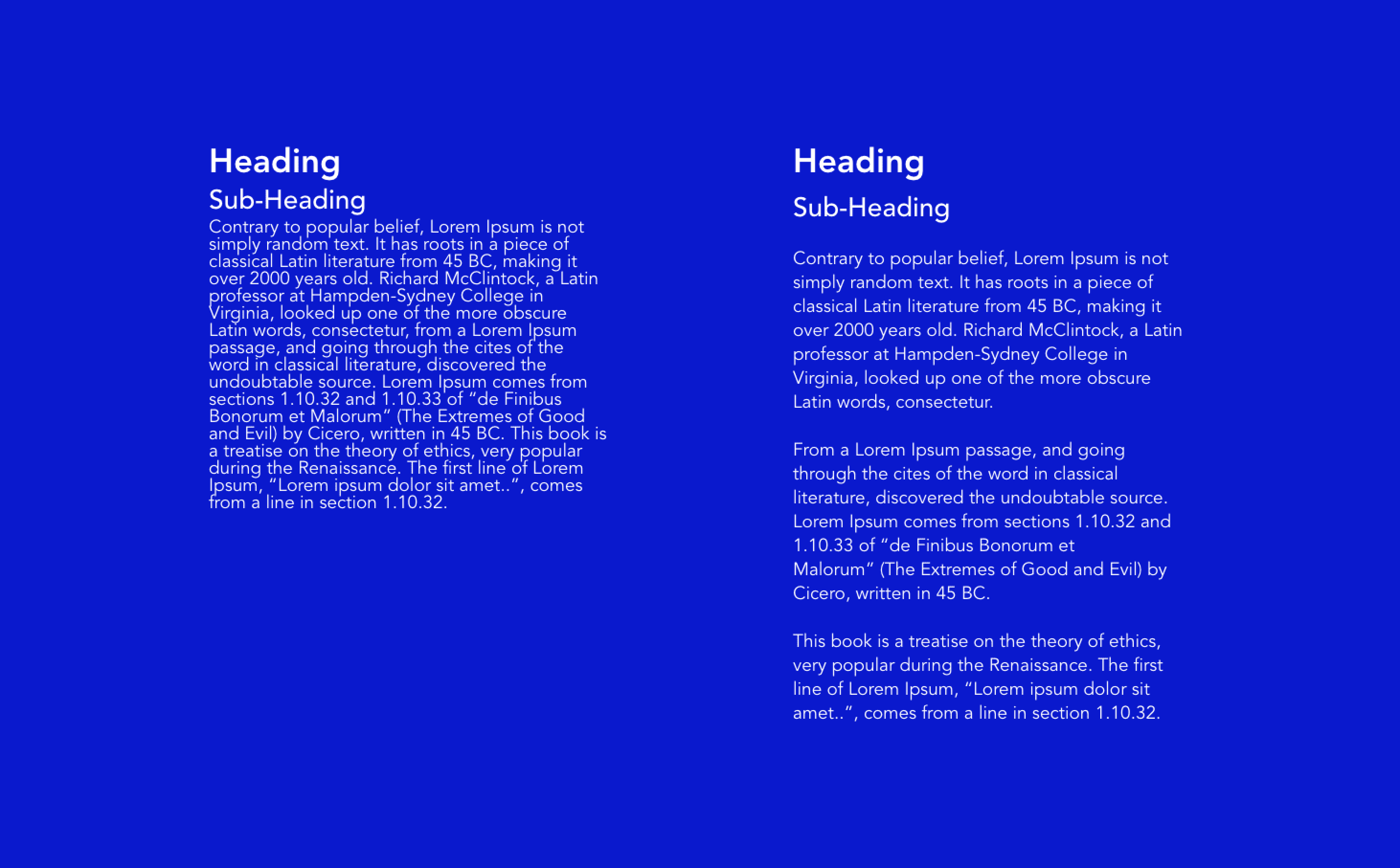
Color & Contrast
Color and contrast are good ways to further show the hierarchy and importance of text on a page. Full color (dark gray or black) is usually used for important text on a page (titles, headings and body content). Colored text is usually used for links and buttons. Grayed out text is usually used for footnotes or less important content on a page. It's important to note that using full black (hex code #000000) text on a full white (hex code #FFFFFF) background can be jarring/uncomfortable to the eye because the contrast is too high. Rather, use a toned down black color or a very dark gray color for body text to reduce the text contrast with the background. An example of how color and contrast can be used to show text hierarchy is shown in the image below.

Consitency
It’s important to ensure that you use consistent typefaces all through your designs. This creates a pattern which helps users instantly recognise what they’re reading. For example, if you used Poppins Bold, 32px as the page title and Poppins Regular, 16px as the body text on a page of a website you’re designing then these font weights and sizes should be maintained for all page titles and body text in your design.
Some designers prefer to use more than one typeface in their designs. Often times they may combine a serif and sans-serif font. This can be a powerful way to show hierarchy and can really uplift the look and feel of your design, this should be done with caution though. The fonts from the typefaces you use need to have intention behind them, this will further help to build a recognizable pattern for users. For example, you may decide to use a serif typeface for all page titles and section headers and then a sans-serif typeface for body content and meta content in your design. Please do not use more than two typefaces in a design. It’s also important to note that not all typefaces work well with each other. Some typefaces complement each other better than others. Before combining two typefaces, do a quick search to see if they work well with each other.
White Space
White space is the space between elements or in this case bodies of text. White space, when used correctly, can be a great way to show how bodies of text are related to each other and also to give some balance to your design. It also makes text in your design less cluttered and more readable/scannable. The images below show how white space can be used to improve the balance and show relatability between text.
 Image showing how white space can help scannability of text and show how text blocks are related to each other.
 Another image showing how white space can improve text scannability
Typography in Development
When designing UI’s you may want to download typefaces (font families) that aren’t stored locally on your computer or the design tool you’re using. You will also need to share the typefaces you use in your designs with your development team. It’s important to know what kind of font file formats work with your design tools and in development.
The three most common font file formats for UI design and development are:
- .OTF - Open Type Format
- .TTF - True Type Format
- .WOFF - Web Open Format Font
When you download font files and are trying to share them ensure that they are either .OTF or .TTF. .WOFF is sometimes used as well, but .OTF and .TTF are the most versatile and common formats.
Some fonts are free while others are paid. At this stage it’s advisable to use only free fonts. Some great sources of free fonts are; google fonts, adobe fonts and font squirrel. There are many other font libraries which you can check out through a quick google search. Please avoid the urge to download 10’s of fonts (many designers do this when they start off, myself included 🙈). For now, the fonts in your design tool should be enough, if you need any other fonts during the course we’ll let you know.
Summary/Takeaways
- Serif and sans-serif typefaces are the two main types of typefaces used in UI design and development.
- Serif typefaces have strokes while sans-serif typefaces have no storkes.
- Size, weight, color and placement are great ways to show hierarchy of text in your design.
- Body text should be no less than 16px for readability.
- Use a line spacing between 130% - 180% depending on the typeface. When in doubt use 150%.
- Dont not use full black (hex code #000000) on full white (hex code #FFFFFF) backgrounds.
- Text in your UI designs should either be left, right or center aligned.
- Use no more than two typefaces in your designs.
- When combining two typefaces in your design, check to make sure they complement each other.
- Use white space to show which blocks of text are more related to each other and which are less.
- When downloading fonts or sharing font files with developers ensure the files are either .OTF or .TTF.
Useful Links on Typography
Other Useful Links on Typography
Reflect
We’ve covered quite a bit of material on typography - don’t worry you’re not expected to know it all off-head. Before moving on to the next lesson, spend a few minutes reflecting on what typography is, what typography terms you remember, the principles of typography and what formats typefaces come in.