Flexbox
If an element has display: flex, the child elements inside won't follow the
normal flow rules. Instead, they follow a whole different set of rules: the
flex rules.
The basic idea of Flexbox is that the items flex (expand) to fill additional space or shrink to fit into smaller spaces.
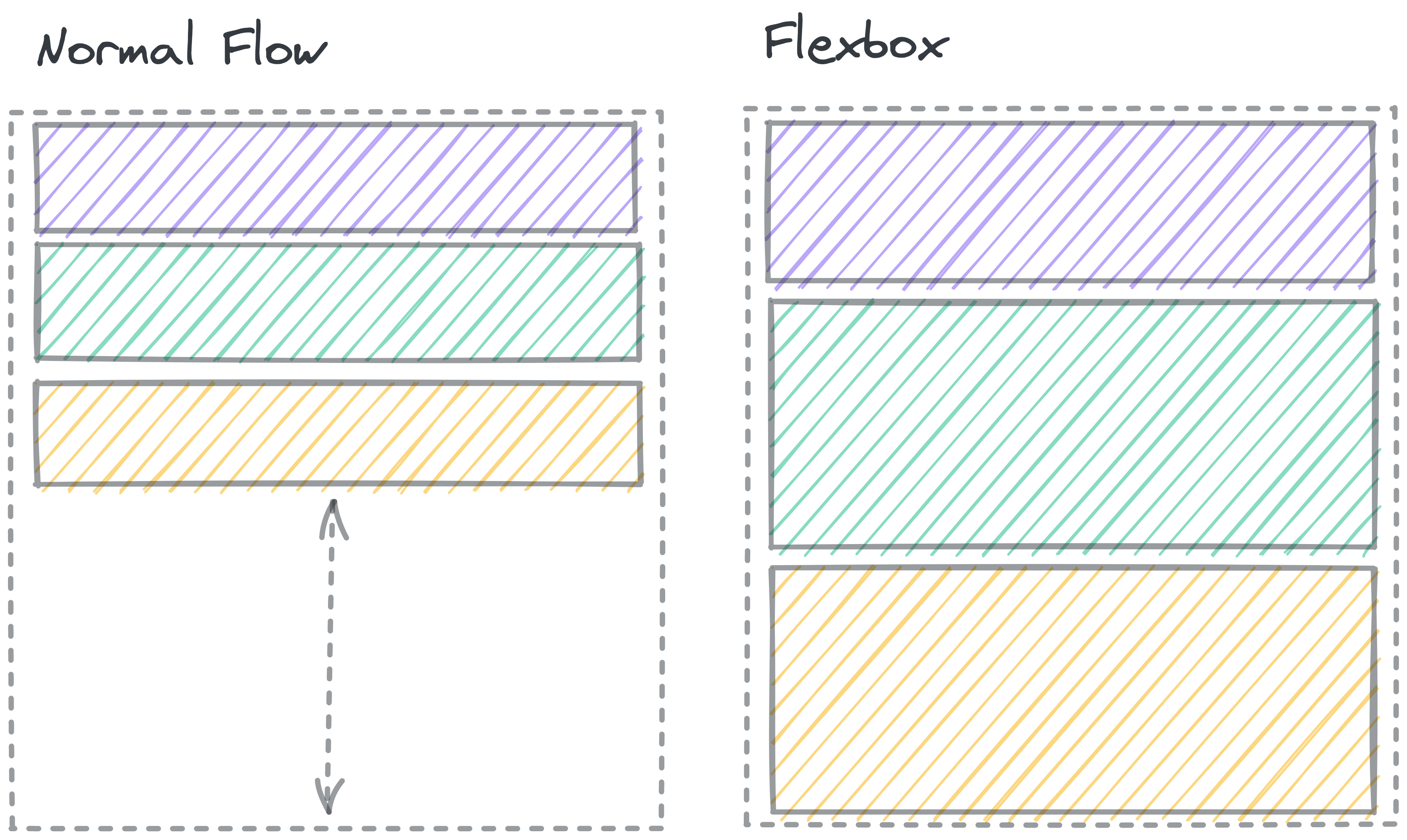
The dashed line shows a container element. In Normal flow, there’s space below the block elements inside the container. In a Flexbox, the elements grow to fill the whole space.
If you set an element to display: flex;, it acts on the outside like a regular block element. On the inside, elements no longer follow Normal flow. Instead, that element becomes a flex container, and the items inside get laid out according to the flexbox rules.
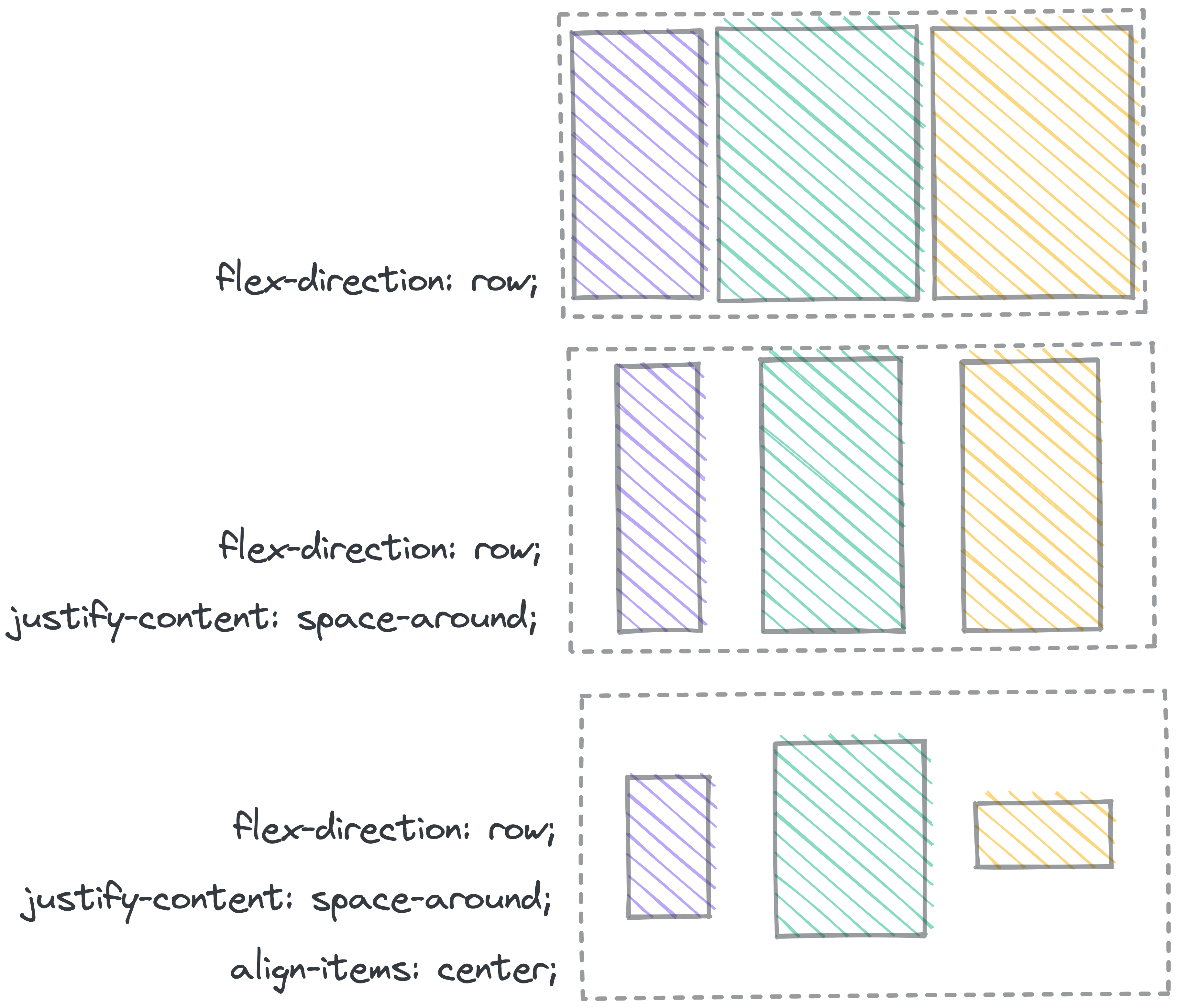
Flexbox gives you lots of tools to change the way the elements move to fill the space.
You can change:
- The direction of the box (columns or rows)
- The space between items
- The horizontal and vertical alignment of the elements within the box
- Whether or not elements will wrap around if they get crowded
- Which elements grow and shrink, and by how much
Further Reading: Flexbox
Josh Comeau's Interactive Guide to Flexbox has a great walkthrough of the different properties and how to build a strong mental model for flexbox.
MDN’s page on Flexbox goes into great detail about the details of how Flexbox works.