Web Foundations
Welcome to Web Foundations! You are joining a global learning community dedicated to helping you learn and thrive in computer science.
What you'll learn
This course provides a foundation in building for the web. It will help you understand how the internet works, help you examine the role of the internet in your life, and teach you the basics of web development.
It will cover the building blocks of web technologies. You will learn HTML, CSS, and the basics of JavaScript. The course will focus on collaboration, communication, and sharing. Web technology is fundamentally social; you will work together and build for real audiences.
The course culminates in a project where you'll create a website of your own design using the tools you learn throughout the course.
Course Overview
- Week 1: Foundations
- Week 2: Web Design
- Week 3: Layout and Multimedia
- Week 4: Publishing and Sharing
- Week 5: Final Project
How the course works
There are multiple ways you'll learn in this course:
- Read and engage with the materials on this site
- Attend live class and complete activities in class
- Practice coding with exercises
- Complete projects to demonstrate what you have learned
Active engagement is necessary for success in the course! You should try building lots of websites so that you can explore the concepts in a variety of ways.
You are encouraged to seek out additional practice outside of the practice problems included in the course.
Using the Kibo co-learning hub in Lagos and Abeokuta
If you are in Lagos or Ogun state, Nigeria, and have indicated during the application that you would be able to visit the Kibo hub for laptop support, use the links below to book a time to visit the Kibo hub throughout the Try Kibo program
Important Notes
- Arrive at the hub within your chosen timeslot with a means of identification
- This invite is admits one person only. You may not come along with a friend, otherwise, they'll be asked to wait outside of the learning space
- Each time slot allows 2 hours of hub use. Book additional slots for longer use.
- Maintain hub cleanliness and handle all items carefully.
- You must not visit the Kibo hub without booking a time as you will not be granted access
Now, you are ready to start onboarding. Mark this lesson as complete and tap "Next Lesson" below
Copyright © 2023 Kibo, Inc. All Rights Reserved.
Start Onboarding
Welcome to the Try Kibo onboarding process. During this process, you will select a live class, join your class replit team, join Discord and introduce yourself, and lastly, prepare for Orientation.
Note: Complete these steps and submit the onboarding checklist by 3p.m. GMT on Thursday, October 26 to receive an orientation invite. Failure to do so results in withdrawal from the program
Sign up for a live class
This is a mandatory weekly Zoom class for problem-solving and learning with peers and an instructor. They are 90-minutes long and will happen on Thursdays
| Time (in GMT) | Sign-up Link |
|---|---|
| 3:00pm GMT | Live class A |
| 5:00pm GMT | Live class B |
Join Replit team
You have already created a Replit account during the admissions challenge. Now, you need to join the Replit team so you will be able to access your work in class. To prepare to use Replit in class:
- Go to replit.com
- Select "Log in" at the top right corner to login to your account
- Click this link to join the Replit team for the class.
Join Discord, introduce yourself, and submit the checklist form
Discord is our community platform. It's where you will communicate and connect with your peers and instructors. Once the program starts, all communication from the Kibo team will be through Discord, so joining is mandatory.
Here are the things that you must do as soon as you join Discord:
- Introduce yourself in the #introductions channel
- Your full name
- Your location
- A fun fact about you
- An image or gif that represents you
- Update your Discord profile with your first name and last initial e.g., "Labake A", "Sydney W"
- Submit the onboarding checklist form -- you will not receive an invite to orientation if you don't submit this form
Now, join the Try Kibo Discord server and do the above
- If you already have a Discord account, log in. Otherwise, create an account and verify it via email. Check your spam folder if the email is not in your inbox
- Join the Kibo School Discord server: https://discord.gg/tptRNh8V.
- As you join the discord server, follow the steps until you submit the onboarding checklist
We’re excited to see you at Orientation! Only those who submit the checklist form on or before 3p.m. GMT. Thursday, October 26 will get an invite to the mandatory orientation.
Orientation date: Friday, 27th October from 3 - 5:30pm GMT. Mark your calendar
Community orientation
The community orientation challenges are required for all students in the program. By the end of the challenge, you will have:
- Set an intention for next 5 weeks
- Built your first squad project
- Understood the tools you will use for class
Demo video
Instructions
- These challenges are best done on a computer
- The challenge should take you 60 - 90 minutes to complete
- The feedback form at the end of this page indicates that you have completed the challenge. You must submit the feedback form to receive credit for attending orientation.
- If you have questions or need help, post a question in the #help Discord channel
Let’s see which team can finish all the challenges the quickest! 🏁
Ready?

Challenge 0: All onboard - meet your squad ⛰️
Description: Join your squad channel, introduce yourself, and pick a scribe
- Log in to Discord, under the Squad channels category, you will find your squad e.g., 'Squad #'
- Join the voice channel and post a message in the chat introducing yourself e.g., "Hello, My name is Emmy from Lagos, Nigeria"
Wait for other Squad members to join and introduce themselves. After all squad members have posted a message and joined the squad voice channel:
- Pick a "scribe". Your scribe will act as the moderator and will be in charge of creating/sharing links, sharing screens, and asking questions that your squad might have in the #help channel.
- All squad members will remain in the Squad voice channel throughout the community orientation.
Completion criteria: Every squad member has sent a message in the squad chat, has joined the voice channel and your squad has a scribe.
Challenge 1: Letter from the future ✉️✍🏾
Description: Imagine it's week 5 of Try Kibo. Write a message to your present self in the padlet below. Describe how you will work to make sure you successfully complete the program. Every team member should post a message.
- Click on the + sign
- Enter your first name and last initial in the "Subject"
- Write your intention
- Add an image or GIF to accompany your message (optional)
- Click "Publish"
Completion criteria: Every squad member has posted an intention in the padlet
Challenge 2: Build Team Info Page👩🏾💻
Description: In this challenge, you will build a site in Replit with info about your team. Every team member should still be on the Squad voice channel
- Your scribe should share their screen
- While sharing screen, the team scribe should go to the replit team for the Future Proof with Python class, and create a replit group for today's challenge
Watch the video below to see how to do this.
NB: If you can't find the replit team for your program on Replit, this means that you have not joined the replit team yet! Join here here
- Once your scribe has created a group, everyone needs to go and join that same group. Everyone should log in to Replit , navigate to "teams", find "Try Kibo 10: Web Foundations", and find the group that your scribe just created.
NB: DO NOT create another group or join a different group erroneously! Ask your scribe for their replit name, and find it amongst the groups. See video demo on how to join the repl your scribe created below.
Once all team members have joined the repl that your scribe created, you will discuss and write your program in your repl as a team.
- Follow the instructions in the file
instructions.md.
Work together as a team to add all the information below to your site:
- Your Squad name
- One thing that everyone in the squad has in common
- Each squad must individually add their profile to the page. add:
- First name and last initial (e.g., Mercy W, Osamudiamen O)
- Photo
- A one-sentence biography
- Why you are learning Web Foundations
In the end, your site should look similar to this example site
Once the Team Info Program is done, ensure all team members have a link to the website - you will all individually submit that link in the next challenge.
Completion criteria: Every squad member’s information is on the squad info bot/page and everyone has a link to the repl
Challenge 3: Submitting the feedback form
Description: Submit the feedback form below indicating that you have completed the challenge. You must submit the feedback form to receive credit for attending orientation.
-
Each squad member should submit this form
-
After each member has submitted the form above, your scribe should get the link to the website and share it in the #random channel saying "Squad # has completed all the challenges."
Once this is done, the community orientation leaderboard will be updated with your Squad name
Completion criteria: All squad members have submitted the feedback form and your scribe has sent a message in the #random channel saying you have completed all the challenges.
The End of Orientation
You’re done with orientation and ready to begin class. The Week 1 Lesson will be released on Monday, Oct 30.
Learning Tips
Web Foundations is an online course. This means that while you will have one live class every week, you will be directing your learning during most of the program.
However, learning online doesn’t mean learning alone. We believe that you will get the most out of the program if you:
- Learn from your peers
- Ask for help when you need it
Alumni Advice
Here’s a clip from Alexis, a Try Kibo alumni, on how to succeed in the program:
Don’t give up, and if you’re having a problem, don’t be afraid to speak up.
You can also check out the YouTube Playlist with more student stories and advice from alumni.
👨👩👧👧 Learn from Your Peers
Since the start of Try Kibo in August 2021, almost 200 students have participated in at least one of our courses. And the most common feedback they mention is the value of learning from other students in the program.
Here are some words of wisdom from previous Try Kibo students:
I loved the sense of community and connection that Discord provided. I found it easier asking for help when I got stuck from my squad members and the other classmates
Discord helped a lot, before i asked a question i found that someone else already had. Most of the questions i had were already answered in the threads.
Working as a group always helps to solve issues quicker.
Discord helped me know that I was not the only one struggling with that assignment. And when people asked questions, I kinda took a piece of their assignment that I did not understand and that they did really well.
Sometimes I don’t even know I’m having certain issues until someone else asks
Community Rules and Tips
Kibo is a learning community. Since lots of other students have the same goals and go through the same challenges as you, it helps everyone to learn together because:
- You can see things from different points of view
- Life happens and the motivation can weaken. Having a group of peers to support your learning can help you power through, even when times get hard.
- There is always someone available to help, but this is only useful if you ask.
Here are some tips and rules for making the most of the Kibo learning community:
- Be involved. Participate in discussions, find time to work with other students.
- Share your knowledge. If you think you have got a concept mastered, or are good at a specific skill, offer to help someone else.
- Celebrate creativity. When you make a cool project, share it with the group! If someone else shares a great project, celebrate them!
- If you need help or have a question, just ask. Other students might help you, or they might have the same issue that you do. Asking for help helps everyone. Remember that there are no “dumb” or “useless” questions.
🆘 Ask for Help
Learning should not be a solitary pursuit. If you have trouble understanding the concepts, can't find the assignment details, or have issues with one of the program tools, we expect you to reach out for help!
Here are more quotes from past students:
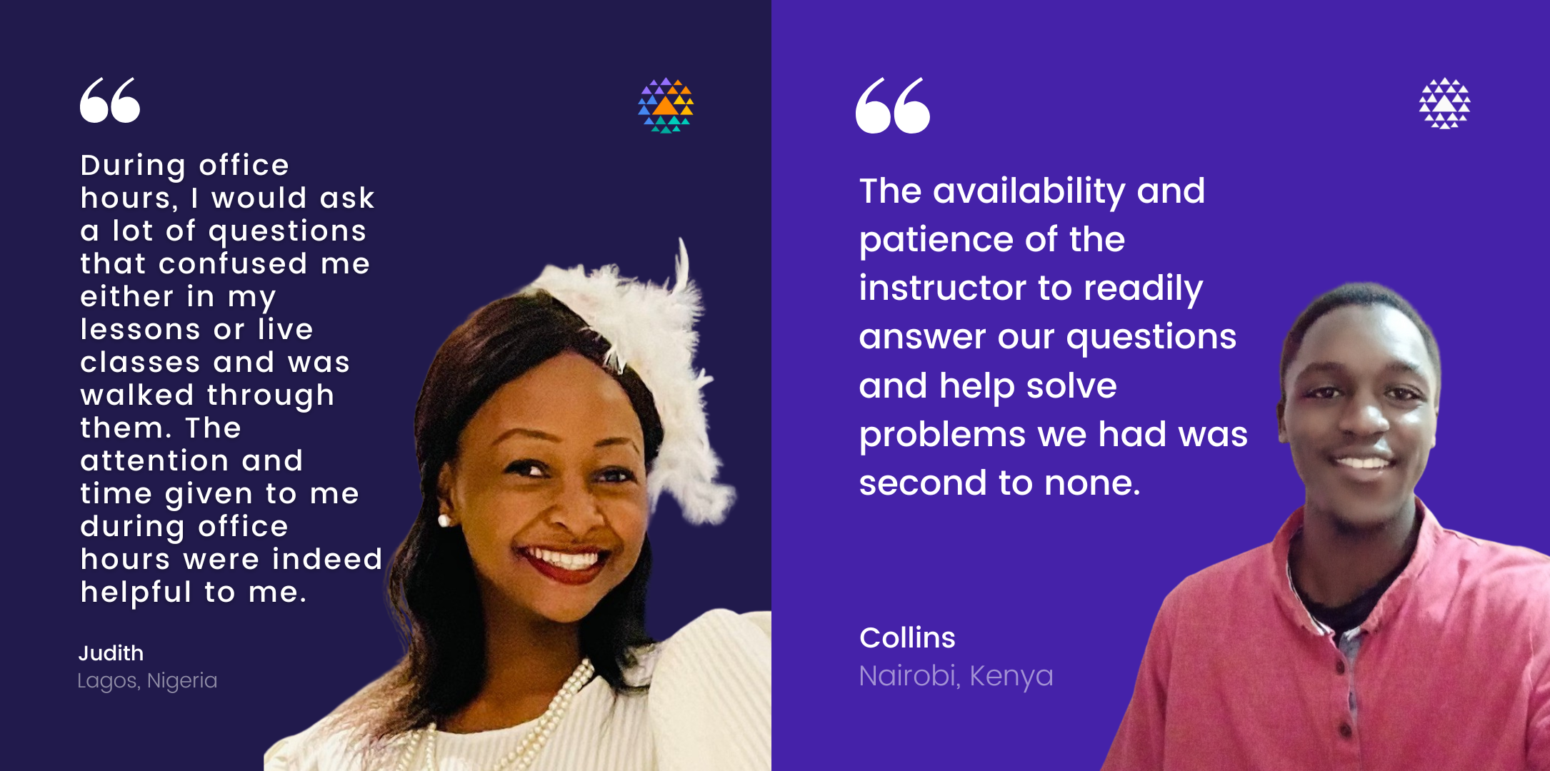
The office hours were very helpful in helping me to get me one on one helping my assignments.
It was easy to share images/screenshots when we needed help. When someone had a question, it was so easy to just send a screenshot or image of what they are doing wrong.
I wonder why I didn't attend more office hours sooner.
What I found valuable was the fact that I was not going to be judged for asking questions, no matter how "Useless" it sounds.
How should you ask for help?
When you need to ask the community or Kibo team for help, be sure to ask a good question.
Some students send messages like "I need help". Unfortunately, this message does not have the information needed for someone to help.
❌ Don’t Write:
- “need help”
- “I’m stuck on problem 3”
- “Can anyone help?”
- “Hi”
✅ Do Write:
- “I’m working on solving problem three, and getting this error when I run my code: [screenshot]. Can anyone help explain this error? I don’t get it.”
- “I’m trying to print all the values in this list for my project, but it keeps saying
NameError: name ‘item’ is not defined. Here's a screenshot of my code. I tried changing the list, but that didn't work."
When writing a message to ask for help, be sure to include the following information:
- Details of your goal. "I am trying to [goal]."
- Details of what you have tried so far. "I have tried [details of how you have tried to solve the problem already]."
- Any helpful context. “Here’s a screenshot of my code."
- Specific ask. "Can you help me [specific ask]"
Screenshots
It’s often helpful to include a screenshot with your question. Here’s how:
- Windows: press the Windows key + Print Screen key
- the screenshot will be saved to the Pictures > Screenshots folder
- alternatively: press the Windows key + Shift + S to open the snipping tool
- Mac: press the Command key + Shift key + 4
- it will save to your desktop, and show as a thumbnail
Learning mindset
Learning programming is challenging!
We’ve collected skills, tips, and mindsets that helped students get the most from the program. We hope that they help you too.
🌱 Growth Mindset
In this class and beyond, we hope you use the following methods mentioned in the video to improve your learning
- Maintaining a growth mindset
- Using and refining a process
- Seeking advice and feedback from peers and teachers
- Doing challenging things
🐛 Debugging Mindset
What we see as a good program with a small bug, the child sees as “wrong”, “bad”, “a mistake”. School teaches that errors are bad; the last thing one wants to do is to pore over them, dwell on them, or think about them. The child is glad to take advantage of a computer’s ability to erase it all without any trace for anyone to see.
The debugging philosophy suggests an opposite attitude. Errors benefit us because they lead us to study what happened, to understand what went wrong, and, through understanding, to fix it.
Seymour Papert, Mindstorms
When you see errors in your code, how do you feel?
When you see an error message, or your website doesn’t look the way it should, or your program isn’t doing what you want, it’s natural to feel scared, stressed, or frustrated.
However, errors don’t mean your program is bad. They definitely don’t mean you are a bad programmer. Debugging is the process of making programs better. Learning to code means running into lots of bugs.
Our version of the Growth Mindset is the Debugging Mindset.
- You will run into lots of errors.
- When you do, treat each one as a chance to learn.
- Bugs and errors are normal. Everyone learning to program creates lots of buggy programs — then debugs them. You will too.
Live Classes
Each week you will have a live class.
Video recordings, slides, and links for the exercises will be posted after the classes each week.
| Week | Topic | Slides | Class A Video | Class B Video | Exercise | Survey |
|---|---|---|---|---|---|---|
| 1 | Foundations | View | View | View | View | View |
| 2 | Web Design | View | View | View | View | View |
| 3 | Layout and Multimedia | View | View | View | View | View |
| 4 | Publishing & Sharing | View | View | View | View |
If you miss a class, first notify your instructor. Then, review the slides and recording of the class and complete the activity or exercise from the class so that you do not fall behind.
Final project
Due date: Friday, December 1
In week 5 there are no new topics to learn. So you’ll focus on your final project, and then work on finishing up the work from the previous weeks and wrapping up the course.
Congratulations on making it this far in your Try Kibo journey! It’s been a fun-filled few weeks. Now it’s time for you to put your skills to test by building a website of your own design. The final project is a chance to celebrate what you’ve learned and explore the creativity of coding.🎨
Description
Your final project will be a website you design and create with a team.
You’ve learned a ton about HTML, CSS, and the web in this course. The final project is your chance to build a website of your own design from scratch.
There are few requirements. You must use the knowledge you learned in the course, as outlined in the rubric below.
Topic and Design Guidelines
Your team gets to decide what your final project will be. The challenge is to choose a design that is exciting to you, but is not so big that it’s overwhelming or impossible to complete.
Here’s some guidelines that can help you pick an exciting project you’ll be able to complete.
- Your final project should be about as complicated as the most complicated exercises and projects you’ve already done, or maybe a little bit more advanced.
- Don’t plan to learn a whole new technology for the final project. Plan to use mostly what you’ve already learned (with a little bit more Googling for the things you run into along the way).
What features should you include?
- Different HTML elements
- Web Design (fonts, colors, layout)
- Interactivity (media elements)
- Publishing and Sharing
What features should you avoid?
- Collecting data
- Forms
- Payment
We haven’t learned how to collect and save data from users. Don’t plan to build a banking app, a social media website, or an e-commerce site. For those to work, they need to save data from users, which is not taught in Web Foundations.
If you have an idea that your team really loves that depends on saving user data, try to come up with a version that works without saving any user data. For example, you could have a version of Youtube that only has a few videos, and doesn’t save comments or likes. Without those features, it’s not exactly like youtube, but it’s still pretty cool.
How should you work together?
You should talk with your team about what works best for everyone. The best teams communicate clearly and often, so that there isn’t confusion about what is going on. Try to agree on how you’ll communicate (Discord, Whatsapp, email, or something else), and what times you’ll meet to work on the project.
You should also create shared a design doc to write down your ideas. You can use Google Docs or a text file in Replit. You might include links, images, drawings, and text that explains what you are planning to build.
A design doc can also help you track what work you’ve done, and what work is left to do.
Submitting the Project
✨✨Have fun!✨✨
Wrapping up: Final steps for Web Foundations
Congratulations on almost finishing your Web Foundations journey. Below is what you need to do to finish strong.
Earn Your Certificate
You have worked really hard and we want to recognize that work with a certificate you can share digitally. To earn your certificate, you need to complete the following by Friday, Dec 1
- Complete the assignments from Weeks 1 through 3, and submit in Replit. (Note: these are the assignments on the “Project” pages of each lesson)
- Complete the Final Project
- Complete the Program Feedback Survey
Study computer science at Kibo in 2024
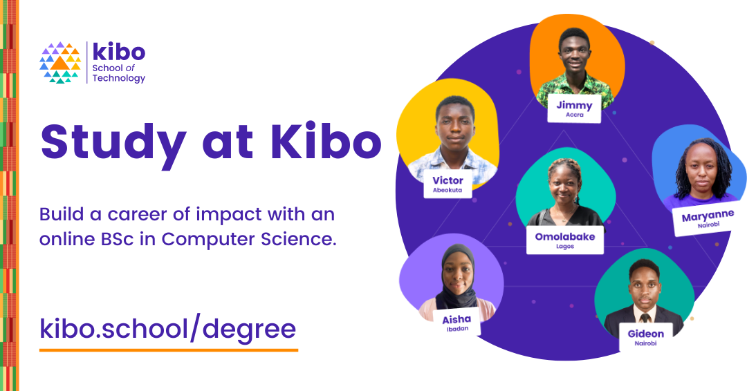
From software engineering and product management to data science and academia, your professional options with computer science are virtually limitless.
If you would like to build a career of impact as a world-class technologist at Kibo, learn more and indicate your interest here here
Application opens in 2024!
Share your experience
We would love to highlight your story to other young Africans just like you. Here are the steps to help us share your story.
- Share a social media post about your Try Kibo experience. Tag us (@kiboschool) across any platforms and we will reshare
- Record yourself answering a few questions and upload them in this form
- Give us permission to edit and share your video experience by filling out this release form
You can read/watch testimonials from other Try Kibo alumni on LinkedIn and YouTube
Stay in the Kibo family
Stay in Discord: We will be adding you to our Discord alumni channel. You'll join fellow Kibo alumni, stay connected with your peers, and be invited to more community events like the fireside chat.
Alumni Newsletter: We will send regular updates about what the Kibo family is up to. If you have a story you’d like to share with the Kibo community, let us know!
Show gratitude
This experience has been better by the efforts of so many people, including your peers. Take a minute to write and read notes of gratitude:
Keep coding
Remember that programming is a long journey and what matters is to learn well, not fast. And keep practicing!
- Finish the practice assignments from this course, if there are any that you didn’t get to during these five weeks.
- Practice more HTML, CSS, and JavaScript. Our favorite resources for continuing to learn are
Thank you! ✨
Kibo would not be the same without your participation. We are so grateful that you joined us!
Foundations
This week, you'll lay the foundations... of the foundations. Everyone has seen some web technologies before -- whether it's just as someone who's used websites, or built some of your own. These technologies are ubiquitous.
Whatever your prior expereince, this week you'll touch on HTML, CSS, and JavaScript, three core languages at the heart of the internet. As you get your first taste of reading and writing each language, you'll focus on how they are connected.
You'll also start practising learning and working together. The internet is social, and technologists build it together. So, that's what you'll learn to do too.
Learning Outcomes
After this week, you will be able to:
- Explain the role of HTML, CSS, and JavaScript
- Use core HTML elements to structure a webpage
- Select and apply styles using CSS
- Use a script tag to include a JavaScript file on a webpage
An overview of this week's content
Web Development
This course is about how to build web pages.
Web Development is everything that’s involved in building websites. Websites as different as Youtube, Wikipedia, Twitter, and Google all use the same building blocks under the hood. Under the hood, all of those websites use HTML, CSS, and JavaScript.
All the familiar features like text, images, colors, input boxes, forms, and videos are made out of these technologies. There’s some features like chat or purchases that require learning more than what we’ll cover in this course, but everything you see on the web is based on these foundational languages.
In this course, you’ll learn the basics of building websites with HTML and CSS.
HTML, CSS, and JavaScript
Web pages are built using different technologies. The most basic and fundamental ones are HTML, JavaScript, and CSS.
Roughly speaking,
- HTML is for content
- CSS is for styles
- JavaScript is for interactions
These three languages come together to make up a website.
HTML
HTML makes up the content and structure of the webpage. It’s what a page is made of.
Here’s an example.
<p>
	This is a paragraph. It has an
	<a href="https://example.com">
		Example Link
	</a>
	inside the paragraph.
</p>
<img src="valley-waterfall.png" alt="this is an example image" />
HTML is text! The syntax uses the angle brackets <> to identify elements that make up a page. You'll learn lots of different elements.
CSS
CSS controls the appearance of HTML elements.
CSS is made of rules that look like this:
p {
	color: red;
}
This CSS sets the color of the text within paragraphs to red.
Here’s the result:

Here’s the HTML content that's being styled:
<p>
	This is a paragraph. It has an <a href="https://example.com">Example Link</a> inside the paragraph.
</p>
JavaScript
JavaScript (often abbreviated JS) is a programming language that runs within the browser. It has many of the same features as other programming languages like Python, Ruby, or Java, but lots of quirks and specific details to learn about the language itself.
Here's a small example program in JavaScript that adds a list of names to the page:
let names = ["Lola", "Wasiu", "Rob"]

for (let name of names) {
	document.querySelector('.container') += name
}
In summary
- Websites are made of HTML, CSS, and JavaScript
- HTML has elements that look like
<a href="https://example.com">A Link Example</a>
- CSS has rules that control the appearance of selected elements, like
p {
	color: red;
}
- JS is a programming language like Python, but with some differences in syntax and what it can do
For the rest of the course, you'll dive deeper into HTML and CSS, and get lots of practice reading and writing these languages to build webpages.
The Web and the Internet
The Internet
Even though we tend to use "the web" and "the internet" interchangably, they're actually two different things. While the focus of this course is on the web and web development, it's good to have some foundational understanding of the internet.
Starting in the 1960s, university and government researchers created a system to share files between computers. That system, called ARPANET, established protocols for file sharing, routing, and messaging that grew into the public internet.
Since then, the internet has grown to become a global network of cables, cell towers, satellites, phones, and computers , all connected by networking protocols descended from those of ARPANET.
You may have seen protocols like http (it's in the address bar, or at the beginning of a URL). Protocols like HTTP (the hypertext transfer protocol)
are sets of rules that software programs follow so that they understand each other.
Connecting billions of different devices requires a lot of rules! There are a lot of protocols that make up the modern Internet -- HTTP, TCP/IP, Ethernet, DNS, Websockets... Even Bluetooth is a protocol that carries internet traffic!
You don't need to know what those acronyms stand for yet. You should know that the Internet is made of a lot of devices, connected by protocols.
Web Pages
If the Internet is the connections between the computers plus the protocols they use to communicate, the Web is the most visible way that people interact with the internet in their daily lives.
The Web was originally conceived as a collection of files and documents, shared and linked together using the internet.
Web pages are documents, created using HTML, CSS and other web technologies. Web pages can be accessed using a web browser, like Chrome or Edge. Pages contain text, images, links, and other elements.
A combination of multiple web pages makes up a website.
📺 How does the web work?
Here’s the main things to focus on:
- You use your browser to navigate to a url:

- Your browser requests files from a server
- The server sends files
- HTML
- CSS
- JavaScript
- images
- others like audio, fonts, and attachments
- Your browser turns those files into the page that you see.

Further Exploration: Clients and Servers
Computers connected to the web are called clients and servers. A simplified diagram of how they interact might look like this:

- Clients are internet-connected devices. For example, your computer connected to your Wi-Fi, or your phone connected to your mobile network, using software available on those devices — usually a web browser like Firefox or Chrome.
- Servers are computers that store webpages, sites, or apps. When a client device wants to access a webpage, a copy of the webpage is downloaded from the server onto the client machine to be displayed in the user's web browser.
What makes up a web page?
A website is made up of many different files. These files come in two main types:
- Code files: Websites are built primarily from HTML, CSS, and JavaScript, though you'll meet other technologies a bit later.
- Assets: This is a collective name for all the other stuff that makes up a website, such as images, music, video, or PDFs.
🔍 Further Exploration: How does the browser put the files together?
When browsers send requests to servers for HTML files, those HTML files often contain <link> elements referencing external CSS stylesheets and <script> elements referencing external JavaScript scripts.
- The browser reads the HTML file first.
- The browser looks for any
<link>elements to external CSS stylesheets and any<script>elements that reference JavaScript files. - The browser sends requests back to the server for the CSS files it has found from
<link>elements and the JavaScript files from<script>elements. - The browser builds the page from the HTML, applies the styles from the CSS, and executes the JavaScript. It shows the resulting page on the screen.
- Then you see the page content, and can interact with it!
In this class, we won’t worry too much about how the other computer decides which files to send, or how to write other kinds of programs. If you continue to learn more about programming and web development, you’ll learn more about how that part of the system works.
If you’re curious about this topic, you can read more on MDN’s page on How the Web Works.
Practice: Draw the Web
👩🏾🎨 Draw what it looks like to load a webpage. Some ideas to include in your image: browser, server, files (HTML and CSS)
- Draw using whatever tool you like (such as paper, tldraw, or the built-in Padlet draw tool)
- Take a screenshot, a phone picture, or export the image if you use a drawing tool
- Upload the image to the Padlet (click the + button in the bottom-right, then add your image)
- You can also choose to Draw from the Padlet "more" menu.
https://padlet.com/curriculumpad/draw-the-internet-ynyrdwo7xv6hroxe
HTML Elements and Attributes
In this lesson, you’ll revisit HTML in more detail, and learn about more elements.
HTML Basics
HTML Example
Here’s an example. On the left is HTML. On the right is the same code, rendered as a webpage.
<p>
    This is a paragraph. It has an
    <a href="https://example.com">
        Example Link
    </a>
    inside the paragraph.
</p>
<img src="https://web-foundations.vercel.app/lessons/foundations/html-elements-and-attributes/valley-waterfall.png" alt="this is an example image" />
This tool is called CodePen, and we'll use it to demonstrate snippets of HTML, CSS, and JS. You can use it as a small playground for experimenting.
HTML Elements
HTML is made of text you can type on your keyboard. In addition to normal words, there are special words in angle brackets, like <p>, <a>, and <img> that add structure to the content.
The building blocks of HTML are called elements. A webpage is made up of elements.
- Elements have different types
- Elements can nest inside each other
- Elements can have attributes
Types and Tags
There are lots of types of elements. In the snippet above, the elements are:
<a>stands for ‘anchor’, but means link<p>for paragraph<img>for images
There are many many elements in addition to these three. You’ll learn about 20 to 30 elements in the course. You can always look them up if you forget.
Tags
The syntax that looks like <some name> is called a tag. It says what kind of element it is.
Elements usually have two tags: an opening tag, and a closing tag. They show where the element starts and where it stops.
<p>Opening first, then closing</p>
- The opening tag is
<p> - The closing tag is
</p>, with a forward slash/before thep.
📺 Here is a summary of HTML Tags
Nesting HTML Elements
HTML elements can go inside of each other. Everything that’s in between the opening tag and the closing tag is ‘inside’ an element. It can be text, like the paragraph above, or other HTML elements, or both. The element inside another element is called the child element while the one outside is the parent. Here's an example showing a <p> element inside an <a> element.

HTML Attributes
HTML elements often have more information.
This kind of information goes in an element’s attributes. Attributes provide more information about how an element should work.
For instance, an <img> tag can say where to find the actual image. An <a> tag can tell where to link to.
Here’s some examples:
-
the
src(source) of an<img>(image) element tells the browser where to go to find the actual image to put there:<img src="valley-waterfall.png" /> -
the
href(hypertext reference) of an anchor tag (<a>) tells the browser where the link should go when you click it.<a href="https://example.com">The text that shows up</a> -
the
classattribute of any element helps identify it as part of a group. It’s really useful for styling and adding interactivity.<p class="nice">Hello world!</p>

📺 Here's a video recap on HTML Attributes
Elements to know
There’s more than 200 HTML elements, you can see them all on MDN. You don’t need to memorize all of them. There are tons of them you’ll never ever use!
Here’s the ones that you'll use this week.
<a>: hyperlink
📺 Check out this video on Hyperlink
<a> stands for ‘anchor’, but means link. It’s the element that connects the whole web together.
- The href attribute determines where the link will go when clicked
- Whatever’s inside the tag is clickable as a link
See the Pen a tag demo by Rob Cobb (@rrcobb) on CodePen.
Further Exploration: Hyperlinks
Read more about the <a> tag and hyperlinks on MDN.
Topics to explore:
- URLs, paths, absolute and relative paths
- email (
mailto) and phone (tel) links - urls, absolute and relative paths, and files
- download links
- linking directly to a part of a page
Image: <img>
Images make the web visually appealing. The <img> tag tells which image to add, where.
- The src attribute says where to find the image
- The alt attribute has a text description of the image, for accessibility
See the Pen Example of an img tag by Rob Cobb (@rrcobb) on CodePen.
📺 Check out this video on Images
Challenge: 🤔 How would you make an image that linked to another page?
Answer
You put the image inside the link, like this:
<a href="https://kibo.school">
  <img src="valley-waterfall.jpeg" />
</a>
When someone clicks on the image, it will navigate to the URL, just like a text link.
Further Exploration: Images
Read more about <img> and Images in HTML on MDN.
Topics to explore:
- URLs and paths for images
- types of image files
- alt text and screen readers
- setting image width and height
- figures and captions
- background images
Also check out this video about images and Pixels from Code.org
Text
Text Nodes
Inside a <p>, an <a>, or lots of other tags, you’ll see regular text. Text placed inside many elements shows up on the page. Sometimes, depending on the element, the text will show up differently.
Text Elements
<p>: Paragraph
<p> is for paragraph. It’s for the body text that makes up the bulk of text-heavy pages.
- Paragraphs show the text inside the tag. They don’t make the text show a special way.
- Each paragraph gets shown on a new line when the page is displayed.
See the Pen p tag demo by Rob Cobb (@rrcobb) on CodePen.
📺 Here's a video recap of the Paragraph tag
<h1> to <h6>: Heading
- There are six heading elements.
- The biggest one is
h1, the smallest ish6 - They are used for the title of the page, section and subsection titles
See the Pen heading demos by Rob Cobb (@rrcobb) on CodePen.
<ul>, <ol>, <li>: Lists
There are two kinds of lists. Unordered Lists <ul> have dots before each item. Ordered Lists <ol> have increasing numbers before each item. Both lists use <li> for list items.
See the Pen List Demos by Rob Cobb (@rrcobb) on CodePen.
<strong>, <em>: emphasized text
- Both of these tags indicate that text is emphasized in some way
<strong>is a strong emphasis, for really important information<em>is for information that’s different from the norm, but not as strongly emphasized
See the Pen strong and em demos by Rob Cobb (@rrcobb) on CodePen.
Practice: Find a new tag
🔍 The Mozilla Developer Network (MDN) is a top source of tutorials and reference materials for Web Developers.
Starting at the MDN overview page on HTML, find a description for an HTML element that’s new to you. Using the link below, share:
- the name of the element
- the link to the MDN page, and
- what you find interesting about it
https://padlet.com/curriculumpad/find-a-new-tag-on-mdn-4ge2twh4yzdhn6se
Practice: Use the basic elements
👉🏿 Your turn! Click the link below to attempt the practice exercise on Replit.
https://replit.com/team/tk10-wf/Practice-Use-the-basic-elements
To complete this, try to include these tags:
- a paragraph
- a link
- an image (there's an example image called example.jpeg in the sidebar)
- two headings, of different levels
- an unordered list
- an ordered list
- some emphasized and strongly emphasized text
- Don't worry about the content of the page, it can just say "This is a heading" for the headings, and "this is a link" for the links.
Re-read the lesson or look up the elements using Google if you get stuck.
CSS Selectors and Properties
Let's dive deeper into CSS selectors and properties.
CSS
CSS controls the appearance of HTML elements. CSS is made of rules that look like this:
p {
    color: red;
}
This CSS sets the color of the text within paragraphs to red. Here’s the result:

Try It: Change the Color
👉🏿 Your turn! Practice changing what shows up on the page by editing the CSS.
Set a timer for 10 minutes to experiment with HTML and CSS.
- Try changing the text in the paragraph.
- Try changing the CSS so that the color is blue.
If the embed below doesn’t load, use this link to open the page directly: https://codepen.io/rrcobb/pen/poKeopy
See the Pen Try it: Change the color by Rob Cobb (@rrcobb) on CodePen.
Linking CSS
📺 Check out this Code.org video on how to link your CSS
We’ll put our styles in a CSS file, usually called style.css. We need to tell the browser that this file is "linked" to the content in our HTML file.
In the HTML file, we’ll link to style.css using the <link> tag:
<link href="style.css" rel="stylesheet" type="text/css" />
- The
hrefattribute of thelinksays where to find the CSS file - The
relattribute of thelinksays what the relationship is to the page — for us, alwaysstylesheet. - The
typeattribute of thelinksays what kind of file it is — alwaystext/cssfor us.
Practice: Link the stylesheet
Add the
<link>tag to this HTML page so that the styles are connected.👉🏿 Use the link below to attempt the practice exercise
https://replit.com/team/tk10-wf/Practice-Link-the-Stylesheet
CSS Syntax
Each rule has a selector and a list of declarations. The selector says which elements should get these styles.

The selector is
p, so all the<p>elements get the styles.
A declaration is a property and a value.
The property is
colorand the value isred
CSS selectors
When you write CSS, the steps often go:
- Pick what elements to style
- Edit their styles in the DevTools
- Write the style rules in your CSS file
Step 1 is “Pick what elements to style”.
Selectors determine which elements will get which styles.
See the Pen css selectors intro by Rob Cobb (@rrcobb) on CodePen.
The selectors in this example are p and a.
Question: Which elements get color: red;?
Answer: The paragraphs, because of the p selector.
Question: Which elements get color: green;?
Answer: The link, because of the a selector.
How selectors work
Selectors pick all the elements that match, and the style rule applies to all those elements.
There are lots of kinds of selectors. We’ll focus on the three most common selectors (Element Selectors, Class selectors, and id selectors) and how to combine selectors. Then, you can practice with more advanced selectors too!
Element Selectors
From the example above, p and a are Element Selectors. They select all the elements that are that type.
Question: How would you select all the images on a page and give them height: 100px?
Answer: The selector would be img, and the full CSS rule would be
img {
	height: 100px;
}
Class selectors
When an element has a class attribute, there’s special syntax to select them.
See the Pen class selectors demo by Rob Cobb (@rrcobb) on CodePen.
The selector .cool-paragraph selected the second paragraph, because it had a matching class attribute. The syntax is . plus the name of the class, in this case cool-paragraph.
You can have lots of elements with the same class. There can be lots of cool-paragraphs.
id selectors
An id selector selects elements that have a matching id. It’s similar to a class selector, just a slightly different syntax.
See the Pen id selector demo by Rob Cobb (@rrcobb) on CodePen.
#paragraph-6 picks the paragraph with the id paragraph-6. The syntax is a # plus the id (like paragraph-6). There’s only supposed to be one element with any particular id.
Combining selectors
Matching either selector ('or')
You can select more than one element with a combined selector.
The easiest way is to list multiple selectors, separated by commas.
p, a, .cool-text {
	color: hotpink;
}
All paragraphs, links, and elements with the cool-text class will be selected.
Matching both Selectors ('and')
If you put two selectors together, you select elements that match both selectors. You can select “the paragraphs that also have the class cool-paragraph” by combining the p and .cool-paragraph selectors like p.cool-paragraph.
There are other CSS combinators that let you pick elements that have relations like “all the links inside of list items” or “paragraphs right after second-level headings”.
Combinator is a fancy word for “thing that combines things”.
Here’s some examples:
.cool-paragraph strongselects all the<strong>elements inside elements with thecool-paragraphclass.h2 + pselects the paragraphs that immediately follow a level 2 header
You don’t need to memorize all the combinators.
If you want to see them and browse more examples, check out the MDN page on CSS Selectors.
📺 A video recap of CSS and Selectors
Practice: Select the Elements
👉🏿 Practice using selectors
In the CSS file, fill in the selectors for each of the rules so that the styles work. https://replit.com/team/tk10-wf/Practice-Select-the-Elements
Practice: CSS Diner
🍽️ For more practice with CSS selectors, try out CSS Diner.
There are 30 short exercises to practice selecting the plates, the food, or the table.
Try to get to at least Level 10!
A Taste of JavaScript
JavaScript lets you control the action on a page. It’s also a super powerful programming language you can use for all kinds of other applications.
Today, you’re just going to see how to link a JavaScript file to your HTML.
Script tag
We write our JavaScript in separate files, which in this course we’ll name script.js. To connect the JavaScript to the HTML page, we’ll use a <script> tag.
<script src="script.js"></script>
We use the src attribute to say where to find the JavaScript file.
Note: It’s called src for <script> tags. link and a tags have href, which is similar. If you mix them up, try switching to the other one.
We usually place the script tag at the end of the <body> tag, so that the rest of the page has loaded before the script is run.
Practice: Link the JavaScript using the <script> tag
👉🏿 Use the link below to attempt the practice exercise
Add the <script> tag to connect the JavaScript file to the HTML page.
https://replit.com/team/tk10-wf/Practice-Link-the-Script
Deeper Connections: CSS Selectors in JS
Look at all the places it uses CSS Selectors:
document.querySelector('#gross')
document.querySelector('.reaction')
document.querySelector('#yum')
#gross, .reaction, and #yum are all CSS Selectors! When you learn to use JavaScript to create interactions, you’ll still use concepts from HTML and CSS.
The same CSS selectors that you use for styles will also let you pick HTML elements in your JS code.
Browser Developer Tools
Web developers frequently need to see what's happening 'under the hood' on a website. The Browser Developer Tools (also called the “DevTools”, the “Inspector”, or the “Console”) give you that power.
The DevTools are awesome for seeing how a webpage is working, and testing out code. 👍🏿
The Devtools are safe It’s impossible to do any permanent damage to a website from the DevTools.
None of the changes you make in the DevTools are permanent. It’s a safe space to experiment. If something goes wrong, you can refresh 🔁 the page and get back to the original.
You can read more on MDN about:
- What the DevTools are
- How to use them to View and change the HTML Elements
- CSS Properties and Values.
Try it: Devtools Scavenger hunt
In this Scavenger Hunt, you’ll use the DevTools to view and edit properties of a webpage. You’ll get to explore for yourself what a webpage is made of, and practice using the tools that real web developers use to debug websites.
- On your laptop, go to https://devtools.programming.africa/
- Use the DevTools to find the secret messages on the page
⚠️ If you get stuck on this assignment, watch the video below to see how to solve each clue.
Scavenger Hunt Solution Video
Practice
💡 This is your chance to put what you’ve learned into action. Try solving these practice challenges to check that you understand the concepts.
If you get stuck
- Read the instructions again.
- Remember Go Climb Kibo - first Google, then ask the Community on Discord, then reach out to the Kibo team.
Chicken Peanut Stew Recipe Page
🍲 Starting with a plain text version of a recipe, write the HTML markup to turn it into a webpage.
https://replit.com/team/tk10-wf/Chicken-Peanut-Stew-Recipe-Page
Shirt City Landing Page: Debug
👕 Help the new clothing brand Shirt City debug their landing page.
https://replit.com/team/tk10-wf/Shirt-City-Landing-Page-Debug
Make a Greeting Card
🎉 Starting with the working version of a Birthday Card web page, edit the HTML and CSS to make it your own.
Project: Your “CS Professor” Page
Due date: Sunday, November 5
👩🏾🏫 Your CS Professor page
CS Professors are notorious for building sites that, while functional, are totally unstyled. In this project, you'll put together your own CS Professor website.
Remember...
- Read the instructions tab in Replit
- Plan before you code
- Debug if you aren't getting the desired output
- Attend office hours if you need additional support
- Ask for help in Discord
Wrap up
Summary
In this lesson you learned:
- The role of HTML, CSS, and JavaScript
- How to use core HTML elements to structure a webpage
- Selecting and applying styles using CSS
- Using a script tag to include a JavaScript file on a webpage
How was this lesson?
Feedback is a gift! We use your feedback to improve our lessons for future students. Thank you!
👉🏿 Submit your feedback below or use this link.
Further readings
More HTML Elements
Other elements and tags
As you learn more web development, you’ll see tons of other tags.
Here’s a preview of some of the tags you’ll encounter. Again - you don’t need to know these ones. Remember that you can look them up later!
Stylized text elements
There are lots of elements for particular kinds of styled text.
Here’s some of the tags, but without examples. Don’t try to memorize them. Instead, skim them, and then remember that you can always go back and look up the right element to use for a particular situation.
List: stylized text elements
<code>: used to style blocks of code.<pre>: used for text that has been pre-formatted, like a poem, where the spaces are already there. Otherwise, spaces, tabs, and newlines all get collapsed by the browser.<small>: Small text<u>: Underlined text<i>: Italicized text<s>: Text with a strikethrough, likethis<q>: “quoted text that fits within a line”<blockquote>: A block quote, usually multiple lines<mark>: Highlighted text<del>,<ins>: Text that’s been deleted or inserted<sub>,<sup>: Subscript ($_{subscript}$) and Superscript ($^{superscript}$)
Semantic elements
Semantics refers to the meaning of a piece of code. It’s about "what purpose or role does that HTML element have", rather than "what does it look like?".
When approaching which markup to use, ask yourself, "What element(s) best describe/represent the data that I'm going to populate?”
MDN
HTML elements mean something. A <p> isn’t just styled like a paragraph, it tells other programs that the text inside really is a paragraph.
There are lots of kinds of “things” that go on webpages. For many of them, there’s a matching HTML element. Here’s some examples (there’s more than 100!)
List of Semantic Elements
<article><section><nav><footer><aside><details><summary>
Further Exploration: Semantic Elements
https://developer.mozilla.org/en-US/docs/Glossary/semantics
Questions to explore:
- Why use Semantic HTML?
- What are the benefits of Semantic Elements?
- When would you use these?
<div>, <span>: Generic Elements
Sometimes, you don’t know which semantic element to use. <div> stands for “division” and it’s a generic block of HTML. <span> is a generic “span” of text characters, inline with some other text. If you don’t know another element that’s more appropriate, you can use one of these instead.
See the Pen div and span by Rob Cobb (@rrcobb) on CodePen.
Structure and Page Information
When you create an HTML project, your editor might suggest a bunch of default starter HTML in index.html. You will usually not need to write these tags yourself, but here’s what they mean in case you were curious.
List: Structure and Page Information tags
<!DOCTYPE html>isn’t actually an element. It goes at the top of a file to say that it’s HTML.<html>is the ‘root element’ of an HTML document. All of the other elements should be inside it.<body>is where all the page content should go - everything you see on the page.<head>is hidden metadata. It’s data about the webpage that doesn’t show up on the screen.<title>is the title of the page. It’s what shows in search results and in the browser tab.<meta>is for various other metadata about the page. There’s lots of types, which you can read about on MDN.
Multimedia and Embedding
There are lots of tags for including media on a webpage.
List: Media tags
<iframe> is for embedding external site content onto a page
<audio> for an audio recording
<video> for a video recording
<canvas> is an element where you can draw shapes programmatically. Used for animations and games!
<object> is an element for embedded content, like a pdf or a video.
Forms
There is a whole set of HTML tags that are all about forms. We’ll focus on them in Week 3, but here’s the list as a preview:
List: Form tags
<form> is for creating a form and grouping all the elements inside as part of the form
<input> represents an input. There are lots of different types of inputs!
<button> is a button, like a Next or Submit button.
<select> shows a dropdown
<option> is for the items in a select dropdown, like <li> is for items in a list
MDN has several pages on Forms. We’ll learn more in Week 3.
MDN Element Reference
Those are the core elements you’ll encounter.
For the full listing of HTML Elements, check out the MDN Elements Reference.
Happy Elementing!
Bonus: Static vs. Dynamic websites
The content of a web page can either be static or dynamic.
In this course, you’ll learn to make static web pages. Your final project will be more like Wikipedia, and less like Facebook.
Web Apps use the same building blocks as static websites. The tools in this course will help when you move on to building Web Apps in the future.
Web design
In week 1, you learned the basics of CSS. So you already know:
- CSS describes how HTML elements should be displayed on the page
- Use
<link>to connect CSS to an HTML page:<link href="style.css" rel="stylesheet" /> - CSS selectors like
p,.details, or#title - Basic CSS properties like
color
But... the sites you made in Week 1 were not pretty!
It’s not enough to apply just any styles. You have to know which styles will make your site look good.
Learning Outcomes
After this week, you will be able to:
- Style text size, font, spacing, and color
- Choose and apply colors to a webpage
- Use margin, padding, and border to manage the space between elements
What is web design?
Web design is all about what shows up on the page, and how it looks and behaves. All of these parts are connected - what HTML elements you choose is closely tied to how they look!
What an element does is connected to how it feels to use it. For example, it's helpful to the user if a link looks changes color when they click it or hover over it with the cursor.
Learning web design means learning what a good website or feature looks like, and how to actually make it happen in code. It's about both the skills and about judgement.
You won't become a master web designer in just a week. You will learn to use CSS properties that determine the appearance of web pages, and you'll start to develop your best judgement for seeing what makes a design good or bad.
Noticing
Designing a site to look good starts with noticing what doesn’t look right. Then, you can make large or small changes to the design to fix it.
You’ve already visited plenty of websites in your life, and you’ve probably noticed that some sites look good, and others look bad. Now, you’ll need to hone this skill to notice why you feel this way about some sites.
Practice: Noticing
What makes a site look good?
Everyone has different taste in design, so there’s no universal “best” styles. Even so, some sites seem better to more people or are easier to use. Usually, what makes sites look good is a combination of just a few characteristics:
- Text Styling
- Spacing
- Colors
- Box model
- Layout
CSS has tools for styling each of these. We’ll focus on some of these in the next few lessons.
Try it: Web Design in 4 Minutes
What you’ll learn this week
Text Styling
- Font size, line spacing, line length
- Font families, font weights, and how to use web fonts
- Styling lists, links, and emphasized text
Colors
- Contrast and readability
- Choosing a palette
- CSS Color values
Box Model
- The CSS Box Model
- Margin, padding, and borders
Reflection: Sites with Good Design
Practice: CSS Diner
You're going to be using CSS Selectors a ton this week.
If you skipped it in Week 1 (or if you just want to practice selectors more), CSS Diner is a great place to practice selectors.
There are 30 short exercises to practice selecting the plates, the food, or the table.
Try to get 5 levels beyond where you got last time!
Further Exploration
If you want to read more about visual design, see Clean Up Your Mess: A Guide to Visual Design For Everyone (10 min).
It discusses what makes a design “clean” and how to communicate what’s important. In particular, it focuses on how to use spacing, size, proximity, and alignment to create contrast and a visual hierarchy.
Styling text
Text is a big part of almost every webpage. If the text looks good, the page will look good.
There’s a lot you can control about how text looks! Size, color, spacing, and
shape are only the first layer. There’s also niche text styles, like decoration
(e.g. underline or strikethrough).
There's lots of other choices too! Body and header fonts, how links look when you hover them, how the numbers or bullets look on your lists...
Choosing the right value for each property is hard. Each change you make forces you to tweak something else. Over time, you’ll build an intuition for what makes a site look good, and how to achieve good design with CSS. For now, we’ll tell you what properties CSS can control, and the most important rules for good typography.
Typography Tutorial
Before we do a deep dive into writing CSS to control text, check out this interactive tutorial by Learn UI Design.
Click through the Interactive Typography Tutorial
- Scroll and click through each step
- Try different fonts, line lengths and heights, point sizes, and spacing.
- (You don't need to sign up for their course)
Afterwards, reflect on these questions:
- What text properties did you already know about?
- What properties were new to you?
In the next few lessons, you'll learn how to control those properties with CSS, instead of with sliders.
CSS Text Properties
Typography
The style and appearance of text on the page is called Typography.
Using CSS, we can control the appearance of the text, including:
- size
- spacing
- line length
- color
Using these properties, we can make the text look good!
You can use CSS to control these properties. The properties are:
font-sizeline-heightmax-width(for controlling the length of each line)colorandbackground-color
Practice: Good Text, Bad Text
Key rules for Typography
- Point size should be 15-25 pixels
- Line spacing should be 120–145% of the point size
- Line length should be 45–90 characters (including spaces)
- Less color is more effective
Body text point size should be 15-25 pixels
font-size is the relevant CSS property, so the recommendation is body text between font-size: 15px and font-size: 25px.
body {
    font-size: 18px;
}
Line spacing should be 120–145% of the point size
line-height controls how tall each line is. You can set it as a multiple of the font-size by using a value without units, like 1.4. Use between line-height: 1.2 and line-height: 1.45.
body {
    line-height: 1.35;
}
The average line length should be 45–90 characters
Line length is determined by the width of the parent element. The max-width on the parent element is often easiest way to control the average line.
body {
    max-width: 500px;
}
Less Color is more effective
The color property in CSS sets the color of text. The background-color
property sets the background color. Usually, the best choice is black or dark
gray text, on a white or near-white background.
The goal is to create contrast between the background color and the text color. Dark text on a dark background is hard to read. So is light text on a light background.
body {
    background-color: #eee; /* near-white */
    color: #333; /* dark grey */
}
Summary
Combining all the rules above, here's a default style for body text:
body {
    font-size: 18px;
    line-height: 1.35;
    max-width: 500px;
    background-color: #eee; /* near-white */
    color: #333; /* a dark grey */
}
There's lots of wiggle room! You don't need to use exactly these rules.
Further Exploration
What makes good Typography?
Butterick’s page What is good typography? says
"Good typography reinforces the meaning of the text."
There's lots to learn about what makes typography good.
Read more: Good Typography
Different purposes call for different text styles.
Still, there are some fundamentals that apply across most sites.
👉🏿 Read Typography in Ten Minutes. Make a note of the terms you don’t understand. There’s a lot to learn about making text look good, but this is a good starting point.
For each of the terms you don’t understand, try doing a quick google search to learn more about that term. You might not totally understand everything at first, but it’s a good habit to try to do a search when you encounter a term you don’t know.
- The summary of key rules from Practical Typography has more rules for improving text.
- For more on color, see Butterick’s Practical Typography, Color
Text and Font Styling
There's also lots more to learn about the CSS properties for text styling.
Read more: Text and Font Styling
The Text and Font Styling page on MDN has more detail about these properties and other properties you can use to style text. Read about:
- Text
color - Values and Units
- Styling with
font-weight,text-transform,text-decoration, andtext-shadow - Alignment and spacing with
text-align,letter-spacing, andword-spacing
It also links to many other pages about styling text. There’s a ton to explore.
Styling Elements
Most of the text on the page is body text, so the styling recommendations so far have been about body text. But, there’s other text on the page too!
Let's see how to style different kinds of elements.
Headings
Like you learned in Week 1, you can use the <h1> through <h6> tags for
headings. You can and should style those elements.
Here’s the suggested rules:
- Use space above and below (see the next lesson on spacing for how).
- Limit the number of heading levels (two or three is best).
- Headings should be larger than the body text, but not too much.
- You can use a different font family for headings, but you don’t have to.
Further Exploration: Styling headings
Read more about styling headings from Practical Typography.
Emphasis
You can use the <strong> and <em> tags to create emphasis. You can style
those elements to create further contrast, if you want.
- Bold text creates strong emphasis
- Italic text creates a more subtle emphasis
- Don’t use both at the same time, and try not to overuse them
You can also use CSS properties to control emphasis:
font-weightcontrols how heavy (bold) text should appear.font-stylecontrols whether text should be italicized or nottext-transformandfont-variantcan be used to create all-caps or small-caps effectstext-decorationcontrols text underline, overline, or strike-through.
Further Exploration: Bold and Italic
See Practical Typography’s chapter on Bold and Italic
Links
People visually recognize links because they are styled differently from other text.
Often, they are colored differently and underlined.
- Links are a good time to use an accent color to style text.
- You can change the
text-decoration- you can remove the underline, or show it only on hover. - You can style other properties, like
background-colorandborder-bottom. - Link states: hover, visited, active
Links can show differently when they are hovered over, or after they’ve been
clicked. To apply styles to particular states, you need a new kind of selector:
the :hover and :visited pseudo-selectors.
See the Pen Link styles (hover, visited) by Rob Cobb (@rrcobb) on CodePen.
It’s also nice to be able to make the cursor show differently when hovering something clickable. By default, clickable links have cursor: pointer to make the pointer into a little hand icon. You can apply this yourself to other elements that are meant to be clicked.
Read more about styling links on MDN.
Practice: Typesetting a Homepage
Further Exploration: Styling Lists
You can control the appearance of lists using the text styling and spacing CSS properties. There’s also some additional properties to control the appearance of list items.
Read more about styling lists on MDN.
Colors
Colors in CSS
CSS has lots of properties that deal with color. The primary ones you’ll deal with are
colorfor text color.background-colorfor the background color of any element.border-colorfor the color of a border.
Further Exploration: More color properties
There are tons more CSS properties that use colors. Try searching MDN for any of these that interest you:
box-shadowoutline-colortext-decoration-colortext-emphasis-colortext-shadowcaret-colorcolumn-rule-color
CSS Color Values
In our examples, we’ve mostly used named color values, like mediumorchid and darkslateblue and hotpink. You may have also seen hex color values, like #483d8b, which specify the red, green, and blue color values for a color.
There are more ways to specify colors than named values and hex values!
As usual, MDN has your guide. The page on color values explains lots of other ways of specifying color values.
Choosing Good Colors
Choosing bad colors makes a site look amateurish. So, what makes good colors?
If you don’t have enough contrast, the text won’t be readable.
In the lesson on Styling Text, we said
Your primary goal should be to create contrast between the background color and the text color. Dark text on a dark background is hard to read. So is light text on a light background.
Usually, the best choice is black or dark gray text, on a white or near-white background.
This is still true.
What colors do good sites have?
When designers create a color palette, they usually pick:
- Theme color (or several related theme colors) for background colors for the header and footer.
- Accent color, for links and highlights.
- Background color (usually an off-white, like
#eeeeee). - Body font color (usually a dark gray, like
#222222).
Try it: Count the colors
Try it: A color palette
Even on a site that looks very colorful, there’s only a handful of colors.
Building a color palette means choosing just a few colors to use on your site.
CSS Variables
If you’re going to use the same value in lots of places in your CSS code, there’s a really useful tool: CSS variables. Here’s how they work.
html {
  --theme: #D231A0;
}

a:hover {
  color: var(--theme);
  text-decoration-color: var(--theme);
}
This snippet creates a CSS variable called --theme, then uses it as the color for the text and the underline when a link is hovered. When the browser sees var(--theme), it looks up the variable --theme and uses that value, #D231A0.
You can use CSS variables for any values — colors, sizes, numbers, percentages, or any other property values. CSS variables are really useful for color palettes, since it’s common to use the same colors again and again.
Related colors
If you choose colors that look “related”, the site will look more natural.
How can colors be related? In this course, we won’t get too deep into color theory. Instead, here’s a couple activities that might help you think about choosing a family of related colors.
Practice: Color Method Game
Practice: Apply a palette
The Box Model
Rectangles everywhere
CSS thinks in rectangles.
Everything in CSS has a box around it.
Everything on the screen in your browser — even if it shows up as a circle, triangle, or squiggle — has a dedicated rectangle of space when browser figures out where to put it on the screen.
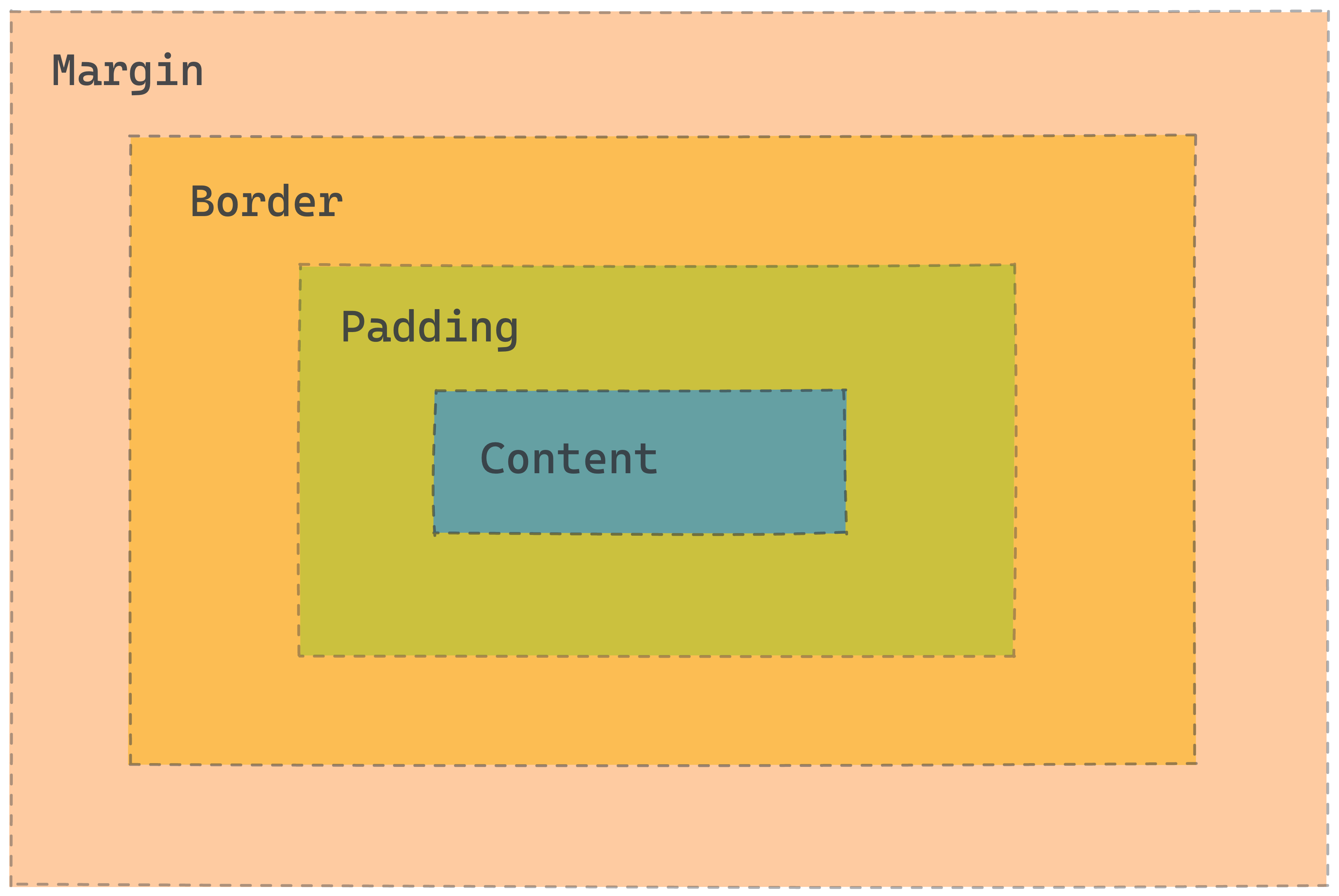
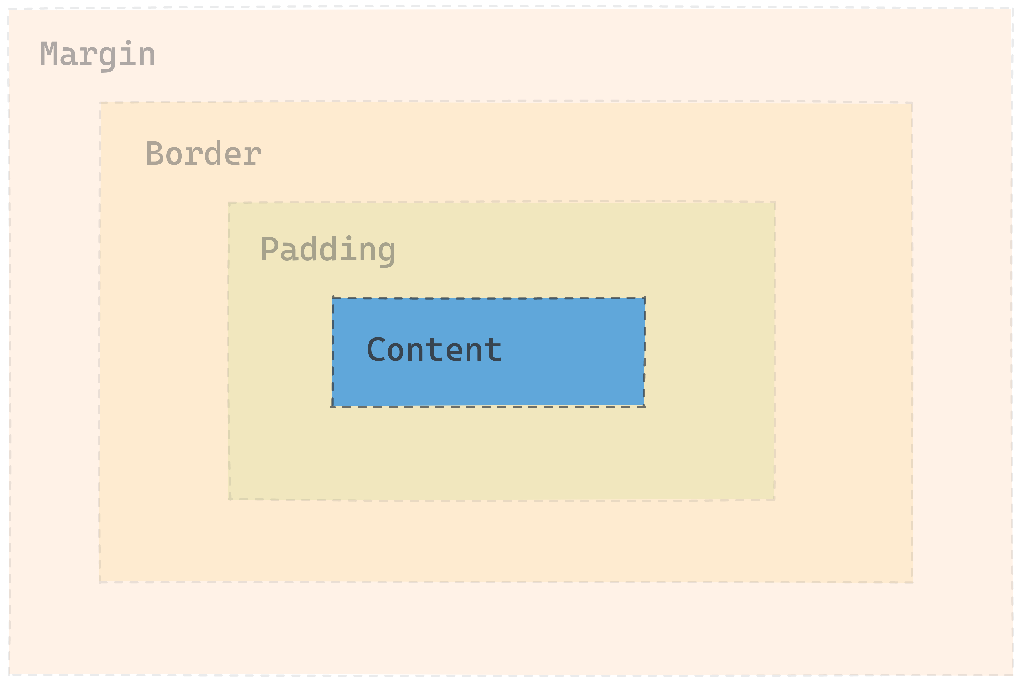
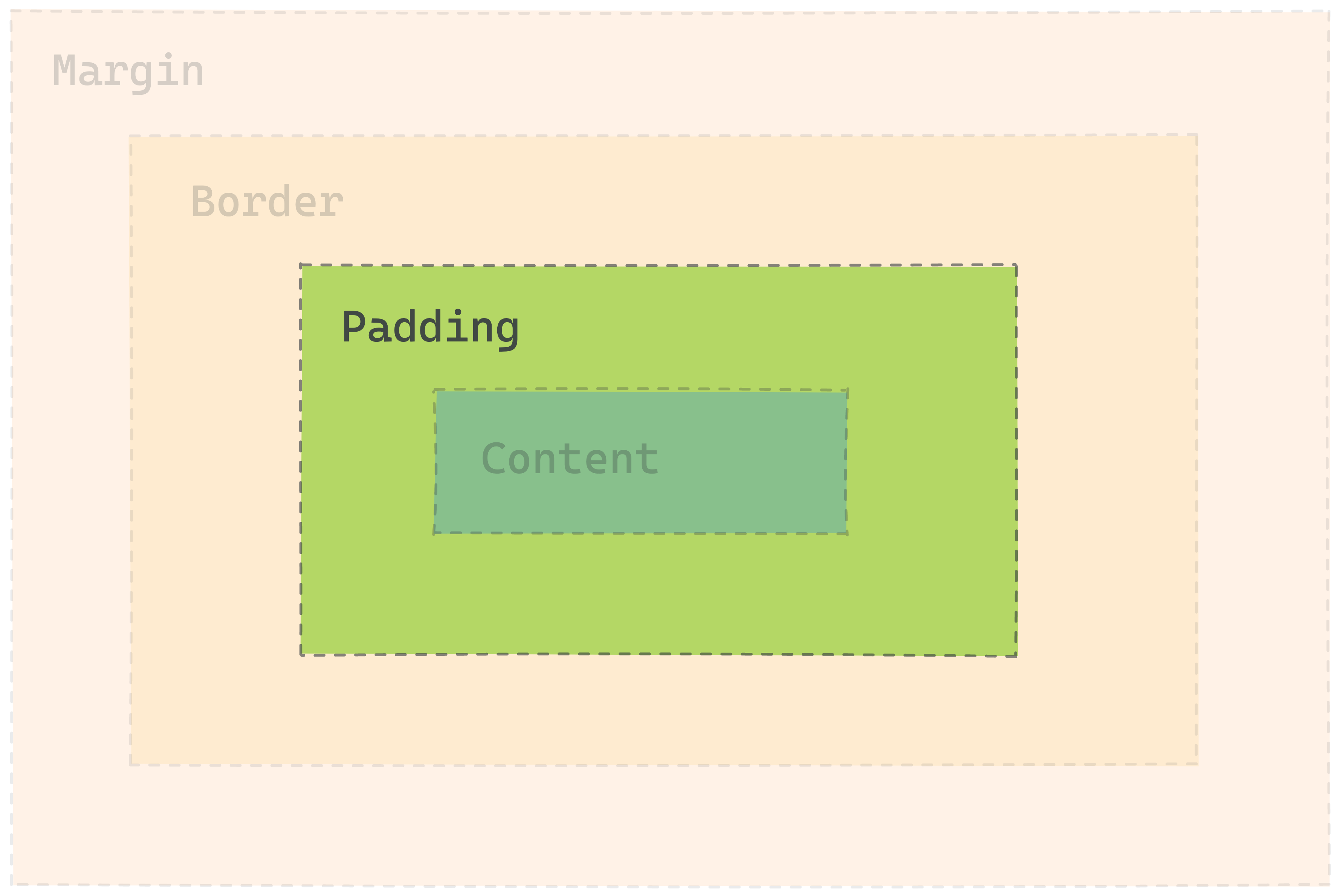
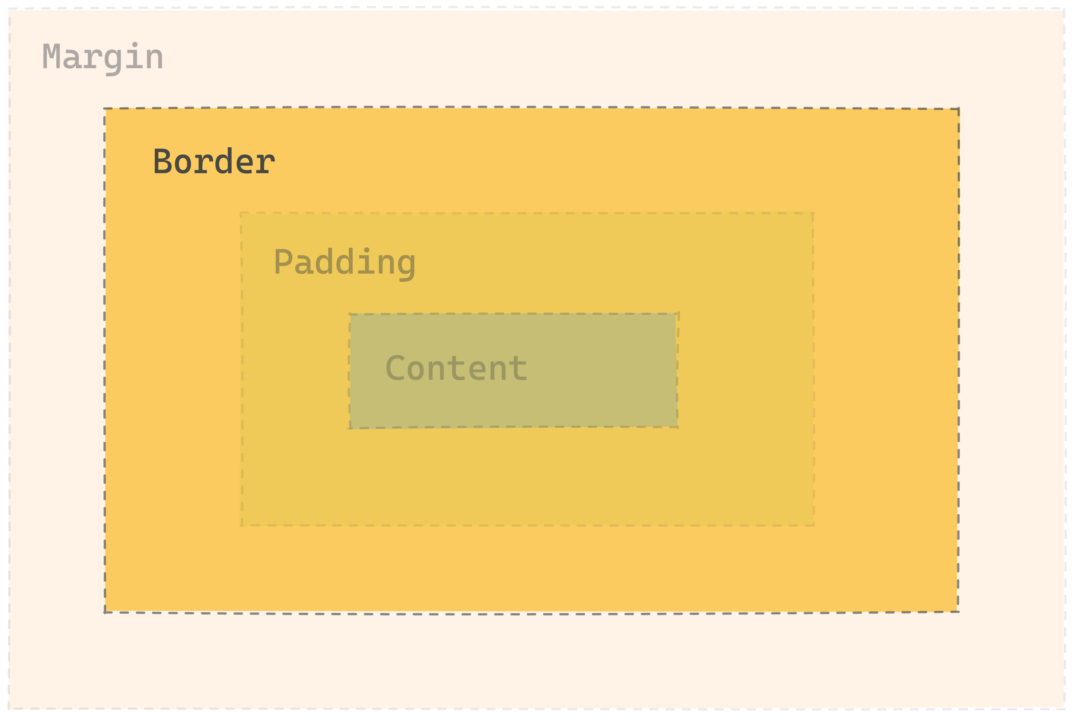
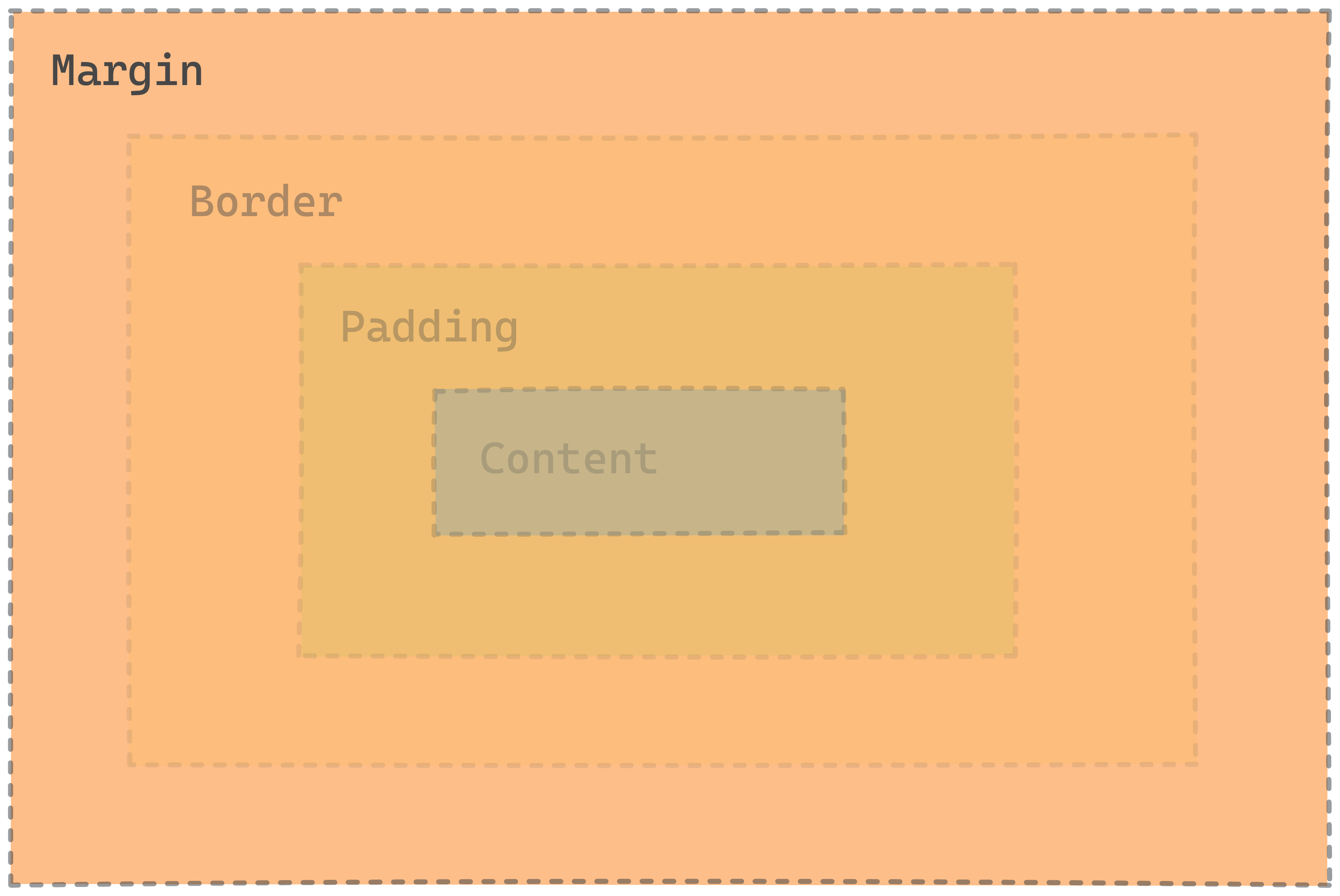
The Illustrated Box Model
Below is an illustration of the Box Model. Each element has margin, border, padding, and content.
If you know the Box Model, you can use CSS to control how much space the browser puts between the rectangles. It’s a key set of tools for you to use in making a page look good.
From the inside, going outwards:
- Content is what’s inside an element.
- Padding is the space between the element and the border.
- Border is a line around the element that can have some width.
- Margin is the space between elements.
These properties apply to the top, right, bottom, and left of the element.
Box Model in the DevTools
Before you dive deeper into the box model, here’s a quick tutorial on how to view the box model in the DevTools.
📽️ Video: Viewing the Box Model in the DevTools
Content
Content is what’s inside the element.
It doesn’t have a single CSS property that sets how big it is. Instead, it’s the sum of the sizes of all the stuff inside.
For some elements, you can set the width and height properties to control the dimensions, but this doesn’t always work.
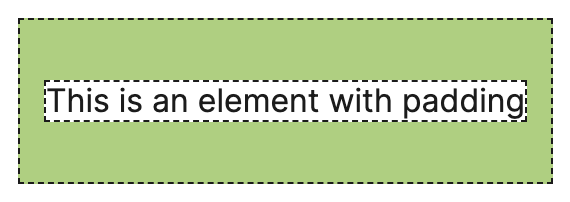
Padding
Padding is the space between an element and its border.
It’s controlled by the padding properties:
padding-toppadding-rightpadding-bottompadding-left
You can set any of the properties on their own, or set them all at once with padding.
Check out the MDN docs on padding for an interactive example and more information.
padding example
The padding shorthand sets the top, right, bottom, and left in one line.
/* top | right | bottom | left */
padding: 30px 12px 30px 12px;
Further Exploration: CSS direction shorthands
These are all equivalent:
/* top | right | bottom | left */
padding: 30px 12px 30px 12px;

/* top | right and left | bottom  */
padding: 30px 12px 30px;

/* top and bottom | right and left  */
padding: 30px 12px;
If you leave out some of the 4 values, they get ‘filled in’ by the earlier value along the same axis.
If you use just 1 value, it applies to all 4 sides, so padding: 1px is the same as padding: 1px 1px 1px 1px.
The same shorthand works for the border and margin properties too.
Border
Border is a line around an element, with a width, color, and style. It’s controlled by a set of border properties.
border-widthborder-colorborder-style
These can each be set for the whole element, or for the top, right, bottom, or left, like border-top-color or border-bottom-style.
border example
The border shorthand sets the width, style, and color for all 4 sides.
/* width | style | color */
border: 4px dashed green;
See the MDN docs on border for more information.
Margin
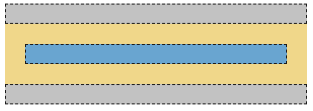
Margin is the space between one element’s border and another element. It’s controlled by a set of margin properties.
margin-topmargin-rightmargin-bottommargin-left
Like the other box model properties, margin is a shorthand for setting all of the properties at once.
margin examples
margin is shown in yellow. It’s applied to the blue element.
margin: 20px;
20 pixels of margin on all sides.
margin: 20px 0;
20 pixels of top and bottom margin, 0 left and right margin.
margin: 0;
0 margin on the top, bottom, left, and right.
Practice: Box Model
Further Reading: Box Model
Further Reading: The Box Model
There's a lot more to learn about the box model! These resources explain some of the topics we’ve skipped over here, like:
- box-sizing
- margin collapse
display: inline-block- ‘inner’ and ‘outer’ display
Resources
- MDN’s page on the box model explains the components of the box model in more detail.
- Shay Howe’s tutorial on HTML and CSS is another useful explanation of how the Box Model works.
- Colt Steele’s video on the Box Model is great if you enjoy video content
Further Reading: Box model for inline elements
The box model is different for inline elements
One thing that can be pretty confusing: the box model is true for most elements, but... some elements don’t actually work that way!
Elements like <a>, <span>, <strong>, and <em> are inline elements. They don’t go onto a whole new line like a <p> or a <div>. Inline elements get a slightly different version of the box model than block elements.
Here are the differences for inline boxes (from MDN):
- The box will not break onto a new line.
- The
widthandheightproperties will not apply. - Vertical padding, margins, and borders will apply but will not cause other inline boxes to move away from the box.
Horizontal padding, margins, and borders will apply and will cause other inline boxes to move away from the box.
MDN’s page on the Box Model explains more about block and inline boxes.
Practice
Biography page
Wanted Poster
Recipe Site, revisited
Project: Article Styling
Due date: Sunday, November 12
📰 Article Styling
In this project, you'll use what you've learned about web design to style an article page based on an image.
Remember...
- Read the instructions tab in Replit
- Plan before you code
- Debug if you aren't getting the desired output
- Attend office hours if you need additional support
- Ask for help in Discord
Fonts
The easiest and most visible improvement you can make to your typography is to use a professional font
The font-family CSS property sets the font face.
This example sets the font to Garamond, a nice-looking web-safe font.
body {
    font-family: Garamond;
}
There are lots of fonts. For using fonts on a web page, there are two categories you need to know: web safe fonts and custom fonts.
Web Safe Fonts
Fonts are files that the browser needs in order to display each character correctly. Each letter and symbol is represented by the points that make it up, sort of like the pixels that make up an image.
Web-safe fonts are pre-installed on most computers, so you can use them without any other steps. See CSS Font Stack for the list.
Custom Fonts
If you want to use fonts that aren’t already installed on the user’s computer,
you can use a <link> tag to load the font, just like you link a stylesheet.
That way, the browser knows where to download the font before using it.
Google Fonts is a tool for finding and using custom
fonts. You can browse or search for a font, then copy a <link> tag and
font-family rule to use in your site.
Example: Google Fonts usage
For using the font Merriweather in Regular, Italic, and Bold, loading from Google fonts.
Add this to the <head> in index.html
<link rel="preconnect" href="https://fonts.googleapis.com">
<link rel="preconnect" href="https://fonts.gstatic.com" crossorigin>
<link href="https://fonts.googleapis.com/css2?family=Merriweather:ital,wght@0,400;0,700;1,400&display=swap" rel="stylesheet">
And use this as the CSS rule for the text to style (in this case, body):
body {
    font-family: 'Merriweather', serif;
}
Both of these are copied from the Google Fonts page after selecting the fonts.
Try it: Find and use a custom font
Practice choosing and loading a font.
- Visit Google Fonts and set a timer for 5 minutes to explore and choose a font.
- Add that font to your Good Text, Bad Text practice site. You can refer to the example above for what should go in the
<head>tag in your html.- Use the
font-familyproperty to apply your font to the text.
Font stacks and Fallbacks
Since different users have different fonts installed, the font-family property allows specifying a list of fonts. The browser will try each one in order, and use the first one that works.
For example:
font-family: "Lucida Grande", "Lucida Sans", Geneva, Verdana, sans-serif;
With this font stack, the browser will try Lucida Grande first, then
Lucida Sans, then Geneva, then Verdana, then the browser’s default
sans-serif font. The first one that it finds will be used.
Further Exploration: Web Fonts
There's tons more to learn about fonts.
MDN on Web Fonts
Read the MDN page on Web Fonts to learn more about font stacks and setting custom fonts.
- Using
font-faceCSS property to declare your own fonts - Details about how font loading works
- Different kinds of font files
Wrap up
Summary
In this lesson you learned:
- What Web Design is
- How to style text
- How to space elements using content, margin, padding, and border
- How to choose a good color palette
- Some cool project you can build with HTML and CSS
How was this lesson?
Feedback is a gift! We use your feedback to improve our lessons for future students. Thank you!
👉🏿 Submit your feedback below or use this link.
Layout and Multimedia Elements
In previous lessons, you've seen how to create website contents using different HTML elements and adding styles using CSS. This week, we'll focus layout and positioning in CSS, and on multimedia content using new HTML elements.
Learning Outcomes
After this week, you will be able to:
- Use Flexbox, Grid, and positioning to control the layout of elements on the page.
- Use HTML Multimedia elements to embed different contents and interactivity in your website.
Overview
Layout
With the Box Model, you can control the size and spacing in and around elements. But, the box model doesn’t let you position elements anywhere you want.
In this lesson, you’ll learn about laying out the elements on the page.
🚧 Layout can be time-consuming and difficult. Be patient!
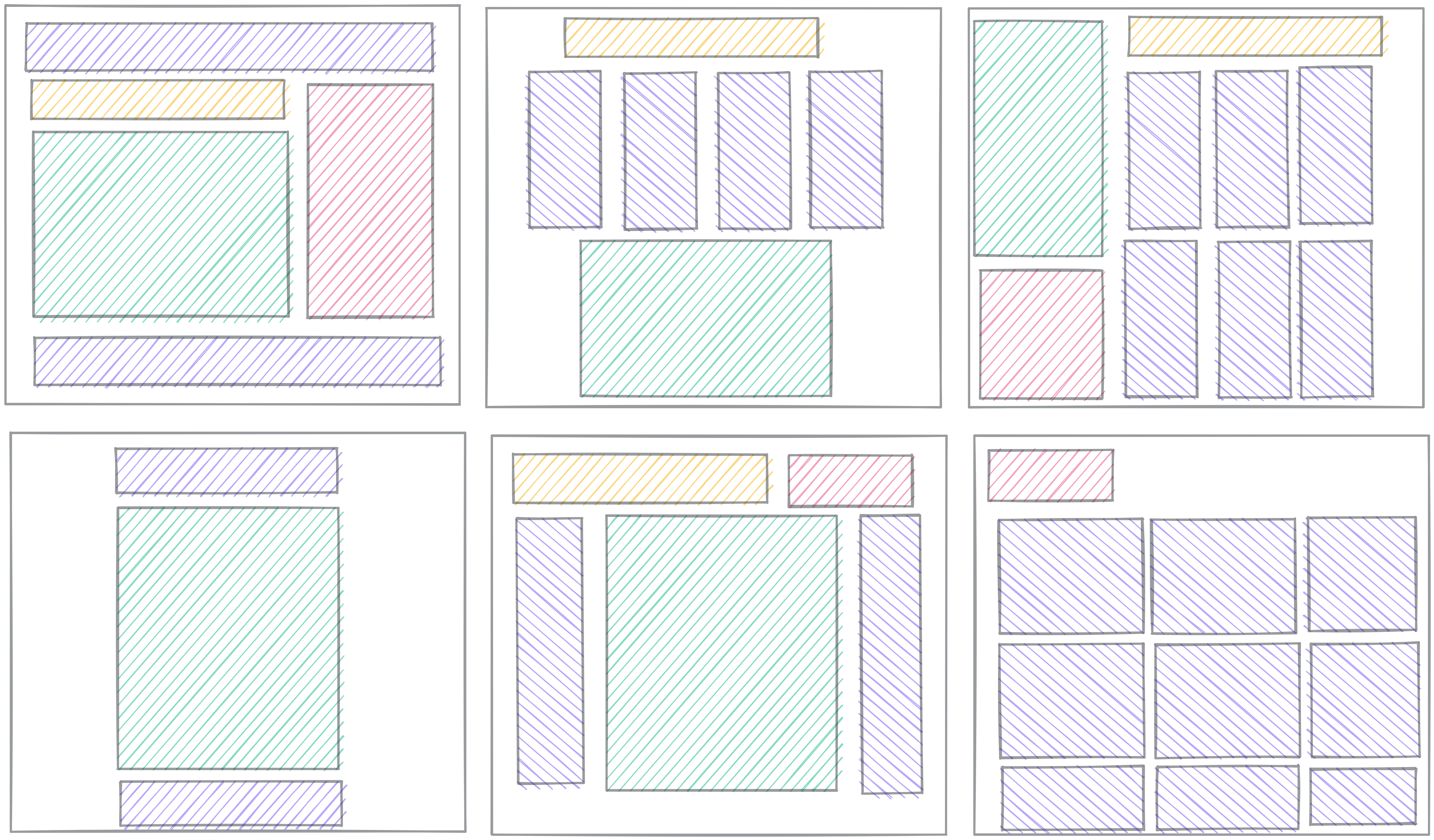
CSS Layout
Layout means controlling the arrangement of the elements on the page.
It’s challenging because it involves the interactions between lots of different properties: the sizes of the elements (per the Box Model), their nesting relationships with each other, and lots of other CSS properties.
We won’t cover every detail about layout in this lesson. We’ll focus on three key concepts:
- Understanding Normal Flow
- The
displayproperty - Flexbox
There are tons more things to learn about layout, but with these four concepts, you should be able to achieve most layouts you want.
Further Exploration: MDN Layout Overview
In this lesson, we’re leaving out things you might want to learn eventually. Left-out topics include:
- Float
- Table layout
- Multi-column layout
- Responsive design and media queries
Check out MDN’s Introduction to CSS Layout for an overview of layout topics.
Display
🎥 Watch this video from WDS on CSS `display`
The display property controls how each element gets treated in the flow.
- Is it treated as block or inline? (the outside display)
- How do elements flow inside the element? (the inside display)
First we'll talk more about block and inline elements, then we'll talk more about another kind of flow called flexbox.
Block and Inline
Block elements get line breaks before and after the element, so they show up on their own line. You can set display: block; to make an element act as a block.
Elements like <p>, <div>, <h2>, and <section> all have display: block; automatically, so you don’t need to set it.
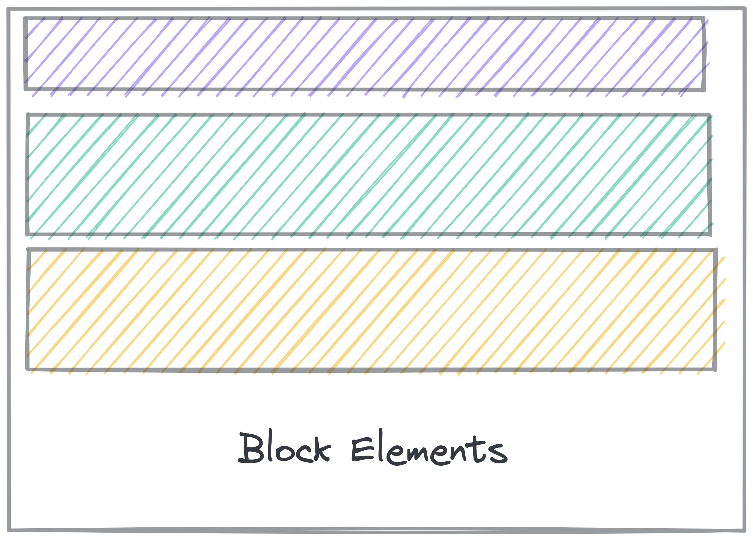
Inline elements don’t get line breaks, so show up inline with other elements.
You can set elements to display: inline; to force them to show inline with other elements.
Elements like <a>, <em>, and <strong> automatically have display: inline;, so you don’t need to set it yourself.
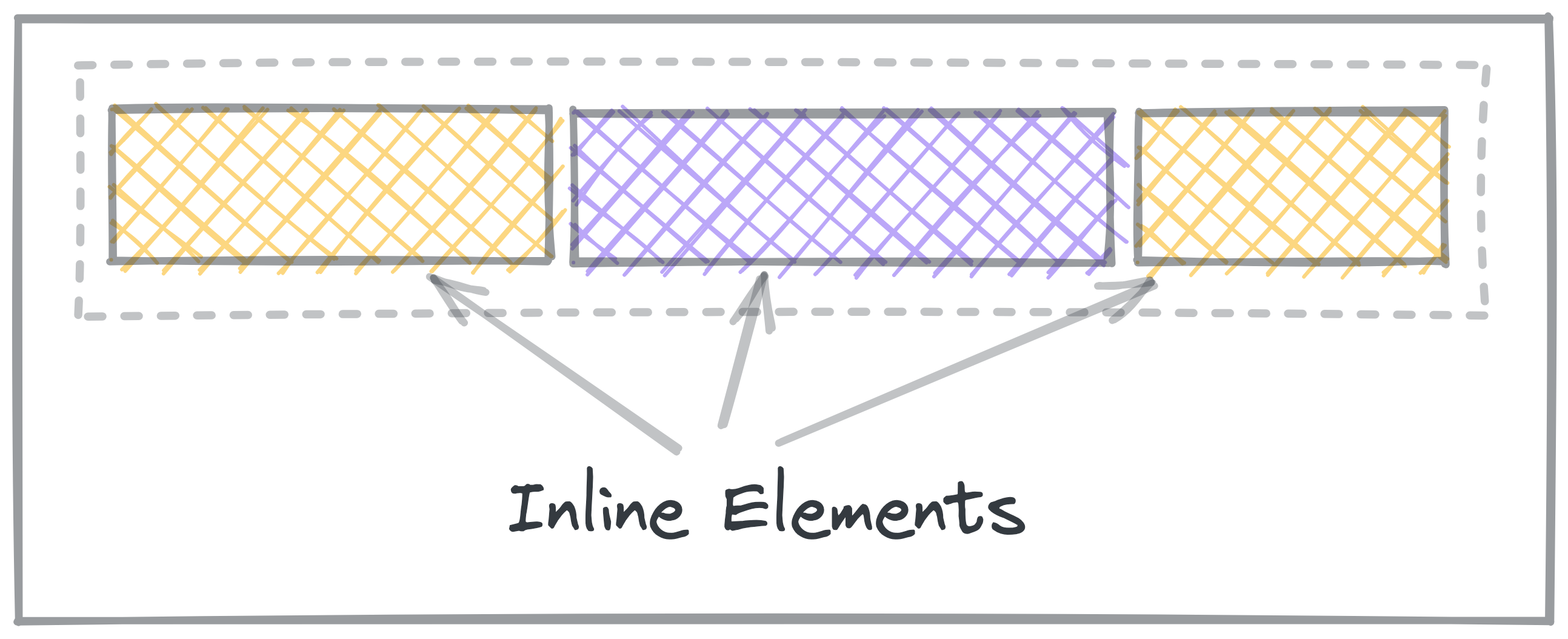
Inline Block elements are a mix of both. display: inline-block makes the
element show up inline, but take up space like a block.
Practice: Block and Inline
Other display values
display: none;
none is a special display value that hides content.
This is particularly useful if you want to hide something, like if it should only appear when a button is clicked.
display: flex;
This turns the contents into a Flexbox.
You'll learn about Flexbox in another lesson.
display: grid;
This turns the contents into a Grid.
You'll learn about Grid in another lesson.
Normal Flow
Normal flow is how elements are laid out on the page by default.
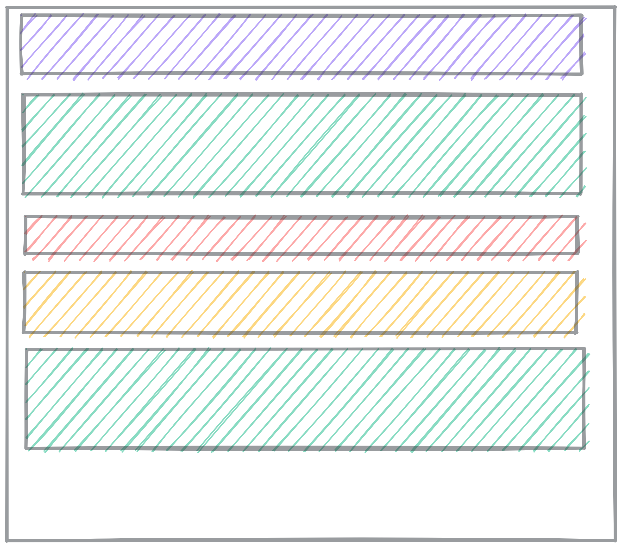
In Normal Flow, block elements stack on top of each other, each on its own line.
-
Block elements fill up 100% of the available width. Usually, that’s the width of the screen. They are as tall as their content.
-
Inline elements, like links and spans, are laid out inside the block elements, and don’t go on new lines.
When you learn about Flex and Grid, those are alternate flow modes. Elements will no longer follow the normal flow rules.
Read more about Normal flow on MDN.
Inside Display
So far, we’ve only talked about Normal flow, using block and inline elements. There are other flow modes that make creating certain layouts much easier.
When you set display to other values, you change how the elements
inside that element get displayed. Instead of Normal flow, they use other
layout rules.
The only other flow mode we’re going to explore in depth is flex. You might
come across grid and table layouts.
The MDN reference on the CSS display property lists comprehensive information about what the possible display values are. You can get by without knowing most of them, but the possible inside display values are flow, flow-root, table, flex, grid, and ruby.
Flexbox
If an element has display: flex, the child elements inside won't follow the
normal flow rules. Instead, they follow a whole different set of rules: the
flex rules.
The basic idea of Flexbox is that the items flex (expand) to fill additional space or shrink to fit into smaller spaces.
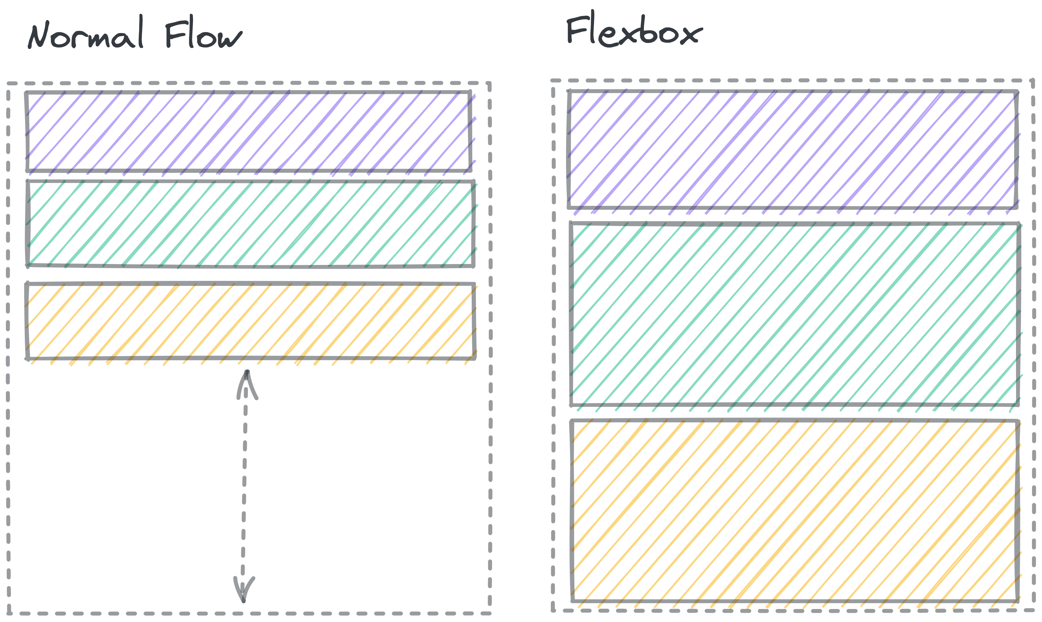
The dashed line shows a container element. In Normal flow, there’s space below the block elements inside the container. In a Flexbox, the elements grow to fill the whole space.
If you set an element to display: flex;, it acts on the outside like a regular block element. On the inside, elements no longer follow Normal flow. Instead, that element becomes a flex container, and the items inside get laid out according to the flexbox rules.
Flexbox gives you lots of tools to change the way the elements move to fill the space.
You can change:
- The direction of the box (columns or rows)
- The space between items
- The horizontal and vertical alignment of the elements within the box
- Whether or not elements will wrap around if they get crowded
- Which elements grow and shrink, and by how much
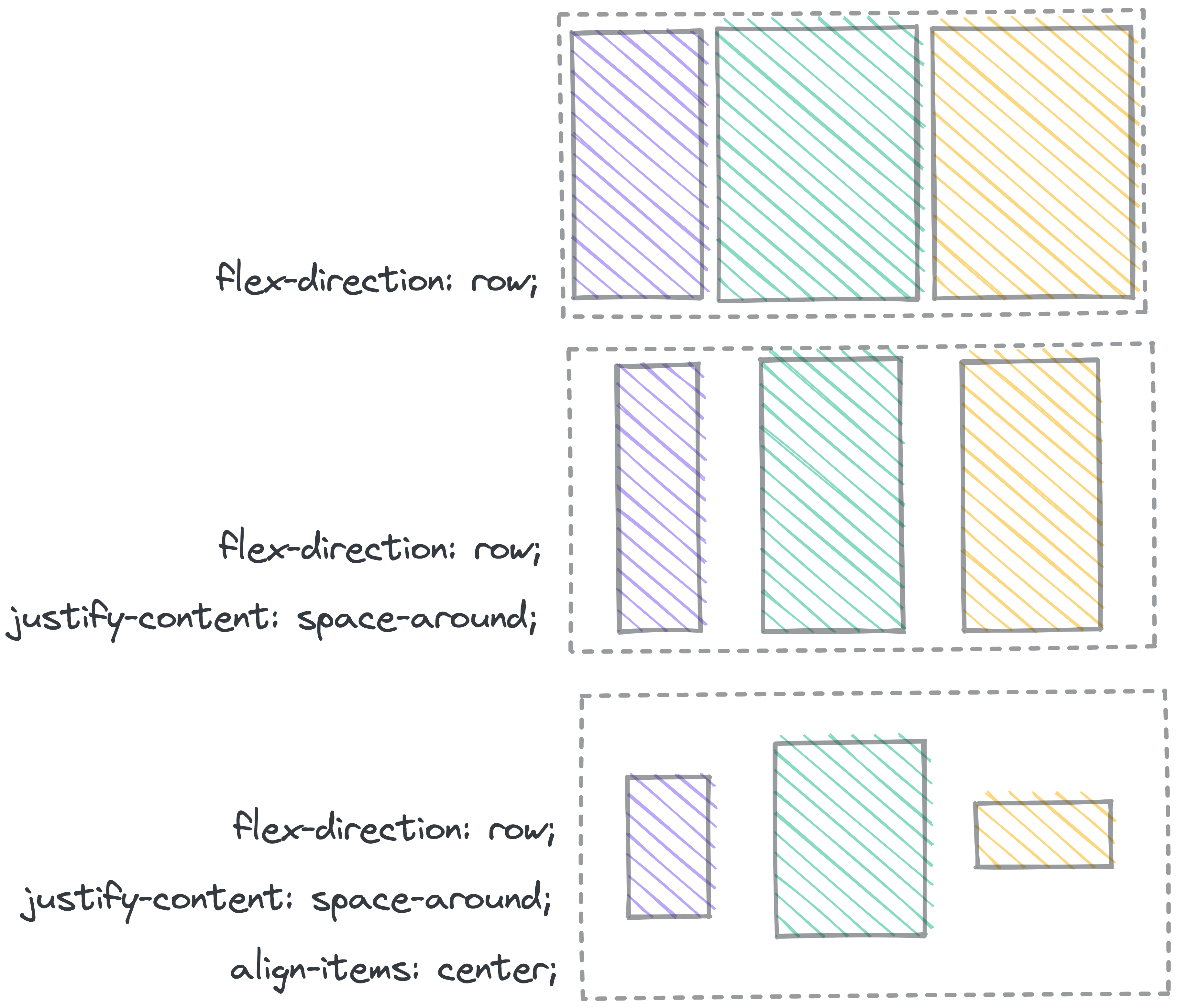
Further Reading: Flexbox
Josh Comeau's Interactive Guide to Flexbox has a great walkthrough of the different properties and how to build a strong mental model for flexbox.
MDN’s page on Flexbox goes into great detail about the details of how Flexbox works.
Practice: Flexbox Froggy
CSS Grid
CSS Grid is a layout framework native to CSS. It's a way to position elements on a page consistently while taking the device width and height into account.
That video contained a lot of information! So let's highlight the important bits:
- CSS Grid is a way to structure elements on the web page.
- A grid container is the parent elements and contains the grid items.
- A grid item is the child element and lives inside the grid container.
- The grid only applies to the grid items, not the elements inside a grid item.
The grid container and grid item are structured like this:
<main> <!-- This is a grid container -->
    <h1>The title</h1> <!-- This is a grid item -->
    <ul> <!-- This is a grid item -->
        <li>One</li> <!-- This is NOT a grid item -->
        <li>Two</li> <!-- This is NOT a grid item -->
        <li>Three</li> <!-- This is NOT a grid item -->
    </ul>
    <section> <!-- This is a grid item -->
        <p>We're explaining grid!</p> <!-- This is NOT a grid item -->
    </section>
    <footer> <!-- This is a grid item -->
        <p>The end</p> <!-- This is NOT a grid item -->
    </footer>
</main>
- There can be multiple grid elements on a page.
- A 1x1 unit in a grid is a cell
- A collection of cells is a grid area
- A grid row is the horizontal direction of the grid
- A grid column is the vertical direction of the grid
- A grid gap is the space between grid cells, you can't put elements in grid gaps
- There are lines that define the boundaries of the cells, and they’re numbered
The Syntax
We can define a grid in CSS by specifying the display rule on the element. So if we use the HTML from above, we can have CSS that looks like this:
main {
    display: grid;
}
You may not notice a difference immediately but if you inspect the web page, you will see that the main element
does have a display of grid and you can switch on the grid outlines to show you where the lines, rows and columns are.
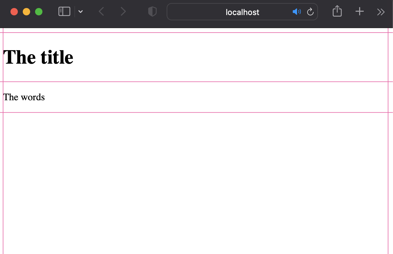
So now let's position our grid items the way we want on the page. I want my h1 to be at the very top then my ul
and my section to be side by side and then my footer to be below everything. It should look like this:
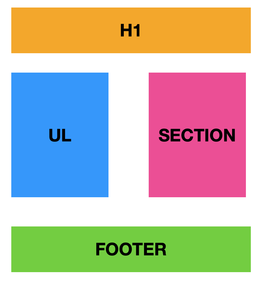
First, let's position the h1, since it's already the first grid item and I want it to be on it's own row, I can
rely on the browser to display the default, but I want to make sure it'll span the length of the row. So I should
define that explicitly:
    h1 {
      grid-column-start: 1;
      grid-column-end: 3;
    }
See how the h1 now spans across the length of the page? This is how we explicitly define the width of the
grid-area. I haven't defined the height of the area because I'm relying on the implicit grid, which by default will
only take the space of one row.
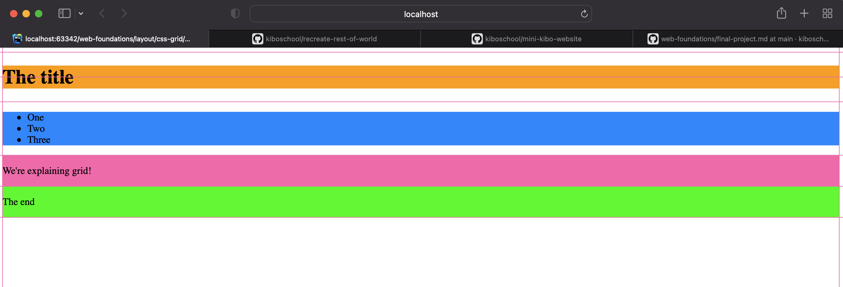
Now it's time for the ul and the section. Remember: the elements within the ul and section aren't grid items!
    ul {
        grid-column-start: 1;
        grid-column-end: 2;
        grid-row-start: 2;
        grid-row-end: 10;
    }

    section {
        grid-column-start: 2;
        grid-column-end: 3;
        grid-row-start: 2;
        grid-row-end: 10;
    }
For each element, I have to define which line I want the start and end my column and which lines I want to start and
end my row, so using the line numbers, and the start and end suffixes for both the columns and rows, I can
define the grid-area for these elements. Now the page looks like this:
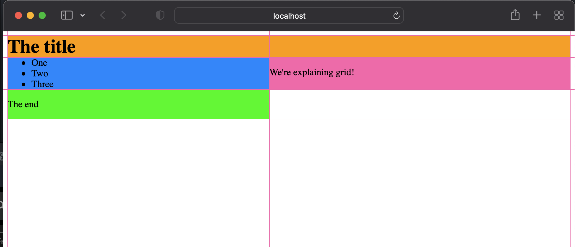
So now, the footer needs to be the same width as the h1, just like in our diagram, and for that, we can copy the
rules for the h1
    footer {
      grid-column-start: 1;
      grid-column-end: 3;
    }
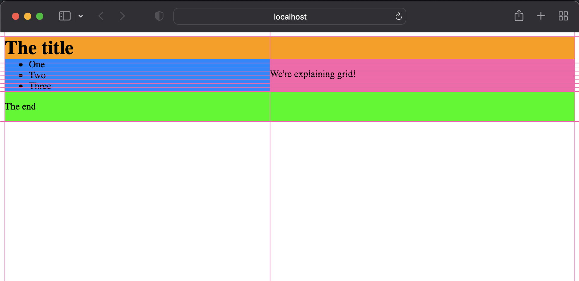
We're almost done but there's still something missing. Most of the elements are touching since they start from the same lines. We should add a grid gap to the grid container so that there's a little more space between the elements.
    main {
      display: grid;
      grid-gap: 50px;
   }
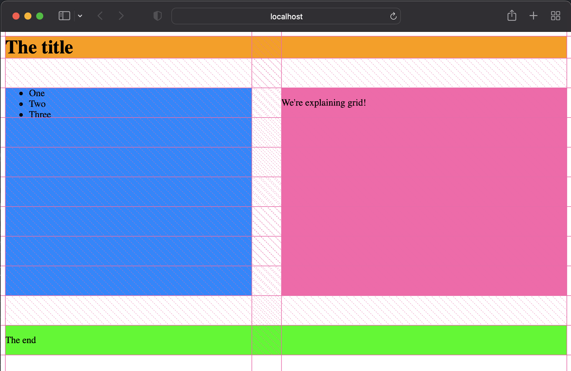
That's it!
Practice: Outline the Grid
Positioning
The position property can break Normal flow. Unlike flex, which makes a container where the normal flow rules don’t apply, position can take an individual element out of the flow.
There are five values for position.
position: static;
position: relative;
position: absolute;
position: fixed;
position: sticky;
See the MDN docs for position for more, and for an interactive example.
Static
static is how elements are positioned by default. The normal flow rules apply.
position: static;
Relative
relative means the element shifts from where it would normally be positioned.
top, bottom, left, and right are used with position to specify where to move the positioned element.
position: relative;
top: 40px; left: 40px;
The yellow box is shifted 40px from the top and 40px from the left of where it started.
Absolute
Absolute positioned elements are out of the flow.
position: absolute;
top: 40px; left: 40px;
The yellow box is out of the normal flow, so the blue boxes act as if it isn’t there.
The top and left values are calculated from the parent element, instead of where the box started.
Fixed
Fixed position means that as you scroll, the element stays in the same spot on the screen, within the scroll window.
Like absolute, fixed elements are removed from the flow, and they calculate the top and right values from the containing element.
position: absolute;
top: 80px; left: 10px;
Scroll the example to see how the block stays in place while the rest of the page scrolls by.
Sticky
position: sticky is really cool. It works like relative, until the element reaches the edge of the scroll window.
Then, the sticky element is ‘stuck’ to the top of the scroll window, until you scroll past the end of what it’s contained in.
position: sticky;
Scroll the example to see the effect.
Further Exploration: Position
MDN’s page on positioning provides more detail on the
positionproperty and how to use it.
Practice: Absolute Robot
🤖 The face has fallen off the robot!
Practice using the
top,left, andwidthCSS properties andposition: absoluteto create a zany and fun face on the robot.
Multimedia HTML Elements
Multimedia includes different content you can insert into your website, such as
- video
- music
- voice notes
- maps
- slides
- animations
- ... and more!
In this lesson, you'll review the image tag, since it's similar to how other multimedia elements work. Then you’ll learn new multimedia HTML Elements.
Finally, you can review some of the elements you already know that create interactivity.
Review: Images
A lot of the new interactive elements work similarly to how images work.
<img src="valley-waterfall.png" />
The src attribute tells the browser where to find the image file, and the browser inserts the image at that spot in your site.
When styling images, you have to think about the width and height carefully so that you don’t break the aspect ratio. If an image is normally 100px by 100px, and you make it 50px by 200px in CSS, that will stretch out the image, and it will look bad.
When styling the new interactive elements, you’ll have to think about the same ideas: where’s the source url, and how do I style the element so that it looks right on the page.
<iframe>
Inline frames allow you to embed content from another site into your site. You can use them to embed tons of different kinds of content. In this curriculum, we use tons of embedded content — YouTube and Loom videos, forms, and interactive coding exercises.
A typical iframe might look something like this, which embeds a video from youtube.
See the Pen Iframe Demo by Rob Cobb (@rrcobb) on CodePen.
The src, width and height attributes are familiar from the <img> element.
srcis the url where the browser should find the contentwidthandheightcontrol the width and height of the element
The other attributes are new:
titlesets the title of the iframeframebordercontrols the border of the iframe. It’s often good to set it to0allowandallowfullscreencontrol the permissions that the iframe has. Since the content is coming from another website, you can decide what it is allowed to do.
Further Reading: iframe
- See the full documentation for iframe elements on MDN
- Check out the page on embedding technologies.
- You can also read more about iframe’s allow attribute on MDN.
Audio and Video
The <audio> tag is a built-in audio player. It lets you add audio content to your page, which the user can click to play.
<audio controls src="t-rex-roar.mp3"></audio>
Similarly, the <video> element is a built-in video player.
<video controls width="250" src="flower.webm"></video>
src and width work the same way they do for img and iframe.
The new attribute is controls. With controls added, the audio or video player will show the controls: play, pause, and volume.
It’s usually good to show the controls, since otherwise the user won’t be able to control the video or audio on the page. Usually, if they can’t control the audio or video, they’ll close the page instead of letting things autoplay.
src and source
<audio> and <video> tags allow specifying sources using <source> tags instead of the src attribute.
<video controls width="250">
    <source src="flower.webm" type="video/webm">
    <source src="flower.mp4" type="video/mp4">
</video>
Specifying multiple sources lets browser choose which kind of content to support. There’s fancy new formats like .webm that only some browsers can use, so if you write your code using <source>, users who have those browsers get the fancy new formats, and other users still get something that works for them.
Further Exploration: Multimedia and Embedding
For more, check out
- The MDN page on Video and Audio content
- The video tag page on MDN
- The audio tag page on MDN.
- The MDN guide on Multimedia and Embedding covers many ideas related to this lesson in more detail.
- The HTML Canvas element is used for programmatically drawn content.
Practice: Maps and Videos
📺 Practice using the
<iframe>element by embedding a map and a video into a page.
Practice
Improve the Kibo mini website
Project: Layout the Recipe Cards
Due date: Sunday, November 19
📰 Layout the Recipe Cards
In this project, you'll use what you've learned about layout to properly layout and position a page based on an image.
Remember...
- Read the instructions tab in Replit
- Plan before you code
- Debug if you aren't getting the desired output
- Attend office hours if you need additional support
- Ask for help in Discord
Wrap up
Summary
In this lesson you learned:
- New HTML elements that create interactivity
- Layout ideas like flow, block, and inline
- To use CSS flexbox to control element layout
- CSS Position and some of the effects you can control on a page with
fixedandsticky
How was this lesson?
Feedback is a gift! We use your feedback to improve our lessons for future students. Thank you!
👉🏿 Submit your feedback below or use this link.
Bonus: More Styling and CSS
We skipped over tons of topics in the lessons. This section has some further, optional information that might be useful.
Responsive Design
Designing for different screen sizes is hard! MDN has a few guides on strategies for responsive design that you can read.
- Responsive Design gives an overview.
- Responsive Images details how to include images that work well across screen sizes
- Media Queries are a core tool you can use to adapt to different screen sizes.
CSS Units
So far, we’ve used pixels (px) as the units in our examples. CSS has lots of different kinds of units that are useful in different situations.
Pixels are not the only units! CSS actually has more than 10 units you can use. For now, the only one we’ll mention is em. 1em is the same as saying “the current font size”. So, to make text three quarters the size of the surrounding text, you could use font-size: 0.75em.
You can also specify values in terms of percentages. An element with width: 50% will try to take up 50% of the width of its parent element.
The MDN page on CSS values and units goes into depth about the different units available for different values.
Overflow and Scrolling
Content doesn’t always fit within the width and height of the containing element.
What happens to that overflowing content? It might scroll horizontally or vertically, it might spill out of the containing box, or it might get hidden.
Read more on MDN about handling overflowing content.
The margin: auto trick
Setting margin: auto is a one way to center an element horizontally. It sets the left and right margins to whatever is needed to center the element. It doesn’t work for vertical alignment.
z-index
When CSS boxes overlap, which one shows up on top?
The z-index property decides.
The name "z-index" comes from thinking about the screen's x and y dimensions. If x and y are left/right and up/down directions on the screen, then the ‘z’ dimension is "popping out of" and "going into" the screen.
z-index is tricky to use, in part because it’s hard to see and think about. To learn more about it, check out the MDN reference on z-index, and the MDN series on Understanding CSS z-index.
Further Reading: Web.Dev's Learn CSS
If you’ve finished these resources, and still want to learn more about CSS, check out Learn CSS from web.dev.
It’s a free resource from Google and others that covers CSS topics in even more detail.
Bonus: Interactive HTML Elements
You have already seen elements and properties that help create interactivity.
They don't have to be multimedia elements to create interactivity!
<a>
Perhaps the most fundamental interaction on the web is clicking a link.
See the Pen Link Demo on CodePen.
<details> and <summary>
You may have also seen the <details> and <summary> elements which creates a toggle element that shows the details when you click the summary.
See the Pen Untitled by Rob Cobb (@rrcobb) on CodePen.
You've seen this combo in action!
We use the details and summary components in the lessons to hide away some of the content under a toggle.
There is always more underneath!
:hover and :cursor
You’ve also learned a couple of CSS tricks that create some interactive feeling:
- Using the
:hoverselector to style elements when they are hovered (hover on MDN) - Using the
cursorproperty to style the cursor (cursor on MDN)
See the Pen Untitled by Rob Cobb (@rrcobb) on CodePen.
These are basic kinds of interactivity, but don’t forget about them!
Publishing and Sharing
Now that you can make websites, you need to be able to publish them and share them! That's what these lessons are about.
Learning Objectives
You'll learn to:
- Publish your website using Github Pages
- Use HTML tags to control the preview when you share the link to your site
- Set up a domain name, so that your site shows up when someone types in the URL, like devtools.programming.africa
How the internet works (again)
You’ve explored how HTML, CSS, and JS come together to make the features on a webpage. Now, let’s take a step back to talk again about how the web works. That way, you can publish websites and share your projects with friends, family, and (maybe) with strangers!
How the Web Works
Our picture of how the web works so far is like this:
- Your browser asks the server for a webpage
- The server sends back HTML, CSS, and JS files (plus images, videos, and other files)
- The browser puts those files together to make the webpage
What’s missing?
There’s a lot that this picture leaves out.
- Domain Names: how does your browser take a URL like kibo.school and find the address of the server to ask for the files?
- Backend Software: how does the server actually send the files back?
- Hardware: things like wires, wifi, routers, and cell towers
- Packets: how do the server and browser actually send the files? What happens if parts of the files don’t make it?
- Search: how does Google know about all the web pages? How does it know which pages to show you when you search?
- Security and Privacy: how do browsers and servers use encryption to protect your information?
- And lots more!
This week, we’ll focus on Domain Names, since that’s what you need to know about to publish and share your site.
Code.org videos about the Internet
What else you’ll learn
In the next few lessons, you’ll learn:
- To use Github Pages as the server for your site
- How to configure a custom domain name
- Other tips and tricks to make sharing your site great
Draw the Internet: Revisited
Publishing your site
You want to share your website with someone else. That means that somewhere, there has to be a server to send the files to the browser.
Publishing using Replit
Every Replit web project has a built-in published version. You don’t need to do anything special to publish your Replit site, it’s automatically published.
When you run your code, the preview window has a public URL and an “open in new tab” button that links to your site. So cool!
Replit acts as the server for your files.
This is great! You can share the link with anyone you want, and they can see your site.
There are a couple downsides:
- Replit sites go to sleep after a while. They take a little while to wake up.
- The url for the site is bad looking and hard to remember.
- Who would remember to type in https://210-recreate-the-rest-of-world-homepage-zkibostudent1.tk5-web.repl.co/ ?
Using Replit to publish and share your sites can be great!
Publishing using Github Pages
Github Pages are easy to use if your code is already on Github.
Even if it's not, the steps are simple:
- Sign in to Github
- Add your code to a Github repository
- Publish your new Github repository using Github Pages
Create a Github Account
If you already have a Github account, just sign in. Otherwise, visit https://github.com/ and click Sign Up. From there, fill in your information and confirm your email address.
Connect your Replit project to Github
Replit knows how to connect your project with Github, and store and sync the code. If you want the same project to be on Replit and Github, here's how.
Here’s a recap of the video
- Pick a Replit project you’d like to store on Github and publish through Github Pages. (the project doesn’t have to be done yet!)
- In the Replit project, click the branching tree icon for Version Control (it’s on the left panel below the files icon)
- Click “Connect to Github”
- Replit will prompt you to connect your Github account to your Replit account. Follow the prompts. Select “All Repositories” when prompted.
- Go back to Replit after you’ve finished the steps to connect your accounts.
- Click “Connect to Github” again. This time, it will allow you to enter the name of a new Repository (Github’s term for a project).
- You can add a name and description for your project, which will show up on Github.
- A “Public” repository will be visible. If you want other developers to see it, make it public.
- The code for a “Private” repository will not be visible, but you can still publish the site using Github Pages.
Publish your project using Github Pages
Here’s the steps:
- Go to the Repository for your project on Github
- Click “Settings” from the menu
- Click “Pages” on the left sidebar
- Select a branch (there should only be one, called
main) and click “Save”
Your site should be available on Github Pages with a github.io domain name in a few minutes.
You can see the Github repo here: https://github.com/kiboschool/demo-recipe-site
And the live Github Pages site here: https://kiboschool.github.io/demo-recipe-site/
More About Github
For developers, Github is like Instagram or TikTok. It’s a place to share and remix ideas, see content from other developers, and to get a sense of what’s going on. Unlike other social media, Github is also a serious professional tool, used by teams of thousands of engineers to build complex software projects.
Sharing projects on Github is a typical way that developers show off their skills and build their portfolio of work. Github stores your code. It also has a built-in free publishing tool called Github Pages.
We haven’t covered anything about Git, the version control tool at the heart of Github, but you can use Github’s Pages feature without knowing everything about Git.
Other Servers and Hosts
There are lots of other services available to act as the server for your webpages. We aren’t going to mention them here, but it’s worth knowing that these aren’t your only options.
- There are other tools like Replit and Github that serve your pages as you’ve designed them.
- There are also tons of tools for writing custom servers, so your code decides what to send to the client.
Next, you’ll learn how to setup your website on its own custom domain.
Domains and hosting
Domain Names
To give your site a custom URL, you need to have the Domain Name. Domain Names are how your browser finds the server to talk to for a particular URL.
Domain names are like google.com and kibo.school: the part of the url after the protocol (https) and before the page (/search or /degree)
IP Addresses & DNS
To recap:
- The Domain Name System (DNS) is how your computer finds the address (like 162.159.135.42) like for a name (like kibo.school)
- DNS uses a distributed hierarchy of DNS servers. When one DNS server doesn’t know the answer, it asks another “higher” DNS server.
- 👑 “Root” DNS servers manage the top level domains, like .com and .org
Further Reading: MDN on Domain Names
See the MDN page What is a Domain Name? for more
What does it mean to own a domain name?
When someone buys a domain name, they get to decide which IP address the name points to. When Ope bought the kibo.school domain, she set the address to 162.159.135.42. That’s the address of the Kibo server (right now, it's a managed Wordpress site, if you were curious).
Website building and publishing steps
Making kibo.school involves these steps:
- Build the site (using HTML, CSS, and JS)
- Publish the site on a server
- Use DNS to make the kibo.school point to the server’s IP address
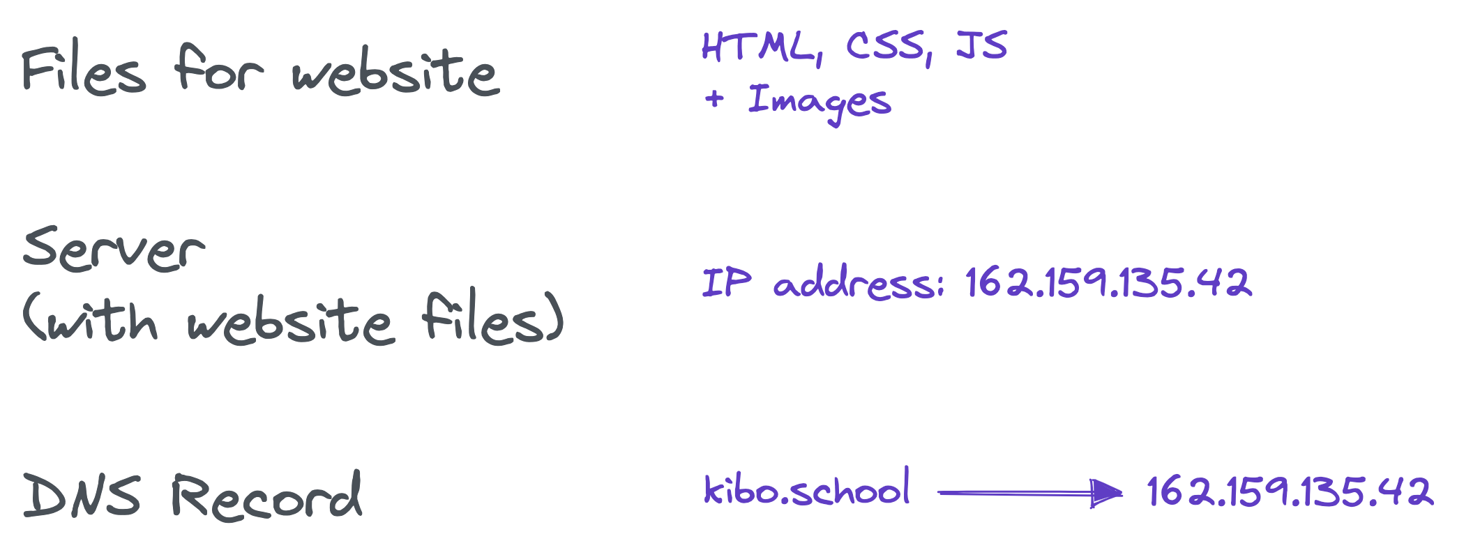
How does your browser load kibo.school?
When you type kibo.school into your browser:
- Your browser asks DNS for the address of kibo.school, and gets back 162.159.135.42
- Your browser asks 162.159.135.42 for the actual webpage
- The server at that address sends back the files that make up the site you see (HTML, CSS, and JS, plus images and videos)
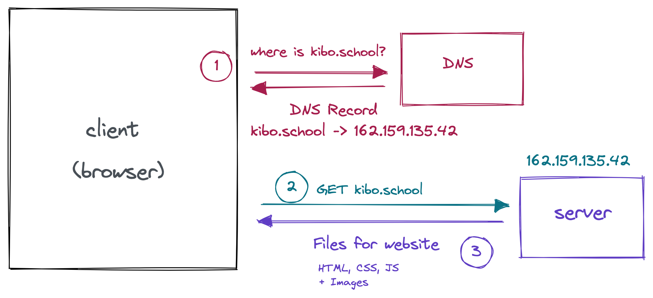
Getting a Domain
Okay, how do you actually get a domain like kibo.school, so that you can set up a website?
For most websites, you buy a domain. Some are expensive, and others are relatively cheap. There are also some services that offer free domains, which we’ll talk about too.
Paid Domains
When you buy a domain, you are registered as the owner, usually for some number of years.
That gives you the ability to configure the DNS records, usually through a registrar. Often, the same companies that sell the domains will act as the registrar and allow you to configure DNS records.
Domains usually start at $5-$10 USD. There are often discounts for the first year of owning a domain. Some domains are more expensive: popular sites, business addresses, and short or memorable domain names sometimes cost thousands or millions of dollars!
Further exploration: Domain pricing
The price often depends on the top level domain (TLD). TLDs are like .com or .org or .gh. Depending on the TLD, the price for a similar name might be very different.
There are lots of tools for searching and buying domains. Google Domains is a relatively high-quality tool. In the past, folks from our team have also used Hover, NameCheap, Vercel, and others. We recommend using Google Domains if you are searching for or buying a domain. You may find a better price elsewhere, though!
Free Domains
There are lots of hosting providers that will give you a free domain if you pay to host your site with their service. It’s usually not worth it, because their hosting is usually pretty bad.
There are some actually free domains available too (though registration is still required):
- Replit and Github Pages offer domains that have
.repl.coand.github.ioat the end, for free. - Sites like Neocities let you make your own website and host it on a
.neocities.orgdomain for free. You can pay for a different domain name. - Co.vu offers free
.co.vudomains - Freenom offers free .TK, .ML, .GA, .CF, and .GQ domains, but reviewers say that it often doesn’t work.
The free domains are typically not as nice as domains you pay for.
Walkthrough: Configuring DNS for a real domain
Video Recap
- Starting point:
- Already bought a domain using Google Domains
- Already have a site published using Github Pages
- Add a Custom Domain on the Github Settings page
- Follow the instructions in the Github error message
- In Google Domains, click to DNS in the sidebar navigation
- Add a CNAME record
- With host name that matches your Custom Domain on the Github side (
recipe.kibo-demo.clubin the video) - And data that match the github.io domain that you can copy from the error message (
kiboschool.github.ioin the video)
- Be patient
- Wait for a while, since it might take a few minutes.
- It’s easy to mess things up, so take your time and be patient with yourself.
Sharing your work
Some of the sites you’ve made in this class are just for practice. Others are really cool, and you should be proud of them! You might want to show them off 🤔
This lesson is a collection of tips for making your site nicer for sharing.
Test your site
⚠️ Test your site ⚠️
- Load your site.
- Note any issues or areas for improvement. Is there anything that’s unclear?
- Fix those areas
The most basic tip is also the most important. You need to test your site.
More testing strategies
Some testing strategies that you might not think of immediately:
- Devices: Test your site on different devices, at different widths. Make sure it looks right when it’s a different size.
- Share with others: Show your site to other people, and ask them for feedback. They will notice things that you don’t.
- Remember that users don't know anything: Consider what someone else will know when they come to your site. The purpose of your site may be obvious to you, but it will not be obvious to them.
There are a lot of tools and tricks for testing websites to make sure they are great. Lighthouse is a tool built right into the Browser DevTools, which will make suggestions geared towards improving performance and accessibility.
Write a Readme
If you are sharing your code with developers or with an employer, you should write a Readme file.
A Readme is a file that explains what the project is about. It explains things like what you were thinking, who the project is for, what tools you used, and how someone might contribute.
Readme files
On Github and Replit, the Readme file serves as a landing page for a project. Since Github is a social site for developers, Readme pages are a really important way of communicating to other developers.
If you visit the Github page for the DevTools Scavenger Hunt, you’ll see that the Readme explains what the site is for, and links to more information about Kibo. The expectation is that other developers might see this page, and read the Readme to learn about the site and about Kibo.
If you are putting your work on Github, other developers might find it! The best thing you can do to make your online developer profile stand out (other than make great projects) is to write clear a Readme for your project.
Title and Favicon
What shows up in the tab bar for the page is the title and favicon.

You can control these!
- The
<title>tag determines what text shows in the tab bar. - A file typically called
favicon.icocontrols the icon for the site.
Further reading: MDN on Title and Favicon
See MDN’s guide on metadata in the <head> tag.
MDN also has more information about showing different versions of the favicon depending on the screen size.
Sharing meta tags
When you share a link to a site on Discord, there’s a preview of the site. It shows the title, an image, and a description of what you’ll find if you click the link.
You can control how that preview looks!
The <title> tag determines what title will show in the social preview. In addition, various <meta> tags control how other elements of the preview will show.
Meta tags demo
Here are the meta tags for the peanut stew recipe page, and the result:
<!-- Primary Meta Tags -->
<title>Kibo Demo | Chicken Peanut Stew Recipe</title>
<meta name="title" content="Kibo Demo | Chicken Peanut Stew Recipe">
<meta name="description" content="(demo for learning web development)
This recipe for Chicken Peanut Stew has everything going on. It's sweet yet fiery, crunchy yet smooth. Adapted from Marcus Samuelsson.">

<!-- Open Graph / Facebook -->
<meta property="og:type" content="website">
<meta property="og:url" content="https://metatags.io/">
<meta property="og:title" content="Kibo Demo | Chicken Peanut Stew Recipe">
<meta property="og:description" content="(demo for learning web development)
This recipe for Chicken Peanut Stew has everything going on. It's sweet yet fiery, crunchy yet smooth. Adapted from Marcus Samuelsson.">
<meta property="og:image" content="https://metatags.io/assets/meta-tags-16a33a6a8531e519cc0936fbba0ad904e52d35f34a46c97a2c9f6f7dd7d336f2.png">

<!-- Twitter -->
<meta property="twitter:card" content="summary_large_image">
<meta property="twitter:url" content="https://metatags.io/">
<meta property="twitter:title" content="Kibo Demo | Chicken Peanut Stew Recipe">
<meta property="twitter:description" content="(demo for learning web development)
This recipe for Chicken Peanut Stew has everything going on. It's sweet yet fiery, crunchy yet smooth. Adapted from Marcus Samuelsson.">
<meta property="twitter:image" content="https://metatags.io/assets/meta-tags-16a33a6a8531e519cc0936fbba0ad904e52d35f34a46c97a2c9f6f7dd7d336f2.png">
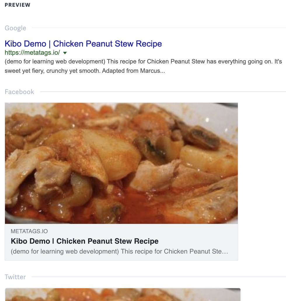
🏷️ Metatags.io lets you build and preview the
<meta>tags for multiple sites at once. It also has a bunch of helpful tips about what the different tags mean, and how they are relevant to how a brand is perceived on social media, in search, and more.Try it: go to Metatags.io and generate the meta tags for your site.
When should you share your site?
For some people, sharing comes naturally. Others are more shy, and hesitate to share their work.
We encourage you to share your work early. Here’s (just some) of the reasons why:
- It’s motivating when others see what you’ve learned and created.
- You’ll get feedback about what you’ve made, which helps you learn
- Sharing your project helps others to learn
Sometimes sharing is uncomfortable!
It’s okay to tell people when you share “I’m just a beginner, and this was my student project”, if that helps you feel better about sharing your work.
Practice
HTML Slideshow Readme
Add Cool Link Previews
Publish and share a site
Instead of focusing on building from scratch, this project asks you to polish a previous project, publish it, and share it.
There isn’t a separate repo for you to start or submit this project. We’ll see your work when you share it in Discord!
Wrap up
Summary
In this lesson you learned:
- more about how the internet works under the hood
- how to publish your site so that others can see it
- how to improve your site so that it looks great when you share it
How was this lesson?
Feedback is a gift! We use your feedback to improve our lessons for future students. Thank you!
👉🏿 Submit your feedback below or use this link.
Bonus: More about DNS
You don't need to know this to publish your site, but in case you were curious about DNS, here's more info.
DNS Records
In the lesson on domains and hosting, you learned what DNS is for. Now let’s talk a about what it actually looks like! The graphic showed the record like this:
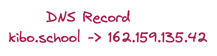
At its heart, DNS is really simple: it matches a name and a value. In this case, the name kibo.school is matched with the value 162.159.135.42
The actual DNS record looks like this:
kibo.school. 3600 IN A 162.159.135.42
This says that kibo.school points to 162.159.135.42. It’s also got some extra info:
- There’s an extra
.afterkibo.school - There’s a TTL of
3600 - It’s an
INsearch - It’s an
Arecord
The extra dot means that it’s an absolute domain name. You can basically ignore this. (If it bugs you, you can read an explanation here.)
TTL stands for “time to live”. It says how long a DNS server should keep a copy of this record before it checks again. If it’s shorter, updates to the DNS record will show up faster, but the website might load slower.
A is the type of record.
IN is for INternet. All DNS records are IN.
Types of DNS Records
There are lots of different types of DNS records. Different types tell different kinds of information, like:
MXrecords: The email server is located at this addressCNAMErecords: This name points to a different name (instead of an IP address)
A records match a domain name to an IP address. For matching the domain [kibo.school](http://kibo.school) to the address 162.159.135.42, we use an A record.
As noted in the video, IP addresses like 162.159.135.42 are version 4 addresses. AAAA records are for IP version 6.
Further Reading: DNS
Cloudflare is a popular service for DNS management, among other services and tools.
Their help center has great explanations on What is DNS? and DNS records.
Try it: Mess with DNS
👉🏿 Get hands-on practice creating DNS records to tell browsers where to find different websites.
Questions about DNS
🤔 You’ve probably learned some pieces about DNS, but not everything.
Check your understanding of DNS and learn some more facts about DNS with this interactive game.
Further Reading
Julia Evans, creator of Mess with DNS and DNS Questions
Julia makes tons of awesome comics, like this one on How to be a Wizard Programmer.
You can find more of her work online at https://wizardzines.com/.
Julia’s blog post about the process of creating the Mess with DNS tool is a really fun read!
She also has DNS-specific blog posts about resolving DNS in Go and making DNS queries in Ruby.