CSS Grid
CSS Grid is a layout framework native to CSS. It's a way to position elements on a page consistently while taking the device width and height into account.
That video contained a lot of information! So let's highlight the important bits:
- CSS Grid is a way to structure elements on the web page.
- A grid container is the parent elements and contains the grid items.
- A grid item is the child element and lives inside the grid container.
- The grid only applies to the grid items, not the elements inside a grid item.
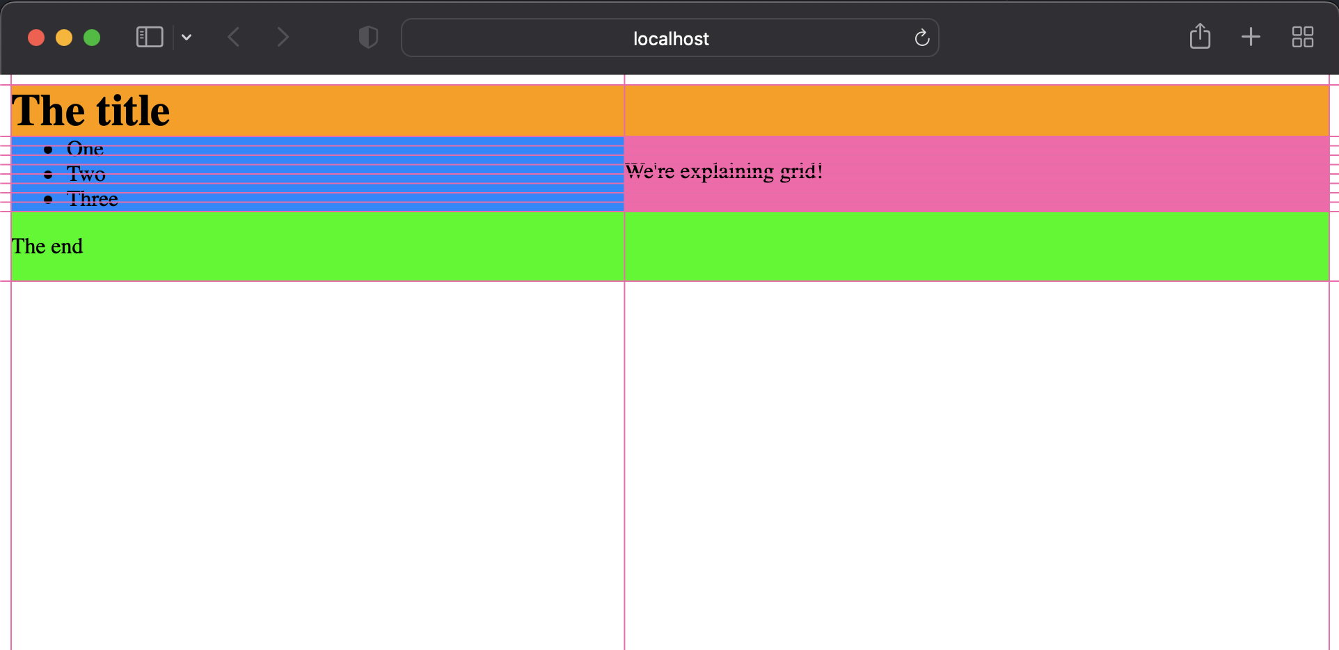
The grid container and grid item are structured like this:
<main> <!-- This is a grid container -->
    <h1>The title</h1> <!-- This is a grid item -->
    <ul> <!-- This is a grid item -->
        <li>One</li> <!-- This is NOT a grid item -->
        <li>Two</li> <!-- This is NOT a grid item -->
        <li>Three</li> <!-- This is NOT a grid item -->
    </ul>
    <section> <!-- This is a grid item -->
        <p>We're explaining grid!</p> <!-- This is NOT a grid item -->
    </section>
    <footer> <!-- This is a grid item -->
        <p>The end</p> <!-- This is NOT a grid item -->
    </footer>
</main>
- There can be multiple grid elements on a page.
- A 1x1 unit in a grid is a cell
- A collection of cells is a grid area
- A grid row is the horizontal direction of the grid
- A grid column is the vertical direction of the grid
- A grid gap is the space between grid cells, you can't put elements in grid gaps
- There are lines that define the boundaries of the cells, and they’re numbered
The Syntax
We can define a grid in CSS by specifying the display rule on the element. So if we use the HTML from above, we can have CSS that looks like this:
main {
    display: grid;
}
You may not notice a difference immediately but if you inspect the web page, you will see that the main element
does have a display of grid and you can switch on the grid outlines to show you where the lines, rows and columns are.
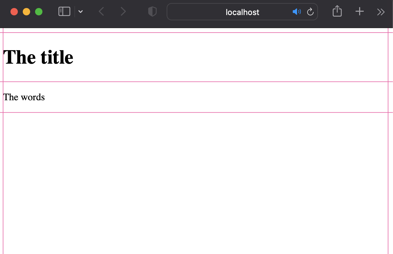
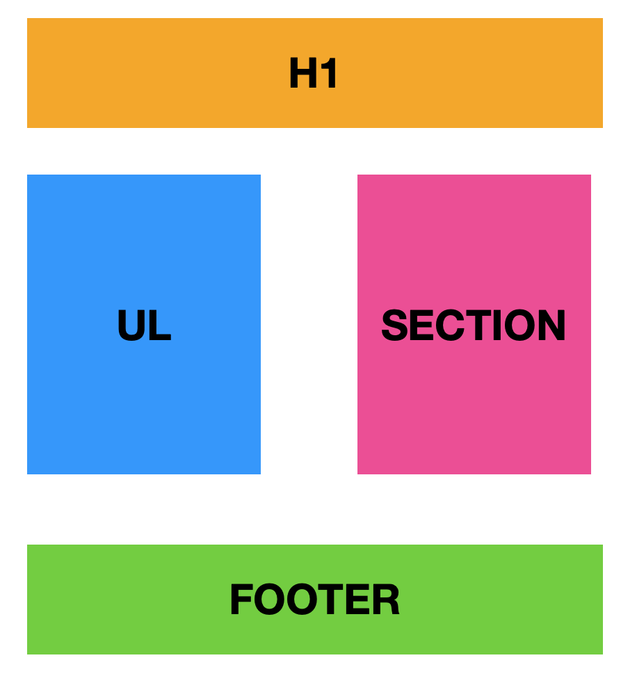
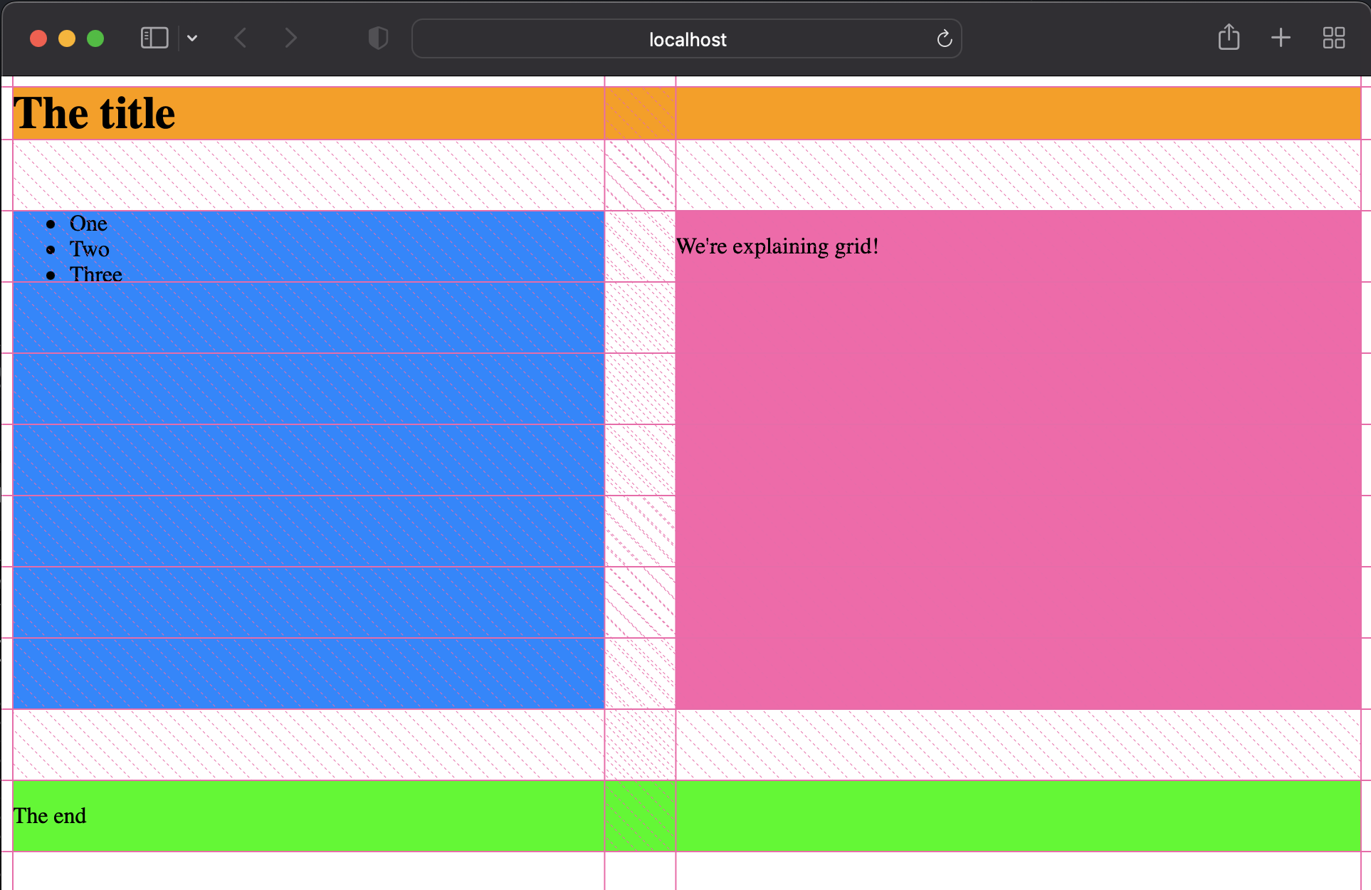
So now let's position our grid items the way we want on the page. I want my h1 to be at the very top then my ul
and my section to be side by side and then my footer to be below everything. It should look like this:
First, let's position the h1, since it's already the first grid item and I want it to be on it's own row, I can
rely on the browser to display the default, but I want to make sure it'll span the length of the row. So I should
define that explicitly:
    h1 {
      grid-column-start: 1;
      grid-column-end: 3;
    }
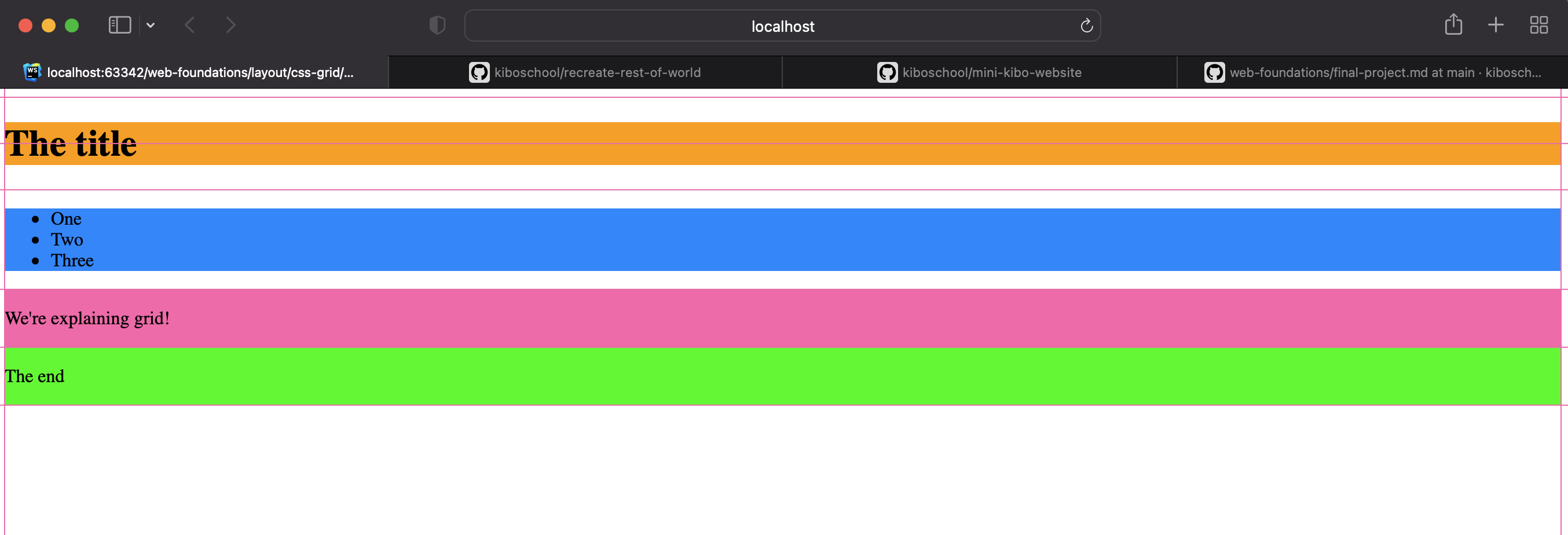
See how the h1 now spans across the length of the page? This is how we explicitly define the width of the
grid-area. I haven't defined the height of the area because I'm relying on the implicit grid, which by default will
only take the space of one row.
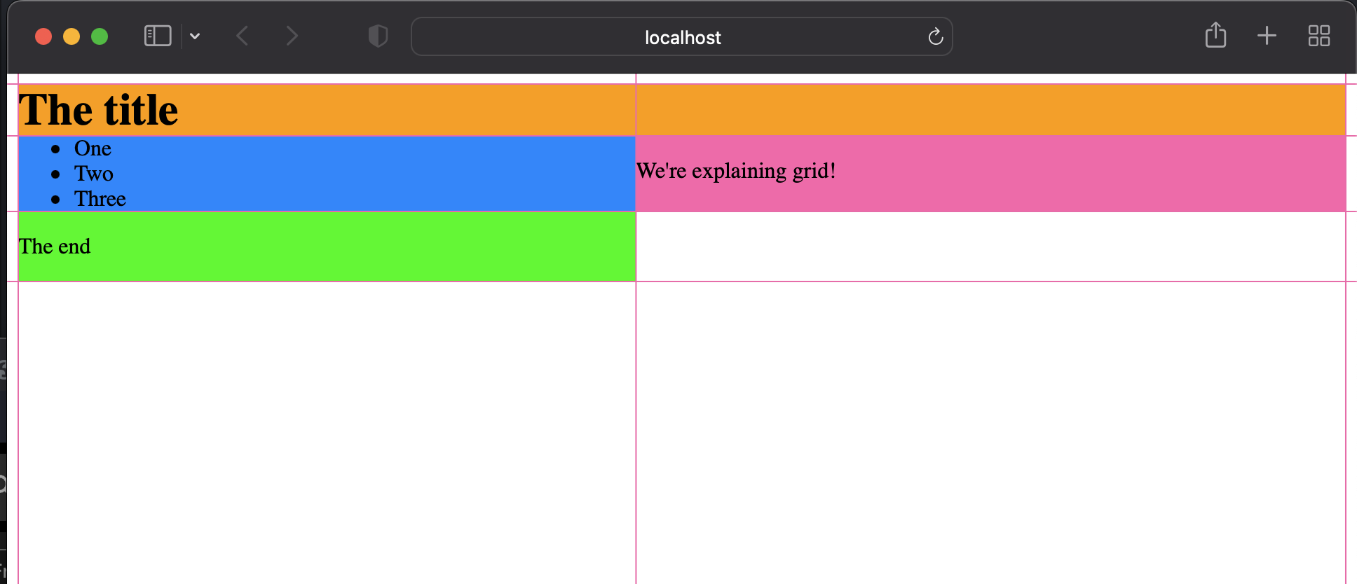
Now it's time for the ul and the section. Remember: the elements within the ul and section aren't grid items!
    ul {
        grid-column-start: 1;
        grid-column-end: 2;
        grid-row-start: 2;
        grid-row-end: 10;
    }

    section {
        grid-column-start: 2;
        grid-column-end: 3;
        grid-row-start: 2;
        grid-row-end: 10;
    }
For each element, I have to define which line I want the start and end my column and which lines I want to start and
end my row, so using the line numbers, and the start and end suffixes for both the columns and rows, I can
define the grid-area for these elements. Now the page looks like this:
So now, the footer needs to be the same width as the h1, just like in our diagram, and for that, we can copy the
rules for the h1
    footer {
      grid-column-start: 1;
      grid-column-end: 3;
    }
We're almost done but there's still something missing. Most of the elements are touching since they start from the same lines. We should add a grid gap to the grid container so that there's a little more space between the elements.
    main {
      display: grid;
      grid-gap: 50px;
   }
That's it!