Introduction to Data Science
Welcome to Introduction to Data Science! You are joining a global learning community dedicated to helping you learn and thrive in data science.
What you'll learn
Data science is applicable to a myriad of professions, and analyzing large amounts of data is a common application of computer science. This course empowers students to analyze data, and produce data-driven insights. It covers the foundational suite of concepts needed to solve data problems, including preparation (collection and processing), presentation (information visualization), and analysis (machine learning).
Course Overview
- Week 1: Intro to Data Science
- Week 2: Databases and SQL
- Week 3: Data Visualization and Insight
- Week 4: Intro to Machine Learning
- Week 5: Final Project and Wrap up
How the course works
There are multiple ways you'll learn in this class:
- Read and engage with the materials on this site
- Attend live class and complete the activities in class
- Practice with exercises to try out the concepts
- Complete projects to demonstrate what you have learned
You are encouraged to seek out additional practice outside of the practice problems included in the course. You should also try building various programs so that you can explore the concepts in a variety of ways.
Now, you are ready to start onboarding. Tap "Next Lesson" below
Copyright © 2024 Kibo, Inc. All Rights Reserved.
Start Onboarding
Deadline: Thursday, May 2 at 12pm GMT.
Welcome to Try Kibo onboarding. You’re now ready to get set up for class. Ensure to read and understand all the information below as you will be asked some questions at the end of this process.
During this process, you will:
- Select a live class.
- Join your class Replit team.
- Learn about how you will learn at Kibo.
- Join Discord, update your profile, and introduce yourself.
- Submit an onboarding checklist form
As you get through these steps, you will complete 3 activities that will help us verify that you are ready for class.
Virtual sessions during Try Kibo
While you study at Kibo, there will be weekly live events that you will attend. These events are:
-
Live class(90 minutes): Mandatory weekly live sessions on Google Meet, led by an instructor or teaching assistant. It will include collaborative problem-solving (1 hour) and opportunities to ask questions about your lessons (30 minutes). You will select a live class time below.
-
Office hours (60 minutes): Personalized help with your projects and lessons. This session is optional and led by a teaching assistant.
-
Community Friday (60 minutes): Career-focused events featuring tech professionals and mentors like software engineers, product managers, and data scientists.
Activity 1 - select a live class
Below is a list of weekly live classes available. Submit the form below to pick a live class time that works best for you. You can only select one live class. Time is in GMT(convert to your local timezone)
| Time (in GMT) | Day | Led by |
|---|---|---|
| 5:00pm GMT | Wednesday | Emmanuel A |
| 2:30pm GMT | Thursdays | Wasiu Y |
| 7:00pm GMT | Fridays | Enoch E |
| 3:00pm GMT | Saturdays | Emmanuel O |
Learning at Kibo
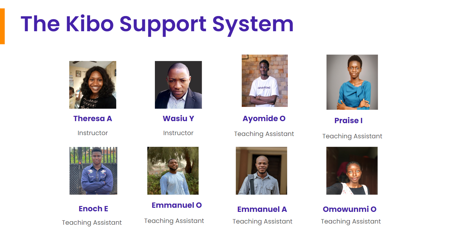
You will be learning with peers, instructors, and teaching assistants from across the continent. In this section, you will learn about the support system available to you and how you can get help.
- The Kibo Support System: This includes community managers, instructors, and teaching assistants who are available to help you throughout your learning journey. Feel free to reach out and connect with any of them
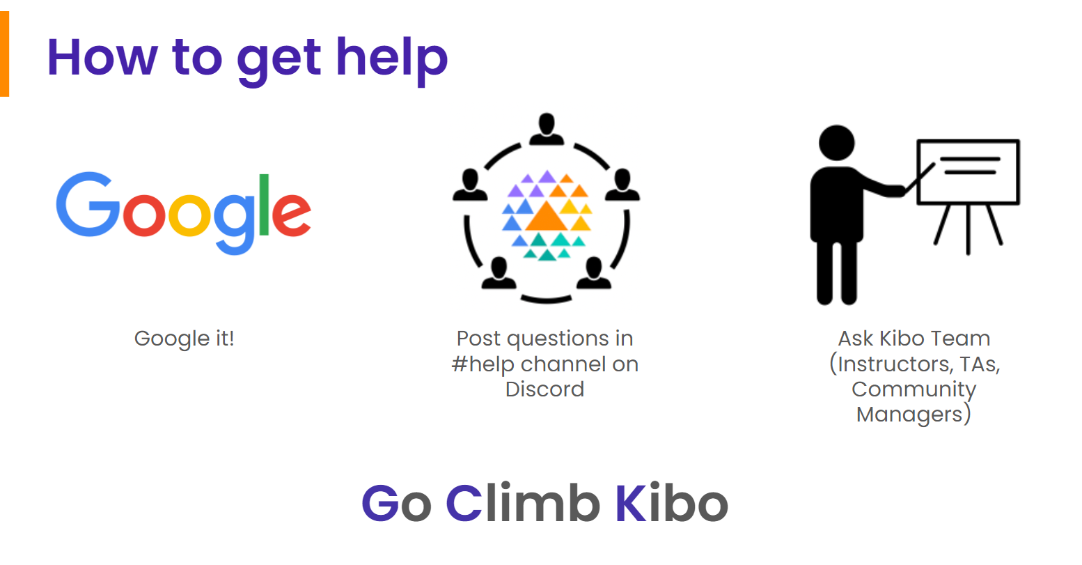
- How to get help: Even though you will have a host of people who will support you throughout your journey, you will also refine your problem-solving abilities. As a rule of thumb, if you need help with your lessons, follow these steps to get help.
- Google: Try to find answers to your questions online – a great way to polish your Google searching skills
- Community: Ask your peers in the #help channels on Discord. They might have similar questions or answer
- Kibo: If you still need assistance, contact the Kibo team—your instructor, TAs, or community managers.
Tools for Success
During your class, you will use various tools for your learning. These tools are:
- Anchor: If you can see this, you are on Anchor. All your lessons will be released on this site – bookmark this site: lms.kibo.school
- Replit: You will write your code and submit it using. It has everything you need to build and run computer programs. You will join a replit team to access your lessons below
- Zoom & Google Meet: You will use these tools to attend your live classes, office hours, and events.
- Discord: This is our community platform, where you'll communicate and connect with peers and instructors. Joining Discord is mandatory once the program starts, as all communication from the Kibo team will be conducted there. You will join Discord and introduce yourself below
Activity 2 – Join Replit Team
You have already created a Replit account during the admissions challenge. Now, you need to join the Replit team so you will be able to access your work in class.
- Go to replit.com
- Select "Log in" at the top right corner to login to your account
- Click this link to join the Replit team for the class.
Activity 3 – Join Discord and complete the onboarding checklist
After the class starts, all communication from the Kibo team will occur on Discord, so joining is mandatory. Follow the steps below to join Discord, introduce yourself, update your profile, and complete the onboarding checklist form.
🚨Note: If you witness any delays trying to join Discord, be patient and try again in a few hours. Discord may ban your account if they see multiple activities happening at one time, and it may take up to 20 days to resolve.
-
If you already have a Discord account, log in. Otherwise, create an account and verify it via email. Check your spam folder if the email is not in your inbox
-
Join the Try Kibo Discord Server: https://discord.gg/skbZYFttNP and follow the steps until you submit the onboarding checklist
Steps
- Introduce yourself in the #introductions channel
- Your full name
- Your location(city, country)
- A fun fact about you
- An image or gif that represents you
- Update your Discord name to your first name and last initial e.g., "Jessica A", "Sydney W"
- Add a preferred profile picture
- Submit the onboarding checklist form
- Introduce yourself in the #introductions channel
Once you have done all the above, you’re ready for class! You will get an invite to the mandatory orientation on or before the end of today.
Orientation date: Friday, 3rd May from 2 - 3:30pm GMT. Mark your calendar
Intro to Data Science
Welcome to week 1 of the Intro to data science course!
This week, we will explore the fundamental concepts and techniques used in data science. We will start by understanding what data science is and its importance in today's world. Next, we'll dive into data science tools and its workflows. Furthermore, we will learn about data and spreadsheet by exploring a sample dataset. Finally, you'll be introduced to Google Sheet and its basic functionalities.
Whatever your prior expereince, this week you'll touch on basics of data science and the tools you'll be using. You'll also start practising learning and working together. The internet is social, and technologists build it together. So, that's what you'll learn to do too.
Learning Outcomes
After this week, you will be able to:
- Explain what data science is and its importance.
- Describe some data science tools.
- Experiment with data using Google sheet
- Apply different data cleaning and visualization techniques on a dataset.
An overview of this week's lesson
Intro to Data Science
Data is the new electricity - Satya Nadella (CEO, Microsoft)
We live in a time where huge amount of data are generated every second through website visit, social media likes and posts, online purchase, gaming, and online movie streaming among others. With an estimated 2.5 quintillion bytes of data generated each day, it is now inevitable for individuals and businesses to strategize on ways to derive valuable insight from this huge data lying around.
Now that you have an idea about the data boom, let’s look at what data science is all about.
What is Data Science?
In summary...
- Data science is a multidisciplinary field that involves the processes, tools, and techniques needed to uncover insight from raw data.
- It plays a critical role in enabling businesses to leverage their data assets and stay competitive in today's data-driven economy.
Now that you have an idea of what data science is, we need to understand why data science is important, and its role in modern businesses.
Data science in today's business
Let us now examine a selection of companies that have incorporated data into their operations and are effectively leveraging it to enhance the triumph of their respective brands.
Given its significance in modern-day organizations, data science holds crucial importance to decision making and business success. However, there is a growing need for professionals who are equipped with data science skills... could that be you?
Who is a data scientist?
👩🏾🎨 Practice: Data and Businesses
- Why is data science important for businesses?
- Highlight 2 things a data scientist doesn't do in an organization.
Answer these questions in the padlett below.
🛃 Building blocks and Workflow
Building blocks
Previously, we described data science as a multidisciplinary field. At the high level, data science is typically an intersection of 3 core areas - statistics, computer science, and _domain knowledge. Altogether, these three areas form the building blocks of data science, allowing practitioners to collect, process, analyze, and visualize data in a way that generates valuable insights and informs decision-making processes in various industries and domains.
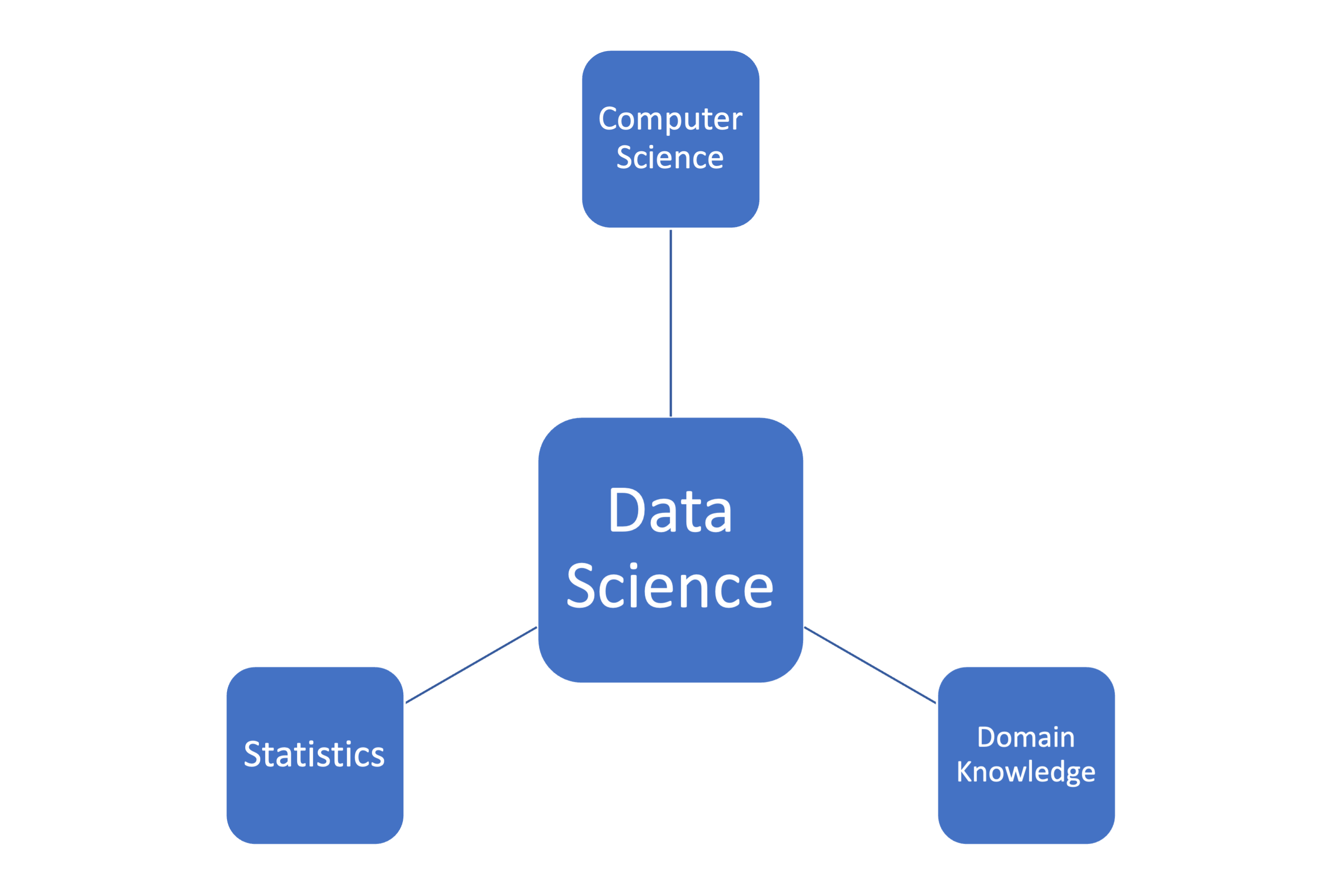
...statistics, computer science, and domain knowledge are all essential components of data science, and each plays a critical role in the data science process as highlighted below.
In summary, data science building blocks are an intersection of statistical methods, computer science tools, and domain knowledge, which are used together to extract insights and generate value from data. Now, how does a typical data science project looks like?
Data science workflow
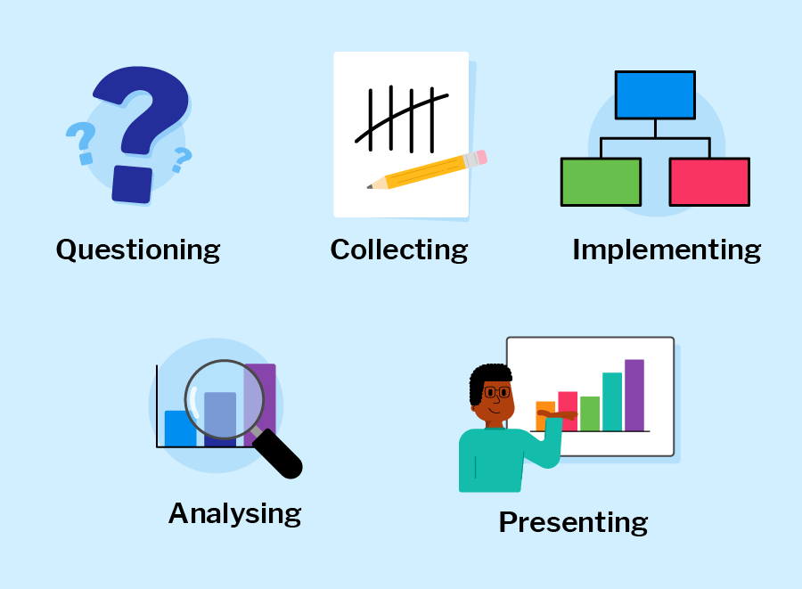
Each phase includes different dependent tasks and activities needed to achieve the overall goal of the project. Overall, the workflow serve as guidelines throughout the project life cycle. A typical end-to-end journey of a sample data science project using this workflow is explained in the next video.
Throughout the entire data science workflow, data scientists need to collaborate closely with stakeholders, communicate their findings clearly, and continuously refine their methods and models based on feedback and new insights.
Practice: Draw your building block
👩🏾🎨 Draw your version of the data science building blocks. Some ideas to include in your image: statistics, computer science, and domain expertise.
- Draw using whatever tool you like (such as paper, tldraw, or the built-in Padlet draw tool)
- Take a screenshot, a phone picture, or export the image if you use a drawing tool.
- Upload the image to the Padlet (click the + button in the bottom, then add your image)
Data Type Taxonomies
What is data?
Data is increasing rapidly due to several factors...
- rise of digital technologies
- growing use of the internet and social media
- increasing number of devices and sensors that generate data.
In fact, it is estimated that the amount of data generated worldwide will reach 180 zettabytes by 2025, up from just 4.4 zettabytes in 2013. This explosion of data presents both opportunities and challenges for data scientists, who must find ways to extract insights and value from this vast and complex data landscape.
👩🏾🎨 ...Data is the new electricity in town...
Just as electricity transformed industries such as manufacturing, transportation, and communications, data is transforming modern-day businesses and organizations across various domains. Currently, it is being generated and consumed globally at an unprecedented rate, and it has become a valuable resource that drives innovation, growth, and competitiveness. Consequently, we now live in the era of big data.
Data Taxonomies
The data we have today are in different forms such as social media likes and posts, online purchase, gaming, business transactions, and online movie streaming among others. Understanding the types of data that you are working with is essential in ensuring that you are using the appropriate methods to analyze and manipulate it.
Note: Sometimes, it is required to convert from one data type to another before analysis or visualization. This conversion is part of data wrangling.

These data types are essential for understanding the characteristics and properties of the data and determining appropriate analysis techniques. Let's take a look at each of this data tpes...
👩🏾🎨 Practice: Group the data
With your knowledge of data and different data types, check your understanding by attempting the following questions:
-
Group the following sample data into their suitable data types.
- Age
- Income
- GPS coordinates
- Maps
- Product type
- Stock prices
- Web traffic
- Moview reviews
- Ethnicity
-
Do you think any of the sample data should be in more than one category? If yes, list them.
🔢 Data and Spreadsheets
As a multidisciplinary field, data science uses myriads of tools for different tasks within the phases of the data science workflow, and we'll explore some of these tools in this course. In this section, we'll start by looking at spreadsheets, and further explore a popular web-based spreadsheet software - Google Sheet. To start with, let us understand what we mean by spreadsheets and why we need them as data scientist.
What are Spreadsheets?
They are often designed to hold numeric and short text data types. Today, there are many spreadsheet programs out there which can be used locally on your PC or online through your browsers. They provide different features to ease data manipulation as shown below.
Overall, spreadsheets are a useful tool for data science tasks, particularly for tasks that involve organizing, manipulating, and analyzing data on a smaller scale. However, for more complex data analysis tasks or larger datasets, specialized software tools and/or programming languages may be required.
How can i use spreadsheet?
Popular spreadsheet softwares currently available includes Microsoft Excel, Apple Numbers, LibreOffice, OpenOffice, Smartsheet, and Zoho Sheet among others. However, Microsoft Excel is the most popular within the data science communities. To get started quickly without any installation bottleneck, we'll be using Google Sheet - a web-based spreadsheet.
Next, we'll explore a sample dataset using Google Sheet. As we've learnt in the previous video, you can have more than one worksheet in a workbook. In this sample dataset, we have 3 worksheets with different dataset.
- corona_virus - official daily counts of COVID-19 cases, deaths and vaccine utilisation.
- movies - information about movies, including their names, release dates, user ratings, genres, overviews, and others.
- emissions - information about methane gas emissions globally.
👩🏾🎨 Practice: Data playground... 🎯
- Create a copy of this dataset for your own use.
- Explore each worksheet to have a sense of what the data represent.
- Attempt the following questions.
- Which country 🏳️ has the highest number of
activeCOVID-19 cases? - Which movie 🎞️ has the
lowestbudget? - What is the total
emmisions🌅 globally? - Try to change the 🔴 colour of each workbook.
- Which country 🏳️ has the highest number of
Note: Remember to use the built-in functions where neccessary.
♻️ Data Cleaning
In data science, unclean data refers to a dataset that contains errors, inconsistencies, or inaccuracies, making it unsuitable for analysis without preprocessing. Such data may have missing values, duplicate entries, incorrect formatting, inconsistent naming conventions, outliers, or other issues that can impact the quality and reliability of the data. These problems can arise from various sources, such as...
- Data entry errors
- Measurement inaccuracies
- Technical issues during data collection or storage.
Cleaning the data involves identifying and addressing these issues to ensure that the dataset is accurate, complete, and reliable before further analysis or modeling takes place.
Data cleaning aims to improve the integrity, completeness, and consistency of the data. When cleaning a data, our goal will be to produce a clean and reliable dataset that is ready for further analysis. By investing time and effort into data cleaning, we can improve the accuracy and credibility of our analysis results, leading to more robust and reliable insights. To understand this more, we'll be looking at the following.
Data cleaning with Google Sheet ♻️
In GS, data cleaning can involve tasks such as removing duplicate values, correcting misspellings, handling missing data by filling in or deleting the values, and formatting data appropriately. GS provides us with various built-in functions and tools, such as filters, conditional formatting, and formulas, that can help with data cleaning tasks.
When we carry out data cleaning, we can improve the quality of our datasets and ensure that the data is ready for further analysis or visualization. To have an understanding of how to clean a dataset, we'll be looking at 3 things for this lesson.
1. Handling missing data
Missing data is one of the most frequently occuring problems you can face as a data scientist. Watch the next video to have an idea of how important it is to understand this problem, and possible causes.
As a data scientist, there are many ways of dealing with missing values in a data. For this lesson, we'll be looking at 4 different techniques of handling missing data - _dropping, filling with constant, filling with statistics, and interpolation.
2. Removing Duplicates
Duplicate data are rows or records within a dataset with similar or nearly identical values across all or most of their attributes. This can occur due to various reasons, such as data entry errors, system glitches, or merging data from different sources. As a data scientist, there are number of ways to handle duplicate data in a small or large dataset.
3. #VALUE! Error
The #VALUE! error in Google Sheets is caused by attempting to perform calculations or operations involving cells containing incompatible data types, such as trying to add text to a numerical calculation or using dates in an inappropriate context.
4. Conditional Formatting
Conditional formatting is used in Google Sheets, as well as other spreadsheet software, to visually highlight and emphasize data based on specific conditions or criteria.
Smart CleanUp in GS
With GS Smart Cleanup feature, we can do many things in an easier manner. Let's look at two important functionalities of this feature...
- Finding Problems: It takes a look at your data set, and tries to find out if there could be any problems in that dataset. For example, are there any duplicates in that data set? Is there anything that might be spelled incorrectly? So it gives you a chance to fix your dataset before you analyze it.
- Statistics: Smart Cleanup can help take a look at a column, and gives some statistics based on that column.
📺 Watch the video below on using Smart Cleanup and practice along.
👩🏾🎨 Practice: Clean the smell... 🎯
A smaller sample of the global COVID-19 dataset is provided here for this exrcise.
- Create a copy of the dataset for your own use.
- Explore the dataset to have a sense of what the it represent.
- By leveraging your data cleaning skills, attempt the following...
- Remove duplicate data if exist.
- Handle blank space.
- Convert the column from text to number.
- Implement other cleaning techniques of your choice.
Data visualization
Rather than looking at rows and columns of numbers or text, imagine using colors, shapes, and patterns to represent information in a visual way. This makes it much simpler for our brains to process and interpret the data, thereby helping us understand information and data more easily. With visualizations, we can see trends, patterns, and relationships that might not be apparent in raw data. Then how can we visualize our data?
Visualization tools
Data visualization tools are software programs that we can use to create visual representations of data in an easy and interactive way. They provide a user-friendly interface where we can input our data and choose from various charts, graphs, and other visual elements to display the information visually. For instance, Google Sheet allows us to create simple charts and graphs directly from spreadsheet data.
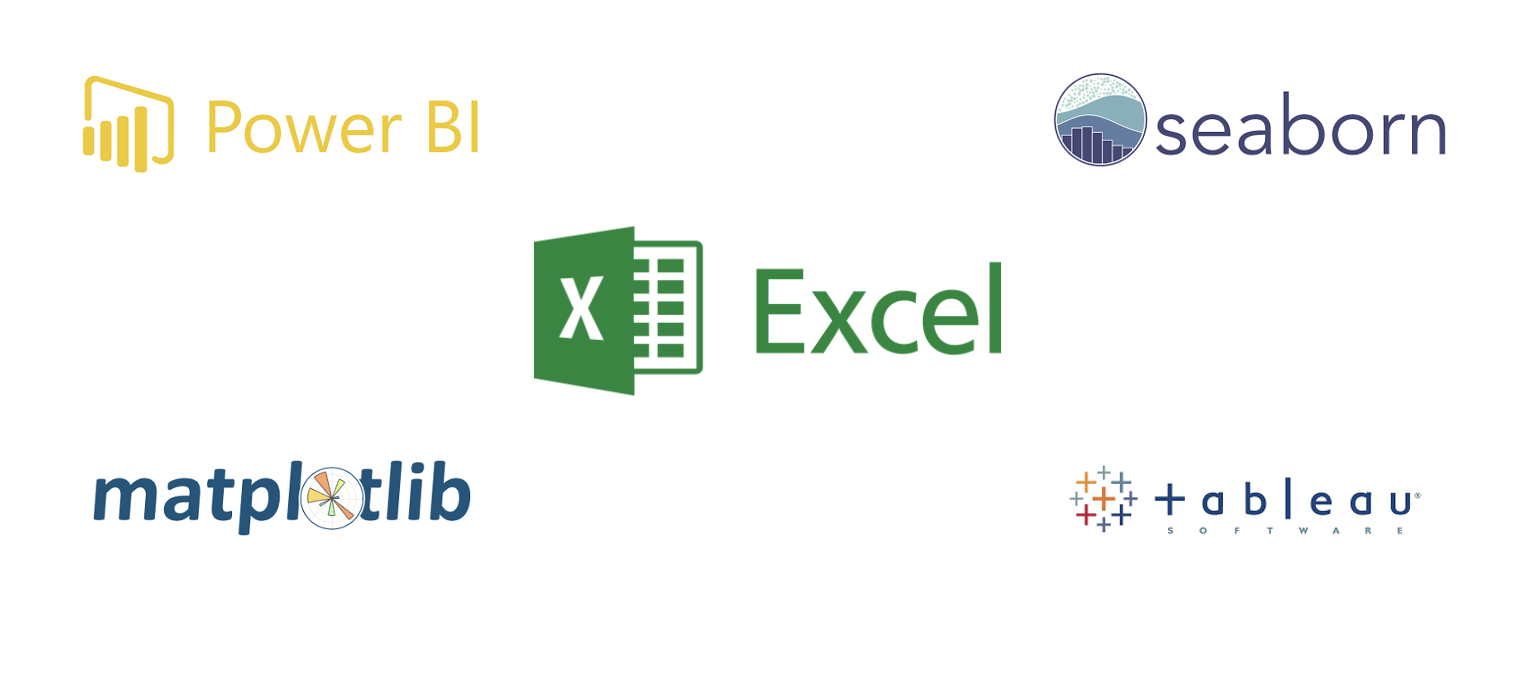
Looker studio, Power BI, Tableau, Seaborn, and Matplotlib are more advanced tools that offer a wider range of customization options and advanced visualization techniques. For example, Looker and Power BI allow us to create interactive dashboards and explore data from multiple perspectives. Seaborn and Matplotlib are Python libraries that provide extensive options for creating complex and aesthetically pleasing visualizations. In this lesson, you'll only learn data visualization using Google Sheet. Looker studio will be explored in week 3.
Visualization with Google Sheet
Data visualization using Google Sheet allows us to present data in a visual and easy-to-understand way, even for people without technical expertise. Imagine you have a spreadsheet full of numbers and information. With Google Sheet's charting and graphing features, you can transform those numbers into colorful and meaningful visual representations. For example, you can create bar charts to compare different categories, line graphs to track trends over time, or pie charts to show proportions. These visualizations help us see patterns, relationships, and insights that might be hidden in rows and columns of data.
By presenting information visually, Google sheet makes it easier for us to grasp and interpret the data, enabling better decision-making and communication. Visualizations also make it easier to share and communicate information with others, as it provides a clear and intuitive way to present complex data. Whether it's in business, science, or everyday life, data visualization helps us make better decisions and gain insights from the vast amounts of information around us.
👩🏾🎨 Practice: Data Visualization Using Google Sheets
Dataset Description:
You have been provided with a dataset containing data on the sales performance of a company. The dataset contains the following columns:
- Date: Date of the sale.
- Product: Name of the product sold.
- Units Sold: Number of units sold for each product.
- Revenue: Revenue generated from the sale.
| Date       | Product   | Units Sold | Revenue |
|------------|-----------|------------|---------|
| 2024-01-01 | Product A | 50         | 2500    |
| 2024-01-01 | Product B | 30         | 1500    |
| 2024-01-02 | Product A | 45         | 2250    |
| 2024-01-02 | Product B | 35         | 1750    |
| 2024-01-03 | Product A | 55         | 2750    |
| 2024-01-03 | Product B | 40         | 2000    |
| 2024-01-04 | Product A | 60         | 3000    |
| 2024-01-04 | Product B | 50         | 2500    |
| 2024-01-05 | Product A | 65         | 3250    |
| 2024-01-05 | Product B | 45         | 2250    |
| 2024-01-06 | Product A | 70         | 3500    |
| 2024-01-06 | Product B | 55         | 2750    |
Task
- Create a google sheet and enter the data.
- Create at least two different types of visualizations (e.g., bar chart, line chart, pie chart) to answer the following questions:
- Which product has the highest sales revenue?
- How does the sales revenue vary over time?
- Add appropriate titles, labels, and legends to each visualization to enhance clarity and understanding.
Practice
Data Cleaning and Visualization Using Google Sheets
Dataset Description:
You have been provided with a dataset containing the following columns:
- Country: Name of the country.
- Income per Person: Average income per person in the country.
- Internet Use Rate: Percentage of the population using the internet.
- Urban Rate: Percentage of the population living in urban areas.
Objective:
Your task is to clean the dataset and create visualizations to explore the relationships between income, internet use, and urbanization across different countries.
Steps to Complete the Exercise:
-
Load the Dataset into Google Sheets:
- Open Google Sheets and create a new spreadsheet.
- Copy and paste the dataset into the spreadsheet or use the
IMPORTDATAfunction to import data from a CSV file.
-
Data Cleaning and Formatting:
- Identify and handle missing or erroneous data:
- Check for any blank cells or
N/Aentries in the dataset. - Replace any missing or erroneous values with appropriate data (e.g., average income per person for missing values).
- Check for any blank cells or
- Ensure consistent formatting:
- Convert any text values to numbers if necessary.
- Remove any extra spaces or special characters from the data.
- Rename column headers to be more descriptive if needed.
- Identify and handle missing or erroneous data:
-
Create Basic Visualizations:
- Create a scatter plot to visualize the relationship between income per person and internet use rate.
- Create a bar chart or pie chart to compare internet use rates across different countries.
- Create a histogram to visualize the distribution of urbanization rates among the countries.
-
Enhance Visualizations:
- Add appropriate titles and labels to each chart to provide context and clarity.
- Customize the appearance of the charts by adjusting colors, fonts, and styles to improve readability.
-
Submission Guidelines:
-
Download your google sheet file to your computer.
- Click on
File - Select
download
- Click on
-
Attach it below and submit.
- There is no external submission for this project. Please ignore the
Incomplete statusfor external submission.
- There is no external submission for this project. Please ignore the
Assignment - COVID-19 Visualization

Dataset Description:
You have been provided with a COVID-19 dataset containing the following columns:
- Country: Name of the country.
- Total Cases: Total number of confirmed COVID-19 cases.
- New Cases: Number of new COVID-19 cases reported.
- Total Deaths: Total number of COVID-19 related deaths.
- New Deaths: Number of new COVID-19 related deaths reported.
- Total Recovered: Total number of COVID-19 recoveries.
- New Recovered: Number of new COVID-19 recoveries reported.
- Active Cases: Number of active COVID-19 cases.
- Serious, Critical: Number of critical COVID-19 cases.
- Tot Cases/1M pop: Total cases per 1 million population.
- Deaths/1M pop: Deaths per 1 million population.
- Total Tests: Total number of COVID-19 tests conducted.
- Tests/1M pop: Tests per 1 million population.
- Population: Total population of the country.
Assignment Objective:
Your task is to clean the dataset and create visualizations to explore the global COVID-19 situation, focusing on the distribution of cases, deaths, and recoveries across different countries.
Assignment Tasks:
-
Data Cleaning:
- Identify and handle missing or erroneous data by checking for any blank cells or "N/A" entries in the dataset.
- Select the range of cells you want to check.
- Go to the "Format" menu, choose "Conditional formatting".
- Set up a rule to format cells with blank values or
N/Atext differently (e.g., highlight them in red). - Replace any missing or erroneous values with appropriate data (e.g., mean or median values).
- Ensure consistent formatting:
- Convert any text values to numbers if necessary.
- Remove any extra spaces or special characters from the data.
- Identify and handle missing or erroneous data by checking for any blank cells or "N/A" entries in the dataset.
-
Data Visualization:
- Create visualizations to explore the distribution of COVID-19 cases, deaths, and recoveries across different countries.
- Choose the columns containing COVID-19 cases, deaths, and recoveries data, as well as the corresponding countries.
- Use appropriate chart types such as bar charts, pie charts, or choropleth maps to visualize the data.
- For comparing values across countries, consider using a bar chart or a column chart.
- If you want to show the proportion of cases, deaths, and recoveries for each country, a pie chart could be suitable.
- To visualize geographic distribution, use a choropleth map where countries are shaded based on the intensity of COVID-19 metrics. Create Your Chart:
- Select the data range.
- Go to the "Insert" menu and choose the chart type you want to use.
- Customize your chart by adding titles, axis labels, and legends to provide context.
Submission Guidelines:
- Download your google sheet file to your computer.
- Click on
File - Select
download
- Click on
- Attach it below and submit.
- There is no external submission for this project. Please ignore the
Incomplete statusfor external submission.
- There is no external submission for this project. Please ignore the
Wrap up

Weekly objectives
Looking back at what you've done this week, do you think you have achieved the objectives for this week? Here are the objectives.
- Explain what data science is and its importance.
- Describe some data science tools.
- Experiment with data using Google sheet
- Apply different data cleaning and visualization techniques on a dataset.
How was this lesson?
Databases and SQL
Welcome to week 2 of the Intro to data science course! In the first week, we looked at data science broadly, including its building blocks and workflow, and and also understand data types, spreadsheets, and using Google for data capturing, cleaning, and visualization.
This week, we'll continue the journey by looking at databases and SQL. First, we'll look at what are databses and their different types. Next, we'll deep dive into how to persist (save) and retrieve data from databases. Similarly, we'll touch on different SQL syntax and commands required to interact with the database. Finally, we'll see how SQL is being used by e-commerce and social network companies.
Whatever your prior expereince, this week you'll touch on basics of databases and SQL. You'll also continue practice on learning and working together.
Learning Outcomes
After this week, you will be able to:
- Explain databases and its types.
- Use different SQL command to persist and retrive data to/from a database.
- Join and retrieve data from multiple tables in a database.
- Use different SQL functions to manipulate data in the database.
An overview of this week's lesson
Introduction to Databases
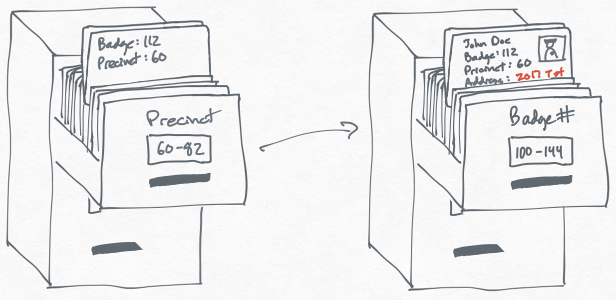
A database is like a digital filing cabinet where we store all sorts of information in an organized way, making it easy to find and use when we need it. We need databases because they help us keep track of everything from our shopping lists and favorite songs to important customer information for businesses, making sure nothing gets lost or forgotten.
With this little understanding of databases, you might be asking why do we need databases? Businesses use databases to manage everything from customer information and inventory levels to employee records and financial transactions. They help in making informed decisions by providing quick access to important data.
Types of Databases
While considering a database, we need to first understand the structure of the data we want to store in it. Broadly, most data falls into one of these 3 categories...
structuredsemi-structuredunstructured
Subsequently, the type of data category determines what type of databases will be suitable for our use cases. Generally, databases are of 2 types - relational and non-relational.
Database Terminologies
Just like every other tools, there are certain terms or keywords that are associated with databases. To have a decent idea of how databases work, these terms need to be clearly understood. The common ones are given below...
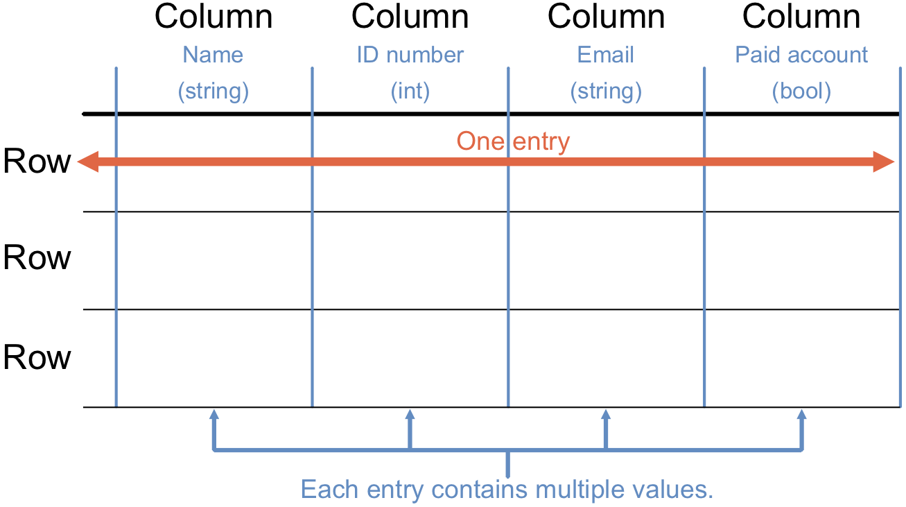
1. Tables
Think of a table as a spreadsheet where data about a particular category is stored. For example, a Person table might store information about persons as depicted below.
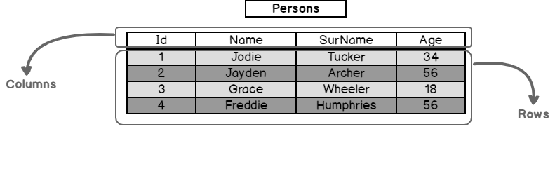
2. Rows and Columns
Each row (record) in a table represents a unique piece of data, like a single customer. Columns (fields) represent the attributes of that data, such as name, email, and phone number.
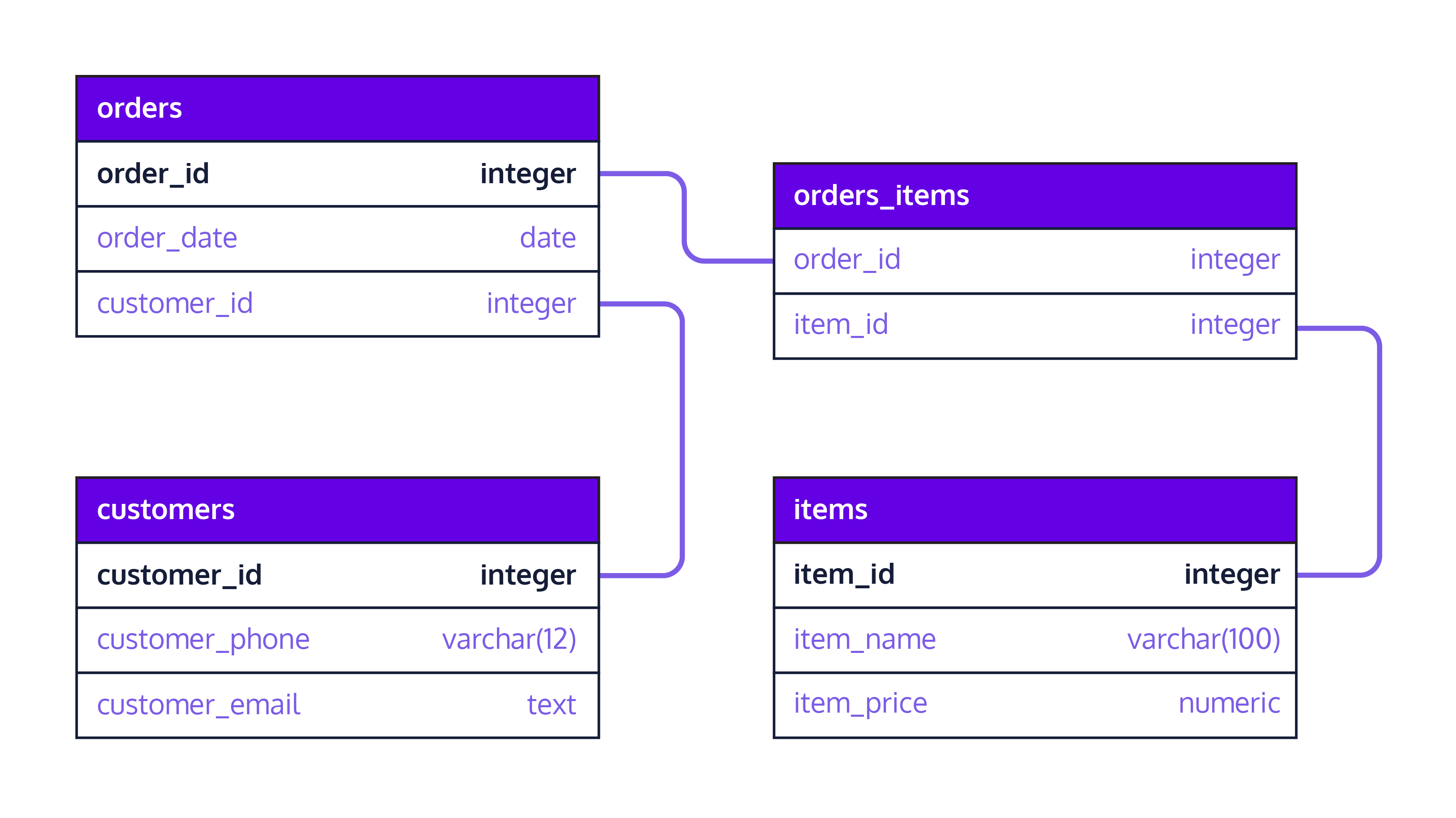
3. Schema
A schema is the blueprint of a database that defines how data is organized, including the tables, fields, and relationships between tables. For example, the schema belows defines how 4 different table are organised and linked together.
👩🏾🎨 Practice: Draw your Pets table
The following are the TODOs...✍🏾
- Draw a simple table for a
Petsdatabase. - Use pet_id, name, pet_type (e.g., dog, cat), and owner_id as columns.
- Use Tldraw or other drawing tools.
- Upload the drawing/sketch to Padlet below.
Fundamentals of SQL
SQL, or Structured Query Language, was created in 1970 to interact with databases. SQL is pronounced sequel or sometimes ess-queue-ell, and was initially known as the structured English query language (SEQUEL).
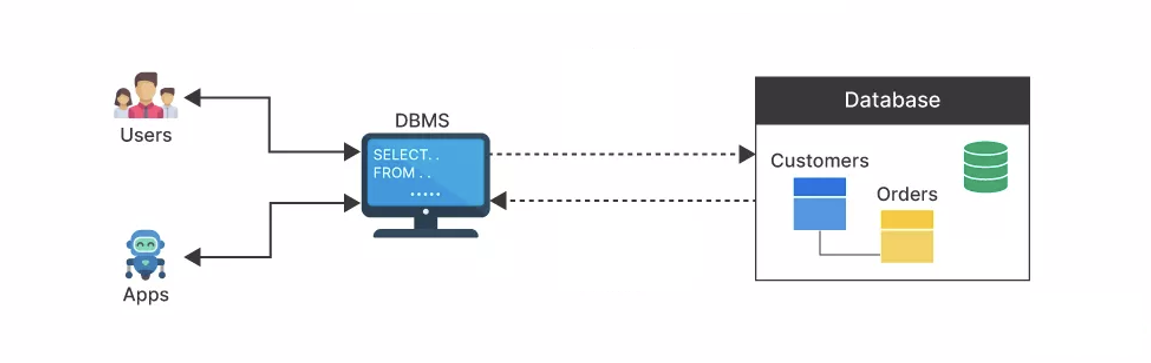
Over the years, SQL became a standard way to query and manipulate several databases. Hence, making it possible to use SQL across different database systems. Database systems or Database Management System (DBMS) is a piece of software that uses SQL behind the scenes to manage the data in a database.
Example DBMS are Oracle, Postgres, SQL Server, and MySQL. Using SQL with different DBMS might be slightly different in a few cases, however, it follows the same syntax for most. A typical workflow of DBMS being used to manage customer orders is shown below.
SQL vs NoSQL
To choose the right type of database, we need to look at both the relationship between the data point and the structure of the whole data. For SQL databases, they organize data into well-defined tables and relationships, like a neatly arranged photo album, making them great for structured data that fits into a fixed format.
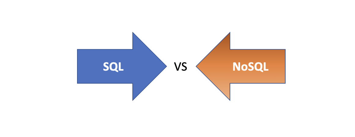
However, NoSQL databases offer a more flexible and scalabale approach, where data can be stored in various ways without a predefined structure. This is ideal for handling a wide range and scale of data types and relationships. Now, let's look at how these two database types differ based on structure, queries, and use cases.
Now that we have an idea of what SQL is and why we need it, we can then dive into writing SQL statements to define and manipulate our datases.
NOTE!: In subsequent lessons, we'll only focus on SQL usage in a relational database context.
👩🏾🎨 Practice: Database selection
The following are the TODOs...✍🏾
- Assume you have a bookstore and needs to annalyse the sales across multiple cities.
- What type of database will be well-suited to your analysis? SQL or NoSQL?
- Justify your answer
Data Management with SQL
To manage the data in a database, we need an SQL Query, which are instructions you give to a database to perform specific actions, such as retrieving data, updating records, or creating new database and tables. Think of them as commands or requests to access and manipulate the data stored in your database in various ways.
In summary, we now understand the following about SQL.
- SQL interacts with databases using relational database management systems (RDBMS), such as MySQL.
- W have seen how to download and install
MySQL, a popular and free RDBMS. - Using MySQL Workbench, we can create a database, import data, and execute SQL queries to analyze the data.
- We have also seen SQL operations like SELECT, filtering, aggregate functions, and exporting data to Excel or PowerBI.
Now, let's look at some of the above points in details. Since SQL queries are written to manage and manipulate relational databases, a simple SQL query typically follows this basic structure:
- SELECT: This is a clause that specifies the columns to be returned in the query result.
- FROM: This is a clause that indicates the table from where to retrieve the data.
- WHERE (optional): This is a clause that sets conditions for selecting rows. Only rows that meet the condition will be included in the result.
- ORDER BY (optional): This is a clause that specifies the order in which to return the rows, based on one or more columns.
To further undertand the structure of a query, imagine you have a database for a bookstore and you want to find the titles and prices of all books in the "Fantasy" genre that are priced under $20, ordered by their publication date. The SQL query for this request would look something like this:
SELECT Title, Price, Me
FROM Books
WHERE Genre = 'Fantasy' AND Price < 20
ORDER BY PublishDate DESC;
In the above query, here is a breakdown of the query...
- The SELECT clause selects the
TitleandPricecolumns. - The FROM clause specifies that the data comes from the
Bookstable. - The WHERE clause filters the rows to include only those where the
Genreis 'Fantasy' and thePriceis less than $20. - The ORDER BY clause orders the results by
PublishDatein descending order (DESC), meaning the most recently published books appear first.
Next, we need to look at different SQL commands in detail to have a better understanding of how it works behind the scene using a sample scenario of a book store.
Basic SQL Commands
Just like evry other standard language, SQL has its syntax which must adhere to before we can use it. Generally, SQL commands can be broadly categorized into Data Definition Language (DDL) and Data Manipulation Language (DML), Data Control Language (DCL), and Transaction Control Language (TCL). For this lesson, we'll on only focus on DDL and DML.
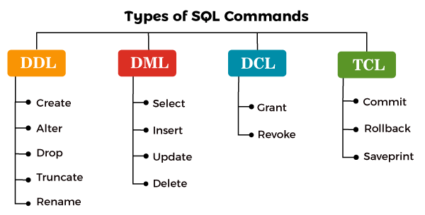
Data Definition Language (DDL)
DDL are set of commands that deals with the schema and structure of a database. These commands are used to create, alter, and delete databases and their objects like tables and indexes. The key operations performed by DDL commands include:
1. CREATE
This command is used to create new tables, databases, and other database objects. Let's look at a use case scenario.
Use case: A new online bookstore wants to manage information about its books and customers. They decided to start by creating two tables - one for Books and another for Customers. The CREATE TABLE statement can be used to establish these table structure in the database with appropriate columns for storing book details (like title, author, and price) and customer information (such as name, email, and purchase history).
NOTE: Running the code above will not output or display anything
2. ALTER
Modifies the structure of existing database objects, for example, adding or removing columns from a table.
Use case: After a few months of operations, the bookstore realizes that they need to track each book's genre to make recommendations to customers. They decide to add a Genre column to the Books table. The ALTER command is used to modify the Books table to include this new column without losing any existing data.
3. DROP
This deletes databases, tables, or other objects completely from the database.
Use case: The bookstore initially created a temporary table named TempSales to experiment with a new sales tracking approach. After developing a more robust system integrated with their main sales database, the temporary table is no longer needed. The DROP command is used to delete the TempSales table and all its contents from the database, freeing up space and resources.
DROP TABLE TempSales;
4. TRUNCATE
We can use TRUNCATE to reset a table by removing all its data while retaining the table's structure, making it ready for new data without the need to recreate the table schema.
Use case: The online bookstore runs a monthly promotion where they temporarily store promotional data in a table called MonthlyDeals. At the beginning of each new month, they need to clear this table to make room for the new month's promotions without removing the table structure itself, as it will be reused. The TRUNCATE command is perfect for this scenario because it quickly deletes all records from the MonthlyDeals table, but keeps the table available for the next set of data.
TRUNCATE TABLE MonthlyDeals;
Data Manipulation Language (DML)
DML commands are used for managing data within tables, which allow us to insert, update, delete, and retrieve data from a database. Unlike the DDL, the primary focus of DML is on the manipulation of data rather than the structure of the database. The key operations performed by DDL commands include:
- SELECT: Retrieves data from one or more tables and is the most widely used DML command.
- INSERT: Adds new rows (records) to a table.
- UPDATE: Modifies existing data within a table.
- DELETE: Removes rows from a table.
Unlike DDL commands, DML operations can be rolled back (undone) if the database is using TRANSACTION control. However, using TRANSACTION is out of scope for this lesson. Now let's look at these DML commands in detail while continuing with the bookstore scenario.
1. SELECT
This retrieves specific data from one or more tables, allowing for conditions to specify exactly which records to return.
Use case: To analyze sales trends, the online bookstore wants to create a report of all books in the "Fantasy" genre published after January 1, 2015, . Here, we can use the SELECT statement to query the Books table by retrieving titles and publication dates that match these criteria.
2. INSERT
Adds new records to a table by specifying values for each column in the new row.
Use case: A customer purchases a new title from the online bookstore, "The Lost Kingdom" by _Jane Smith, priced at $12.50 in the "Adventure" genre. The bookstore uses the INSERT statement to add this book and many others to the Books table.
3. UPDATE
This command modifies existing records in a table based on specified criteria, by allowing for one or more columns to be updated.
Use case: After a pricing review, the bookstore decides to reduce the price of "The Enchanted Forest" by $2. Here, the UPDATE statement is used to adjust the Price column in the Books table for this title.
4. DELETE
It removes records from a table that match specified criteria by effectively deleting the data from the database.
Use case: The bookstore decides to discontinue selling a poorly reviewed book titled "Mystic River" that hasn't sold any copies. here, we can use the DELETE statement to remove all records of this book from the Books table.
Data Types
Understanding SQL data types is crucial for defining the type of data that can be stored in each column of a table. These data types help ensure that the data stored in a database is accurate, consistent, and in a format that can be effectively used for analysis. Using the bookstore example, you'll notice the use of INTEGER and VARCHAR in the previous SQL commands. Let's look at what they actually indicate.
- INTEGER: A whole number. For example, in our bookstore database, the
BookIDcolumn uses the INTEGER data type to store unique identification numbers for each book. - VARCHAR: A variable-length string. This is used for text or characters of varying length. In the bookstore example, the
TitleandAuthorcolumns might use the VARCHAR data type to store book titles and author names, respectively, since these can vary in length. - DATE: A calendar date (year, month, day). This type is used for dates, allowing the database to store information in a date format. In our bookstore database, the
PublishDatecolumn uses the DATE data type to store the release dates of books.
👩🏾🎨 Practice: SQL Playground...
Using the SQL editor below, write a series of SQL command to...✍🏾
- Create atleast 2 different tables in the databse.
- Add at least 4 columns with appropriate data types in each table.
- Modify the tables by adding an additional column.
- Insert minimum of 4 records in each table.
- Delete one record each from each table
Combining multiple tables
In our bookstore example, imagine we need to generate reports showing not just what books were sold, but also who bought them and when. We cannot achieve this only by focusing on just one Books table. We'll need to pull data from different tables to answer such complex questions.
Joins are crucial in relational databases because they allow for the combination of data from two or more tables based on a related column between them. This is essential for creating comprehensive datasets that can answer complex queries by pulling together relevant information from different tables.
Types of Joins
There are different ways we can join multiple tables depending on why we need those data in the other columns. For this lesson, we'll be looking at 4 different joins.
- Inner join
- Left outer join
- Right outer join
- Full outer join
To illustrate how these join work on multiple tables, let's consider two simplified tables from our bookstore database.
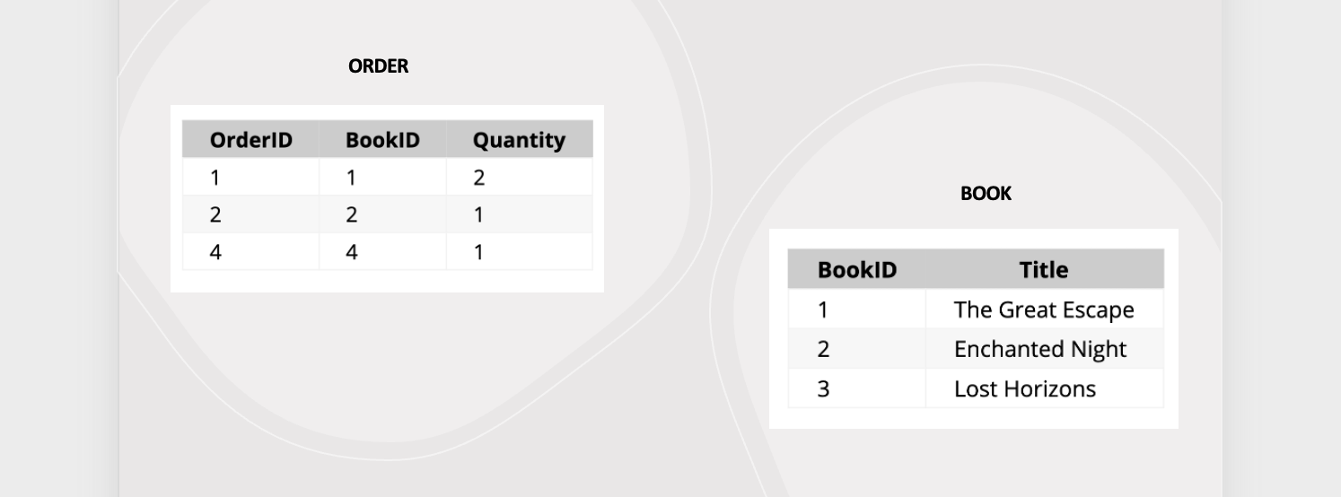
| OrderID | BookID | Quantity |
|---------|--------|----------|
| 1       | 1      | 2        |
| 2       | 2      | 1        |
| 4       | 4      | 1        |  <-- Note: BookID 4 does not match any BookID in the Books table -->
1. INNER JOIN
This is the most common type of JOIN you'll come across. Inner join combines multiple tables by retrieving records that have matching values in both tables (in the common column). Following up with our bookstore example, let's look at how we can get data from both Orders and Books tables.
SQL Query:
SELECT Orders.OrderID, Books.Title, Orders.Quantity
FROM Orders
INNER JOIN Books ON Orders.BookID = Books.BookID;
Result:
| OrderID | Title | Quantity |
|---|---|---|
| 1 | The Great Escape | 2 |
| 2 | Enchanted Night | 1 |
2. LEFT OUTER JOIN
Also called LEFT JOIN, it returns all records from the left table, and the matching records from the right table. For the bookstore database, it'll return all rows from the left table (Orders), and the matched rows from the right table (Books). If there's no match, the result from the right table is NULL.
SQL Query:
SELECT Orders.OrderID, Books.Title, Orders.Quantity
FROM Orders
LEFT OUTER JOIN Books ON Orders.BookID = Books.BookID;
Result:
| OrderID | Title            | Quantity |
|---------|------------------|----------|
| 1       | The Great Escape | 2        |
| 2       | Enchanted Night  | 1        |
| 4       | NULL             | 1        |  <-- No matching _BookID_ in `Books` table for _OrderID_ 4 -->
3. RIGHT OUTER JOIN
This is the opposite of LEFT JOIN, where it returns all records from the right table, and the matching records from the left table. Using our example, it returns all rows from the right table (Books), and the matched rows from the left table (Orders). If there's no match, the result from the left table is NULL.
SQL Query:
SELECT Orders.OrderID, Books.Title, Orders.Quantity
FROM Books
LEFT OUTER JOIN Orders ON Books.BookID = Orders.BookID;
Result:
| OrderID | Title            | Quantity |
|---------|------------------|----------|
| 1       | The Great Escape | 2        |
| 2       | Enchanted Night  | 1        |
| NULL    | Lost Horizons    | NULL     |  <-- Note: No matching OrderID in Orders table -->
4. FULL OUTER JOIN
Combines the results of both LEFT OUTER JOIN and RIGHT OUTER JOIN. All rows from both tables are returned, with NULL values in places where there is no match.
SQL Query:
Result:
| OrderID | Title            | Quantity |
|---------|------------------|----------|
| 1       | The Great Escape | 2        |
| 2       | Enchanted Night  | 1        |
| 4       | NULL             | 1        | <-- No matching BookID in Books table -->
| NULL    | Lost Horizons    | NULL     | <-- No matching OrderID in Orders table -->
👩🏾🎨 Practice: Hypothetical Presidential Election
For a presidential election databse, imagine we have two tables: Candidates and Votes.
Task: Using JOIN, write the SQL commands to get an overview of the election results.
Candidates
| CandidateID | Name | Party |
|---|---|---|
| 1 | Jane K. Doe | Party A |
| 2 | John Smith | Party B |
Votes
| VoteID | CandidateID | Region | NumberOfVotes |
|---|---|---|---|
| 1 | 1 | North | 5000 |
| 2 | 2 | South | 4000 |
| 3 | 1 | East | 6000 |
| 4 | 2 | West | 3000 |
SQL Functions
SQL functions are built-in operations in SQL that allow for processing and manipulation of data directly within your queries. With these, we can perform calculations, convert data types, and many more, by simplifying complex tasks into manageable commands.
In SQL, there are 2 categories of SQL functions.
- Built-in functions.
- User-defined functions.
However, we'll only focus on built-in functions for this lesson.
Built-in Functions
These are predefined operations used to perform specific tasks that involves data manipulation, transformation, or analysis within your queries. They are integral to SQL and are supported across various database management systems, except for some little variations. Based on what each function is doing, they are generally categorized as follows:
Aggregate Functions
Aggregate functions are used for calculations on a set of values where they return a single value, making them essential for statistical analysis over rows of a table. To understand this, let's look at different aggregate functions and how to use them in the context of our bookstore example.
COUNT(): Counts the number of rows in a dataset.SUM(): Calculates the total sum of a numeric column.AVG(): Determines the average value of a numeric column.MAX(): Finds the maximum value in a column.MIN(): Finds the minimum value in a column.
COUNT()
In our bookstore example, we can use this function to count the total number of books and total genres. For example,
SUM()
In our bookstore example, we can use this function to calculate the total quantity of books sold, alongside the total number of orders. For example,
AVG()
In our bookstore example, we can use this function to determine the average price of books, alongside the count (i.e., total number) of books. For example,
MAX() and MIN()
In our bookstore example, we can use this function to find the highest and lowest price of books. For example,
String Functions
String functions are used to manipulate, examine, or handle text data (strings). Below are the different types of functions in this category. To understand this, let's look at different string functions and how to use them in the context of our bookstore example.
UPPER(): Converts a string to uppercase.LOWER(): Converts a string to lowercase.LENGTH(): Returns the length of a string.TRIM(): Removes leading and trailing spaces from a string.CONCAT(): Joins two or more strings together.
UPPER() and LOWER()
In our bookstore example, this function will converts book titles to uppercase and author names to lowercase. For example,
LENGTH() and TRIM()
For our bookstore example, this function will get the length of book titles and trims authors' names. For example,
SELECT Title, LENGTH(Title) AS TitleLength,
TRIM(Author) AS TrimmedAuthor FROM Books;
Output:
Title            | TitleLength | TrimmedAuthor
-----------------|-------------|---------------
The Great Escape | 15          | John Doe
Enchanted Night  | 14          | Jane Smith
Lost Horizons    | 13          | Emily Brontë
-----------------------------------------------
Date and Time Functions
Date and time functions allow you to manipulate and extract portions of dates and times. Below are the different types of functions in this category. To understand this, let's look at different date and time functions and how to use them in the context of our bookstore example.
NOW(): Returns the current date and time.CURDATE(): Returns the current date.DATE_ADD(): Adds a specified time interval to a date.DATEDIFF(): Calculates the difference between two dates.YEAR(),MONTH(),DAY(): Extract the year, month, and day from a date, respectively.
YEAR(), MONTH(), and DAY()
These functions extracts the year, month, and day from a date. Below is an example of how to use these functions in our bookstore example
Numeric/Mathematical Functions
These functions perform mathematical calculations on numeric data. Below are the different types of functions in this category. To understand this, let's look at different numeric/mathematical functions and how to use them in the context of our bookstore example.
ROUND(): Rounds a number to a specified number of decimal places.ABS(): Returns the absolute value of a number.CEIL()orCEILING(): Rounds a number up to the nearest integer.FLOOR(): Rounds a number down to the nearest integer.RAND(): Generates a random number.
ROUND(), CEIL(), and FLOOR()
Below is an example showing how to use these functions in our bookstore example.
👩🏾🎨 Practice: SQL Functions
Consider the following student table:
Students
+-----------+-----------+-----+-------+
| StudentID | Name      | Age | Grade |
|-----------|-----------|-----|-------|
| 1         | John      | 18  | 85    |
| 2         | Alice     | 17  | 92    |
| 3         | Michael   | 19  | 78    |
| 4         | Emily     | 16  | 88    |
| 5         | Chris     | 18  | 95    |
+-----------+-----------+-----+-------+
Using this Students table, write SQL queries to perform the following tasks:
- Calculate the average age of all students.
- Count the number of students who are older than 17 years
- Find the maximum grade achieved by any student.
- Calculate the sum of all grades.
- Retrieve the name and grade of the top-performing student.
Practice - Social Media Engagement Analysis

Dataset
The dataset contains information about social media posts including...
- Post_ID: Unique identifier for each social media post.
- Post_Content: Textual content or description of the post shared on social media.
- Post_Type: Type of the post (e.g., text, image, video).
- Likes: Number of likes received on the post.
- Comments: Number of comments received on the post.
- Shares: Number of shares received on the post.
- Timestamp: Date and time when the post was shared on social media.
You can get a copy of the dataset here
Instructions
For this assignment, you are expected to use the SQL editor below to write and run your SQL queries.
- Explore the provided dataset to have an idea of what it represent.
- Create a table called
engagement. - Insert the dataset into the engagements table by copying and using this insert command
- Analyze the engagement metrics (likes, comments, shares) of the social media posts using SQL queries.
- Calculate total likes, average comments per post, and total shares for each post type
- Include comments in your script to explain each query and its purpose.
Submission Guidelines:
- Download your SQL query file to your computer.
- Click on
elipsisicon at the top-right of your onecompiler editor and selectdownload.
- Click on
- Attach the downloaded file below and submit.
- There is no external submission for this project. Please ignore the
Incomplete statusfor external submission.
- There is no external submission for this project. Please ignore the
Assignment - Online Retail Sales Analysis

Dataset Description: The dataset contains information about online retail sales transactions. It includes the following columns:
- Transaction_ID: Unique identifier for each transaction.
- Customer_ID: Unique identifier for each customer.
- Transaction_Date: Date of the transaction.
- Product_ID: Unique identifier for each product.
- Product_Name: Name of the product.
- Unit_Price: Price per unit of the product.
- Quantity: Number of units purchased in the transaction.
- Total_Price: Total price of the transaction.
- Country: Country where the transaction took place.
- Payment_Method: Payment method used for the transaction.
You can get a copy of the dataset here.
Instructions
For this assignment, you are expected to use the SQL editor below to write and run your SQL queries.
-
Data Setup:
- Create a table
transactions. - Insert the dataset into the transactions table by using this script
- Create a table
-
SQL Queries:
Write SQL queries to perform the following tasks:
- Retrieve the first 10 records from the dataset using the
SELECTandLIMITcommand. - Calculate the total number of transactions in the dataset using the
SELECTandCOUNT()fuction. - Find the total revenue generated from online sales using the
SUM()function. - Identify the top 5 best-selling products by quantity sold using the
SELECT,ORDER BY, andLIMITcommand. - Calculate the average unit price of products sold ysing the
AVG(). - Determine the total sales revenue generated by each country.
- Find the total quantity of products purchased by each customer.
- Identify the most common payment method used for transactions.
- Retrieve the first 10 records from the dataset using the
-
Data Management:
- Create a new table named
customer_infowith columns for customer details such as 'Customer_ID', 'Customer_Name', and 'Email'.- Use the
CREATE TABLEcommand for this.
- Use the
- Insert sample customer data into the newly created table.
- Use the
INSERT INTOcommand for this.
- Use the
- Update the dataset to include a new column 'Discount' and calculate a
10%discount for each transaction.- Use the
UPDATEcommand for this.
- Use the
- Delete transactions with a quantity of
0or negative values.- Use the
DELETEcommand for this.
- Use the
- Create a new table named
-
Joining Tables:
- Perform inner joins between the original dataset and the 'Customer_Info' table based on the 'Customer_ID' column.
- Write a query to retrieve transaction details along with corresponding customer information.
-
SQL Functions:
- Utilize SQL functions to...
- Calculate the total price for each transaction (Unit_Price * Quantity).
- Extract the month and year from the '
Transaction_Date' column. - Concatenate the '
Product_Name' and 'Country' columns to create a new column 'Product_Location'.
- Utilize SQL functions to...
Submission Guidelines:
- Download your SQL query file to your computer.
- Click on
elipsisicon at the top-right of your onecompiler editor and selectdownload.
- Click on
- Attach the downloaded file below and submit.
- There is no external submission for this project. Please ignore the
Incomplete statusfor external submission.
- There is no external submission for this project. Please ignore the
Wrap up

Weekly objectives
Looking back at what you've done this week, do you think you have achieved the objectives for this week? Here are the objectives.
- Explain databases and its types.
- Use different SQL command to persist and retrive data to/from a database.
- Join and retrieve data from multiple tables in a database.
- Use different SQL functions to manipulate data in the database.
How was this lesson?
Data Visualization and Insight 📶

Welcome to week 3 of the Intro to data science course! In the second week, we looked at databases and SQL as a standard language for manipulating our data. We went further to explore managing data using different SQL commands and functions.
This week, we'll begin our journey of data visulization 😍 by looking at what it is, and different ways of visualizing data. Next, we'll look at methods of creating different visualization plots. Furthermore, you'll be introduced to looker studio and how to both lead and clean your data on looker studio. Finally, we'll explore different techniques of creating dashboards using Looker.
Learning Outcomes
After this week, you will be able to:
- Understand the basics and importance of data visualization.
- Illustrate how to create basic plots.
- Practice how to load and clean data on Looker.
- Create report dashboards for data insight and reporting.
An overview of this week's lesson
Data Visualization
Data visualization is important for individuals as it enhances understanding, improves decision-making, and facilitates communication. For businesses, data visualization provides data-driven insights, effective communication of complex information, improved efficiency, and compelling presentations. By using the power of data visualization, individuals and businesses can unlock the value of their data and gain a competitive advantage in the digital era.
So, what do we mean when we say the word visualization?
What is data visualization?
Data visualization is a vital component of the data science workflow, enabling data scientists to explore and communicate insights effectively. By transforming data into visual representations, it'll help us facilitates understanding, aids decision-making, and helps uncover meaningful patterns and relationships in the data. At a high level, data visualization is crucial in data science for two main reasons - exploration and communication.
Exploration
data visualization helps in exploring and understanding the data. Raw data can be complex and overwhelming, making it difficult to identify patterns, trends, or outliers. By visualizing the data, we can gain insights and understand the underlying structure more effectively. Visual representations such as charts, graphs, and plots provide a way to visually explore the data, uncover relationships, and discover patterns that may not be apparent in the raw data. With this, we can drill down into specific subsets of data, filter and manipulate variables, and gain a deeper understanding of the data from different angles. This exploratory aspect of data visualization is vital for data scientists to make sense of the data, ask relevant questions, and formulate hypotheses.
Communication
Humans are highly visual beings, and we process visual information more efficiently than text or numbers alone. By presenting data visually, this means we can convey information in a concise, engaging, and memorable manner. This is particularly important when communicating with stakeholders, clients, or non-technical audiences who may not have a deep understanding of the underlying data. Visualizations can simplify complex concepts, highlight the most relevant information, and facilitate data-driven storytelling, making it easier for decision-makers to grasp the implications of the data and make informed choices. Now, let's look at an example of communicatng or telling a story using data visualization.
📺 200 countries in 200 years - Hans Rosling 👨🏾💻
I'm sure you're wondering right now how that was done, but the interesting part is the fact that the visualization you just watched was done 14 years ago 😱 - that is the power of visualization.
The possibilies are endless when it comes to communicating insight through visualization. However, with these posibilities comes misrepresentation of data in visualization, if not used correctly. To wrap up this intro section on data visualization, let's look at the next video to understand what misrepresentation is, and how we can avoid it in visual contents.
📺 The right way to visualize and not misrepresent 👨🏾💻
Visualization Tools and Libraries
From decsion making to performance monitoring and customer insights, data visualization plays a crucial role in businesses across various industries. By leveraging data visualizations, we can unlock the value of data, gain insights, and drive success in a competitive market landscape. However, to achieve these, we need to choose the right tools or libraries to do the job.
Visualisation tools
Visualization tools and libraries play a vital role in data science by enabling data scientists to visually explore, analyze, and communicate insights from data. These tools offer various options for customization, interactivity, and data manipulation, allowing users to create interactive visualizations, apply statistical analysis, and combine multiple data sources. They often support different types of visualizations, such as scatter plots, bar charts, heatmaps, network graphs, and geographic maps, among others.
Similarly, they can be standalone applications or integrated into programming languages like Python and R through dedicated libraries. In this section, we'll explore 4 visualization or business intelligence tools.
Power BITableauLooker Studio
1. Power BI
It is designed by Microsoft to help you analyze and present data in a way that is easy to understand and enables data-driven decision-making. In summary, Power BI allows you to...
- Connect to various data sources, including Excel spreadsheets, databases, and APIs.
- Retrieve and combine data from different sources within Power BI.
- Create visualizations such as charts, tables, and maps using a drag-and-drop interface.
- No coding is required to build visualizations in Power BI.
- Customize visualizations according to your preferences.
- Explore and interact with data through interactive features provided by Power BI.
- Power BI offers a wide range of visualization options.
- Create visually appealing and interactive charts, tables, and maps.
2. Tableau
Tableau provides a user-friendly interface that enables users to explore and analyze data without the need for extensive programming skills. In summary...
- It is a beginner-friendly data visualization tool
- Empowers novice and expert data scientists to explore, analyze, and communicate data through interactive and visually appealing visualizations.
- Provides a user-friendly interface, a wide range of visualization options, and ample learning resources to support your journey in data visualization and analysis.
- Has the ability to create dynamic dashboards, making it an ideal choice for data analysis and communication.
3. Looker studio
👩🏾🎨 Practice: Setup Looker Studio... 🎯
- Sign up for Looker Studio and explore the interface.
- Identify at least two types of data sources that can be connected to Looker Studio.
Exploring Looker Studio
Data Connectors
Imagine you have different storage places for your data, like a big library with lots of books. Now, think of data connectors as special tools that help you easily find and bring those books from different shelves in the library to your desk, so you can read and analyze them.
In Looker Studio, these connectors work like magical bridges between your data sources (like databases, spreadsheets, or cloud services) and Looker, making it simple for you to access and explore your data without having to do any heavy lifting.
Now that you have an understanding of what connectors are and different ones available in Looker studio, we'll now focus on using Google Sheet connector in this lesson.
Add google sheet to Looker
Adding Google Sheets to Looker involves setting up a connection between your Google Sheets and Looker, allowing you to seamlessly import and analyze your spreadsheet data within the Looker studio. To connect your dataset in google sheet, follow the steps in the video below.
In summary, connecting your data in google sheet to looker studio is just a few clicks 🎯 away by following the steps below.
-
Create Data Source
- On the Looker Studio homepage, click on the
+ Createbutton and select Data Source from the dropdown menu. - You'll be taken to the Connect to Data page, where you can see a variety of
data connectors.
- On the Looker Studio homepage, click on the
-
Select Google Sheets Connector:
- Find and click on the
Google Sheetsconnector. You might need to scroll through the list or use the search bar. - Grant the necessary permissions if prompted.
- Find and click on the
-
Choose Your Spreadsheet:
- Select the spreadsheet that contains your bookstore data or any other dataset you have on google sheet. Then, select the specific worksheet.
- Click on the Connect button in the top right corner to establish the connection between your Google Sheet and Looker Studio.
Once you have your data successfully loaded your data into Looker, we can now explore different things we can do with the data. Let's start with cleaning our data.
Data Cleaning in Looker
Just like sorting through your clothes to remove any wrinkles or stains, data cleaning in Looker involves identifying and fixing any errors, inconsistencies, or missing values in your data. This ensures that when you analyze your data, you can trust the results and make informed decisions based on accurate information.
Conseuently, data cleaning in Looker is essential because it helps make our data more reliable and easier to work with, ultimately leading to better insights and smarter decision-making. It's like giving your data a makeover, so it's polished and presentable for analysis 🥰.
To summarise data cleaning functionalities in Looker studio, remember to note the following points:
- Identifying missing values
- Look for
no data,zeros, orunknownsin reports as they can skew analysis.
- Look for
- Handling missing values:
- It's crucial to decide whether to remove or keep them, considering the proportion relative to the dataset.
- Utilize filters or controls to remove null values, but be cautious as it may affect other data.
- Options like showing no data or replacing with zeros are also methods of dealing with missing values, ensuring clarity in visualization.
- Data types
- Incorrect data types, such as treating numeric values as text, can lead to wrong conclusions; ensure proper data type assignment for accurate analysis.
👩🏾🎨 Practice: Data Connectors
Imagine you are a data analyst at a retail company, and your team is interested in analyzing data from various sources using Looker Studio. Your task is to connect to different data sources.
Instructions:
- Connect to a CSV file containing sales data using the
File Uploadconnector in Looker Studio. - Connect to a Google Sheets document containing inventory data using the
Google Sheetsconnector. - Connect to a SQL database containing customer data using the
SQLconnector. - Once connected to each data source, verify the connection status and ensure that data is successfully imported into Looker Studio.
Submission:
- Take a snippet of your Looker studio inface after importing data from all the sources
- Upload the screenshot/snippet to this padlett.
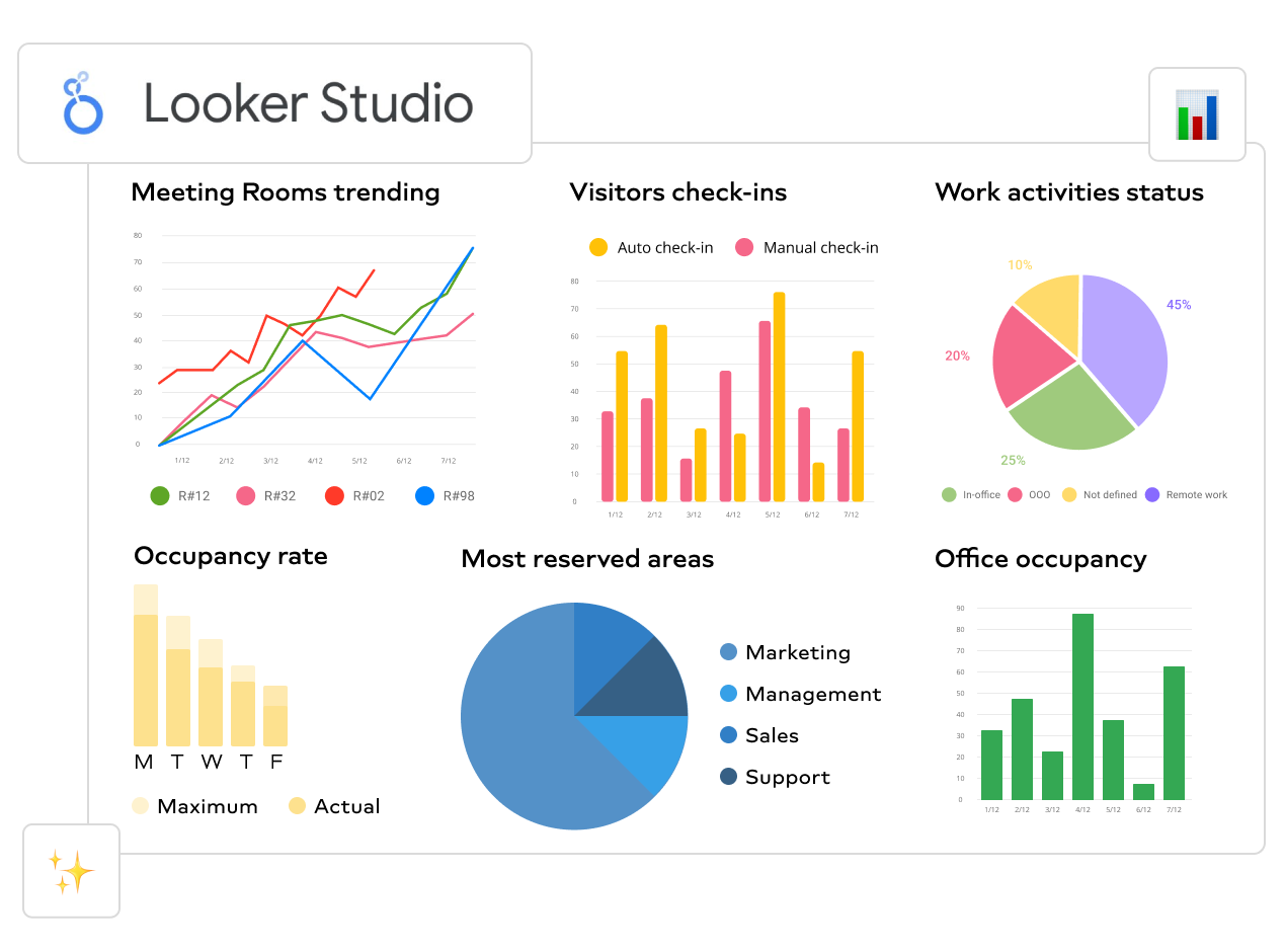
Creating dashboards
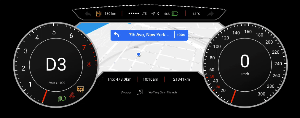
Creating dashboards in Looker is like building a control panel for your data — it gives you a clear, organized view of important information all in one place. Imagine you're driving a car and your dashboard shows you everything you need to know about your journey — like speed, fuel level, and navigation.
In the same way, Looker dashboards display key metrics and insights from your data, helping you make informed decisions and steer a business in the right direction through data. To create a dashboard, Charts are an important component we can piece together to tell different stories and reveal valuable insights about a data.
Charts in Looker
In summary...
- Looker Studio offers various types of charts for data visualization, including tables, pie charts, time series charts, interactive bar charts, geo charts, line charts, scatter charts, pivot tables, bullet charts, treemap charts, and so on.
- Each chart type has specific configurations and settings for customization, such as selecting dimensions and metrics and changing chart types.
- Charts can be adjusted to display different metrics, such as impressions, clicks, conversions, return-on-investment (ROI), average order value, etc.
- Some chart types are more suitable for specific purposes, such as scorecards for displaying KPIs, time series charts for tracking trends over time, and scatter charts for observing relationships.
That's a lots of chart to master 🤔 at this level. Don't worry, we'll only be focusing on a few important ones.
1. KPIs
Imagine you're driving a car and you have a dashboard that shows your speed, fuel level, and distance traveled. KPIs are like the numbers on that dashboard which tells you how well you're doing at a glance. For example, if you're aiming to drive at 60 mph, the KPI would show your current speed compared to that target.
KPIs (Key Performance Indicators) provide a high-level overview of important metrics or performance indicators, typically displayed as numeric values or gauges. They offer a quick snapshot of performance against predefined targets or benchmarks. Let's practice through the video below how we can create KPIs as part of our reports.
How can i create KPIs as part of my reports?
2. Bar Chart
Picture a bar graph at a candy store showing how many of each candy bar they've sold. Each candy bar has its own bar, and the taller the bar, the more of that candy was sold. It's an easy way to see which candy is the most popular without having to count every single sale.
Bar charts are commonly used to compare categorical data by representing values as rectangular bars of varying lengths. They are effective for visualizing differences or trends across different categories or groups. Let's practice through the video below how we can create Bar charts as part of our reports.
How can i create Bar charts as part of my reports?
3. Scatter Plots
Imagine you're tracking the height and weight of different animals at the zoo. Each animal is a dot on a graph, with their weight on one side and their height on the other. Scatter plots help you see if there's a connection between weight and height—if bigger animals tend to be taller, for example.
Scatter plots are used to visualize the relationship between two variables by plotting individual data points on a graph with horizontal and vertical axes. They help identify patterns, correlations, or outliers within the data. Let's practice through the video below how we can create Scatter plots as part of our reports.
How can i create Scatter plots as part of my reports?
3. Pivot Tables
Think of a pivot table like a big box of Lego bricks. You can rearrange the bricks in different ways to build different things. With a pivot table, you can rearrange your data to see it from different angles. For example, you might organize sales data by month to see which months had the most sales, or by product to see which products sold the best.
Pivot tables allow users to summarize and analyze large datasets by dynamically reorganizing rows and columns to view data from different perspectives. It offer flexibility in aggregating and exploring data across multiple dimensions.
How can i create Pivot tables ?
5. Maps
Maps are like the ones you see in a GPS devic which shows you where things are located in the world. In data visualization, maps can show you where your customers are located, where your stores are located, or any other geographic information you might have.
They are useful for displaying regional patterns, trends, or distributions within the data.
How can i create Geo location or Maps as part of my Report?
Practice - Dashboard Projects
In this practice exercise, you'll dive into the exciting world of dashboard creation, focusing on two essential projects: a Logistic report and Site Traffic Dashboard. These projects will give you hands-on experience in analyzing data and visualizing key metrics to drive informed decision-making within organizations.
Let's get started by exploring each dashboard project in detail and learning how to build them from scratch using the powerful tools available in Looker. Here's a step-by-step guide to attempt this practice exercise.
Step-by-Step Instructions:
- Start by watching the video. Pay close attention to each step demonstrated by the instructor.
- Open Looker and ensure that you have access to the sample dataset provided for the dashboard project.
- Check the video description for the dataset.
- Begin by importing the sample dataset into your workspace.
- Follow along with the instructor as they demonstrate how to create each visualization component of the dashboard.
1. Logistic Report
Other resources:
- Dataset: Check video description
- Icon download
2. Site Traffic Analysis
Other resources:
- Dataset: Check video description
- Icon download
Submission Guidelines:
- Download your dashboard as a PDF to your computer.
- Click on
Shareat the top-right. - Select
Download report
- Click on
- Attach it below and submit.
- There is no external submission for this project. Please ignore the
Incomplete statusfor external submission.
- There is no external submission for this project. Please ignore the
Assignment - Retail Sales Analysis

Dataset Description:
The dataset contains information about online retail sales transactions. It includes the following columns:
- Customer_id: Unique customer ID
- Age: Customer's age
- Gender:
0for Male,1for Female - Revenue_Total: Total sales by customer
- N_Purchases: Number of purchases to date
- Purchase_DATE: Date of the latest purchase (in
dd.mm.yy format) - Purchase_VALUE: Latest purchase amount in
€ - Pay_Method: Payment method (
0for Digital Wallets,1for Card,2for PayPal,3for Other) - Time_Spent: Time spent on the website (in seconds)
- Browser: Type of browser used (
0for Chrome,1for Safari,2for Edge,3for Other) - Newsletter: Subscription status for newsletter (
0for not subscribed,1for subscribed) - Voucher: Voucher usage status (
0for not used,1for used)
You can get a copy of the dataset here.
TODOs:
Your task is to create an interactive dashboard using Looker to visualize key insights from the provided dataset by following the steps below.
Data Exploration:
- Begin by exploring the dataset to understand its structure and contents.
- Identify any potential data quality issues or anomalies that need to be addressed and fix them.
Dashboard Design:
- Design a dashboard layout that highlight key metrics and trends related to online retail sales transactions.
Dashboard Components:
Include the following visualization components in your dashboard:
- A line chart showing trends in revenue over time.
- A bar chart comparing the distribution of purchase values across different payment methods.
- A pie chart illustrating the gender distribution of customers.
- Additional visualizations as needed to showcase other relevant insights.
- A scatter plot showing the relationship between age and purchase value.
- A KPI scorecard summarizing key performance indicators such as total revenue, average purchase value, and number of purchases.
Interactivity:
- Implement interactive features such as filters and drill-downs to allow users to explore the data dynamically.
Dashboard Presentation:
- Ensure that your dashboard is visually appealing, easy to navigate, and effectively communicates key insights from the dataset.
Submission Guidelines:
- Download your dashboard as a PDF to your computer.
- Click on
Shareat the top-right. - Select
Download report
- Click on
- Attach it below and submit.
- There is no external submission for this project. Please ignore the
Incomplete statusfor external submission.
- There is no external submission for this project. Please ignore the
Intro to Machine Learning

Welcome to week 4 of the Intro to data science course! In the third week, we looked at data visualization using Looker studio. We went further to understand different ways we can create charts and dashboards to report insight effectively.
This week, we'll begin our journey of machine learning 😍 by looking at what it is, and why it is so important for individual and businesses. Next, we'll look at different machine learning techniques - supervised and unsupervised learning. Also, we'll learn about classification and regresion, and finally explore some practical applications of machine learning 😍.
Learning Outcomes
After this week, you will be able to:
- Explain the basics and importance of machine learning in today's world.
- Distinguish different types of machine learning techniques.
- Formulate and apply machine learning to real-world problems.
An overview of this week's lesson
Getting to know ML
Machine learning is like teaching a computer how to learn from examples and make decisions on its own. Imagine you have a friend who loves to identifies pictures of different fruits. At first, you show your friend different pictures of red apples. Your friend learns from these examples and starts to recognize the differences between different red apples. Later, you show your friend new pictures of green apple, and they can tell you if it's still an apple based on what they learned from the previous examples. That's how machine learning works!
 Image source: IntelliPaat
For these ML algorithms, the more examples they see, the better they get at making accurate decisions without explicit programming, just like your friend learning to distinguish between different colours of apple. However, unlike humans who needs years of gathering experience in a particular task, such as image recognition, ML learns to do this in just a matter of hours using quality data.
Categories of ML
In ML, the type of data we have and the problem we plan to solve largely determines the type of ML to use. Watch this video from IBM on different categories of ML.
At the high level, we have 3 broad categories of ML.
- Supervised learning
- Unupervised learning
- Reinforcement learning
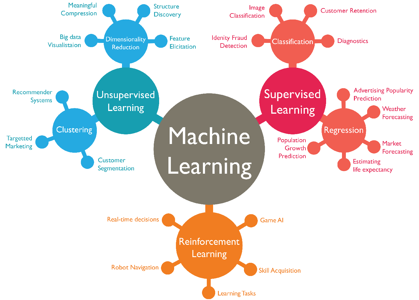
👩🏾🎨 Practice: Categories of machine learning... 🎯
There are 3 problem set provided below. Based on your understanding of ML and its categories, classify each of the problem set into one of supervised, unsupervised, and reinforcement learning.
-
You're given a dataset of patient medical records, including symptoms, test results, and final diagnoses. Your task is to develop an ML model to predict whether a patient has a certain medical condition based on their symptoms and test results. What type of ML problem is this?
-
Imagine you're building an autonomous car that needs to navigate through a simulated city. The car learns to drive safely and efficiently by receiving rewards for following traffic rules and penalties for collisions. What suitable ML problem type is this?
-
You have a dataset of patient medical records, including symptoms, test results, and final diagnoses. Your task is to develop an ML model to predict whether a patient has a certain medical condition based on their symptoms and test results. What suitable ML problem type is this?
➡️ Next, we'll look at
supervised learning... 🎯
Supervised learning
Imagine you have a really smart friend who loves to play a guessing game with you. They give you pictures of different animals, like cats and dogs, and tell you what each animal is. Your friend wants you to learn from these examples, so they can show you new pictures of animals you haven't seen before, and you can try to guess what they are based on what you've learned.

Supervised learning is a lot like this guessing game with your friend. In this type of machine learning, the computer is the "learner," and it's given labeled examples as training data. Each example consists of both the picture of the animal (input) and the name of the animal (output). The computer's job is to learn from these examples, just like you did from your friend, so that it can correctly guess the names of animals it hasn't seen before.
For example, if you are training a model to classify images of cats and dogs, the data would be a set of images, each with a label that says whether it is a cat or a dog. But how do we build a model or train a machine?
Building a model means you're training a machine to perform a specific task. To do this, there are dependent steps we need to take as listed below.
- Data collection and cleaning - collection and cleaning of dataset.
- Feature engineering - transforming and structuring the data for analysis or modelling.
- Data Modelling - using algorithms to develop predictive models.
So far, we've covered step 1 and 2 in previous weeks, and the final dataset serves as the input into the modelling phase. Now, let's look at data modelling by breaking it down into ML algorithms, training, validation, and testing.
ML Algorithms
Imagine you have a friend who loves solving puzzles. You give them a bunch of puzzle pieces with pictures on them and tell them to figure out what the complete picture looks like. Your friend starts to put the pieces together, trying different combinations, and learning from their mistakes until they complete the puzzle.
These algorithms form the core of machine learning, as they are responsible for extracting patterns and relationships from the data and using that knowledge to perform specific tasks. Just like your friend uses different strategies to put the puzzle pieces together, ML algorithms learn from data and make smart choices.
There are various types of machine learning algorithms, each designed for different types of tasks and data. Some common types of supervised ML algorithms include:
- Linear regression
- Support vector machines
- Decision trees
- Naive bayes
We'll be using some of these algorithms to perform specific tasks as we move on in the course. To train an ML agorithm, we need to split our dataset into 3 different categories: training, validation, and testing. As a rule of thumb, the percentage of data in each category can be 70% for training, 20% for validation, and 10% for testing.
Training
Suppose you have a friend who loves playing video games. You want to help them become better at a specific game, so you decide to train them by showing them different game scenarios and guiding them through each level.
In ML, model training is a bit like this gaming scenario. The model is the computer's way of learning and making predictions, just like your friend is learning to play the game. To train the model, you provide it with lots of examples, like different game situations, and tell it what the correct outcome should be for each example. This information is called training data.
ML algorithms uses this training data to learn patterns and rules, just like your friend learns from playing different game scenarios. It automatically adjusts its settings and calculations, trying to make its predictions as accurate as possible based on the training data. As the training continues, the model gets better and better at making predictions on new, unseen data, just like your friend improves their gaming skills with practice.
Validation and testing
Model validation and testing are two important steps in the ML process. They help to ensure that the ML model is accurate and reliable. In the video game example, model validation and testing is about making sure your friend's gaming skills are reliable and can handle different challenges, just like how they performed during training.
After the training, you want to check if your friend's gaming skills are truly good and not just based on specific situations they've seen before. In machine learning, this is called model validation and testing. It involves presenting the model with new or unseen data to assess its performance on real-world situations.
The goal of model testing is to ensure that the model is not just memorizing the examples from training but can actually apply what it learned to make useful predictions on new, real-world data. This process helps you assess the model's performance and make sure it's reliable for the tasks you want it to perform.
As a recap, check the video below to get a summary of training, validation, and testing.
👩🏾🎨 Practice: Supervised learning... 🎯
Suppose you want to develop a supervised machine learning model to predict whether a given email is "spam" or "not spam." Which of the following statements are true?
- Emails not marked as "spam" or "not spam" are unlabeled examples.
- We'll use unlabeled examples to train the model.
- Words in the subject header will make good labels.
- The labels applied to some examples might be unreliable.
➡️ Next, we'll look at
Classification in ML... 🎯
ML Classification
Classification in machine learning is like teaching a computer to sort waste items into different bins based on patterns and characteristics it learned from labeled examples. It is a techniques used in supervised learning to carry out predefined task. The learning path for the model depends on both the data and the problem we are trying to solve.
Classification
Imagine you have a big pile of waste materials, and you want to organize them into different bins based on the type of waste. You have plastic bottles, glass containers, paper, metal cans, and organic waste like food scraps. Sorting them by hand could be time-consuming, so you decide to use a machine learning technique called classification to help you with the task.
In machine learning, classification is like having a smart assistant that can automatically identify and sort each waste item into the right bin. Just like you might look at the shape, color, and texture of each item to determine its type, the classification model uses patterns and features from the waste items to make predictions.
In classification, the model is trained on a set of labeled data, which means that the data has been pre-classified into different categories, such as plastic, glass, paper, metal, and organic.
Another example of labeled dataset is given in the diagram below. Independent features are all features in the dataset except the feature we are trying to predict, which is called the dependent feature because its values depend on other features. Each row in the dataset is refrred to as a data point.
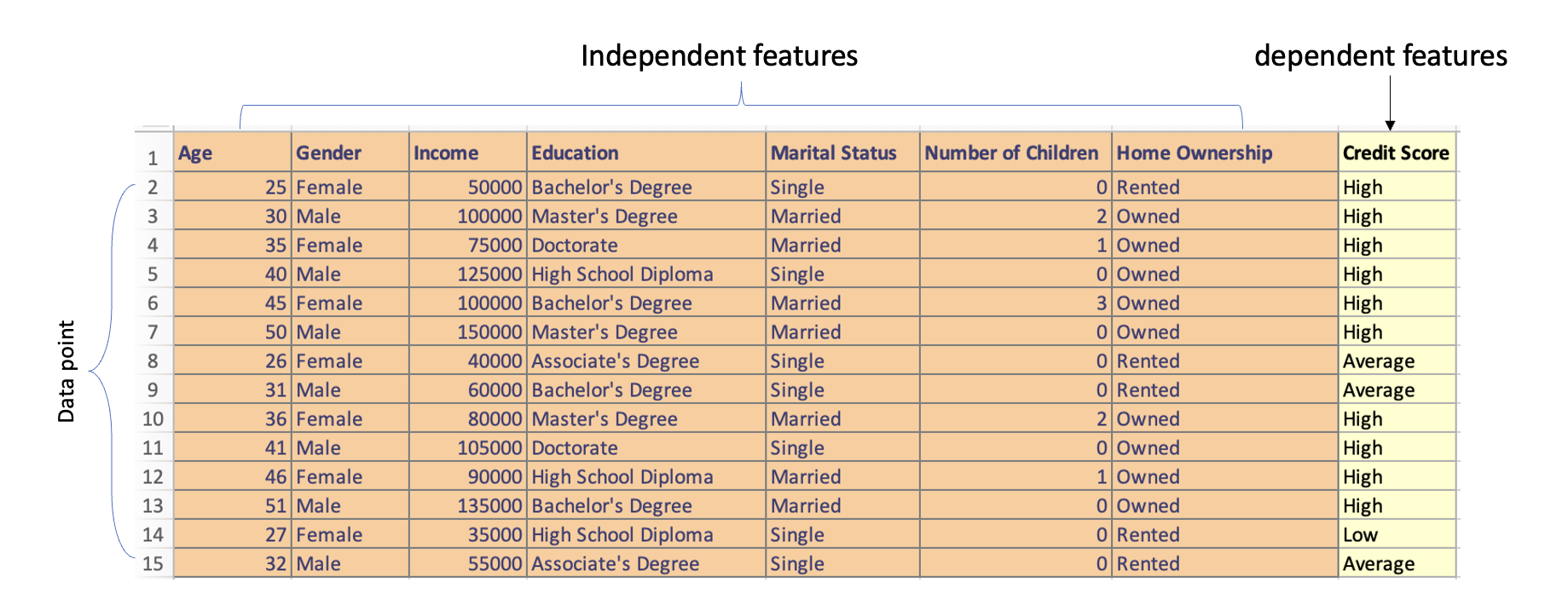
Using the labelled data, the model learns to map the input data to the correct category by adjusting its parameters over time through a process called gradient descent, which essentially involves finding the set of parameters that minimizes the error between the model's predictions and the actual class or label.
Binary vs Multi-class classification
Binary classification is a task where the model is only trained to predict one of two categories, for example, a binary classification model could be used to predict whether an email is spam or ham, or whether a student will pass or fail. In multi-class classification, the model is trained to predict one of more than two categories. For example, to predict the species of a flower (setosa, versicolor, or virginica), or the final grade of a student in a course - A, B, C, D, E or F.
The main difference between binary classification and multi-class classification is the number of categories that the model is trained to predict. In binary classification, the model is only trained to predict one of two categories, while in multi-class classification, the model is trained to predict one of more than two categories.
Here is a code snippet of a binary classification model that classifies whether a student will pass or fail. Play around with the new_student_df to test and see the changes.
In this code snippet, we use the RandomForestClassifier algorithm to build the classification model. It trains on the features such as 'hours_studied', 'previous_grade', 'attendance_percentage', 'test_score', 'homework_score', 'extracurricular_activities', and 'class_participation' to predict whether a student will pass or fail. The model is then evaluated using accuracy.
Finally, we created a new student data who studied for 6 hours, had a previous grade of 80, an attendance percentage of 92, test score of 85, homework score of 88, and participates in class discussions (1). This is simply to test the model.
👩🏾🎨 Practice: Classification in ML... 🎯
-
Suppose an online shoe store wants to create a supervised ML model that will provide personalized shoe recommendations to users. That is, the model will recommend certain pairs of shoes to Marty and different pairs of shoes to Janet. The system will use past user behavior data to generate training data. Which of the following statements are true?
Shoe sizeis a useful feature.The user clicked on the shoe's descriptionis a useful label.Shoe beautyis a useful feature.Shoes that a user adoresis a useful label.
➡️ Next, we'll look at
regression in ML... 🎯
Regression in ML
Imagine you are trying to predict the price of a house based on various features like the number of bedrooms, the area in square feet, and the age of the house. This problem cannot be solved with classification because the outcome you want to predict, i.e, the house price, is a continuous variable, meaning it can take ANY numerical value within a range.
In contrast, classification is only used when the outcome is a categorical variable with distinct categories, like predicting whether an email is spam or not.
Regression
However, unlike classification, the categories in regression are continuous values, such as height, weight, or price. Imagine you want to estimate how much time it will take for you to reach a friend's house based on the distance you have to travel and the average speed at which you drive.

In machine learning, regression works in a similar way. You show the computer many examples of distances traveled and the corresponding time taken to reach a destination. The computer then looks for patterns and relationships between the distances and the time.
Once the computer has learned from these examples, you can provide it with a new distance, and it will predict how much time it will take you to walk there based on what it learned. Hence, regression helps us make accurate predictions for numerical outcomes, just like estimating the time it will take for you to reach your friend's house based on the distance and your walking speed.
Linear regression
Linear regression is a statistical technique used in machine learning to model the relationship between a dependent variable (the outcome we want to predict) and one or more independent variables (features or factors that influence the outcome). It assumes that the relationship between the variables can be approximated by a straight line.
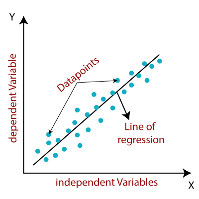
Imagine you have a dataset that includes information about several houses, such as the size of the house (in square feet), the number of bedrooms, and the age of the house. You also have the corresponding prices at which each house was sold.
Linear regression works by finding a straight line (a mathematical equation) that best fits the relationship between the features (size, bedrooms, age) and the house prices. The goal is to find a line that minimizes the difference between the actual house prices and the predicted prices given by the line.
Here is a code snippet of a linear regression model that predict the price of house using a simulated data. Play around with the new_house values and see how the predicted house price changes.
In the code snippet, we used the house_size, number_of_bedrooms, and year_built as the independent variable and house_price as the dependent variable. The model is trained on the data using model.fit(), and we use it to predict the price of a new house with a size of 1600 square feet, 3 bedrooms, and built year of 2008. The predicted_price will give us the estimated price for that new house based on the relationship learned from the training data.
👩🏾🎨 Practice: Regression in ML... 🎯
-
Which of the following statements best describes supervised learning in the context of regression?
- Supervised learning involves training a model with labeled data and then making predictions on unlabeled data.
- Supervised learning is a technique to train models only on numerical data.
- Supervised learning does not involve the use of any training data.
- Supervised learning is only used for classification problems.
-
Which of the following statements is true about linear regression?
- Linear regression is suitable only for categorical data.
- Linear regression assumes a linear relationship between dependent and independent variables.
- Linear regression does not involve any assumptions about the data.
- Linear regression can only predict binary outcomes.
➡️ Next, we'll look at
Unsupervised learning... 🎯
Unsupervised learning
Unsupervised learning in ML is like letting the computer discover hidden patterns and relationships in data all on its own, without any specific guidance. It's a bit like a curious explorer that searches for interesting things in a big collection of objects.
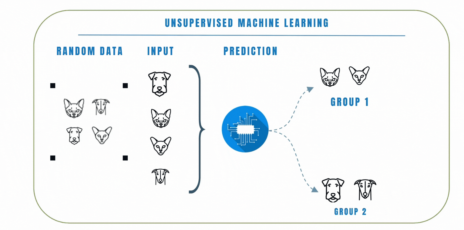
Unlike supervised learning where the model is trained on a labelled dataset, this means that the data does not have any pre-defined labels, so the model has to learn to find patterns in the data on its own.
Clustering
In unsupervised learning, clustering is a popular technique we can use to group similar data points together based on their similarities. The goal of clustering is to find patterns or structures in the data without the need for explicit labels or predefined categories. K-Means and Hierarchical clustering are common clustering algorithms used in unsupervised learning. Let's look at these 2 algorithms by watching the video below.
In a similar scenario, let's consider another example where we have a dataset of emojis that includes emotions such as angry, sad, and happy. Each emoji is represented by certain features like colors, shapes, and facial expressions. Using clustering, we can group similar emojis together based on their features.
For example, emojis with red colors and frowning facial express ions might be grouped as angry emojis. Emojis with blue colors and tears in their eyes might be grouped as sad emojis, while emojis with bright colors and smiling faces might be grouped as happy emojis.
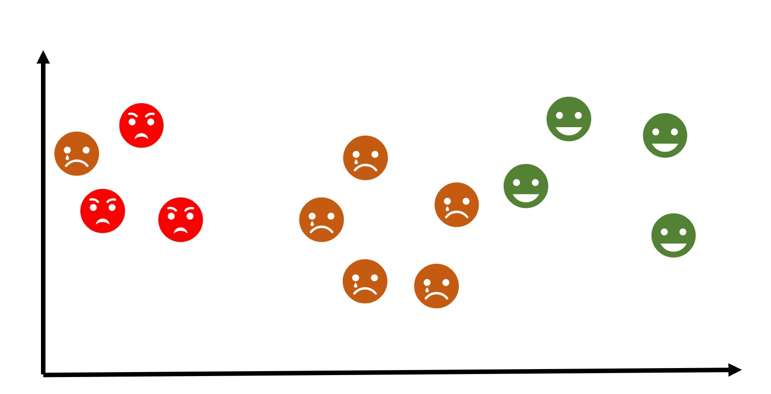
👩🏾🎨 Practice: Unsupervised learning... 🎯
-
Which of the following statements best describes clustering in the context of machine learning?
- Clustering is a technique used to train models on labeled data.
- Clustering involves grouping similar data points together based on certain criteria.
- Clustering is only applicable to classification problems.
- Clustering is primarily used to predict numerical outcomes.
-
Which of the following statements is true about K-Means clustering?
- K-Means clustering is used for text analysis only.
- K-Means clustering aims to minimize the number of clusters.
- K-Means clustering requires the number of clusters (k) to be specified in advance.
- K-Means clustering is not suitable for datasets with a large number of features.
➡️ Next, we'll look at
Applications of ML... 🎯
Applications of ML
ML is a powerful tool that can be used to solve a wide variety of problems. As machine learning technology continues to develop, we can expect to see even more innovative applications of machine learning in the future. Here are some other examples of machine learning:
- Spam filtering
- Fraud detection
- Weather prediction
- Medical diagnosis
- Recommendation systems
- Image and speech recognition
- Predictive maintenance.
- Natural language processing
- Self-driving cars
- Environmental Monitoring
Now, let's understand a use case of day-to-day application of ML in solving everyday problems. The video below talks us through finding personal moments in videos and other applications of ML.
Final project
Due Date: 07/06/2024
Description
You’ve learned a ton about data, data cleaning, and visualization in this course. The final project is your chance to solve a problem with these from scratch. Your final project will involve cleaning, analyzing, and drawing insight from a dataset using visuals to solve a real-life problem. Remember, you're doing this with your team.
Project and Design Guidelines
Your team gets to decide which of the provided projects are you choosing for the final project. The challenge is to choose a project that is exciting to you, but is not so big that it’s overwhelming or impossible to complete.
Here’s some guidelines that can help you pick an exciting project you’ll be able to complete.
- Form a team with maximum of 3 members.
- Choose from the list of sample projects provided below to work on.
- It is allowed if your team choose to work on a project outside the samples provided.
- Don’t plan to learn a whole new tool/technology for the final project. Plan to use mostly what you’ve already learned (with a little bit more Googling for the things you run into along the way).
- You're expected to use Looker studio for your visualizations.
- Add a little bit of documentation to show the steps you took during the implementation of your project.
Sample Projects and Dataset
Here are sample projects you can choose from for your final projects. Remember, the sample projects are optional, hence, your team can decide to work on projects outside the samples provided below.
Dataset Guideline
- Click on the dataset link of your preferred project, this should open up a list of possible dataset on Kaggle, a data science platform. You'll need to create an account if you don't have one.
- Explore each dataset by clicking on it and getting to know what the dataset is about.
- Only choose a dataset that that is useful for your team's project
- Download the dataset using the download button at the top-right part of the dataset page.
- Clean the dataset - most public dataset requires you clean them.
- Import your dataset into Looker studio and start with your analysis
| Project Name | Description | Dataset Link | |
|---|---|---|---|
| 1 | E-Commerce Sales Analysis | Analyze sales trends, customer behavior, and product performance in an online store. | Sales |
| 2 | Stock Market Trends | Explore stock prices, trading volumes, and market trends to gain insights. | Stock |
| 3 | Retail Store Inventory | Optimize inventory management, track product sales, and forecast demand. | Inventory |
| 4 | Flight Delay Analysis | Analyze flight delays based on historical data to identify patterns. | Flight |
| 5 | Weather Patterns | Explore weather data to understand patterns and trends. | Weather |
| 6 | Energy Consumption Analysis | Analyze energy usage patterns to optimize consumption and reduce costs. | Energy |
| 7 | Web Traffic Analysis | Analyze website traffic patterns to optimize user experience and marketing strategies. | Web |
How should you work together?
You’ll should figure out what works best for your team. The best teams communicate clearly up front, so that there isn’t confusion about what is going on. Try to agree on how you’ll communicate (Discord, Whatsapp, email, or something else), and when you’ll get together to work on the project.
It may be helpful to create a design doc. Using Google docs or a text file in Replit, write down your ideas. You might include links, images, drawings, and text that helps to explain what you are planning to build.
A design doc can also help you track what work you’ve done, and what work is left to do.
Submission
- Submit a link to your completed project here.
- Remember to set the access to your Looker project to public under
Sharing.
- Remember to set the access to your Looker project to public under
- Submission is individual. Therefore, each team member MUST submit a copy of their project.
✨✨Have fun!✨✨
Wrapping up: Final Steps for IDS
Congratulations on almost finishing your IDS journey. Below is what you need to do to finish strong.
Earn Your Certificate
You have worked really hard and we want to recognize that work with a certificate you can share digitally. To earn your certificate, you need to complete the following by Friday, June 7
- Complete the assignments from Weeks 1 through 3, and submit as described on the assignment page. (Note: these are the week 1, week 2, and week 3 assignments)
- Complete the Final Project
- Complete the Program Feedback Survey
Share your experience on social media
We would love to hear how the Try Kibo class went for you.
- Share a social media post about your Try Kibo experience. You have worked so hard so let the public know what you worked on and your journey through it.
Tag us (@kiboschool) across any platform and we will reshare
Show gratitude
This experience has been better by the efforts of so many people, including your peers. Take a minute to write and read notes of gratitude:
Keep learning
Remember that this is a long journey and what matters is to learn well, not fast. And keep practicing!
- Finish the practice assignments from this course, if there are any that you didn’t get to during these five weeks.
- Review more data science problems:
Thank you! ✨
Kibo would not be the same without your participation. We are so grateful that you joined us.