Data size and Bubble chart
Data size refers to the amount of data we have to work with. It can vary from small datasets with just a few rows and columns to massive datasets with millions or even billions of data points. The size of the data is important because it can affect how we analyze and visualize the information it contains. To represent different components (such as high and low values) in our visualization, we can use a 3D visualization such as Bubble chart.
Bubble chart
To understand this better, let's consider some examples...
Example 1
Let's consider an imaginary dataset that contains pollution information about different cities from Europe (London, Paris, Berlin, and Rome) and Africa (Lagos, Cairo, Nairobi, and Accra). The dataset includes information on the population size, average temperature in Celsius, and pollution level for each city. We can create the bubble chart by following these steps:
- import the libraries
- create the dataset
- create the bubble chart
Programatically, we can achieve the above steps using the code snippet below.
import pandas as pd
import seaborn as sns
import matplotlib.pyplot as plt

# Create an imaginary dataset
data = pd.DataFrame({
    'City': ['London', 'Paris', 'Rome', 'Lagos', 'Nairobi', 'Accra', 'Berlin', 'Cairo'],
    'Population': [8900000, 2141000, 2873000, 21000000, 4397000, 2062000, 3645000, 20340000],
    'Average Temperature (C)': [13, 12, 18, 28, 24, 28, 9, 32],
    'Pollution Level': [3, 2, 2, 6, 5, 4, 2, 7]
})

# Create a bubble chart
sns.scatterplot(data=data, x='Average Temperature (C)', y='Pollution Level', size='City', hue='City', sizes=(20, 1000))

# Add labels and title
plt.xlabel('Average Temperature (C)')
plt.ylabel('Pollution Level')
plt.title('Temperature vs Pollution Level')

# move legend outside the chart
plt.legend(bbox_to_anchor=(1.01, 1),borderaxespad=0)

# Show the plot
plt.show()
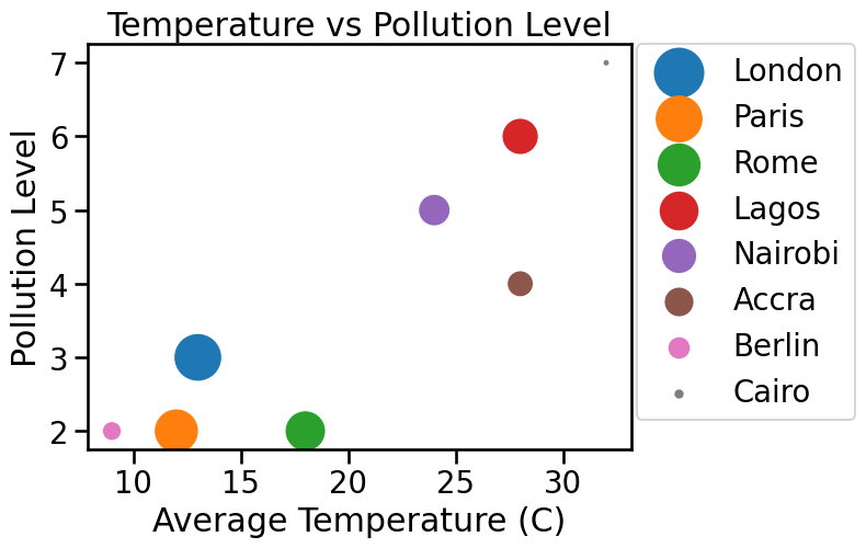
The above bubble chart shows the relationship between average temperature and pollution level, with the size of each bubble representing the population size of the city.
Example 2
In this example, we'll use a real-life dataset - the famous iris dataset, which contains measurements of sepal length, sepal width, petal length, and petal width for different iris flowers. We can create the bubble chart by following these steps:
- import the libraries
- load the dataset
- create the bubble chart
Programatically, we can achieve the above steps using the code snippet below.
import seaborn as sns
import matplotlib.pyplot as plt

# Load the iris dataset from seaborn
iris = sns.load_dataset('iris')

# Create a bubble chart
sns.scatterplot(data=iris, x='sepal_length', y='sepal_width', size='petal_length', sizes=(20, 1000), hue='species')

# Add labels and title
plt.xlabel('Sepal Length')
plt.ylabel('Sepal Width')
plt.title('Iris Sepal Size')

# move legend outside the chart
plt.legend(bbox_to_anchor=(1.01, 1),borderaxespad=0)

# Show the plot
plt.show()
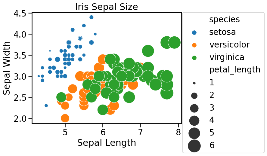
This bubble chart shows the relationship between sepal length and sepal width, with the size of each bubble representing the petal length. This can help us understand the distribution of iris flowers based on their sepal size and petal length.
👩🏾🎨 Practice: Know your Diamonds... 🎯
We'll continue to use the "diamonds" dataset available in Seaborn. Can we visualize the relationship between the carat weight, price, and clarity of diamonds using a bubble chart?
Task: create a bubble chart to visualize the relationship between the carat weight, price, and clarity of diamonds.
Instructions:
- Import the necessary libraries, including
SeabornandMatplotlib. - Load the
diamondsdataset from Seaborn. - Create a bubble chart with
caraton the x-axis,priceon the y-axis, and useclarityto determine the size of the bubbles. - Bonus (Optional):
- Label the axes and add a title to the bubble chart.
- Use different colors to represent different clarity levels.
Dataset:
You can load the diamonds dataset directly from Seaborn.
➡️ Next, you'll learn data distribution using
histogramsanddensity plots🎯.