Introduction to Data Science
Welcome to Intro to Data Science! You are joining a global learning community dedicated to helping you learn and thrive in data science.
Course Description
Data science is applicable to a myriad of professions, and analyzing large amounts of data is a common application of computer science. This course empowers students to analyze data, and produce data-driven insights. It covers the foundational suite of concepts needed to solve data problems, including preparation (collection and processing), presentation (information visualization), and analysis (statistical and machine learning).
Data analysis requires acquiring and cleaning data from various sources including the web, APIs, and databases. As a student, you will learn techniques for summarizing and exploring data with tools like Spreadsheets, Google Colab, and Pandas. Similarly, you'll learn how to create data visualizations using Power BI and Seaborn, and practice communication with data. Likewise, you'll be introduced to machine learning techniques of prediction and classification, and explore Natural Language Processing (NLP). Lastly, you'll learn the fundamentals of deep learning, which will prepare you for advanced study of data science.
Throughout the course, you will work with real datasets and attempt to answer questions relevant to real-life problems.
Course Objectives
At the end of the course, student should be able to:
- Explain the basics of data science, its relevance, and applications in 21st century.
- Describe various data collection and cleaning techniques, using necessary tools.
- Apply different visualization tools to generate insights that drive business decisions.
- Demonstrate understanding of machine learning concepts, and its application to real-world problems.
Instructor
- Name: Wasiu Yusuf
- Email: wasiu.yusuf@kibo.school
Live Class Time
Note: all times are shown in GMT.
- Wednesday at 3:00 PM - 4:30 PM GMT
Office Hours
- Thursday at 2:00 - 3:00 PM GMT
Live Classes
Each week, you will have a live class (see course overview for time). You are required to attend the live class sessions.
Video recordings and resources for the class will be posted after the classes each week. If you have technical difficulties or are occasionally unable to attend the live class, please be sure to watch the recording as quickly as possible so that you do not fall behind.
| Week | Topic | Slides | Live Class |
|---|---|---|---|
| 1 | Intro to Data Science | Slide_1 | Video_1 |
| 2 | Data Collection and Cleaning | Slide_2 | Video_2 |
| 3 | Data Visualization & Insight | Slide_3 | Video_3 |
| 4 | Exploratory Data Analysis | Slide_4 | Video_4 |
| 5 | Feature Engineering | Slide_5 | Video_5 |
| 6 | Intro to Machine Learning | Slide_6 | Video_6 |
| 7 | Model Evaluation Techniques | Slide_7 | Video_7 |
| 8 | Natural Labguage Processing | Slide_8 | Video_8 |
| 9 | Deep Learning Fundamentals | Slide_9 | Video_9 |
| 10 | Final Project Week | NIL | NIL |
If you miss a class, review the slides and recording of the class and submit the activity or exercise as required.
Assessments
Your overall course grade is made up of the following components:
- Practice Exercises: 18%
- Weekly assignments: 42%
- Midterm Project: 15%
- Final Project: 25%
Practice Exercises
Each week, there are activities in the lessons and practice exercises at the end of the lesson. Learning takes lots of practice, so you should complete all of these practice activities. Some of the practice exercises must be submitted, though you will not get quick feedback on your work unless you reach out on Discord or to the instructor directly (perhaps via office hours) for feedback. The purpose of the practices if for you to apply what you are learning and prove to yourself that you understand the concepts. It is very easy to convince yourself that you understand something when the correct answer is sitting right in front of you. By doing the exercises, you will be able to determine if you truly understand the material.
Practice tips
- It's good to look at other solutions, but only after you've tried solving a problem. If you come up with a solution that works, try to notice how someone else solved the same problem, and what you might do to revise your solution.
- It can be good to try solving the same problem a second time, after some days or weeks have passed. Has the problem gotten easier, now that you have solved it before?
- It's fun to solve problems with friends. If you have a solution you really like, you can share it with the squad or community. Remember to use spoiler tags so that you don't ruin the problem in case someone else wants to try it and this is only for practice exercises that are not graded.
- Practice should be challenging, but you shouldn't spend hours stuck on a problem without making progress. If you are stuck, take a break, ask for help, try another problem, and return to the problem later.
- Take a break! It's often helpful to walk around, drink water, eat a bite of food, then return to a problem refreshed. Some problems that seem impossible become very easy when approached with a fresh mind.
Weekly Assignments
Most weeks, you'll have a assignment to complete, usually as an individual, though it will be specified within the assignment description if you can work in a team. The assignment will bring together the skills you learn that week with the skills that you learned in prior weeks. The course topics and assignments build upon each other during the term. It is critically important that you stay caught up and complete all the assignments. If you skip an assignment, you will be at a disadvantage in future assignments.
On weeks that you have projects (midterm or final), you will not have an assignment to complete.
Projects
Approximately midway through the term and during the last two weeks of the term, you will be given a project. These projects are summative in nature--this is your opportunity to demonstrate to the instructor that you understand what you are doing. Note that these two projects make up a significant percentage of your final grade, so it is critical that you begin the projects early.
Getting Help
If you have any trouble understanding the concepts or stuck on a problem, we expect you to reach out for help!
Below are the different ways to get help in this class.
Discord Channel
The first place to go is always the course's help channel on Discord. Share your question there so that your Instructor and your peers can help as soon as we can. Peers should jump in and help answer questions (see the Getting and Giving Help sections for some guidelines).
Message your Instructor on Discord
If your question doesn't get resolved within 24 hours on Discord, you can reach out to your instructor directly via Discord DM or Email.
Office Hours
There will be weekly office hours with your Instructor and your TA. Please make use of them!
Tips on Asking Good Questions
Asking effective questions is a crucial skill for any computer science student. Here are some guidelines to help structure questions effectively:
-
Be Specific:
- Clearly state the problem or concept you're struggling with.
- Avoid vague or broad questions. The more specific you are, the easier it is for others to help.
-
Provide Context:
- Include relevant details about your environment, programming language, tools, and any error messages you're encountering.
- Explain what you're trying to achieve and any steps you've already taken to solve the problem.
-
Show Your Work:
- If your question involves code, provide a minimal, complete, verifiable, and reproducible example (a "MCVE") that demonstrates the issue.
- Highlight the specific lines or sections where you believe the problem lies.
-
Highlight Error Messages:
- If you're getting error messages, include them in your question. Understanding the error is often crucial to finding a solution.
-
Research First:
- Demonstrate that you've made an effort to solve the problem on your own. Share what you've found in your research and explain why it didn't fully solve your issue.
-
Use Clear Language:
- Clearly articulate your question. Avoid jargon or overly technical terms if you're unsure of their meaning.
- Proofread your question to ensure it's grammatically correct and easy to understand.
-
Be Patient and Respectful:
- Be patient while waiting for a response.
- Show gratitude when someone helps you, and be open to feedback.
-
Ask for Understanding, Not Just Solutions:
- Instead of just asking for the solution, try to understand the underlying concepts. This will help you learn and become more self-sufficient in problem-solving.
-
Provide Updates:
- If you make progress or find a solution on your own, share it with those who are helping you. It not only shows gratitude but also helps others who might have a similar issue.
Remember, effective communication is key to getting the help you need both in school and professionally. Following these guidelines will not only help you in receiving quality assistance but will also contribute to a positive and collaborative community experience.
Screenshots
It’s often helpful to include a screenshot with your question. Here’s how:
- Windows: press the Windows key + Print Screen key
- the screenshot will be saved to the Pictures > Screenshots folder
- alternatively: press the Windows key + Shift + S to open the snipping tool
- Mac: press the Command key + Shift key + 4
- it will save to your desktop, and show as a thumbnail
Giving Help
Providing help to peers in a way that fosters learning and collaboration while maintaining academic integrity is crucial. Here are some guidelines that a computer science university student can follow:
-
Understand University Policies: Familiarize yourself with Kibo's Academic Honesty and Integrity Policy. This policy is designed to protect the value of your degree, which is ultimately determined by the ability of our graduates to apply their knowledge and skills to develop high quality solutions to challenging problems--not their grades!
-
Encourage Independent Learning: Rather than giving direct answers, guide your peers to resources, references, or methodologies that can help them solve the problem on their own. Encourage them to understand the concepts rather than just finding the correct solution. Work through examples that are different from the assignments or practice problems provide in the course to demonstrate the concepts.
-
Collaborate, Don't Complete: Collaborate on ideas and concepts, but avoid completing assignments or projects for others. Provide suggestions, share insights, and discuss approaches without doing the work for them or showing your work to them.
-
Set Boundaries: Make it clear that you're willing to help with understanding concepts and problem-solving, but you won't assist in any activity that violates academic integrity policies.
-
Use Group Study Sessions: Participate in group study sessions where everyone can contribute and learn together. This way, ideas are shared, but each individual is responsible for their own understanding and work.
-
Be Mindful of Collaboration Tools: If using collaboration tools like version control systems or shared documents, make sure that contributions are clear and well-documented. Clearly delineate individual contributions to avoid confusion.
-
Refer to Resources: Direct your peers to relevant textbooks, online resources, or documentation. Learning to find and use resources is an essential skill, and guiding them toward these materials can be immensely helpful both in the moment and your career.
-
Ask Probing Questions: Instead of providing direct answers, ask questions that guide your peers to think critically about the problem. This helps them develop problem-solving skills.
-
Be Transparent: If you're unsure about the appropriateness of your assistance, it's better to seek guidance from professors or teaching assistants. Be transparent about the level of help you're providing.
-
Promote Honesty: Encourage your peers to take pride in their work and to be honest about the level of help they received. Acknowledging assistance is a key aspect of academic integrity.
Remember, the goal is to create an environment where students can learn from each other (after, we are better together) while we develop our individual skills and understanding of the subject matter.
Academic Integrity
When you turn in any work that is graded, you are representing that the work is your own. Copying work from another student or from an online resource (including generative AI tools like ChatGPT) and submitting it is plagiarism.
As a reminder of Kibo's academic honesty and integrity policy: Any student found to be committing academic misconduct will be subject to disciplinary action including dismissal.
Disciplinary action may include:
- Failing the assignment
- Failing the course
- Dismissal from Kibo
For more information about what counts as plagiarism and tips for working with integrity, review the "What is Plagiarism?" Video and Slides.
The full Kibo policy on Academic Honesty and Integrity Policy is available here.
Course Tools
In this course, we are using these tools to work on code. If you haven't set up your laptop and installed the software yet, follow the guide in https://github.com/kiboschool/setup-guides.
- GitHub is a website that hosts code. We'll use it as a place to keep our project and assignment code.
- GitHub Classroom is a tool for assigning individual and team projects on Github.
- Google Colab is your code editor. It's where you'll write code to analyze your dataset.
- Chrome is a web browser we'll use to access Google Colab and other online resources. Other browsers may have similar features, but the course is designed to be completed using Chrome.
- Anchor is Kibo's Learning Management System (LMS). You will access your course content through this website, track your progress, and see your grades through this site.
- Gradescope is a grading platform. We'll use it to track assignment submissions and give you feedback on your work.
- Woolf is our accreditation partner. We'll track work there too, so that you get credit towards your degree.
Core Reading
The following materials were key references when this course was developed. Students are encouraged to use these materials to supplement their understanding or to diver deeper into course topics throughout the term.
- Adhikari, A., DeNero J. (2020). Computational and Inferential Thinking: The Foundations of Data Science
- Aggarwal R., Ranganathan P., (2017). Common pitfalls in statistical analysis. NCBI
- Luciano, F., Mariarosaria T., (2016). What is data ethics?. Royal Society Publishing
Supplemental Reading
This course references the following materials. Students are encouraged to use these materials to supplement their understanding or to diver deeper into course topics throughout the term.
- Hamel G. (2020). Python for Data Analysis Playlist
- Datacamp.com. Pandas Cheat Sheet
Intro to Data Science

Welcome to week 1 of the Intro to data science course 🤝
This week, we will explore the fundamental concepts and techniques used in data science. We will start by understanding what data science is and its importance in today's world. We will then dive into the data science building blocks and workflows. Next, we will learn about data types and spreadsheet softwares. Furthermore, you'll learn how to use Microdoft Excel to explore, manipulate, clean, and visualize sample dataset. Finally, you'll be introduced to some data science tools.
Whatever your prior expereince, this week you'll touch on basics of data science and the tools you'll be using. You'll also start practising learning and working together. The internet is social, and technologists build it together. So, that's what you'll learn to do too.
Learning Outcomes.
After this week, you will be able to:
- Explain the basics and building blocks of data science.
- Describe different data types used in data science.
- Apply different data cleaning techniques on messy dataset.
- Generate and visualize data with Microsoft Excel.
An overview of this week's lesson
Intro to Data Science
Data is the new electricity- Satya Nadella
We live in a time where huge amount of data are generated every second through website visit, social media likes and posts, online purchase, gaming, and online movie streaming among others. With an estimated 2.5 quintillion bytes of data generated each day, it is now inevitable for individuals and businesses to strategize on ways to derive valuable insight from this huge data lying around.
Now that you have an idea about the data boom, let’s look at what data science is all about.
What is Data Science?
In summary...
- Data science is an multidisciplinary field that involves the processes, tools, and techniques needed to uncover insight from raw data.
- Data science plays a critical role in enabling businesses to leverage their data assets and stay competitive in today's data-driven economy.
Now that you have an idea of what data science is, let understand why data science is important, and its role in businesses.
Data science in today's business
Given its significance in modern-day organizations...
- data science holds crucial importance to decision making and business success.
- there is a growing need for professionals who are equipped with data science skills... could that be you?
Who is a data scientist?
As an important part of every business, the role of a data scientist includes the following:
-
Collecting, processing, and analyzing data to identify patterns and insights that inform decision-making processes.
-
Developing predictive models that can be used to forecast future trends or outcomes based on historical data.
-
Creating data visualizations that make complex data sets easy to understand and communicate to stakeholders.
-
Collaborating with cross-functional teams to identify business problems and opportunities that can be addressed using data-driven insights.
-
Developing and deploying machine learning algorithms and other advanced analytical techniques to solve complex problems and generate insights.
-
Ensuring the accuracy, integrity, and security of data throughout the data lifecycle.
-
Staying up-to-date with the latest trends and tools in data science, and continuously improving skills and knowledge through ongoing learning and development.
👩🏾🎨 Practice: Data and Businesses
- Why is data science important for businesses?
- Highlight 2 things a data scientist doesn't do in an organization.
Answer these questions in the padlett below.
https://padlet.com/curriculumpad/data-and-businesses
👉🏾 In the next section, we'll explore the building blocks and typical workflow of data science.
🛃 Building blocks and Workflow
Building blocks
Previously, we described data science as a multidisciplinary field. At the high level, data science is typically an intersection of 3 core areas - statistics, computer science, and domain expertise. Altogether, these three areas form the building blocks of data science, allowing practitioners to collect, process, analyze, and visualize data in a way that generates valuable insights and informs decision-making processes in various industries and domains.
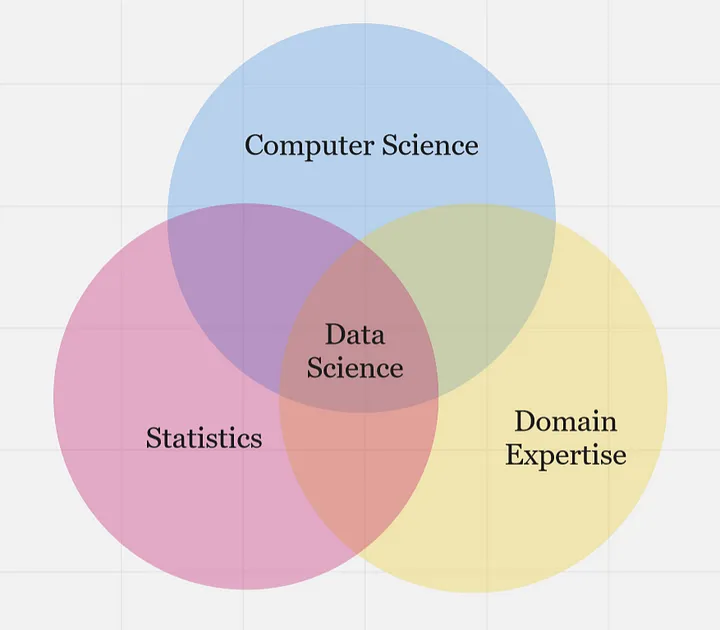
...statistics, computer science, and domain knowledge are all essential components of data science, and each plays a critical role in the data science process as highlighted below.
- Statistics - provides the foundational concepts and methods for collecting, analyzing, and interpreting data. This is essential for understanding the data itself, including identifying patterns, testing hypotheses, and making predictions.
- Computer Science - provides the computational and programming tools needed to manipulate, process, and visualize data at scale, such as tools and infrastructure necessary to work with data at scale. This includes programming languages like Python and R, as well as tools like SQL, Hadoop, and Spark.
- Domain Expertise - refers to expertise in a specific field or industry, which is critical for understanding the context of the data being analyzed and generating insights that are relevant and useful. Domain knowledge is particularly important in fields like healthcare, finance, and engineering, where specialized knowledge is required to make informed decisions based on data.
Overall, data science building blocks are an intersection of statistical methods, computer science tools, and domain knowledge, which are used together to extract insights and generate value from data. Now, how does a typical data science project looks like while using this building blocks?
Data science workflow
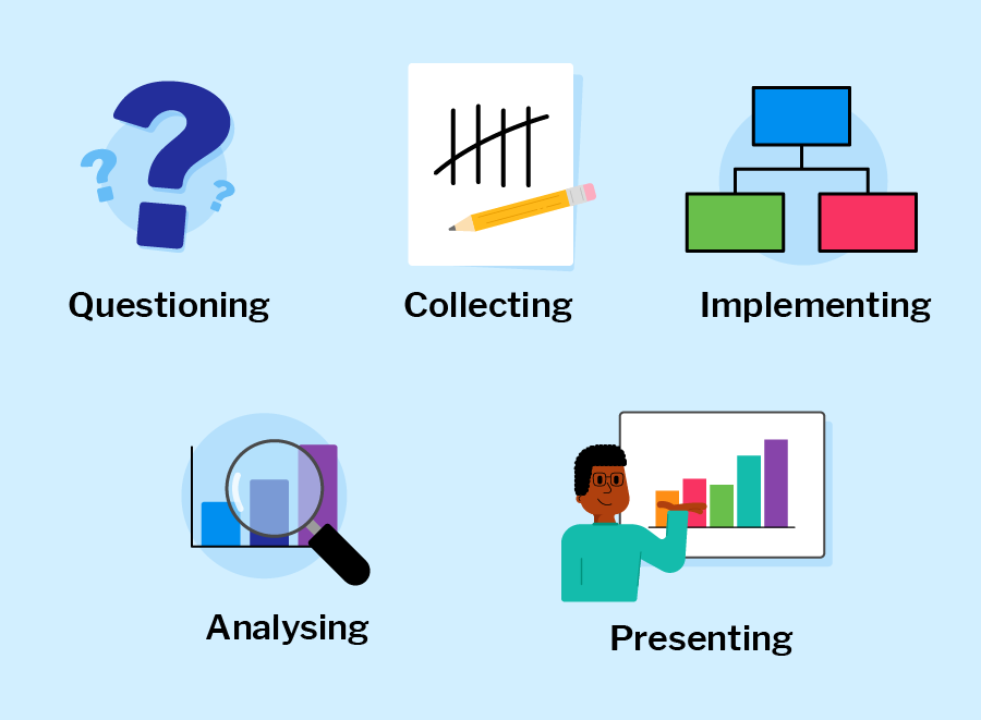
Each phase includes different dependent tasks and activities needed to achieve the overall goal of the project. Overall, the workflow serve as guidelines throughout the project life cycle. A typical end-to-end journey of a sample data science project using this workflow is explained in the next video.
In summary, a typical data science project workflows includes;
-
Problem formulation: involves work with stakeholders to clearly define the problem they are trying to solve, identify the key objectives, and develop a plan for data-driven decision-making.
-
Data collection: This involves obtaining data from various sources, including databases, APIs, and web scraping.
-
Data Preparation: This involves cleaning, transforming, and structuring data in a way that is suitable for analysis.
-
Exploratory Data Analysis (EDA): This involves exploring and analyzing data using statistical and machine learning techniques to identify patterns and trends.
-
Data Modelling: This involves using algorithms to develop predictive models that can be used to make informed decisions based on data.
-
Visualization and Communications: This involves creating visual representations of data to communicate insights and findings to stakeholders.
Throughout the entire data science workflow, data scientists need to collaborate closely with stakeholders, communicate their findings clearly, and continuously refine their methods and models based on feedback and new insights. In subsequent weeks, we'll be diving into each of the phases in the data science workflow.
Practice: Draw your building block
👩🏾🎨 Draw your version of the data science building blocks. Some ideas to include in your image: statistics, computer science, and domain expertise.
- Draw using whatever tool you like (such as paper, tldraw, or the built-in Padlet draw tool)
- Take a screenshot, a phone picture, or export the image if you use a drawing tool
- Upload the image to the Padlet (click the + button in the bottom-right, then add your image)
- You can also choose to Draw from the Padlet "more" menu.
👉🏾 Next, we'll look at the role of data in decision-making, and understand different data categories.
Data Types
What is data?
Data is increasing rapidly due to several factors...
- rise of digital technologies
- growing use of the internet and social media
- increasing number of devices and sensors that generate data.
In fact, it is estimated that the amount of data generated worldwide will reach 180 zettabytes by 2025, up from just 4.4 zettabytes in 2013. This explosion of data presents both opportunities and challenges for data scientists, who must find ways to extract insights and value from this vast and complex data landscape.
👩🏾🎨 ...Data is the new electricity in town...
Just as electricity transformed industries such as manufacturing, transportation, and communications, data is transforming modern-day businesses and organizations across various domains. Currently, it is being generated and consumed globally at an unprecedented rate, and it has become a valuable resource that drives innovation, growth, and competitiveness. Consequently, we now live in the era of big data.
Data Types
The data we have today are in different forms such as social media likes and posts, online purchase, gaming, business transactions, and online movie streaming among others. Understanding the types of data that you are working with is essential in ensuring that you are using the appropriate methods to analyze and manipulate it. Data types refer to the classification or categorization of variables based on the nature of the data they represent. Common data types are represented in the image below.

These data types are essential for understanding the characteristics and properties of the data and determining appropriate analysis techniques. Let's take a look at each of this data tpes...
-
Numerical Data: This includes any data that can be represented by numbers, such as height, weight, temperature, or time.
-
Categorical Data: This includes data that falls into categories or groups, such as gender, race, or occupation.
-
Text Data: This includes any data in the form of written or spoken language, such as customer reviews, social media posts, or news articles.
-
Time Series Data: This includes data that is collected over time, such as stock prices, weather patterns, or website traffic.
-
Spatial Data: This includes data that is associated with a specific location or geographic area, such as GPS coordinates or city population.
-
Image and Video Data: This includes any data in the form of digital images or videos, such as satellite imagery, medical scans, or security footage.
-
Graph and Network Data: This includes data that is organized in the form of nodes and edges, such as social networks or transportation networks.
-
Sensor Data: This includes data collected from sensors, such as pollution sensors, traffic sensors, temperature sensors, pressure sensors, or motion sensors.
-
Transactional Data: This includes data associated with business transactions, such as sales data, customer orders, or financial transactions.
Note: Sometimes, it is required to convert from one data type to another before analysis or visualization. This conversion is part of data wrangling or data preprocessing.
👩🏾🎨 Practice: Data type taxonomies
With your knowledge of data and different data types, check your understanding by attempting the foling questions:
-
Group the following sample data into their suitable data types.
- age
- income
- GPS coordinates
- maps
- product type
- stock prices
- web traffic
- moview reviews
- ethnicity
-
Do you think any of the sample data should be in more than one category?
👉🏾 In the next section, we'll look at data science tools and explore some sample dataset.
🔢 Data and Spreadsheets
As a multidisciplinary field, data science uses myriads of tools for different tasks within the phases of the data science workflow, and we'll explore some of these tools in this course. In this section, we'll start by looking at spreadsheets, and further explore a popular spreadsheet software - Microsoft Excel. To start with, let understand what we mean by spreadsheets and why we need them as data scientist.
What are spreadsheets?
Spreadsheets are softwares that allows a user to capture, organize, and manipulate data represeted in rows and columns. They are often designed to hold numeric and short text data types. Today, there are many spreadsheet programs out there which can be used locally on your PC or online through your browsers. They provide different features to ease data manipulation as shown below.
Benefits of spreadsheets
- Ease of use - Spreadsheets are widely used and familiar to many people, making them easy to use.
- Data organization - Spreadsheets provide a structured way to organize data, making it easier to sort, filter, and analyze datasets.
- Data analysis - Spreadsheets provide a range of functions and formulas that allow for basic data analysis, such as summing, averaging, and finding min/max values.
- Collaboration - Spreadsheets can be easily shared and edited by multiple users, making them a useful tool for collaboration and teamwork.
- Cost-effective - Many spreadsheet programs are available for free or at a low cost, making them an affordable option for data analysis.
Overall, spreadsheets are a useful tool for data science tasks, particularly for tasks that involve organizing, manipulating, and analyzing data on a smaller scale. However, for more complex data analysis tasks or larger datasets, specialized software tools and/or programming languages may be required.
How can i use spreadsheet?
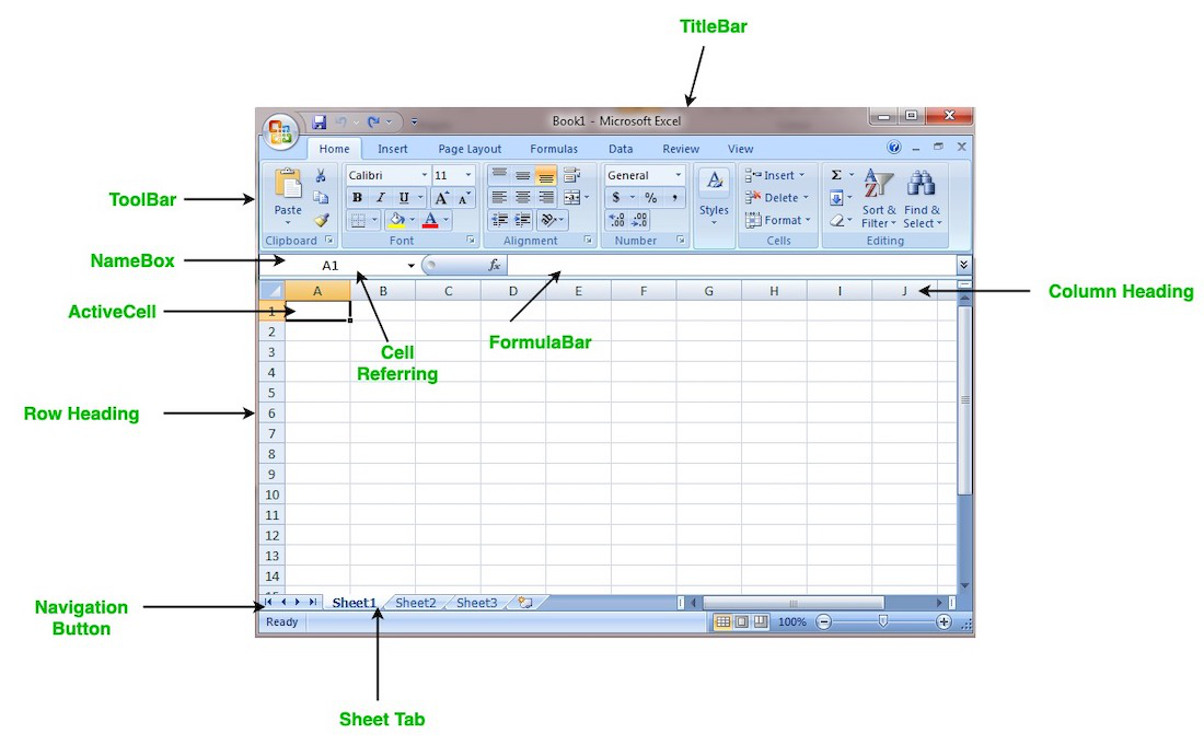
Popular spreadsheet softwares currently available includes Microsoft Excel, Apple Numbers, LibreOffice, OpenOffice, Smartsheet, and Zoho Sheet among others. However, Microsoft Excel is the most popular within the data science communities. For this week, we'll be using Microsoft Excel.
A brief recap of Microsoft Excel...
- Microsoft Excel is a free spreadsheet program create by
Microsoft. - By default, it comes pre-installed as part of your operating system.
- To create a new sheet, launch your Excel app locally or use Office365.
- select a blank workbook or use prdefined templates.
- Enter your data in rows and columns across the worksheet.
- Microsoft Excel app doesn't automatically save your work, unless you configure it to do so.
- There are predefined
built-infunctions to help you with basic and complex arithmetics. Some basic ones are;- AVG - finds the average of a range of cells
- SUM - adds up a range of cells
- MIN - finds the minimum of a range of cells
- MAX - finds the maximum of a range of cells
- COUNT - counts the values in a range of cells
Next, we'll explore a sample dataset using Microsoft Excel. As we've learnt in the previous video, you can have more than one worksheet in a workbook. In this sample dataset, we have 3 worksheets with different dataset.
- corona_virus - official daily counts of COVID-19 cases, deaths and vaccine utilisation.
- movies - contains information about movies, including their names, release dates, user ratings, genres, overviews, and others.
- emissions - contains information about methane gas emissions globally.
➡️ In the next section, we'll introduce you to
data cleaning🎯.
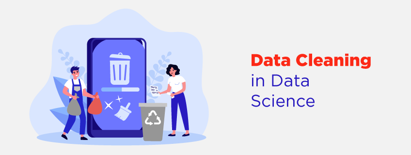
♻️ Data Cleaning
In data science, unclean data refers to a dataset that contains errors, inconsistencies, or inaccuracies, making it unsuitable for analysis without preprocessing. Such data may have missing values, duplicate entries, incorrect formatting, inconsistent naming conventions, outliers, or other issues that can impact the quality and reliability of the data. These problems can arise from various sources, such as...
Cleaning the data involves identifying and addressing these issues to ensure that the dataset is accurate, complete, and reliable before further analysis or modeling takes place.
Data cleaning with Excel
In Excel, data cleaning can involve tasks such as removing duplicate values, correcting misspellings, handling missing data by filling in or deleting the values, and formatting data appropriately. Excel provides us with various built-in functions and tools, such as filters, conditional formatting, and formulas, that can help with data cleaning tasks.
When we carry out data cleaning in Excel, we can improve the quality of our datasets and ensure that the data is ready for further analysis or visualization. To have a good understanding of how to clean a dataset using Microsoft Excel...
- Watch the next video 📺.
- Pause and practice along with the tutor.
A brief recap of data cleaning using Excel...
In the video above, we have covered the following techniques in data cleaning
- Separating Text - separating multiple text in a column into different cells.
- Removing Duplicates - removing duplicate data with
unique()formula andreplacefeature. - Letter cases - using
proper()to remove inconsistent capital letters. - Spacing fixes - removing spacing with
trim()formula. - Splitting text - flash fill to automatically separate data such as city and country
- Percentage formats - changing numbers to percentages
- Text to Number - text to values for further calculations
- Removing Blank Cells - removing blank cells from a dataset.
👩🏾🎨 Practice: Clean the smell... 🎯
A smaller sample of the global COVID-19 dataset is provided here for this exrcise.
- Create a copy of the dataset for your own use.
- Explore the dataset to have a sense of what the it represent.
- By leveraging your data cleaning skills, attempt the following...
- Remove duplicate data if exist
- Handle blank space
- Convert the column from text to number
- Implement other cleaning techniques of your choice
- Submit this exercise using this form.
👉🏾 Next, we'll deep dive into creating cool visualization with Excel.
Data visualization
Rather than looking at rows and columns of numbers or text, imagine using colors, shapes, and patterns to represent information in a visual way. This makes it much simpler for our brains to process and interpret the data, thereby helping us understand information and data more easily. With visualizations, we can see trends, patterns, and relationships that might not be apparent in raw data. Then how can we visualize our data?
Visualization tools
Data visualization tools are software programs that we can use to create visual representations of data in an easy and interactive way. They provide a user-friendly interface where we can input our data and choose from various charts, graphs, and other visual elements to display the information visually. For instance, Excel allows us to create simple charts and graphs directly from spreadsheet data.
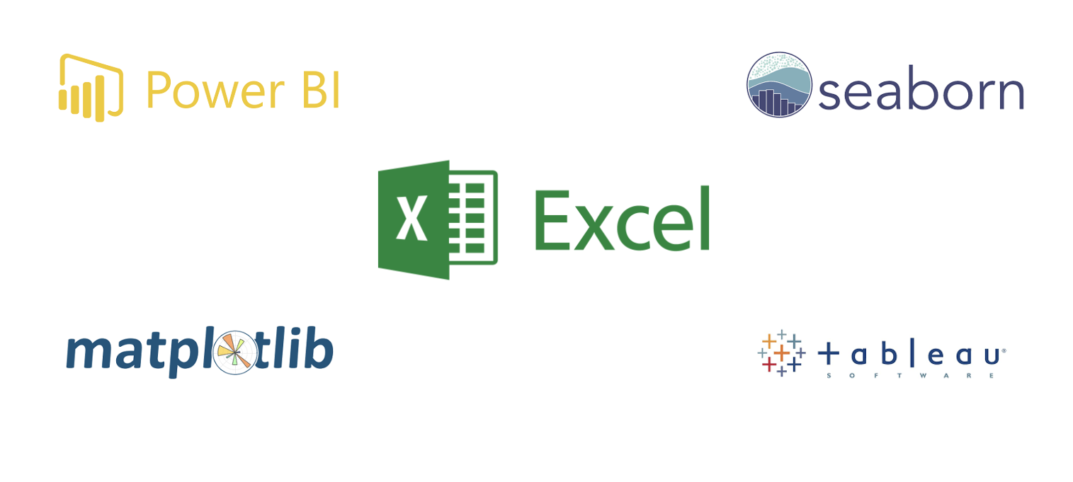
Power BI, Tableau, Seaborn, and Matplotlib are more advanced tools that offer a wider range of customization options and advanced visualization techniques. For example, Tableau enables us to create interactive dashboards and explore data from multiple perspectives. Seaborn and Matplotlib are Python libraries that provide extensive options for creating complex and aesthetically pleasing visualizations. In this lesson, you'll only learn data visualization using Excel. Other tools will be explored in week 4.
Visualization with Excel
Data visualization using Excel allows us to present data in a visual and easy-to-understand way, even for people without technical expertise. Imagine you have a spreadsheet full of numbers and information. With Excel's charting and graphing features, you can transform those numbers into colorful and meaningful visual representations. For example, you can create bar charts to compare different categories, line graphs to track trends over time, or pie charts to show proportions. These visualizations help us see patterns, relationships, and insights that might be hidden in rows and columns of data.
By presenting information visually, Excel makes it easier for us to grasp and interpret the data, enabling better decision-making and communication. Visualizations also make it easier to share and communicate information with others, as it provides a clear and intuitive way to present complex data. Whether it's in business, science, or everyday life, data visualization helps us make better decisions and gain insights from the vast amounts of information around us.
👩🏾🎨 Practice: The Pandemic 🎯
Using the COVID-19 dataset you cleaned in the last practice exercise, create visualizations that provides information about the COVID-19 pandemic.
- Explore the dataset to have a sense of what it represent.
- Create visuals as you deemed fit. No answer is wrong!
- Share your visualization using this padlet.
- You can like other cool visuals on the padlet as well.
👉🏾 Next, we'll explore some common tools in data science.
Data Science Tools
As previously stated, data scientist use different combination of tools on a daily basis to capture, organize, manipulate, analyze, visualize,a and communicate their findings. In this section, we are going to explore the most popular popular tools used by data scienctist. In this lesson, we'll be focus on some tools as listed below, however, other tools will be explored as we progress with the course.
Python
Just the same way we use natural languages like swahili, english, french, arabic, and spanish to communicate, we also need to communicate with computers using some predefined languages known as programming languages, so that our instruction can be executed. As you've probably learnt in your programming 1 & 2 courses, Python is a powerful programming language that is applicable to many areas. One of such area is data science. If you need a refresher on Python, you can use the interactive platform below.
Quick intro to Python
In subsequent weeks, we'll be using Python and its libraries to gather, explore, clean, and manipulate our data. But before then, let us look at some popular tools and python libraries which is common among data scientists.
❓ How can i work with data using Python?
Previously, we've seen how it is possible to capture, clean, manipulate, and visualize data using Excel. However, you're limited to only the features provided by Excel, even though there is more you can do as a data scientist. This is why you need python to programatically do everything you have in Excel and many more. To do that, we'll be using Jupter Notebook.
Jupyter Notebook
The unique feature of Jupyter Notebook is that it allows you to write code in small, manageable chunks called cells, which can be executed independently. This interactive nature makes it easy to experiment with code, test different ideas, and see immediate results. You can write code in languages like Python or R, and with the click of a button, execute the cell to see the output.
Jupyter Notebook also supports the inclusion of visualizations, images, and formatted text, making it an excellent tool for data analysis, data visualization, and presenting your findings.
For this course, we'll be using a cloud version of jupyter notebook called Google Colab!. With this, you can avoid the need for installation and configuration for jupyter notebook. Let's look at what Google Colab is all about.
With Colab, you can do everything you've done using the python shell and more. To wrap up, let look at the benefit of Colab for a data scientist.
- Free Resources:Provision of free cloud computing resources.
- Collaboration: allows multiple users to work on the same notebook simultaneously
- Integration with Google Drive: Colab integrates with Google Drive, allowing users to easily access and store data files and notebooks.
- Pre-installed libraries: comes with many pre-installed libraries and frameworks commonly used in data science, such as TensorFlow, PyTorch, and Scikit-learn.
- Code execution: allows users to execute code in real-time and see the results immediately.
- Visualization: provides support for data visualization tools such as Matplotlib and Seaborn.
Overall, Google Colab is a powerful tool for data scientists, providing access to powerful computing resources, collaboration tools, and a range of features for data analysis and machine learning.
- From the list of Python libraries below, group each library as one of the following -
visualization,machine learning,data manipulation, andUtilities.
- Pandas
- Bokeh
- Numpy
- Maplotlib
- Pytorch
- Keras
- SciKit-Learn
- Polar
- Tensorflow
- OpenCV
- Share your answers using this padlet.
- You can like other cool answers on the padlet as well.
👉🏾 Next week, we'll deep dive into
data collectionandcleanings.
Practices
1. Football Player Data 🎯
The data is of ten hypothetical soccer players, their sleep duration, sleep quality, soreness, stress, as well as GPS metrics such as total distance, acceleration count, deceleration count, max acceleration, max deceleration, and max speed.
TODO
Using your knowledge of data cleaning, clean this dataset by...
- Saving a copy of the dataset for this exercise.
- Handling all missing values.
- Fixing the duplicates data for each player.
- Using other data cleaning techniques you've learnt.
Submission
You are required to submit documentation for practice exercises over the course of the term. Each one will count for 1/10 of your practice grade, or 2% of your overall grade.
- Practice exercises will be graded for completion not correctness.
- You have to document that you did the work, but we won't be checking if you got it right.
- You MUST attempt the quiz
Practices - Intro to DSon Gradescope after the exercise to get the grade for this exercise.
Your log will count for credit as long as it:
- is accessible to your instructor, and
- shows your own work.
Assignment - Student Performance Analysis

Student Performance Analysis
This assignment is all about data cleaning and visualization using Microsoft Excel. The dataset for this assignment are student data from a hypothetical school, which consists of 7 Columns and contains information about gender, race, scores of students in different subjects, and more.

TODOs
- Clone the assignment repository using the link above
- Look through the data -
student_performance_data.csv. - Read the questions below to have an idea of what is required to do with the data.
- Put all your charts/graphs in a single file as this will be submitted as part of the assignment on gradescope.
- Once you have the answers to the questions below, goto assignment on Gradescope
- Look for Assignment - Intro to DS
- Attempt the questions
- Submit once you're done
Questions
- How many UNIQUE data points or samples are in the dataset?
- What are the percentages based on gender 2.1 What is the percentage of Male student 2.2 What is the percentage of Female student
- What percentage of student "completed" the test preparation course
- What percentage of student had a "standard" Lunch
- What percentage of parent has MORE THAN "high school" level of education
- Which group in Race/ethnicity has the lowest percentage.
- Distribution of scores in subject What distribution score range has the highest frequency for Math score What distribution range has the highest frequency for Reading score What distribution range has the highest frequency for Writing score
- Who score higher in Math? Male or female?
- Which race/ethnicity scored the HIGHEST in Math?
- Mention ONE insight you derive from the data
Data Collection and Cleaning
Welcome to week 2 of the Intro to data science course! In the first week, we looked at data science broadly, including its building blocks and workflow, and and also understand data types, spreadsheets, python, and Google Colab.
This week, we'll be more specific while looking at data collection and cleaning. First, we'll look at different data sources such as databases, APIs, web scraping, data streams. Next, we'll deep dive into data loading and exploration. Similarly, we'll touch on data cleaning and transformation. And finally, we'll look at data validation and privacy.
Whatever your prior expereince, this week you'll touch on basics of data collection and cleaning. You'll also continue practising how to learn and work together.
Learning Outcomes
After this week, you will be able to:
- Explain and differentiate various data sources.
- Describe different data loading and cleaning techniques.
- Outline the importance of data quality.
- Compose documentation of relevant information about the analysis process.
An overview of this week's lesson
Data Sources and Collection
With data collection, 'the sooner the better' is always the best answer — Marissa Mayer
As a data scientist, you'll work with different types of data from different sources. It is important to understand not just these data sources but also how to collect the data therein. The process of data collection involves identifying the relevant data sources, collecting and extracting the data, and ensuring its quality and integrity. To achieve this, we'll be looking at 4 different data sources; databases, APIs, web scraping, and data streams.

What are data sources?
Note: Data sources can be diverse, including structured data from databases, spreadsheets, and APIs, as well as unstructured data from social media, text documents, and sensor devices.
As a data scientist, you need a good understanding of different data sources and collection techniques to gather the necessary information for analysis. However, collecting data requires careful planning, attention to detail, and basic knowledge of appropriate tools and techniques to ensure the data is accurate, complete, and representative of the problem being addressed. Owing to this, let's explore different data sources while simultaneously looking at how to collect data from these sources.
1. Databases
A database is an organized collection of structured information, or data, typically stored electronically in a computer system. Databases can store information about people, products, orders, transactions, or anything else using one or multiple tables. Each table is made up of rows and columns in a relational database, and records within each table is identified using a primary key. For example, the image below shows 4 tables; Customer, Order, Product, and Invoice. Each of this table has a primary key (Customer_id, Order_id, Product_id, Invoice_id) to uniquely identifies each record.
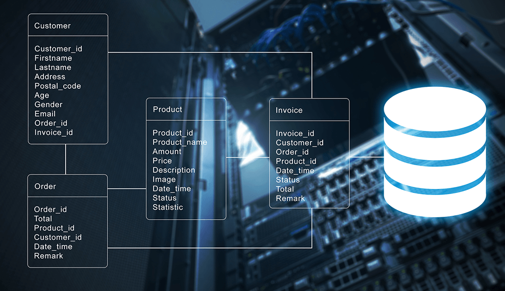
As shown above, multiple tables are linked together for easy access and retrieval. All this is usually controlled by a database management system (DBMS), where data can then be easily accessed, managed, modified, updated, and organized using Structured Query Language (SQL). An example SQL query to retrieve customers' record from a database is given below.
Note: the table name and the retrieved data in the query below are imaginary
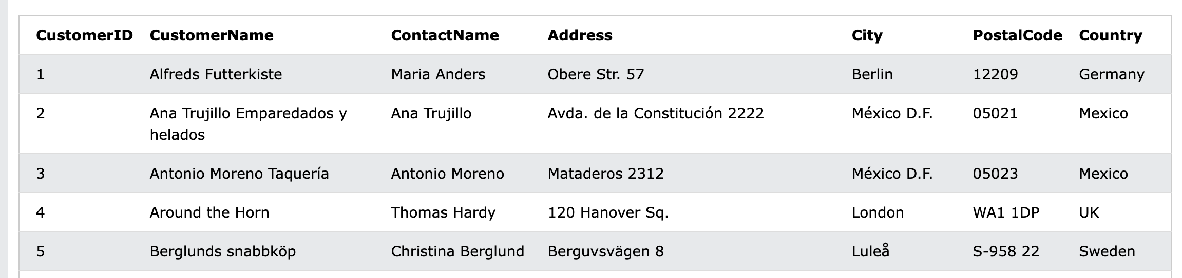
Query Description SELECT * FROM CUSTOMER Retrieve all records or data from the customer table
After running the query above, an example data that could be retrieved is given in the table below. It is evident that data are modelled into rows and columns where each row represent a customer information.
After data retrieval from databases, if required, you can store the retrieved data in a different format (such as .csv) or a separate location for further analysis or integration with other data sources. If you're curious to have better understand of SQL, check out the link below.
Quick intro to SQL
2. Application Programming Interface (API)
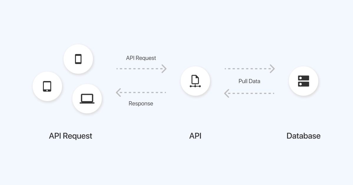
When we pull or check our phone for weather data, a request will be sent to your weather app which resides on a server that stores all the weather information. Behind the scene, an API is used to send a request to the weather app server, which sends back a response (i.e., weather information) to your phone through the API. As depicted below, an API serves as an intermediary that allows a data scientist to access data from public repositories or other sources.
For more detailed information about API, refer back to your previous Web Application Development course.
Now that we have an understanding of what API does, let us look at different format of data we can get while using an API. As a data scientist, the most common data format are csv, json, and xml. Below is a summary with example of how each of this data format looks like.
JSON
JSON is a key-value pair data format and has become one of the most popular format of sharing information in recent times. A file contain json data is saved using .json file extension. A sample json data about a pizza oder is given below
    {
        "crust"": "original",
        "toppings"": ["cheese","pepperoni"", "garlic""],
        "price"": "29.99",
        "shipping"": "delivery",
        "status"": "cooking"
    }
CSV
Comma Separated Value (CSV) is a popular data format in the data science communities, with a plain text file that uses specific structuring to arrange tabular data. It uses a comma (,) to separate each specific data value. A csv data is saved in a file with .csv extension. A sample csv data is given below. In this example, each row in the CSV file represents an employee's details, and each column represents a specific attribute of the employee. The first row is the header row, which provides the names of each attribute.
    EmployeeID,FirstName,LastName,Department,Position,Salary
    1,John,Doe,Marketing,Manager,50000
    2,Jane,Smith,Finance,Accountant,40000
    3,Michael,Johnson,IT,Developer,60000
    4,Sarah,Williams,HR,HR Manager,55000
    5,David,Brown,Sales,Sales Representative,45000
Following the header row, each subsequent row contains the corresponding data for each employee. For example, the first employee has an EmployeeID of 1, a FirstName of John, a LastName of Doe, works in the Marketing department, holds the position of Manager, and has a salary of 50000.
Extensible Markup Language (XML)
XML is the data exchange format for API prior to JSON. It’s a markup language that’s both human and machine readable, and represent structured information such as documents, data, configuration, books, transactions, invoices, and much more. Data in xml format can be saved in a file with .xml extension.
An example is given below showing data about a message from John to Bruce. This XML structure represents a basic representation of an email, including important details like sender, recipient, subject, body, and timestamp.
    <email>
    <sender>John</sender>
    <recipient>Bruce</recipient>
    <subject>Greetings</subject>
    <body>
        Dear Bruce,
        I hope this email finds you well. I wanted to reach out and say hello.
        Best regards,
        John
    </body>
    <timestamp>2023-05-15 09:30:00</timestamp>
    </email>
In this example, the <email> element represents the entire email structure. Inside the email, there are child elements such as <sender>, <recipient>, <subject>, <body>, and <timestamp>. The <sender> element contains the name of the sender, which is "John" in this case. The <recipient> element represents the recipient of the email, which is "Bruce".
The <subject> element contains the subject of the email, which is "Greetings". The main content of the email is enclosed within the <body> element, and it contains the message text. The <timestamp> element represents the date and time when the email was sent, specified in a specific format, such as "2023-05-15 09:30:00".
3. Web Scraping
📺 What is web scraping? listen to PyCoach! 👨🏾💻
While it is possible to scrape all kinds of web data from search engines and social media to government information, it doesn’t mean this data is always available. Depending on the website, you may need to employ a few tools and tricks to get exactly what you need, and also covert it into a format suitable for your project. In Python, we can use libraries like BeautifulSoup and Scrappy to scrape web pages. The process involves sending a request to a web page's URL, retrieving the HTML content of the page, and then parsing the HTML to extract the desired data.
NOTE: It's important to note that web scraping should be done ethically and responsibly, respecting the website's terms of service and not overloading their servers with excessive requests.
For example, if we want to scrape the prices of products, we can locate the HTML elements that contain the prices and use Python to extract and save them.
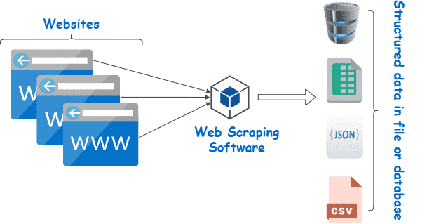
Learning web scraping in Python can be empowering as it allows you to automate data collection from the vast amount of information available on the web, making it easier to analyze and make informed decisions based on that data.
4. Data Streams
📺 What is data streaming? watch this video from Confluent! 👨🏾💻
In summary, remember the following about data streams...
- they are continuous sequences of data that are generated in real-time.
- they require specialized techniques and platforms for processing and analysis to derive insights and make informed decisions.
- Data scientists and analysts need specialized techniques to handle data streams effectively.
- it has numerous applications across industries, including real-time analytics, fraud detection, recommendation systems, and monitoring of network or infrastructure performance.
- organizations can gain valuable insights, respond quickly to emerging trends or events, and make data-driven decisions
👩🏾🎨 Practice: Describe JSON and XML Data... 🎯
In this exercise, you'll access data from sample APIs using your browser. With this, you'll have hands-on experience on JSON and XML data. Try the following in your browser.
-
Open your browser
-
copy and paste each of the url below in your browser
-
Describe what each data from the APIs is all about in the padlett below
➡️ In the next section, you'll be introduced to
data loadinganddata exploration🏙️.
Data Loading and Exploration
So far we've explored some tools used in data science, and now is the time to start using them. Remember we looked at data and different sources or orgin of data. However, as a data scientist, you need to know how to import or get this data from different sources, and work with them. In this lesson, you'll learn how to import and use data from a file (.csv) and API using a popular python libray called Pandas.
Data loading
In data science, one of the fundamental tasks is loading data into our analysis environment. We'll be work with diverse data sources, ranging from structured datasets stored in CSV files to real-time data obtained through APIs. In this section, we will explore how to load data from CSV files and APIs using Pandas. Before we get started with Pandas, let first look at how we can create a notebook (i.e., the file containing our codes and analysis) on google colab, VSCode, and Jupyter Notebook.
📺 How to create a notebook 👨🏾💻
In summary...
- Remember you need an active google account to do this.
- In your browser, goto https://colab.research.google.com
- click on
fileand create a new notebook.
Now that you understanding how to create a notebook, we'll begin by looking at how we can load data from a csv file using Pandas. For this, we'll be using the COVID-19 dataset you explored in section 1.4.
Pandas
Loading data from CSV
Loading data from CSV files using Pandas is a fundamental skill for every data scientist. It provides a convenient way to import data into a structured format for further analysis and exploration. To load a CSV file using Pandas, the first step is to import the Pandas library in your notebook.
import pandas as pd
Using the alias pd allows you to refer to Pandas as pd. Next, we can use the read_csv() function provided by Pandas to read the CSV file into a Pandas DataFrame. The read_csv() function takes the file path (or file location) as input and returns a DataFrame object. To read a CSV file from google drive, you can either specify a file path to your google drive after mounting it or upload it to colab.
df = pd.read_csv('path/to/your/corona_virus.csv')
By default, read_csv() assumes that the CSV file has a header row containing column names. If the CSV file does not have a header row, we can set the header parameter to None.
df = pd.read_csv('path/to/your/corona_virus.csv', header=None)
Once the data is loaded into a DataFrame, Pandas offers a wide range of methods for data exploration and manipulation. You can examine the data using functions like head(), tail(), and describe() to get a glimpse of the dataset's structure and statistical summaries. Now that you've successfully loaded your dataset into Pandas DataFrame, let's see what the data looks like by viewing some rows using Pandas .head() function.
df.head()
✨ Awesome! you've successfully loaded your first CSV file using Python and Pandas.
Loading data from API
In addition to loading data from static files like CSV, data scientists often work with real-time data obtained through APIs. To load data from an API, we typically make HTTP requests and retrieve the data in a structured format, such as JSON (JavaScript Object Notation). Pandas provides convenient functions to handle JSON data and convert it into a DataFrame.
To fetch data from an API, we can use the requests library in Python to send HTTP requests, and then use Pandas to parse and structure the retrieved data. For this, we'll be using the previous API we used in First, let's import both Pandas and the request libary.
    import pandas as pd
    import requests
Next, we send an HTTP GET request to the specified API and receive a response. The response is typically in JSON format, which can be directly converted into a DataFrame using Pandas.
# Make a request to the API
response = requests.get('https://api.unibit.ai/v2/stock/historical/?tickers=AAPL&accessKey=demo')

# Convert JSON response to DataFrame
data = pd.DataFrame(response.json())
👩🏾🎨 Practice: Explore Pandas function 🎯
In this lesson, we've seen how to read data from CSV and API, and how to get a view of our data using head() function. Now you need to explore other Pandas functions.
-
Using the DataFrame you loaded from the CSV, what type of information do you get when you use
describe()andtail()function? -
Share your answer using the padlet below.
➡️ In the next section, you'll be introduced to
data cleaning🏙️.
🔢 Data cleaning techniques
As a data scientist, we'll be working with lots of messy (or smelling 😖) data everyday. However, it is critical to ensure the accuracy, reliability, and integrity of the data by carefully cleaning the data (without water 😁). In this lesson, we'll be looking at different data cleaning techniques needed to get the data ready for further analysis. First, we'll start by exploring techniques needed to handle missing data, and then we'll dive into what to do with duplicate data.

Data cleaning aims to improve the integrity, completeness, and consistency of the data. When cleaning a data, our goal will be to produce a clean and reliable dataset that is ready for further analysis. By investing time and effort into data cleaning, we can improve the accuracy and credibility of our analysis results, leading to more robust and reliable insights. To understand this more, we'll be looking at the following
- Handling missing data
- Removing duplicate data values
1. Handling missing data
Missing data is one of the most frequently occuring problems you can face as a data scientist. Watch the next video to have an idea of how important it is to understand this problem, and possible causes.
📺 How important are missing data? 👨🏾💻
As a data scientist, there are many ways of dealing with missing values in a data. For this lesson, we'll be looking at 4 different techniques of handling missing data - _dropping, filling with constant, filling with statistics, and interpolation.
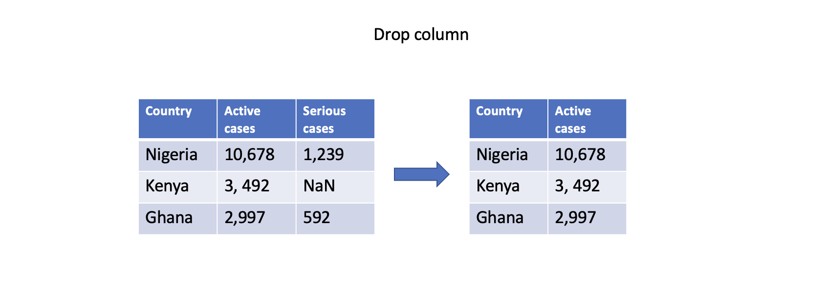
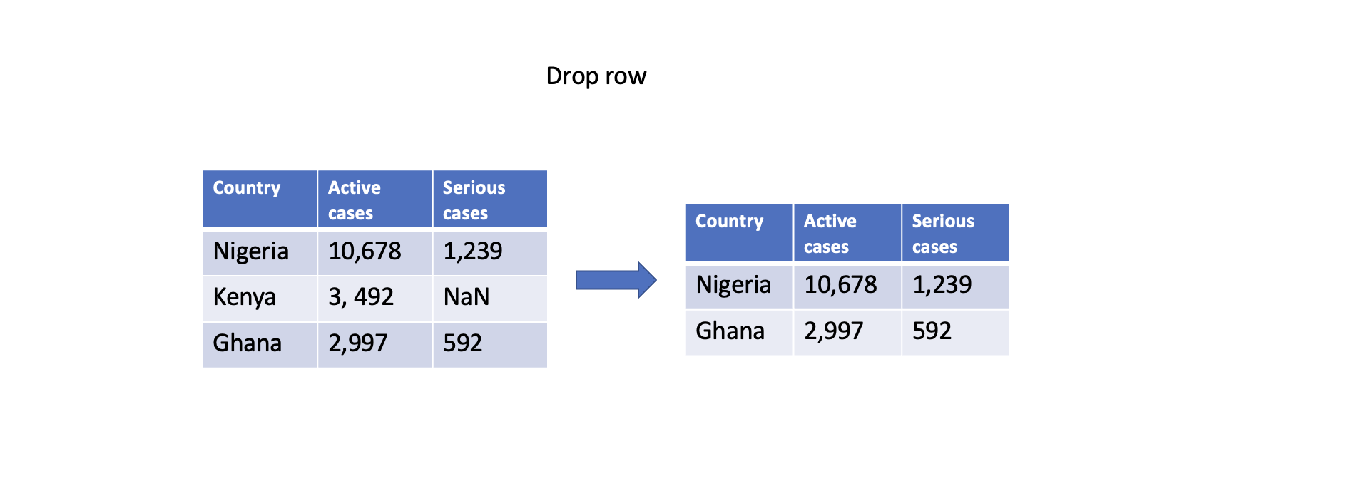
Dropping missing values
One straightforward approach is to remove rows or columns with missing values using the dropna() function. By specifying the appropriate axis parameter, you can drop either rows (axis=0) or columns (axis=1) that contain any missing values. However, this approach should be used with caution as it may result in a loss of valuable data.
    # Drop column with any missing values
    df.dropna(axis=1, inplace=True)

    # Drop rows with any missing values
    df.dropna(axis=0, inplace=True)
Filling with constant
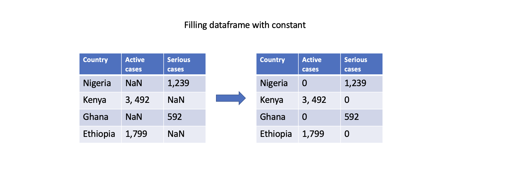
You can also fill missing values with a constant value using the fillna() function. This can be done for specific columns or the entire DataFrame. For example, filling missing values with zero:
# Fill missing values in a specific column
df['Serious cases'].fillna(0, inplace=True)

# Fill missing values in the entire DataFrame
df.fillna(0, inplace=True)

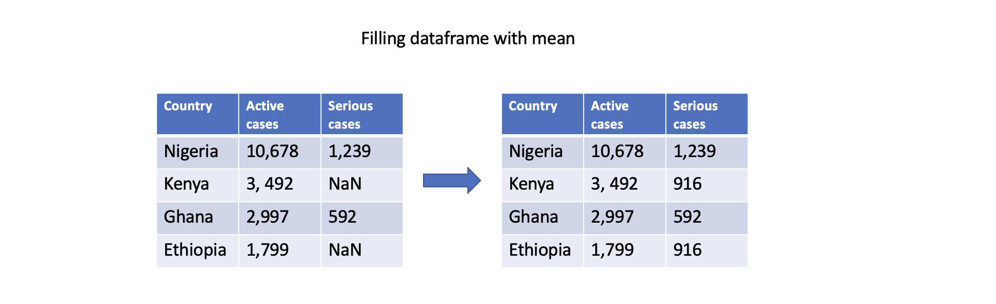
Filling missing values with statistics
Another approach is to fill missing values with summary statistics, such as mean, median, or mode. Pandas provides convenient functions like mean(), median(), and mode() to compute these statistics. For example, filling missing values with the mean of column Serious cases:
# Fill missing values in a specific column with the mean
df['Serious cases'].fillna(df['Serious cases'].mean(), inplace=True)
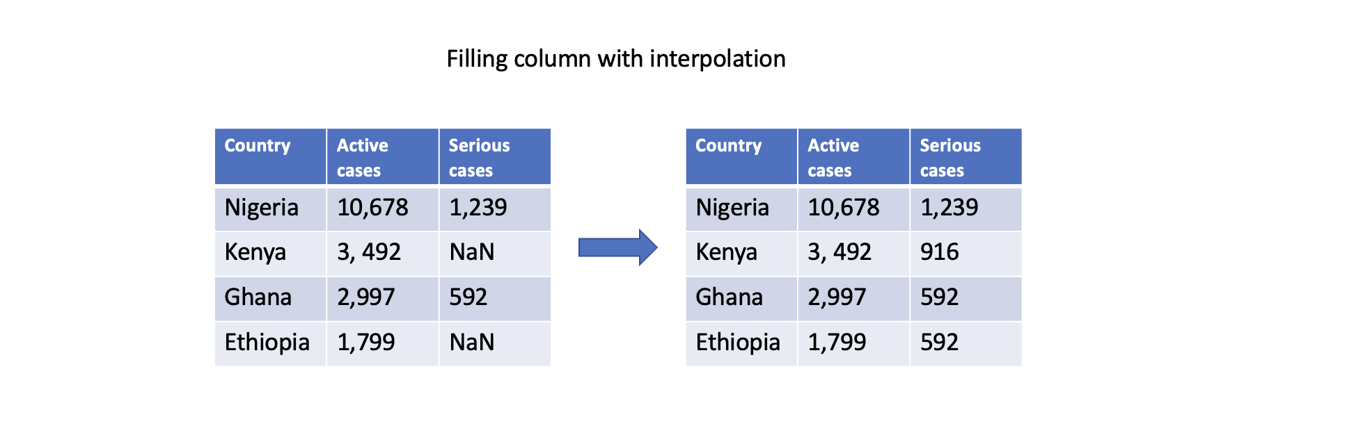
Filling with interpolation
Pandas supports different interpolation methods to estimate (i.e., predict) missing values based on existing data points. The interpolate() function fills missing values using linear interpolation, polynomial interpolation, or other interpolation techniques.
# Interpolate missing values in a specific column
df['Serious cases'].interpolate(inplace=True)
These are just a few examples of how Pandas can handle missing data. The choice of approach depends on the specific dataset, the nature of the missing values, and the analysis goals. As a recap, watch the video below to summarize what has been discussed.
2. Removing duplicates
Duplicate data are rows or records within a dataset with similar or nearly identical values across all or most of their attributes. This can occur due to various reasons, such as data entry errors, system glitches, or merging data from different sources. As a data scientist, there are number of ways to handle duplicate data in a small or large dataset. First, let's have a look at how we can identify if our data set has duplicate record, and in which column they exist.
Identifying duplicate data
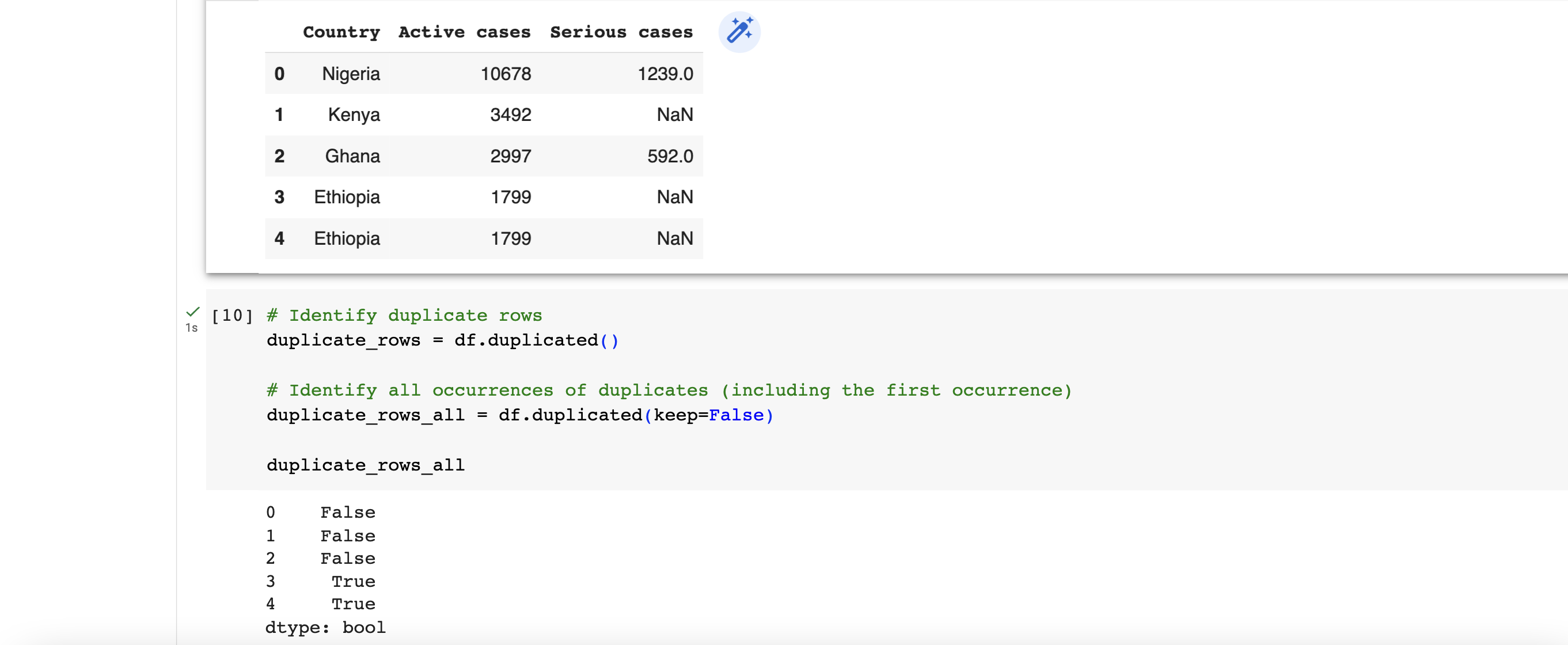
To identify existence duplicate data in a dataset, the duplicated() function in Pandas is suitable for this. It returns a boolean value of either True or False for each of the rows. By using the keep parameter, you can control which occurrence of the duplicated values should be considered as non-duplicate. For example, we can check for duplicate using
# Identify duplicate rows
duplicate_rows = df.duplicated()

# Identify all occurrences of duplicates (including the first occurrence)
duplicate_rows_all = df.duplicated(keep=False)
Dropping duplicate data
To remove duplicate data, a common option is to drop (or remove) the entire row. There are 3 main types of data duplication -
- Exact duplicates: rows with the same values in all columns.
- Partial duplicates: rows with the same values in some columns.
- Duplicate keys: rows with the same values in one or more columns, but not all columns.
We'll only focus on exact duplicates in this section. To remove duplicate rows from a DataFrame, you can use the drop_duplicates() function. This function drops duplicate rows, keeping only the first occurrence by default. However, if you want to remove duplicates including the first occurence, then you can use the keep parameter.
# Drop duplicate rows, keeping the first occurrence
df.drop_duplicates(inplace=True)

# Drop all occurrences of duplicates (keeping none)
df.drop_duplicates(keep=False, inplace=True)
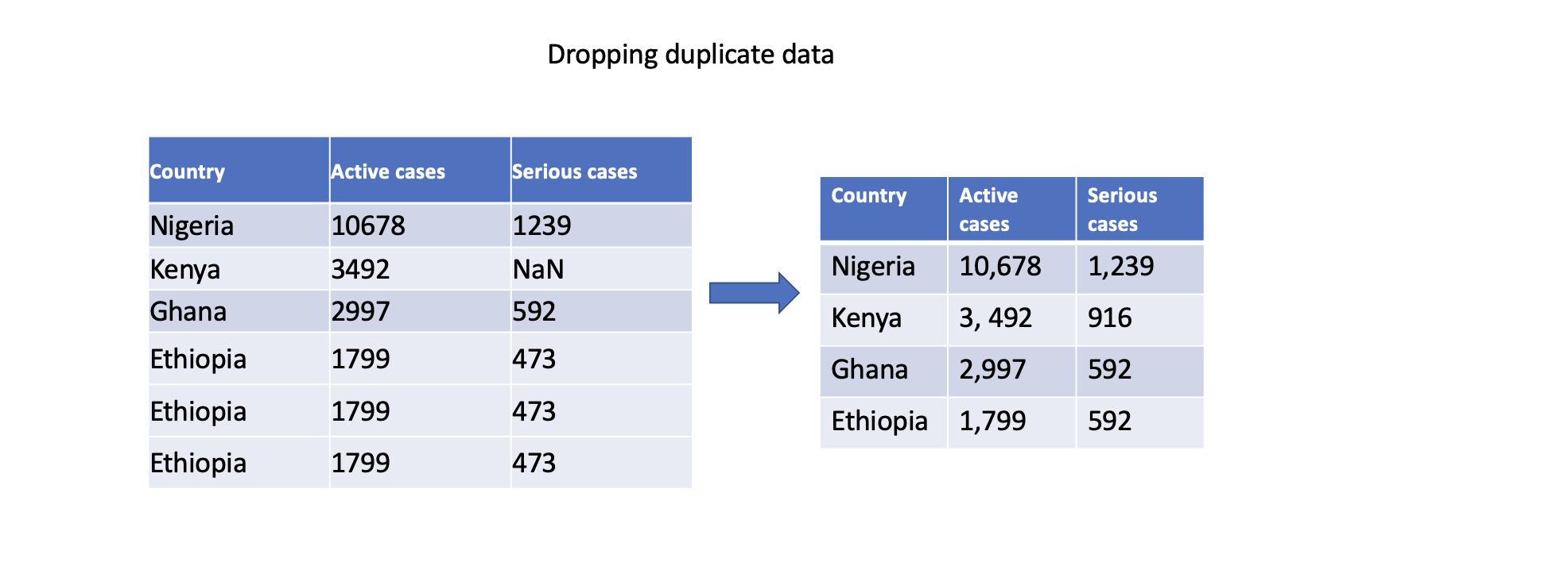
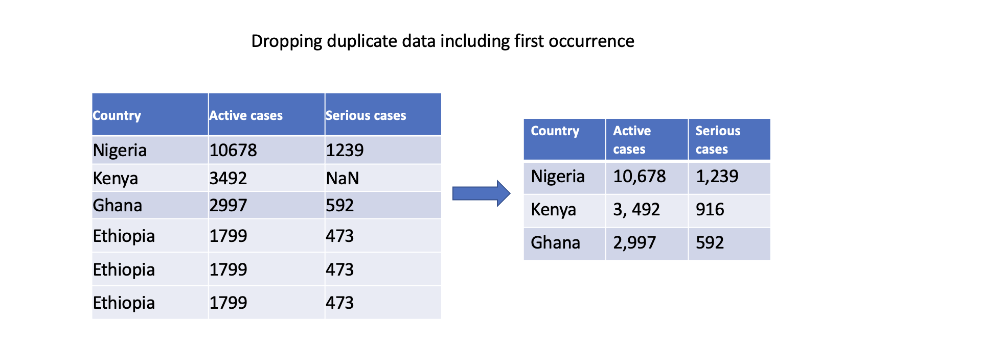
We can also specify specific columns to determine duplicates. Only rows with identical values in the specified columns will be considered duplicates.
# Drop duplicate rows based on specific columns
df.drop_duplicates(subset=['Serious cases'], inplace=True)
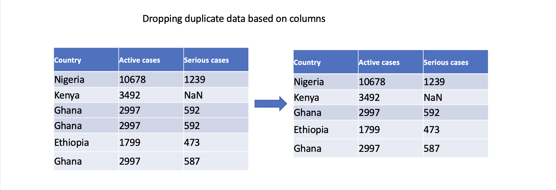
In conclusion, addressing duplicate data is crucial to ensuring accurate analysis, maintain data integrity, derive reliable insights, and support consistent decision-making. By effectively handling duplicate data, we can work with clean and reliable datasets, leading to more robust and trustworthy analysis outcomes.
👩🏾🎨 Check your understanding 🎯
Consider a dataset containing information about students' test scores and their demographic details. The dataset has missing values that need to be addressed before performing any analysis. Use the provided dataset to answer the following questions:
Dataset:
| Student_ID | Age | Gender | Test_Score | Study_Hours |
|---|---|---|---|---|
| 1 | 18 | Male | 85 | 6 |
| 2 | 20 | Female | NaN | 7 |
| 3 | 19 | Male | 78 | NaN |
| 4 | NaN | Female | 92 | 5 |
| 5 | 22 | Male | NaN | NaN |
Questions:
- What is missing data in a dataset?
- Why is it important to handle missing data before performing analysis?
- In the given dataset, how many missing values are in the "Test_Score" column?
- How many missing values are in the "Study_Hours" column?
- What are some common strategies to handle missing data? Briefly explain each.
- For the
Test_Scorecolumn, which strategy would you recommend to handle missing values? Why? - For the
Study_Hourscolumn, which strategy would you recommend to handle missing values? Why? - Can you suggest any Python libraries or functions that can help you handle missing data in a dataset?
- Calculate the mean value of the
Test_Scorecolumn and fill the missing values with it. - Fill the missing values in
Study_Hourswith the median value of the column.
🎯 Make sure you first attempt the questions before revealing the answers
👩🏾🎨 Reveal the Answer
-
What is missing data in a dataset?
- Missing data refers to the absence of values in certain cells of a dataset.
-
Why is it important to handle missing data before performing analysis?
- Handling missing data is important because it can lead to inaccurate analysis and modeling. Missing data can introduce biases and affect the reliability of results.
-
In the given dataset, how many missing values are in the "Test_Score" column?
- There are 2 missing values in the "Test_Score" column.
-
How many missing values are in the "Study_Hours" column?
- There are 3 missing values in the "Study_Hours" column.
-
What are some common strategies to handle missing data? Briefly explain each.
- Imputation/Filling: Replacing missing values with estimated values, such as the mean, median, or mode of the column.
- Deletion: Removing rows or columns with missing values.
- Interpolation: Using machine learning algorithms to predict missing values based on other variables.
-
For the "Test_Score" column, which strategy would you recommend to handle missing values? Why?
- Imputation with the mean value is a reasonable strategy because it provides a representative estimate of missing values without drastically affecting the distribution.
-
For the "Study_Hours" column, which strategy would you recommend to handle missing values? Why?
- Imputation with the median value might be a suitable strategy as well, but you can still use interpolation.
-
Can you suggest any Python libraries or functions that can help you handle missing data in a dataset?
- Python libraries like Pandas provide functions such as
.isna(),.fillna(), and.dropna()for handling missing data.
- Python libraries like Pandas provide functions such as
-
In the
Test_Score, calculate the mean value of the column and fill the missing values with it.test_score_mean = df['Test_Score'].mean() df['Test_Score'].fillna(test_score_mean, inplace=True) -
In the
Study_Hours, fill the missing values with the median value of the column.
study_hours_median = df['Study_Hours'].median()
df['Study_Hours'].fillna(study_hours_median, inplace=True)
➡️ In the next section, you'll be introduced to
Data inconsistenciesandOutliers.
Data Outliers
Handling data outliers is crucial because outliers can significantly impact the accuracy and reliability of data analysis. Imagine a dataset representing the weight of individuals in a class, where all values range from 35kg to 60kg, except for one extreme value of 109kg. This extreme outlier, possibly due to an error or anomaly, can skew the average weight calculation, making it highly misleading.
By identifying and handling outliers, we aim to ensure that our analysis is based on reliable and representative data, enabling us to make more accurate decisions and draw meaningful insights from the data.
Outlier
Outliers can occur due to various reasons, such as measurement errors, data entry mistakes, equipment glitches, or unusual circumstances. They can have a significant impact on data analysis because they can skew (or change) statistical measures and affect the overall trends and patterns observed in the data. Let's look at some examples...
Example 1
Imagine you have a dataset representing the heights of a group of people. Most of the heights fall within a certain range, but there may be a few extreme values that are much higher or lower than the rest. These extreme values are outliers.
Example 2
Consider a small dataset sample...
[15, 101, 18, 7, 13, 16, 11, 21, 5, 15, 10, 9]
Which of the data point is the outlier?
Reveal data outlier
By looking at it, one can quickly say 101 is an outlier because it is much larger than the other values.
Now let's look at the impact of this outlier on the data using the table below.
                | Without outlier       | With outlier            |
                |-----------------------|-------------------------|
                | Mean: 20.08           | Mean: 12.72             |
                | Median: 14.0          | Mean: 13.0              |
                | Mode: 15              | Mode: 15                |
                | Variance: 614.74      | Variance: 21.28         |
                | Std dev: 24.79        | Std dev: 4.61           |
We can obviously see how the outlier has affected the dataset. Hence, identifying and handling outliers is important because they can have a significant impact on our data analysis, and may lead to misleading conclusions. Imagine having numerous outlier in patient health data, thereby leading to wrong diagnosis or prescription 🤦🏾♂️. Consequently, we need to find a way to handle outliers in our dataset.
Finding outliers
There are several techniques to find outliers in a dataset. One simple technique is using the range rule. Let's say we have a dataset representing the number of hours students study each day, ranging from 1 to 10 hours. If we consider any value below 1 hour or above 10 hours as an outlier, we can easily identify them by looking at the data.
Another technique is using z-scores. We can calculate the z-score for each data point, which measures how far each value is from the mean in terms of standard deviations. If a z-score is significantly larger or smaller than 0 (e.g., above 2 or below -2), we can consider it as an outlier.
Additionally, we can use box plots to visualize the distribution of the data. Any data points that fall outside the whiskers of the box plot can be considered outliers. More on visualization will be discussed in subsequent weeks.
Lastly, the percentile approach identifies outliers by comparing data points to percentiles. For instance, if a data point is above the 95th percentile or below the 5th percentile, it might be considered an outlier. This is the approach we'll adopt for this lesson.
Handling data outliers
There are several techniques to handle outlier but we'll only be looking at 3 in this course...
- Trimming
- Replacing
- Windsorization
1. Trimming
Handling outliers using the trimming technique involves capping or trimming extreme values to a specified range. This approach allows us to keep the bulk of the data while removing or adjusting the outliers. Let's explain this concept using a simple example and provide a code sample using pandas.
Trimming example
Imagine we have a dataset of student grades, and we suspect there are outliers that might be affecting our analysis. We can use the trimming technique to remove the extreme values beyond a certain threshold. Let's say we decide to trim the top and bottom 5% of the data.
Here's an example code snippet using pandas to demonstrate how to handle outliers using the trimming technique:
import pandas as pd

# Load the dataset
data = pd.read_csv('your_dataset.csv')

# Define the threshold as 3 standard deviations from the mean
threshold = 3 * data['column_name'].std()

# Identify outliers
outliers = data['column_name'] > threshold

# Trim the dataset by removing outliers
trimmed_data = data[~outliers]

# Print the trimmed dataset
print(trimmed_data)
In code above, the threshold is defined as 3 times the standard deviation of the column values. Rows that have values above this threshold are considered outliers. The ~ operator is used to negate the boolean condition, selecting all the rows that do not contain outliers. Finally, the trimmed dataset is printed.
By applying the trimming technique, you remove extreme outliers from the dataset, allowing for a more representative analysis of the majority of the data.
2. Replacing
Handling outliers using the replacing technique involves replacing extreme outlier values with more representative values in the dataset. This approach aims to mitigate the impact of outliers on data analysis without completely removing them. Using pandas, you can handle outliers using the replacing technique by following these steps:
-
Identify Outliers: Use pandas to identify the outliers in the dataset. You can determine outliers based on statistical measures like z-scores or percentiles, or based on domain-specific knowledge.
-
Replace Outliers: Once the outliers are identified, you can replace them with more representative values. One common approach is to replace outliers with the median or mean value of the feature.
-
Update the Dataset: Modify the dataset by replacing the outliers with the chosen representative values. This can be done using pandas functions like
fillna()orreplace().
Here's an example code snippet using pandas to handle outliers using the replacing technique:
import pandas as pd

# Load the dataset
data = pd.read_csv('your_dataset.csv')

# Identify outliers
outliers = data['column_name'] > threshold

# Replace outliers with the median value
median_value = data['column_name'].median()
data.loc[outliers, 'column_name'] = median_value

# Print the updated dataset
print(data)
In the code snippet above, the outliers are identified based on a condition, such as values greater than a certain threshold. The outliers are then replaced with the median value of the column using the loc accessor. Finally, the updated dataset is printed.
By applying the replacing technique, you replace extreme outliers with more representative values, allowing for a more accurate analysis of the data while still retaining the information from the outliers.
3. Winsorization
Handling outliers using the winsorization technique involves capping extreme values by replacing them with values that are closer to the rest of the data. This approach helps to minimize the impact of outliers on data analysis without completely eliminating them.
In pandas, you can handle outliers using the winsorization technique by following these steps:
-
Define the Threshold: Determine the threshold beyond which the values will be considered outliers. This threshold can be based on domain knowledge or statistical measures like z-scores or percentiles. We'll use percentile in this example.
-
Winsorize the Data: Use pandas'
clip()function to perform winsorization. This function allows you to set upper and lower limits for the values. Any values above the upper limit will be replaced with the maximum value within that limit, and any values below the lower limit will be replaced with the minimum value within that limit.
Here's an example code snippet using pandas to handle outliers using the winsorization technique:
import pandas as pd

# Load the dataset
data = pd.read_csv('your_dataset.csv')

# Define the upper and lower thresholds for winsorization
upper_threshold = data['column_name'].quantile(0.95)
lower_threshold = data['column_name'].quantile(0.05)

# Winsorize the data
winsorized_data = data['column_name'].clip(lower=lower_threshold, upper=upper_threshold)

# Update the dataset with winsorized values
data['column_name'] = winsorized_data

# Print the updated dataset
print(data)
The upper and lower thresholds are defined using quantiles, such as 0.95 for the upper threshold and 0.05 for the lower threshold. The clip() function is then used to winsorize the data by...
- replacing values above the upper threshold with the maximum value within that limit
- replacing values below the lower threshold with the minimum value within that limit.
- Finally, the dataset is updated with the winsorized values and printed.
By applying the winsorization technique, extreme outlier values are capped, bringing them closer to the rest of the data distribution. This helps in reducing the impact of outliers while retaining valuable information from the dataset.
👩🏾🎨 Check your understanding: Handling Outliers 🎯
Consider the following dataset representing the test scores of students:
| Student ID | Test Score |
|---|---|
| 1 | 75 |
| 2 | 82 |
| 3 | 90 |
| 4 | 85 |
| 5 | 95 |
| 6 | 105 |
| 7 | 78 |
| 8 | 92 |
| 9 | 88 |
| 10 | 120 |
Questions:
- What are outliers in a dataset?
- Why is it important to handle outliers in a dataset before analysis?
- What is data trimming?
- Which value(s) would you consider as an outlier in the given dataset? Why?
- What is data replacement?
- Perform data replacement by capping the outlier values at 100.
- What is winsorization?
- Perform winsorization by replacing the outlier values with the 95th percentile value.
- Compare and discuss the effects of trimming, replacement, and winsorization on the dataset.
🎯 Make sure you first attempt the questions before revealing the answers
👩🏾🎨 Reveal the Answer
Check Your Understanding: Handling Outliers - Practice Exercise
Dataset: Consider the following dataset representing the test scores of students:
| Student ID | Test Score |
|---|---|
| 1 | 75 |
| 2 | 82 |
| 3 | 90 |
| 4 | 85 |
| 5 | 95 |
| 6 | 105 |
| 7 | 78 |
| 8 | 92 |
| 9 | 88 |
| 10 | 120 |
Questions:
-
What are outliers in a dataset?
- Outliers are data points that significantly differ from the rest of the data points in a dataset.
-
Why is it important to handle outliers in a dataset before analysis?
- Handling outliers is important because they can skew statistical analysis and modeling results, leading to inaccurate insights and conclusions.
-
What is data trimming?
- Data trimming involves removing extreme values (outliers) from the dataset beyond a certain threshold.
-
Which value(s) would you consider as an outlier in the given dataset? Why?
- The test score of 105 and 120 can be considered outliers because they are significantly higher than the other scores.
-
What is data replacement?
- Data replacement involves replacing outlier values with more reasonable or plausible values that are still within the range of the dataset.
-
Perform data replacement by capping the outlier values at 100.
df['Test Score'] = df['Test Score'].apply(lambda x: min(x, 100)) -
What is winsorization?
- Winsorization involves replacing outlier values with values at a specified percentile to mitigate their impact.
-
Perform winsorization by replacing the outlier values with the 95th percentile value.
percentile_95 = df['Test Score'].quantile(0.95) df['Test Score'] = df['Test Score'].apply(lambda x: min(x, percentile_95)) -
Compare and discuss the effects of trimming, replacement, and winsorization on the dataset.
Note: Solutions provided are based on general recommendations. The choice of handling outliers may vary depending on the context and goals of the analysis.
➡️ In the next section, you'll be introduced to
data validation and documentation🏙️.
Data validation and documentation
Data validation and documentation are crucial in data science to ensure the accuracy, reliability, and understanding of the data we work with.
1. Data validation
Imagine you're a data scientist analyzing sales data for a company. You receive a dataset that contains information about products, prices, and sales quantities. Before diving into the analysis, it's essential to validate the data. Data validation helps identify any errors, inconsistencies, or missing values that could lead to incorrect conclusions.
For instance, you might discover that some products have negative prices or zero sales quantities, which clearly indicate data entry mistakes or anomalies. By validating the data, you can address these issues and ensure the accuracy and reliability of your analysis. There are different techniques we can use to validate data, and I'll explain a few of them.
- Format validation
- Range validation
- Consistency validation
- Cross-Field Validation
Format validation
Format validation is a technique to check if the data follows a specific format or pattern. It helps to identify and handle data that doesn't conform to the expected format. For example, if we have a column representing phone numbers, we can validate that each entry has the correct number of digits or includes the appropriate area code.
Anothher example might be for instance, you have a dataset of email addresses, you can validate that all email addresses have the format name@example.com. To achieve this, we can use a regular expression as shown in the code snippet below...
Range validation
Range validation technique ensures that the data falls within an acceptable range or set of values. It helps identify any values that are outside the expected range and allows us to filter or handle them accordingly. Let's consider an example of validating ages using Python and the pandas library.
Range validation in this example ensures that the ages in the dataset are reasonable and fall within a meaningful range (in this case, between 0 and 100 years). It helps identify and exclude any ages that are outside this range, which may be due to errors or outliers.
Consistency validation
Consistency Validation technique verifies the consistency of data across different fields or columns. It ensures data is consistent and conforms to predefined rules or expectations by identifying any inconsistencies or discrepancies in the data. Let's consider an example of validating customer dataset using Python and the pandas library.
Consistency validation in this example ensures that the phone numbers are in the format "XXX-XXX-XXXX" (e.g., 123-456-7890) and the zip codes are five-digit numbers. Any rows with phone numbers or zip codes that do not match these formats would be considered inconsistent and filtered out.
Cross-Field validation
Cross-Field Validation technique validates the relationship between multiple fields. It ensures that the values in one field or column of a dataset are consistent or meet certain criteria with values in another field or column. For instance, if we have a dataset with a column for start date and end date, we can validate that the end date is later than the start date.
The code performs cross-field validation by comparing the 'end_date' column with the 'start_date' column. Rows where the end date is later than the start date are considered valid. The code filters out the rows that do not meet this condition, resulting in a dataframe with only the rows that have valid date relationships.
2. Data documentation
Imagine you complete your analysis and draw some key insights from the data. Without proper documentation, it would be challenging to reproduce your results or understand the analysis in the future. Data documentation ensures that others (including yourself) can understand and interpret the findings, fostering collaboration and knowledge sharing.
The choice of tools and techniques for data documentation depends on the specific needs and preferences of the data scientist or the organization. The goal is to ensure that the documentation provides comprehensive and accessible information about the dataset, facilitating understanding, collaboration, and the effective use of the data. Some tools we can use for documenting our data includes...
-
Markdown: Markdown is a lightweight markup language that allows you to create formatted documents using plain text. It is commonly used for creating documentation files, such as README files, where you can add headers, lists, tables, and formatting to describe the dataset and its properties.
-
Jupyter Notebook: Jupyter Notebook is an interactive computing environment that allows you to create and share documents containing live code, visualizations, and explanatory text. With Jupyter Notebook, you can write code, include markdown cells for explanations, and generate visualizations directly within the notebook.
-
Confluence: Confluence is a collaboration platform that provides tools for creating and organizing documentation. It allows you to create pages, add text, images, tables, and embed various types of content for document or data-related projects.
-
GitHub: GitHub is a version control platform widely used for software development, but it also serves as a tool for data documentation. You can create repositories to store and share datasets, along with README files and other documentation.
-
Metadata Management Tools: Metadata management tools, like Collibra or Alation, help capture and manage metadata about datasets. These tools enable data scientists to define and document various attributes of the data, such as its source, structure, and relationships with other datasets.
-
Data Catalogs: Data catalogs, such as Apache Atlas or Dataedo, provide a centralized inventory of available datasets. These tools allow data scientists to document and search for datasets, providing descriptions, tags, and other metadata.
➡️ In the next section, you'll be introduced to
data privacy and GDPR🏙️.
GDPR and data privacy
It is crucial to respect and uphold the privacy rights of individuals whose data is being collected and analyzed. As a data scientists, we need to ensure that personal data is handled responsibly, protecting individuals' rights and fostering trust in data-driven practices. To achieve this, we need to understand data privacy and the regulation (i.e., GDPR) surrounding use of personal data.
📺 Data privacy and GDPR 👨🏾💻
Practices
COVID-19 Pandemic
This practice exercise involve working with the COVID-19 pandemic dataset. Here, you'll mainly work on cleaning the dataset.
TODO
Using your knowledge of data cleaning, clean this dataset by...
- Identifying missing values: The first step is to identify any missing values in the data. This can be done using the
isnull()function in Python. - Fill missing values: Once the missing values have been identified, they need to be filled. This can be done using a variety of methods, such as the mean, median, or mode.
- Removing outliers: Outliers are data points that are significantly different from the rest of the data. They can distort the results of analysis, so it is important to remove them. Outliers can be identified using the zscore() function in Python.
- Normalize the data: The data may need to be normalized before it can be analyzed. This means that the data should be converted to a common scale. This can be done using the
min-maxnormalization method. You can read about this!
Here are some additional tips for data cleaning:
- Be careful not to introduce bias into the data when cleaning it.
- Test the data after cleaning it to make sure that it is still valid.
- Document the cleaning process so that it can be repeated if necessary.
Submission
You are required to submit documentation for practice exercises over the course of the term. Each one will count for 1/10 of your practice grade, or 2% of your overall grade.
- Practice exercises will be graded for completion not perfect correctness.
- You have to document that you did the work, but we won't be checking if you got it right.
- You MUST attempt the quiz
Practices - Data Collection and Cleaningon Gradescope after the exercise to get the grade for this exercise.
Your log will count for credit as long as:
- It is accessible to your instructor, and
- It shows your own work.
Assignment - FIFA '21 Player Ratings

FIFA '21 Player Ratings
The FIFA 21 player rating dataset contains information about the ratings of football players in the FIFA 21 video game. Each player is assigned a rating that reflects their overall skill level in the game. The dataset includes various attributes such as player name, nationality, club, position, and individual attributes like pace, shooting, passing, dribbling, defending, and physicality. These ratings are used to determine player performance and abilities within the game.
Here, you have a very messy and raw dataset of EA Sports' installment of their hit FIFA series - FIFA21, which was scraped from sofifa.com.
Challenges
One of the challenges of web scraping is unclean data. Different front-end developers and data scientist write the HTML their own way, and that makes the incoming data unpredictable. Your task in this assignment is to clean up this dataset
You'll definitely learn a lot about data cleaning with this dataset.

TODOs
- Clone the assignment repository using the link above
- Look through the data -
fifa_21_raw_data.csv - Read the
hintsbelow to have an idea of what is required to do with the data. - Work using the provided notebook in the cloned repo.
- Push your solution back to Github once completed.
- Put all your charts/graphs in a single file as this will be submitted as part of the assignment on gradescope.
- Once you have covered the hints below, goto assignment on Gradescope
- Look for Assignment - Data Collection and Cleaning
- Submit your assignment
BONUS (Optional)
- Convert the height and weight columns to numerical forms
- Remove the unnecessary newline characters from all columns that have them.
- Handle duplicate player data from the dataset by dropping duplicate rows, while keeping the first occurrence
- Split the LongName into 2 new coloumns -
first nameandlast name. - Handle missing values by filling it with
statistical techniques. - Are there outliers in the data? If yes, handle them with any of the techniques you've learnt.
Value,WageandRelease Clauseare string columns. Convert them to numbers. For eg, "M" in value column is Million, so multiply the row values by 1,000,000, etc.- Convert all currency character to dollar i.e,
$in columnValue,WageandRelease Clause - Some columns have 'star' characters/icons. Strip those columns of these stars and make the columns numerical
- Go beyond these hints and clean any other inconsistencies you can find.
Data Visualization and Insight 📶

Welcome to week 3 of the Intro to data science course! In the second week, we looked at different data sources and how to collect data from theses sources. We went further to explore different data cleaning techniques, and how to validate and document our data. Finally, we briefly explore data privacy and GDPR.
This week, we'll begin our journey of data visulization 😍 by looking at what it is, and different ways of visualizing data. Next, we'll look at methods of creating different visualization plots and graphs. Finally, we'll explore different techniques of generating insight from data, and how to communicate insight to stakeholders.
Learning Outcomes
After this week, you will be able to:
- Explain the basics and importance of data visualization.
- Describe how to create basic plots.
- Demonstrate how to generate insights from data.
- Outline how to communicate insight to stakeholders.
An overview of this week's lesson
Data Visualization
Data visualization is important for individuals as it enhances understanding, improves decision-making, and facilitates communication. For businesses, data visualization provides data-driven insights, effective communication of complex information, improved efficiency, and compelling presentations. By using the power of data visualization, individuals and businesses can unlock the value of their data and gain a competitive advantage in the digital era.
So, what do we mean when we say the word data visualization?
What is data visualization?
Data visualization is a vital component of the data science workflow, enabling data scientists to explore and communicate insights effectively. By transforming data into visual representations, it'll help us facilitates understanding, aids decision-making, and helps uncover meaningful patterns and relationships in the data. At a high level, data visualization is crucial in data science for two main reasons - exploration and communication.
Exploration
data visualization helps in exploring and understanding the data. Raw data can be complex and overwhelming, making it difficult to identify patterns, trends, or outliers. By visualizing the data, we can gain insights and understand the underlying structure more effectively. Visual representations such as charts, graphs, and plots provide a way to visually explore the data, uncover relationships, and discover patterns that may not be apparent in the raw data.
Through interactive visualizations, we can drill down into specific subsets of data, filter and manipulate variables, and gain a deeper understanding of the data from different angles. This exploratory aspect of data visualization is vital for data scientists to make sense of the data, ask relevant questions, and formulate hypotheses
Communication
Humans are highly visual beings, and we process visual information more efficiently than text or numbers alone. By presenting data visually, this means we can convey information in a concise, engaging, and memorable manner. This is particularly important when communicating with stakeholders, clients, or non-technical audiences who may not have a deep understanding of the underlying data.
Visualizations can simplify complex concepts, highlight the most relevant information, and facilitate data-driven storytelling, making it easier for decision-makers to grasp the implications of the data and make informed choices. Now, let's look at an example of communicatng or telling a story using data visualization.
📺 200 countries in 200 years - Hans Rosling 👨🏾💻
I'm sure you're wondering right now how that was done, but the interesting part is the fact that the visualization you just watched was done 13 years ago 😱, and that is the power of visualization. The possibilies are endless when it comes to communicating through data visualization.
➡️ In the next lesson, you'll learn different data visualization tools.
Visualization Tools and Libraries 📶
In week 1, we looked at data visualization using Excel. In this lesson, we'll dive a little deeper into different and popular visualization tools and libraries. These tools and libraries are important for our daily analysis as it offers wide variety of ways to present our data. Hence, this lesson aims to introduce you to some of these awesome tools.

Visualization tools
Visualization tools make it possible to create charts, graphs, maps, and other visual representations of data, allowing us to uncover patterns, trends, and insights that may not be apparent from raw numbers or text. However, there are various data visualization tools available, each with its own unique features and capabilities. Let's take a quick look at some of these tools.
1. Power BI
In summary, Power BI allows you to...
- Connect to various data sources, including Excel spreadsheets, databases, and APIs.
- Retrieve and combine data from different sources within Power BI.
- Create visualizations such as charts, tables, and maps using a drag-and-drop interface.
- No coding is required to build visualizations in Power BI.
- Customize visualizations according to your preferences.
- Explore and interact with data through interactive features provided by Power BI.
- Power BI offers a wide range of visualization options.
- Create visually appealing and interactive charts, tables, and maps.
To futher explore Power BI, you can download it using the link below.
Download Power BI for desktop!
2. Tableau
In summary...
- Tableau is a beginner-friendly data visualization tool
- It empowers novice and expert data scientists to explore, analyze, and communicate data through interactive and visually appealing visualizations.
- It provides a user-friendly interface, a wide range of visualization options, and ample learning resources to support your journey in data visualization and analysis.
- It provides the ability to create dynamic dashboards, making it an ideal choice for data analysis and communication.
To futher explore Tableau, you can download it using the link below.
Download Tableau for student
3. Matplotlib
While Power BI and Tableau are powerful tools for data visualization, there are a few reasons why one might choose Matplotlib over them:
-
Flexibility and Customization: Matplotlib allows you to have complete control over the design and appearance of your visualizations. It provides a wide range of customization options, allowing you to tweak every aspect of your plots to suit specific needs.
-
Python Integration: Matplotlib is built within the Python ecosystem and seamlessly integrates with other popular libraries such as NumPy and Pandas. This allows you to perform data analysis and visualization within a single Python environment, streamlining the workflow.
-
Code-based Approach: Matplotlib is a code-based library, meaning that visualizations are created by writing Python code. This provides greater flexibility in terms of automating repetitive tasks, creating complex visualizations, and incorporating them into larger data analysis workflows.
For example, let's say we have a dataset containing monthly sales data for a retail store. We want to create a line plot showing the trend in sales over time. Using Matplotlib, we can write a few lines of code to load the data, extract the necessary information, and create the plot. We can customize the axes labels, add a title, and even save the plot to a file, all using code. This flexibility and control allow us to create visualizations tailored to our specific requirements.
4. Seaborn
In summary...
- Seaborn is a library for data visualization that offers more functionality than Matplotlib.
- Seaborn has built-in datasets, such as the penguins dataset, which contains information about penguins' characteristics.
- One-variable plots in Seaborn can be created for continuous values using histogram-like plots called "displots."
- Categorical columns can be visualized using Seaborn's
countplotto display the count of each category. - Seaborn's
displotcan also be used to visualize the distribution of a continuous variable by different categories using the "hue" parameter. Additionally, the plot can be smoothed using the "kde" parameter.
Further reading
The tools we have covered so far are just a few examples of data visualization tools available in the market. Each tool has its own strengths and caters to different needs and skill levels. However, it's important to choose the right tool based on the data requirements, visualization goals, and your preferences. Further reading on these tools and their specific features can be found in their respective documentation and online resources below.
➡️ In the next section, you'll learn how to create basic
chartsandgraphs🎯.
Creating basic plots
As previously discussed, visualizing data is a powerful way to understand patterns, relationships, and distributions. Seaborn, a popular data visualization library in Python, offers a wide range of plot types that can help us gain insights from our data. In this lesson, we'll be looking at the following basic plots:
NOTE: We'll be using combination of
SeabornandMatplotlibin this lesson.
Now, let's explore these plot types by taking a closer look at how we can create them using Seaborn and Matplotlib.
1. Bar Chart
A bar plot is useful for comparing categories or groups and displaying their corresponding values. It allows us to visualize the distribution or relationship between categorical variables. Seaborn's barplot() function can be used to create bar plots.
Let's consider an imaginary dataset of students' scores in different subjects. We'll create a bar plot using Seaborn to visualize the scores. First, we created a DataFrame with the subjects and scores, and then use Seaborn's barplot function to create a bar plot.
import seaborn as sns
import matplotlib.pyplot as plt

# Imaginary data
subjects = ['Math', 'Science', 'English', 'History']
scores = [85, 90, 75, 80]

# Create a DataFrame with subjects and scores
data = {'Subjects': subjects, 'Scores': scores}
df = pd.DataFrame(data)

# Create a bar plot using Seaborn
plt.figure(figsize=(8, 6))
sns.barplot(data=df, x='Subjects', y='Scores')
plt.title('Student Scores in Different Subjects')
plt.xlabel('Subjects')
plt.ylabel('Scores')
plt.show()
In the above bar chart, the x-axis represents the subjects, while the y-axis represents the scores. Each bar represents the score achieved in a particular subject. This way, the bar plot allows us to visually compare the scores of the students in different subjects, and provides an overview of their performance.
2. Line Plot
A line plot is used to display the trend or change in a variable over time or another continuous dimension. Seaborn's lineplot function can be used to create line plots.
Let's consider an imaginary dataset of a student's scores, where we have a list of dates and the corresponding scores achieved by a student over time. We can create a DataFrame with the dates and scores, and then convert the Date column to datetime format using pd.to_datetime. Here is an example of using lineplot()to visualize the score progression:
import seaborn as sns
import matplotlib.pyplot as plt
import pandas as pd

# Imaginary data
dates = ['2022-01-01', '2022-02-01', '2022-03-01', '2022-04-01', '2022-05-01']
scores = [85, 90, 80, 95, 88]

# Create a DataFrame with dates and scores
data = {'Date': dates, 'Score': scores}
df = pd.DataFrame(data)

# Convert the 'Date' column to datetime format
df['Date'] = pd.to_datetime(df['Date'])

# Create a line plot using Seaborn
plt.figure(figsize=(15, 6))
sns.lineplot(data=df, x='Date', y='Score')
plt.title('Student Score Progression Over Time')
plt.xlabel('Date')
plt.ylabel('Score')
plt.show()
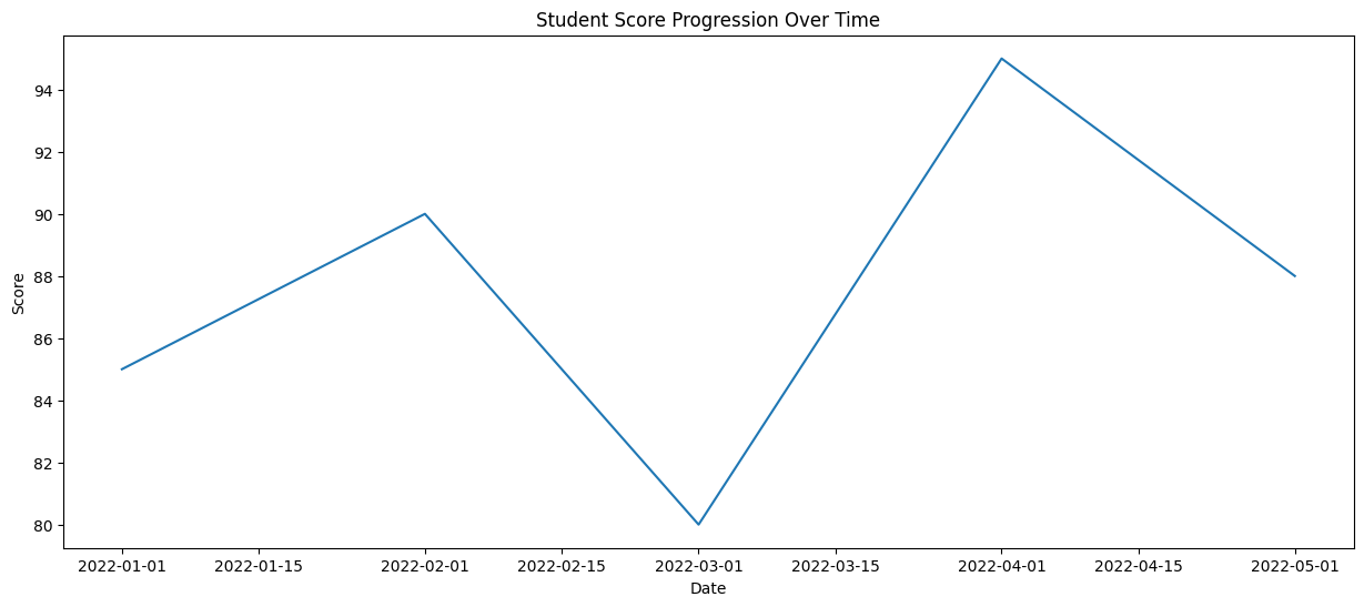
With these, we can observe the trend and changes in the student's performance over time.
3. Box Plot:
A box plot is used to display the distribution of numerical data and identify outliers. It provides information about the median, quartiles, and potential outliers in the data. Seaborn's boxplot function can be used to create box plots. Here's an example:
Let's consider an imaginary dataset of students' scores in different subjects. We'll create a box plot using Seaborn to visualize the distribution of scores.
import seaborn as sns
import matplotlib.pyplot as plt

# Imaginary data
math_scores    = [85, 90, 75, 80, 92]
science_scores = [78, 85, 88, 82, 90]
english_scores = [70, 80, 75, 85, 82]
history_scores = [80, 85, 88, 90, 85]

# Create a DataFrame with subjects and scores
data = {'Math': math_scores, 'Science': science_scores, 'English': english_scores, 'History': history_scores}
df = pd.DataFrame(data)

# Create a box plot using Seaborn
plt.figure(figsize=(8, 6))
sns.boxplot(data=df)
plt.title('Distribution of Scores in Different Subjects')
plt.xlabel('Subjects')
plt.ylabel('Scores')
plt.show()
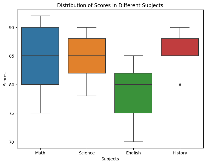
In this example, we created a DataFrame with the subjects and scores, and then use Seaborn's boxplot function to create a box plot. The box plot displays the distribution of scores for each subject, by visually comparing the distributions of scores across different subjects and identifying any variations in performance.
4. Geographic Map
Seaborn, in combination with other libraries, can be used to create geographic maps. These maps help visualize data spatially, such as plotting data points on a world map. To create a geographic map using Seaborn, we can utilize the geopandas library to handle the map data and then use Seaborn to visualize it.
Let's consider an example where we want to plot selected countries across the world on a world map.
import geopandas as gpd
import matplotlib.pyplot as plt

# Load the world map data
world = gpd.read_file(gpd.datasets.get_path('naturalearth_lowres'))

# Select the countries in Europe and Africa
selected_countries = ['United States', 'Canada', 'China', 'India', 'Pakistan',
                        'Saudi Arabia', 'United Kingdom', 'Russia', 'Denmark',
                        'Brazil', 'Nigeria', 'Kenya', 'South Africa', 'Ghana',
                        'Algeria', 'Egypt'
                    ]
filtered_map = world[world['name'].isin(selected_countries)]

# Plot the selected countries on the map
fig, ax = plt.subplots(figsize=(12, 8))
world.plot(ax=ax, color='lightgray')
filtered_map.plot(ax=ax, color='blue')
plt.title('Selected Countries in Europe and Africa')
plt.show()
👩🏾🎨 Practice: Know your Diamonds... 🎯
We'll work with the diamonds dataset, which is available in Seaborn and contains information about the characteristics and prices of diamonds. Can we visualize the relationship between the carat weight of a diamond and its price?
Your task is to create a line plot to visualize the relationship between the carat weight of diamonds and their prices.
Instructions:
- Import the necessary libraries, including Seaborn and Matplotlib.
- Load the "diamonds" dataset from Seaborn.
- Create a scatter plot with
caraton the x-axis andpriceon the y-axis.
You can load the diamonds dataset directly from Seaborn as follows:
import seaborn as sns

# Load the "diamonds" dataset
diamonds = sns.load_dataset("diamonds")
➡️ Next, you'll learn data distribution using
histogramsanddensity plots🎯.
Data size and Bubble chart
Data size refers to the amount of data we have to work with. It can vary from small datasets with just a few rows and columns to massive datasets with millions or even billions of data points. The size of the data is important because it can affect how we analyze and visualize the information it contains. To represent different components (such as high and low values) in our visualization, we can use a 3D visualization such as Bubble chart.
Bubble chart
To understand this better, let's consider some examples...
Example 1
Let's consider an imaginary dataset that contains pollution information about different cities from Europe (London, Paris, Berlin, and Rome) and Africa (Lagos, Cairo, Nairobi, and Accra). The dataset includes information on the population size, average temperature in Celsius, and pollution level for each city. We can create the bubble chart by following these steps:
- import the libraries
- create the dataset
- create the bubble chart
Programatically, we can achieve the above steps using the code snippet below.
import pandas as pd
import seaborn as sns
import matplotlib.pyplot as plt

# Create an imaginary dataset
data = pd.DataFrame({
    'City': ['London', 'Paris', 'Rome', 'Lagos', 'Nairobi', 'Accra', 'Berlin', 'Cairo'],
    'Population': [8900000, 2141000, 2873000, 21000000, 4397000, 2062000, 3645000, 20340000],
    'Average Temperature (C)': [13, 12, 18, 28, 24, 28, 9, 32],
    'Pollution Level': [3, 2, 2, 6, 5, 4, 2, 7]
})

# Create a bubble chart
sns.scatterplot(data=data, x='Average Temperature (C)', y='Pollution Level', size='City', hue='City', sizes=(20, 1000))

# Add labels and title
plt.xlabel('Average Temperature (C)')
plt.ylabel('Pollution Level')
plt.title('Temperature vs Pollution Level')

# move legend outside the chart
plt.legend(bbox_to_anchor=(1.01, 1),borderaxespad=0)

# Show the plot
plt.show()
The above bubble chart shows the relationship between average temperature and pollution level, with the size of each bubble representing the population size of the city.
Example 2
In this example, we'll use a real-life dataset - the famous iris dataset, which contains measurements of sepal length, sepal width, petal length, and petal width for different iris flowers. We can create the bubble chart by following these steps:
- import the libraries
- load the dataset
- create the bubble chart
Programatically, we can achieve the above steps using the code snippet below.
import seaborn as sns
import matplotlib.pyplot as plt

# Load the iris dataset from seaborn
iris = sns.load_dataset('iris')

# Create a bubble chart
sns.scatterplot(data=iris, x='sepal_length', y='sepal_width', size='petal_length', sizes=(20, 1000), hue='species')

# Add labels and title
plt.xlabel('Sepal Length')
plt.ylabel('Sepal Width')
plt.title('Iris Sepal Size')

# move legend outside the chart
plt.legend(bbox_to_anchor=(1.01, 1),borderaxespad=0)

# Show the plot
plt.show()
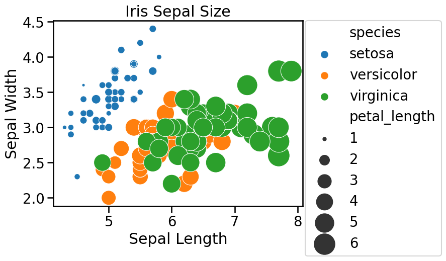
This bubble chart shows the relationship between sepal length and sepal width, with the size of each bubble representing the petal length. This can help us understand the distribution of iris flowers based on their sepal size and petal length.
👩🏾🎨 Practice: Know your Diamonds... 🎯
We'll continue to use the "diamonds" dataset available in Seaborn. Can we visualize the relationship between the carat weight, price, and clarity of diamonds using a bubble chart?
Task: create a bubble chart to visualize the relationship between the carat weight, price, and clarity of diamonds.
Instructions:
- Import the necessary libraries, including
SeabornandMatplotlib. - Load the
diamondsdataset from Seaborn. - Create a bubble chart with
caraton the x-axis,priceon the y-axis, and useclarityto determine the size of the bubbles. - Bonus (Optional):
- Label the axes and add a title to the bubble chart.
- Use different colors to represent different clarity levels.
Dataset:
You can load the diamonds dataset directly from Seaborn.
➡️ Next, you'll learn data distribution using
histogramsanddensity plots🎯.
Data Distribution
Imagine you have a dataset containing the ages of a group of people. Then, you want to understand how the ages are distributed, which means you want to see how many people fall into different age ranges. This is what data distribution is about, and histograms and density plots are useful visualizations for this purpose.
1. Histogram
A histogram is used to visualize the distribution of a continuous variable by displaying the frequency or count of observations falling within specific intervals or bins. A histogram is like a bar graph that shows the frequency or count of scores falling within specific score ranges, known as bins. Each bar in the histogram represents a bin, and its height indicates the number of students with scores within that range.
For example, if the histogram shows a tall bar around the 70-80 range, it means many students scored within that range. A histogram helps visualize the overall pattern and spread of the scores, allowing you to identify common score ranges or any outliers. Seaborn's histplot() function can be used to create histograms.
Suppose we have data on the exam scores of a class of students. A histogram helps us understand the distribution of scores. For example
import seaborn as sns

# Assuming you have a list of test scores called 'scores'
scores = [78, 85, 90, 74, 92, 85, 76, 88, 80, 90, 85, 82, 94, 83]

# Create a histogram
sns.histplot(scores, bins=8)
plt.title('Distribution of Test Scores')
plt.xlabel('Scores')
plt.ylabel('Frequency')
plt.show()
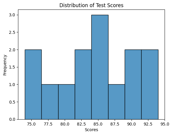
In the code above, we use the sns.histplot function to create a histogram and specify the number of bins (ranges) to divide the scores into.
2. Density plots
A density plot, on the other hand, is a smooth line that shows the distribution of data as a continuous curve. Instead of using bins like a histogram, a density plot estimates the probability density function of the data.
It gives you an idea of how likely it is to find a data point within a certain range. In our age example, the density plot would show the likelihood of finding a person of a specific age. It can help you understand the overall shape of the distribution, such as whether it's symmetric, skewed to the right or left, or multi-modal (having multiple peaks). For example:
import seaborn as sns

# Assuming you have a list of test scores called 'scores'
scores = [78, 85, 90, 74, 92, 85, 76, 88, 80, 90, 85, 82, 94, 83]

# Create a density plot
sns.kdeplot(scores)
plt.title('Density Plot of Test Scores')
plt.xlabel('Scores')
plt.ylabel('Density')
plt.show()
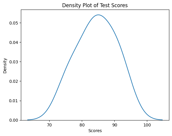
We use the sns.kdeplot function, which stands for kernel density estimation. This function estimates the underlying probability density function of the scores and visualizes it as a smooth curve.
Now that we have an idea of data distribution using histogram and density plot, let's apply these distrubtion techniques on a real-life dataset.
Distribution of IRIS dataset
The Iris dataset is a well-known dataset in the field of data science and machine learning. It consists of measurements of different attributes of various iris flowers - setosa, versicolor, and virginica.

To put it simply, imagine a dataset that contains information about different types of flowers called irises. For each iris flower, the dataset provides four main measurements:
-
Sepal Length: This is the length of the outer part of the flower known as the sepal. Think of it as the green protective cover around the flower.
-
Sepal Width: This is the width of the sepal, measured from one side to the other.
-
Petal Length: This is the length of the inner colorful part of the flower known as the petal. It's the part that often comes in various colors like purple, white, or yellow.
-
Petal Width: This is the width of the petal, measured from one side to the other.
By studying these measurements for a variety of iris flowers, we can gain insights into the different types of iris flowers and understand how they vary from one another. This dataset is often used in data science and machine learning to practice analyzing data and build predictive models.
Histogram and density plot of IRIS
One of the benefit of using Seaborn is the in-built dataset that comes with it. One of this dataset is the Iris dataset we'll be using in this exercise. To load the dataset and view the top rows using Seaborn, we can use the code snippet below:
# load iris dataset
iris_dataset = sns.load_dataset("iris")

# show top 5 rows
iris_dataset.head()
| index | sepal_length | sepal_width | petal_length | petal_width | species |
|---|---|---|---|---|---|
| 0 | 5.1 | 3.5 | 1.4 | 0.2 | setosa |
| 1 | 4.9 | 3.0 | 1.4 | 0.2 | setosa |
| 2 | 4.7 | 3.2 | 1.3 | 0.2 | setosa |
| 3 | 4.6 | 3.1 | 1.5 | 0.2 | setosa |
| 4 | 5.0 | 3.6 | 1.4 | 0.2 | setosa |
Next, let's create a distribution of the Iris species by grouping each specie using colour-coded histogram. We can add colour to the bars of a histogram using the hue property of the histplot() function.
# create a colour-coded distribution of each flower
histogram = sns.histplot(data=iris_dataset, x='petal_length', hue='species')
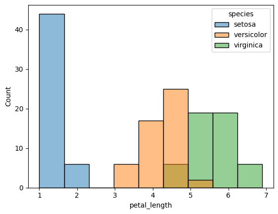
Next, let's create a density plot of the petal length for each specie.
# Density plots for each species
sns.kdeplot(data=iris_data, x='Petal Length (cm)', hue='Species', shade=True)

# Add title
plt.title("Distribution of Petal Lengths, by Species")
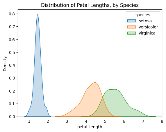
An interesting pattern we can see in the plots is that the species seem to belong to one of two groups- versicolor and virginica seem to have similar values for petal length, while setosa belongs in a category all by itself. In fact, if the petal length of an iris flower is less than 2 cm, it's most likely to be setosa!
👩🏾🎨 Practice: Data distribution... 🎯
We'll continue to use the diamonds dataset available in Seaborn. Can we visualize the distribution of diamond prices in the "diamonds" dataset using a histogram?
Task: Create a histogram to visualize the distribution of diamond prices.
Instructions:
- Import the necessary libraries, including
SeabornandMatplotlib. - Load the
diamondsdataset from Seaborn. - Create a histogram to show the distribution of diamond prices.
- Bonus (Optional):
- Label the
xandyaxes. - Adjust the number of bins for the histogram to experiment with different levels of granularity.
- Label the
Dataset:
You can load the diamonds dataset directly from Seaborn.
➡️ In the next section, you'll learn how to derive insight from data 🎯.
Insight and reporting
Data insight and reporting in data science refer to the process of analyzing and interpreting data to gain valuable information and knowledge that can be used to make informed decisions. By using interactive dashboards with summary statistics, we can gain insights and present them effectively to help decision-makers understand the data's implications and make well-informed choices.
Interactive dashboards
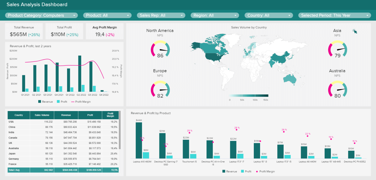
For example, let's say you have an interactive dashboard for the sales data of an online store. You can choose to view the sales performance for specific months, compare sales across different product categories, or filter data to see sales from a particular region or customer segment. With a simple click, the dashboard will update and show you the results, making it easier for you to analyze the data and make important business decisions.
Some popular tools used for creating interactive dashboards are:
These tools help turn complex data into easy-to-understand visuals, enabling businesses to gain valuable insights and make informed decisions quickly. Interactive dashboards play a crucial role in data science by empowering you to explore and understand data effectively, without getting lost in rows and columns of information.
Now, let's look at how we can create an interactive dashboards using one of these tools - Power BI.
In summary, the introductory tutorial has given us a feel of interactive dashboard using Power BI and provides us with other information, such as
- Instruction on how to download the free version of Power BI Desktop
- The video provides a free Excel dataset for practice
- featuring sales dataset
- The steps covered in the video includes...
- importing and transforming data using Power Query
- navigating Power BI's main features,
- creating an interactive dashboard from scratch
- sharing and collaborating with others.
- Various features of Power BI are demonstrated, such as
- manipulating data
- creating visualizations like charts and maps
- utilizing AI tools for analysis.
Unlike static charts and graphs that are fixed and only shows a snippet of the data at a point in time, interactive dashboards allows you to interact with the data and drill down for more insights. However, certain factors needs to be considered before design a dashboard.
Dashboard considerations
The goal of creating a dashboard is to inform a tagetted audience of insights derived from a dataset. To suit this purpose, the follwing are some of the factors to consider.
-
Audience and User Experience: Consider who will be using the dashboard and their level of familiarity with data. Design the dashboard in a way that is intuitive and easy to navigate, even for non-experts. Use user-friendly labels, icons, and tooltips to guide users.
-
Clarity of Purpose: Before creating the dashboard, you need to define its purpose. What insights or information do you want to convey to the users? Clarity of purpose helps in organizing and selecting the right visualizations to present the data effectively.
-
Data Selection and Organization: Choose the most relevant and important data to include in the dashboard. Organize the data logically so that users can quickly find what they need. Group related information together and use clear headings.
-
Appropriate Visualizations: Select appropriate charts and graphs that best represent the data and support the dashboard's purpose. Avoid cluttering the dashboard with too many visualizations, as it can confuse users.
➡️ Next week, we'll dive into Exploratory data analysis 🎯.
➡️ In the next 2 weeks, you'll take everything we've covered and apply it to your
Midterm Project🎯.
Practices
Adidas Sales
In this assignment, your task is to create insightful visualizations using the provided Adidas Sales Dataset. Your goal is to uncover trends, patterns, and insights related to Adidas sales across different regions.
Dataset: You have been provided with the "Adidas Sales Dataset" containing information about sales data for Adidas products across various regions. The dataset includes the following columns:
Retailer: The name of the retailer.Retailer ID: The unique ID assigned to each retailer.Invoice Date: The date of the sales invoice.Region: The region where the sale took place.State: The state within the region.City: The city where the sale occurred.Product: The name of the Adidas product sold.Price per Unit: The price per unit of the product.Units Sold: The quantity of units sold.Total Sales: The total sales amount for the transaction.Operating Profit: The profit generated from the sale.Operating Margin: The profit margin for the transaction.Sales Method: The method used for the sales transaction.
Instructions:
- Load the "Adidas Sales Dataset" into a suitable data structure (e.g., DataFrame).
- Explore the dataset to understand its structure, summary statistics, and any missing values.
- Create a variety of visualizations to answer the following questions:
- Create a bar chart or a line chart to showcase the regional distribution of total sales.
- What are the top-selling products? Create a bar chart to visualize the quantity of each product sold.
- Is there a relationship between the price per unit and the operating profit? Use a scatter plot to explore this relationship.
- How does the sales method impact the operating margin? Create a box plot to compare the distribution of operating margins for different sales methods.
- Put all your visuals in a word document.
- Write a brief summary of your findings and insights from the visualizations.
Submission
You are required to submit documentation for practice exercises over the course of the term. Each one will count for 1/10 of your practice grade, or 2% of your overall grade.
- Practice exercises will be graded for completion not perfect correctness.
- You have to document that you did the work, but we won't be checking if you got it right.
- You MUST upload your visuals as a single file to
Practices - Visualizationon Gradescope after the exercise to get the grade for this exercise.
Your log will count for credit as long as:
- It is accessible to your instructor, and
- It shows your own work.
Assignment - World GDP
The World GDP dataset provides information about the Gross Domestic Product (GDP) of countries worldwide from the year 1980 to 2023. GDP represents the total value of goods and services produced within a country's borders in a specific time period. This dataset includes data for each country, allowing for comprehensive analysis and comparison of economic growth and development.

World GDP Exploration
Your task is to explore and visualize this dataset using the techniques you've learnt during the week. Analyzing the World GDP dataset through visualization can yield valuable insights, such as helping us understand global economic trends, identify countries with significant GDP growth or decline, and explore patterns over time.
For instance, we can create line plots to visualize the changes in GDP for different countries over the years. This allows us to observe the overall economic trajectory of nations, identify periods of rapid growth or recession, and compare the economic performance of different regions.
Repository

TODOs
- Clone the assignment repository using this link above, where you you can get the dataset for this assignment -
world_gdp_dataset.csv - Look through the data to have an understanding of the information therein.
- Check the
Hintsbelow to have an idea of what you can do with the data. - Complete the assignment using the
world_gdp_dataset.ipynbin the repository.- Push your solution back to Github once completed.
- Submit your notebook on Gradescope
- Look for Assignment - Visualization under assignments
Exploratory Data Analysis (EDA)
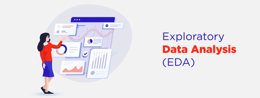
Welcome to week 4 of the Intro to data science course! Last week, we looked at different data visualization and Insight. We went further to explore how to create different plots and graphs using different tools. Lastly, we explored getting insights from data using dashboards.
This week, we'll begin our journey of data exploration and statistics 😍 by looking at what it is, and different ways of exploratory analysis. Next, we'll look at exploratory analysis from visualization point of view. Then, we'll explore different descriptive statistics and analysis.
Learning Outcomes
After this week, you will be able to:
- Explain the basics and importance of EDA in data science.
- Describe different types of statistics required for data analysis.
- Distinguish between measure of dispersion and variability on a dataset.
- Apply correlation analysis to features in a dataset.
An overview of this week's lesson
Intro to EDA
Exploratory Data Analysis (EDA) is like a detective's investigation when it comes to understanding a dataset. Just like how a detective looks for clues to solve a mystery, EDA helps data scientists explore and understand their data to uncover valuable insights and patterns. This detective work helps us understand the story behind the data, find any irregularities or outliers, and decide how to best approach analyzing the data for valuable insights.
What is EDA?
Back to our detective analogy, EDA carefully examine the data to understand its story by summarizing the data using descriptive statistics, such as averages, ranges, and distributions, which give us a general overview. Then, we move on to visualizing the data using graphs and charts, which make it easier to spot trends, relationships, or anomalies. To understand this further, let's look at some examples...
Example 1
Imagine we have a dataset containing information about house prices. Through EDA, we can calculate the average price, explore the distribution of prices, and visualize the relationships between price and factors like the number of bedrooms or location. By doing this, we might discover that houses with more bedrooms tend to have higher prices, or that houses in certain neighborhoods are more expensive than others.
Example 2
Imagine you're given a large dataset, like a collection of puzzle pieces. EDA helps you make sense of these pieces and understand what story they're trying to tell. We can start by examining the individual pieces, such as looking at the values, checking for missing or unusual data, and understanding what each variable represents. This is like inspecting each puzzle piece to see its color, shape, or pattern.
Next, we start putting the puzzle pieces together and look for connections. You analyze how variables relate to each other, finding correlations, trends, and patterns. This is similar to connecting puzzle pieces based on their edges or colors to create meaningful parts of the picture.

Example 3
Imagine you have a dataset that contains information about literacy rates in different African countries.
First, EDA can help us detect any outliers or inconsistencies in the data, such as countries with unusually high or low literacy rates compared to others. Next, we can create visualizations like bar charts or maps to show the literacy rates of different countries by identifying which countries have high literacy rates and vice versa.
This analysis helps us to compare and understand the variations in literacy across different African countries.
👩🏾🎨 Practice: Understand the EDA 🎯
➡️ Next, you'll be introduced to
fundamentals of statistics🎯.
Fundamentals of statistics
Statistics is composed of various elements that work together in collecting, analyzing and interpreting data. To understand the fundamentals of statistics, let's consider a simple example - Imagine you have a bag of colored marbles, and you want to know the proportion of each color in the bag. You randomly pick some marbles and count how many of each color you have.

Statistics starts with data collection, which involves gathering information or observations. In our example, it's the process of picking marbles and recording their colors. The data collected forms the basis for analysis.
Next, we move on to data analysis. This step involves organizing, summarizing, and exploring the data to uncover patterns and insights. For instance, we can calculate the frequencies of different colors or create visual representations like bar charts or pie charts to see the proportions.
Statistics
Descriptive vs Inferential statistics
Descriptive statistics summarizes and describes data, providing an overview of its characteristics. It includes measures of central tendency and variability. Inferential statistics, on the other hand, allows us to make inferences and predictions about a larger population based on a sample. It involves using statistical techniques to analyze sample data and draw conclusions about the population
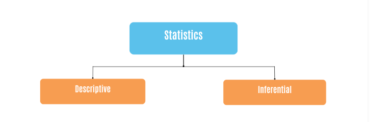
In essence, descriptive statistics describes the data we have, while inferential statistics helps us make predictions and draw conclusions beyond the observed data. Imagine you want to know the average height of students in your school. You measure the heights of a few students and get the following data:
data: 150 cm, 160 cm, 165 cm, 170 cm, 175 cm.
Now, let's explore two types of statistics (descriptive and inferential) using the data above.
Descriptive Statistics
Descriptive statistics helps us understand the main characteristics of the data without making any generalizations beyond the sample we have. In our example, we can calculate the mean (average) height of the students, which is
(150 + 160 + 165 + 170 + 175) / 5 = 164 cm
This provides us with a summary of the data and helps us understand the typical height of the students in our sample.
Inferential Statistics
Inferential statistics allows us to draw conclusions and make predictions about the whole group based on the observed sample. For instance, we can use inferential statistics to estimate the average height of all students in the school by taking a random sample and calculating the mean height of that sample. This estimate can then be used to make inferences about the entire student population.
➡️ In the next lesson, we'll be looking more deeper into
descriptive statistics🎯.
Descriptive Statistics
Descriptive statistics play a crucial role in helping us understand and make sense of a dataset by providing a summarized view of the data, and allowing us to gain valuable insights and draw meaningful conclusions about our data. To conduct descriptive statistics on a dataset, we can either look at measures of central tendency or a bit deeper into measures of dispersion of the dataset.
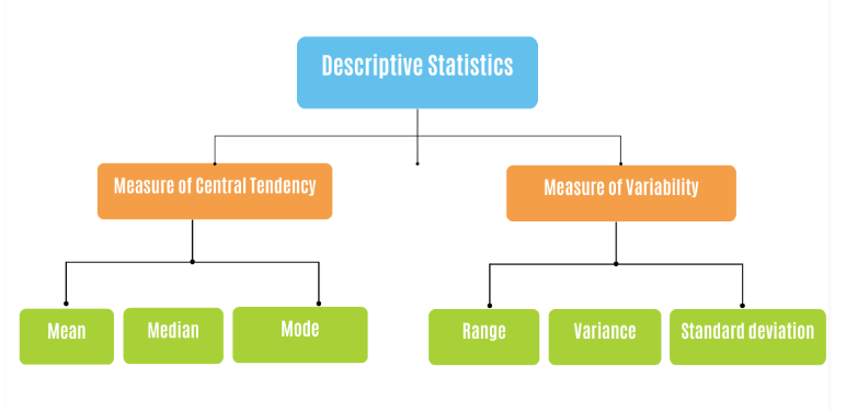
In this lesson, we'll only focus on measures of central tendency, while measures of dispersion will be discussed in the next lesson.
Measures of central tendency
To understand this better, let's take the height of students in a class as a data to explain the mean, median, and mode.
Mean
The mean is the most common measure of central tendency. It is calculated by adding up all the values in the dataset and dividing the sum by the total number of values. Suppose we have the heights of five students in centimeters: 150, 160, 165, 170, and 175. To find the mean height, we add up all the heights and divide by the total number of students (in this case, 5). So,
The mean height of the students is 164 cm, which represents the average height.
Median
The median is another measure of central tendency. It represents the middle value in a dataset when the values are arranged in order. If there is an odd number of values, the median is the middle value itself. For example, If we arrange the heights in ascending order: 150, 160, 165, 170, 175, the median is the middle value. In this case, the middle value is 165 cm.
The median represents the height at which half of the students are taller and half are shorter. It is not affected by extreme values, so even if we had an unusually tall or short student, the median would remain the same. However, if there is an even number of values, the median is the average of the two middle values. For example, in the dataset (150, 150, 160, 165, 170, 175), the median is
Mode
The mode is the value that appears most frequently in a dataset. It represents the most common or popular value. For example, if we observe the heights, we see that no height is repeated in this dataset. Therefore, there is no mode. If, however, we had two students with a height of 160 cm, then the mode would be 160 cm, as it appears more frequently than any other height.
Measures of central tendency in Pandas
Imagine you have a spreadsheet with a list of numbers representing student heights. Using pandas, you can load this data into a DataFrame, which is a tabular structure similar to a table. Once the data is in the DataFrame, you can easily calculate measures of central tendency.
Here's a sample code using Pandas to calculate the mean, median, and mode of student heights:
In the code above, we first create a pandas Series called heights that contains the student heights. We then use the .mean() method to calculate the mean height, the .median() method to calculate the median height, and the .mode() method to calculate the mode height.
👩🏾🎨 Check your understanding: Measures of central tendency... 🎯
Consider the following dataset representing the ages of a group of students in a class:
[18, 20, 19, 21, 22, 18, 20, 21, 19, 20]
- Calculate the mean , median, and mode of the students age in the class.
- Explain in simple terms what each of these measures represents and how they help us understand the distribution of ages in the class.
Visualization in Descriptive statistics
Visualizing data in descriptive statistics enhances our understanding by providing a visual representation of the information. It helps us identify patterns, trends, and potential outliers in the data.
Additionally, it makes it easier to communicate findings to others who may not be familiar with statistical concepts, allowing for a more engaging and intuitive interpretation of the data.
By leveraging visualizations, we can better explore, interpret, and communicate the main characteristics of the data in descriptive statistics. We'll see more of this towards the end of the week.
➡️ Next, we'll explore more on descriptive statistics -
measures of dispersion🎯.
Measure of Dispersion
Let's consider another example using a group of students and their weight. Suppose we have the following weights (in kilograms) for a class of students: 50, 55, 60, 65, and 70.
Range
The range is calculated by subtracting the minimum weight from the maximum weight. In this case, the range is calculated below and this tells us that the weights vary by 20 kilograms within the class.
Variance
Variance measures the average squared deviation of each weight from the mean. It gives us an idea of how spread out the weights are. To calculate the variance:
Standard Deviation
The standard deviation is the square root of the variance. It represents the average distance of each weight from the mean. In this case, the standard deviation is the square root of 50, which is approximately 7.07 kg.
Overall, these measures of dispersion help us understand how the weights of students are spread out within the class. A larger range, variance, or standard deviation indicates greater variability or dispersion of the weights, while a smaller value suggests that the weights are closer together.
Measure of dispersion using Python
Python provides various libraries, such as NumPy and Pandas, that make it easy to calculate measures of dispersion. Here's an example using the Numpy library to calculate the range, variance, and standard deviation of the weight dataset.
In the code snippet above, the np.max() and np.min() functions find the maximum and minimum values in the dataset, allowing us to calculate the range. The np.var() function calculates the variance, and the np.std() function calculates the standard deviation.
👩🏾🎨 Practice: Measures of central tendency... 🎯
Consider the following dataset representing the test scores of a group of students in a class:
[85, 90, 75, 80, 95, 70, 85, 88, 82, 78]
- Calculate the range of the test scores.
- Calculate the variance of the test scores.
- Calculate the standard deviation of the test scores.
- Explain in simple terms what each of these measures of dispersion tells us about the spread or variability of the test scores.
➡️ Next, we'll be looking at
Correlation analysisanalysis 🎯.
Correlation Analysis
To explain correlation analysis, let's consider an example. Suppose we have data on the number of hours studied and the corresponding test scores of a group of students. If there is a positive correlation between these two variables, it means that as the number of hours studied increases, the test scores also tend to increase. This suggests that studying more is associated with higher scores.
On the other hand, if there is a negative correlation, it means that as the number of hours studied increases, the test scores tend to decrease. This implies that studying more may not necessarily lead to higher scores.
Correlation is usually expressed as a value between -1 and +1. A correlation coefficient of +1 indicates a perfect positive correlation, meaning that as one variable increases, the other variable increases proportionally. A correlation coefficient of -1 indicates a perfect negative correlation, where as one variable increases, the other variable decreases proportionally. A correlation coefficient of 0 indicates no correlation, implying that there is no relationship between the variables.
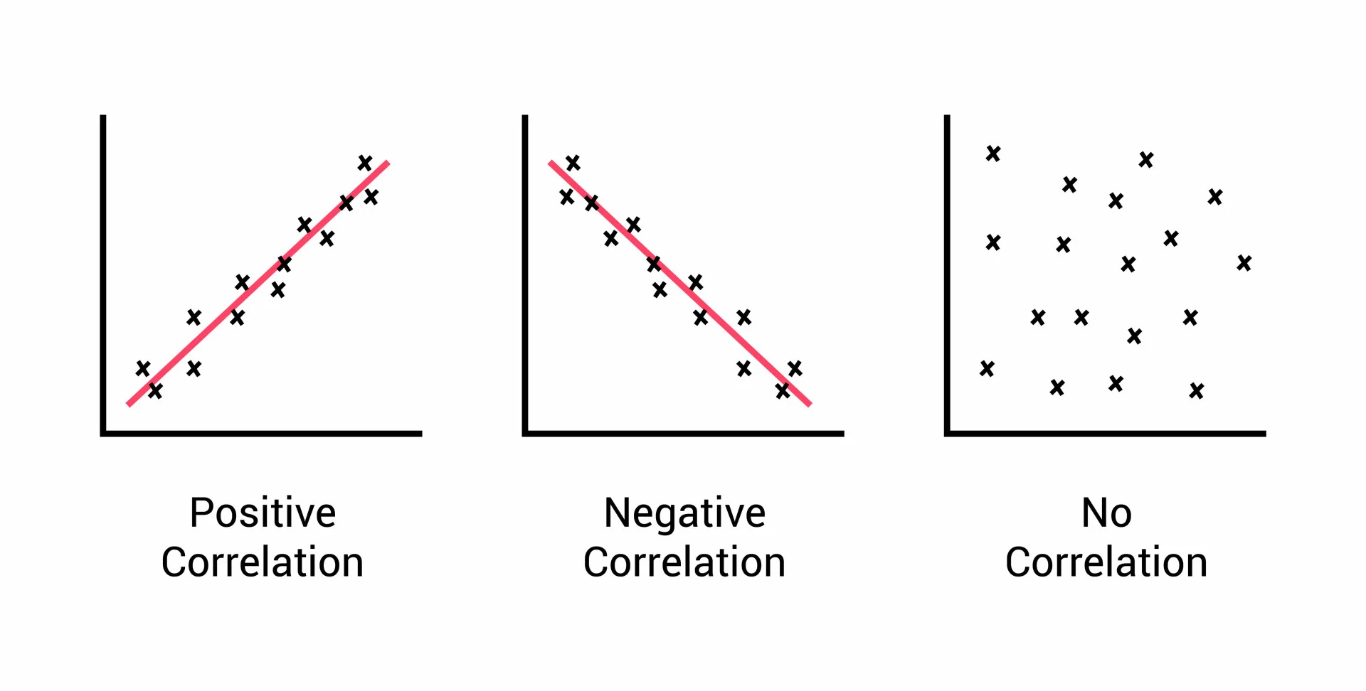
Correlation analysis helps us understand the relationship between variables, and it is often used to identify patterns, make predictions, and inform decision-making. By quantifying the correlation between variables, we can gain insights into how changes in one variable may affect the other and make informed choices based on these relationships.
Correlation ≠ causation
Just because two variables are correlated does not mean that one variable directly causes the other to change. It tells us how they vary together, but it does not provide information about the cause-and-effect relationship between them.
In the context of the number of hours studied and test scores, a positive correlation indicates that as the number of hours studied increases 📶, the test scores tend to increase as well. However, this correlation does not prove that studying more directly causes higher ↗️ test scores.
Correlation ≠ causation
To establish a causal relationship, controlled experiments, where one variable is manipulated while keeping other factors constant, are often used to determine causality. For example, a study could randomly assign students to different study time conditions and measure the impact on their test scores. This type of study design helps isolate the effect of studying on test performance and provides more evidence for causation.
Learn more about controlled experiment
Correlation analysis using Seaborn
Here's a code snippet using Numpy and Seaborn to calculate and plot the correlation between the number of hours studied and test scores.
Note: Seaborn library will be explored in subsequent lessons. Hence, don't stress much about it right now.
We use the np.corrcoef() function from Numpy to calculate the correlation coefficient between the number of hours studied and test scores. Next, we use Seaborn's regplot() function to create a scatter plot with a linear regression line, showing the relationship between the two variables. If we run the above code snippet, then we can see the plot below.
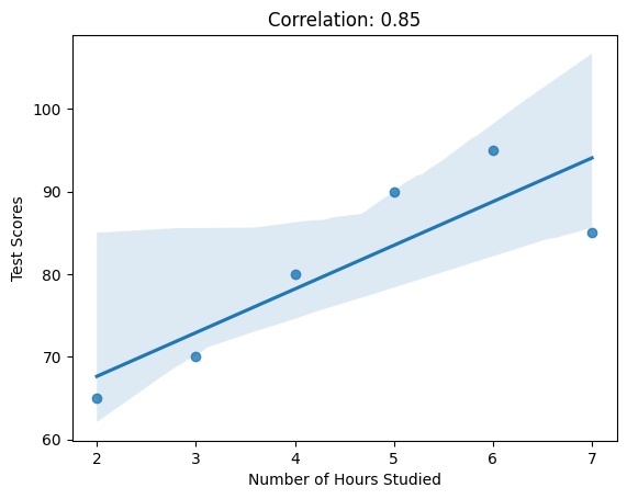
By calculating the correlation coefficient, we can quantify the strength of the relationship between hours studied and test scores. This information can help us understand how changes in study hours may impact test performance and guide decision-making regarding study strategies or resource allocation for improving academic performance.
👩🏾🎨 Practice: Correlation analysis... 📝
Imagine you have collected data about movie ratings from a group of people. Here's a simplified dataset representing the number of hours spent watching movies per week and the corresponding average rating given by each person:
Hours Watched: [6, 8, 5, 4, 9, 7, 3, 2, 7, 5]
Ratings:       [4.5, 3.8, 4.0, 3.2, 4.7, 4.3, 2.9, 3.1, 4.2, 3.8]
- Calculate the correlation coefficient between the hours watched and the ratings.
- Interpret the correlation coefficient value. What does it suggest about the relationship between hours watched and movie ratings?
➡️ In the next lesson, we'll be looking into
visualizationin EDA 🎯.
Visualization for EDA
While we use EDA to examine and summarize the main characteristics of the data before diving into more advanced analyses, visualization refers to the use of graphical representations to understand and explore data.
Visualization plays a crucial role in EDA because it allows us to visually explore patterns, relationships, and distributions within the data. By creating visualizations, we can better understand the data, identify trends, outliers, and potential correlations between variables.
For example, imagine we have a dataset containing information about the sales of different products in a store over time. By creating visualizations, such as line plots or bar charts, we can easily see the sales trends, identify the highest-selling products, or observe any seasonal patterns. Visualizations make it easier to comprehend large amounts of data at a glance and can help us make data-driven decisions and derive meaningful insights.
📺 Visualization in descriptive statistics by Greg Martin 👨🏾💻
👩🏾🎨 Practice: Visualization for EDA 🎯
Imagine you have collected data about movie ratings from a group of people. Here's a simplified dataset representing the number of hours spent watching movies per week and the corresponding average rating given by each person:
Hours Watched: [6, 8, 5, 4, 9, 7, 3, 2, 7, 5]
Ratings:       [4.5, 3.8, 4.0, 3.2, 4.7, 4.3, 2.9, 3.1, 4.2, 3.8]
- Create a scatter plot of hours watched vs. ratings. Label the axes appropriately.
- Based on the scatter plot and correlation coefficient, describe the strength and direction of the relationship between hours watched and movie ratings.
➡️ In the next section, you'll practice what you've learnt so far this week 🏙️.
Practice
Monthly Expenses
Imagine you are working with a dataset that contains information about the monthly expenses of a group of individuals. Here's a simplified version of the dataset:
Person:       [1, 2, 3, 4, 5, 6, 7, 8, 9, 10]
Expenses ($): [450, 600, 350, 700, 550, 480, 320, 410, 580, 520]
Income ($):   [3000, 4000, 2500, 4200, 3500, 3200, 2000, 2800, 3800, 3300]
- Calculate the mean, median, and mode of the monthly expenses.
- Calculate the range, variance, and standard deviation of the monthly expenses.
- Compute the correlation coefficient between expenses and income.
- Interpret the correlation coefficient value. What does it suggest about the relationship between expenses and income?
- Create a scatter plot to visualize the relationship between expenses and income. Label the axes appropriately.
- Based on the scatter plot and correlation coefficient, describe the strength and direction of the relationship between expenses and income.
Submission
You are required to submit documentation for practice exercises over the course of the term. Each one will count for 1/10 of your practice grade, or 2% of your overall grade.
- Practice exercises will be graded for completion not perfect correctness.
- You have to document that you did the work, but we won't be checking if you got it right.
- You MUST upload your analysis/visuals as a single file to
Practice - EDAon Gradescope after the exercise to get the grade for this exercise.
Your log will count for credit as long as:
- It is accessible to your instructor, and
- It shows your own work.
🎯 Midterm Project: Netflix Movies and Shows
As your midterm project in this introductory data science course, you will be working with a dataset containing listings of movies and TV shows available on Netflix up until 2021. The goal of this project is to perform data cleaning tasks and create visualizations to gain insights into the Netflix content library.
Due Date: Tuesday, 14th of November, 2023
🎯 Netflix Movies and Shows
The Netflix dataset contains comprehensive information about movies and TV shows available on the Netflix streaming platform up until 2021. It provides a listing of the vast collection of content available for viewers worldwide. The dataset includes details such as the title, genre, release year, duration, country of origin, and cast/crew information for each movie or TV show.
🎯 TODOs...
1. Data Cleaning:
- Create a notebook with the name
netflix-midterm-project.ipynbwhere you'll do all your work - Load and explore the data to have an understanding of what it represent.
- Remove any duplicate entries in the dataset.
- Handle missing values by either imputing or removing them.
- Standardize and clean up the text data, such as titles or genres, to ensure consistency.
2. Exploratory Data Analysis (EDA):
- Perform descriptive statistics to understand the distribution of release years, genres, and durations.
- Explore the relationship between release years and the number of movies/TV shows available.
3. Data Visualization:
- Visualize the TOP 10 countries contributing to the Netflix content library using a bar plot or a world map.
- Create a
word cloudof the most common words in movie titles or genres to identify popular themes or trends. - Create visualizations to analyze the distribution of content across different genres.
- Design an interactive dashboard to explore the dataset, allowing users to filter by genre, release year, or country.
🎯 HINTs...
- Before starting, make sure to make a
copyof the original dataset to preserve the integrity of the data. - Utilize pandas functions and methods, such as
drop_duplicates(),fillna(), andstr.replace()as discussed in the lessons, to handle cleaning tasks. - Use
Seabornand/ormatplotliblibraries for visualizations. Experiment with different types of plots and charts, such as bar plots, pie charts, and word clouds. - Focus on visualizing aspects such as the distribution of genres, the trend in release years, or the duration of movies and TV shows.
- Consider interactive visualizations such as dashboards, to enable users to explore the dataset and interact with the data.
- Document your data cleaning process and provide clear explanations and interpretations for each visualization.
🎯 Collaboration & Teamwork
- This is a Team Project where you'll work in groups of 2-3 students.
- Form your groups and communicate with your team before you accept the assignment in Github Classroom.
- Join the same team in Github Classroom. Work on your project together.
- Ideally, find a time when you can all join a video call and work together on the project.
- Everyone in the group should have a roughly equal contribution to the project.
- You'll need some extra bit of googling to complete this task.
🎯 Submission
- Commit and push your project to Github.
- Submit your project in Gradescope as a team.
- Upload your work to Woolf (each team member should upload the files to Woolf).
Good Luck! 🤝
Feature Engineering 📶

Welcome to week 5 of the Intro to data science course! Last week, we looked at EDA and its techniques. We started with the fundamentals of EDA and statistics. We went further to explore descriptive statistics and correlation analysis. Finally, we investigated how to use visualization for EDA.
This week, we'll be looking into Feature Engineering by understanding its meaning and importance in data science. Next, we'll look at feature encoding and transformation. Finally, we'll explore different techniques and methods used in feature selection and extraction.
Learning Outcomes
After this week, you will be able to:
- Explain the basics and importance of feature engineering.
- Describe feature encoding and transformation.
- List and compare feature selection methods.
- Different feature selection from feature extraction.
An overview of this week's lesson
Intro to Feature Engineering
Imagine a retail business has a dataset that includes customer information such as age, gender, income, and the number of products purchased. Their goal is to build a model that can accurately predict whether a customer will make a high-value purchase.

At first glance, the dataset may seem straightforward, but feature engineering can help improve the accuracy of the predictive model by creating new features such as total spending, income category, and age group. But what exactly do we mean by features?
What are features?
To better understand this, let's consider an example of a dataset containing information about weather. Each record in the dataset may have various features that describe different aspects of the weather, such as longitude, latitude, humidity, wind direction, and atmospheric pressure. Hence, these characteristics of each weather records are referred to as the weather features.
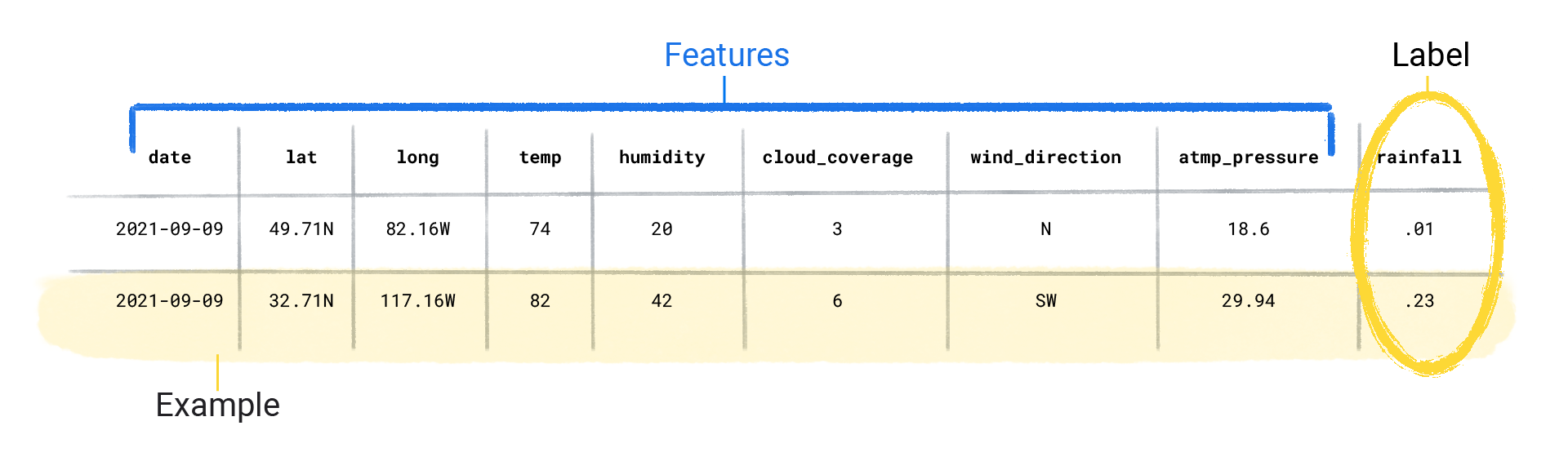
Features are like building blocks that, when combined, provide a comprehensive picture of the data. However, the features in a dataset largely depends on the type of information in the data. Hence, the question now is what makes a good feature in a dataset?
Practice
Now that you have an idea of what makes a good feature in dataset, take a look at this COVID-19 dataset and mention TWO features that are NOT relevant to the analysis of COVID-19 cases according to the information provided.
Try to first work on this without checking the answer
Reveal answer
There are features such as New Cases and New Deaths that are not relevant as their values are empty. This will not help in our analysis. However, if the features were only missing few values, then we can use different techniques covered already to handle that and they'll be used in the analysis.
Feature Engineering
As an analogy, feature engineering is like a craftsman shaping and refining the materials before building something. It's similar to a painter adding brushstrokes or a sculptor chiseling away to create a masterpiece. By carefully selecting, transforming, and creating features, data scientists can enhance the predictive power and understanding of their models.
For predictive models, the more features in a dataset, the more information and patterns to learn from the data, thereby improving the the model's predictive power. Let's look at some examples.
Example 1
Imagine you're a shop owner and a person comes up to you and asks for a tobacco. You proceed to ask for ID and you see the person's birthday is 09/12/1998.
This information is not inherently meaningful, but you add up the number of years by doing some quick mental math and find out the person is 25 years old (which is above the legal smoking age). What happened there? You took a piece of information 09/12/1998 and transformed it to become another variable age to solve the question you had - Is this person allowed to smoke? - that is feature engineering!
Example 2
Imagine a company that offers a streaming music service with a subscription model. They have a dataset containing information about their customers, such as age, gender, location, subscription duration, and the number of songs listened to per day. The company wants to improve their marketing efforts by identifying potential customers who are more likely to renew their subscriptions.
By leveraging feature engineering techniques, the company can create new features or modify existing ones to capture important customer behaviors and characteristics, such as creating features that capture engagement levels, playlist diversity, and usage patterns.
- Engagement Level: by combining the number of songs listened to per day and the subscription duration.
- Playlist Diversity: by creating a feature that measures the diversity of music genres in a customer's playlist.
- Usage Patterns: generating features that capture usage patterns, such as peak listening times or average session duration.
These engineered features help identify customers more likely to renew their subscriptions, consequently enabling targeted marketing campaigns.
➡️ In the next section, we'll be looking at
Feature transformation🎯.
Feature transformation
Think of it as translating a story from one language to another depending on the audience. It deals with reshaping or molding the data to better highlight patterns and relationships, by applying mathematical or statistical operations to the data to create new features or modify existing ones.
For example, imagine we have a dataset of temperatures in Celsius (°C), and we want to understand it in Fahrenheit (°F). Feature transformation can help us convert all the temperatures to Fahrenheit, making it easier for us to relate to and compare.

Feature transformation techniques
There are many different techniques for feature transformation, and the each technique has its purpose and can be applied depending on the characteristics of the data and the specific analysis goals. In this lesson, we'll look at 2 techniques used for transformation - scaling and binning.
1. Scaling
Feature scaling involves making sure that all our numeric features in the data have a similar range of values. This includes rescaling numerical features to a common range, such as 0 to 1 or -1 to 1. It ensures that all features have a similar influence on the analysis and prevents any one feature from dominating (or bullying 😁) the others.
Let's look at an example of scaling features in a dataset. Imagine we have a dataset containing both numeric and non-numeric features, we can scale the numeric features using the code snippet below.
We used Min-Max (or Normalization) scaling technique to scale the numeric features (Age, Height, Weight, Income, and Experience), but then we modified the scaled values to ensure they are positive, by adding the absolute minimum value of the scaled data. Other scaling techniques includes
- Standardization (or Zero Score)
- Max scaling
- Robust Scaling
- Power
- Box-Cox
- Quantile
- Rank
- Unit Vector Scaling
Check your understanding: Scaling
You are working with a dataset that contains information about different houses for sale. Here's a simplified version of the dataset:
House ID:       [1, 2, 3, 4, 5, 6, 7, 8, 9, 10]
Square Feet:    [1200, 1500, 1800, 900, 2200, 1000, 1600, 1300, 1100, 1700]
Bedrooms:       [2, 3, 4, 2, 4, 2, 3, 2, 2, 3]
Bathrooms:      [1, 2, 2, 1, 3, 1, 2, 1, 1, 2]
Year Built:     [1995, 2000, 1985, 2005, 2010, 1998, 2002, 1990, 2008, 2015]
Price ($):      [150000, 200000, 230000, 120000, 280000, 140000, 210000, 180000, 160000, 220000]
Task: Perform min-max scaling on the Square Feet feature to bring it into the range [0, 1].
2. Binning
Binning is the process of dividing a continuous feature (e.g., age) into discrete intervals or bins. It's like creating age groups to make it easier to understand and analyze the data. For example, let's say we have a dataset of customer ages, and we want to bin the ages into 5 bins, the we have
- 0-18 years old
- 19-30 years old
- 31-45 years old
- 46-60 years old
- 61+ years old
We can then assign each customer to a bin based on their age. This would allow us to use the binned age as a categorical feature, rather than wide range of continuos values. Binning helps simplify the data and make it easier to interpret and analyze, thereby allowing us to summarize the data in a meaningful way and uncover insights that may not be apparent when looking at individual values.
Let's use another example to demonstrate binning. Suppose we have a dataset containing information about students' test scores, and we want to bin their scores into different performance categories, such as Low, Medium, and High. Here's a sample DataFrame with six features: Student_ID, Math_Score, Science_Score, English_Score, History_Score, and Total_Score:
In this example, we used the pandas cut() function to bin the Math_Score column into three categories: "Low" (scores below 70), "Medium" (scores between 70 and 80), and "High" (scores above 80). The new column "Math_Category" has been added to the DataFrame to store the respective category for each student's math score.
Different binning techniques can be used depending on the data and analysis goals. Here are some common binning techniques:
- Equal Width: Dividing the data into bins of equal width. For example, dividing age into bins like
0-10 years,11-20 years, etc. - Equal Frequency: Dividing the data into bins with an equal number of data points. This can help handle
skeweddata. - Custom: Defining specific bins based on domain knowledge or specific requirements.
Check your understanding: Binning
You are working with a dataset that contains information about different houses for sale. Here's a simplified version of the dataset:
House ID:       [1, 2, 3, 4, 5, 6, 7, 8, 9, 10]
Square Feet:    [1200, 1500, 1800, 900, 2200, 1000, 1600, 1300, 1100, 1700]
Bedrooms:       [2, 3, 4, 2, 4, 2, 3, 2, 2, 3]
Bathrooms:      [1, 2, 2, 1, 3, 1, 2, 1, 1, 2]
Year Built:     [1995, 2000, 1985, 2005, 2010, 1998, 2002, 1990, 2008, 2015]
Price ($):      [150000, 200000, 230000, 120000, 280000, 140000, 210000, 180000, 160000, 220000]
Task:
Apply binning on the Year Built feature to categorize houses into decades (e.g., 1980s, 1990s, etc.)
➡️ In the next section, we'll be looking at
Feature encoding🎯.
Feature Encoding
In the last lesson, we have seen how to transform or scale numerical features. In this lesson, we'll be focusing on techniques we need to know in order to perform feature engineering on categorical features. This is required because machine learning models can only understand numerical data. Hence, feature encoding is like translating different languages into a common language that a computer can understand.
What is feature encoding?
Since most machine learning algorithms work with numerical data, feature encoding is necessary to represent categorical information in a way that can be used for analysis or modeling.
For example, let's consider the Gender column with values Male and Female in a dataset. We can encode this column into numerical values, like 0 for Male and 1 for Female. This way, the computer can understand and work with the data, allowing us to use it for various tasks, such as making predictions or finding patterns.
Encoding techniques
There are a number of different techniques for encoding categorical features, but some of the most common include...
- Label encoding
- One-hot encoding
1. Label encoding
Label encoding is a technique in data science that converts categorical or non-numeric features into numbers. This is done by assigning each category a unique integer value. This is like giving numbers to different things so that we can easily refer to them using numbers instead of long names.
For example, using a sample dataFrame, suppose we have a dataset of fruits, and the categorical features include Fruit_Type, Color, and Taste. We can use label encoding to convert these features into numbers. Here's a sample code snippet:
In the code snippet, Apple is represented as 0, Banana as 1, and Orange as 2. Now, we can use these encoded numbers for further analysis or modeling tasks. Here's the output of the code snippet.
Check your understanding: Label encoding
You are working with a dataset that contains information about different houses for sale. Here's a simplified version of the dataset:
House ID:       [1, 2, 3, 4, 5, 6, 7, 8, 9, 10]
Square Feet:    [1200, 1500, 1800, 900, 2200, 1000, 1600, 1300, 1100, 1700]
Bedrooms:       [2, 3, 4, 2, 4, 2, 3, 2, 2, 3]
Bathrooms:      [1, 2, 2, 1, 3, 1, 2, 1, 1, 2]
Year Built:     [1995, 2000, 1985, 2005, 2010, 1998, 2002, 1990, 2008, 2015]
Price ($):      [150000, 200000, 230000, 120000, 280000, 140000, 210000, 180000, 160000, 220000]
Task:
Use label encoding to encode the Bedrooms feature into numerical values (e.g., 2 bedrooms as 0, 3 bedrooms as 1, etc.)
2. One-hot encoding
One-hot encoding is another technique used to handle categorical or non-numeric features. This is done by creating a new binary feature for each category. Each column represents a specific category, and it contains a value of 1 if the data point belongs to that category, and 0 if it does not.
Now, let's use the same example of the fruit dataset and perform one-hot encoding on the Fruit_Type column.
The output of the sample code is a DataFrame with three additional columns: Fruit_Apple, Fruit_Banana, and Fruit_Orange. Each column represents a fruit type, and a value of 1 indicates that the row corresponds to that particular fruit, while a value of 0 indicates that it doesn't.
With one-hot encoding, we have converted the Fruit_Type categorical feature into binary columns, making it easier for machine learning algorithms to process and analyze the data.
Check your understanding: One-Hot encoding
You are working with a dataset that contains information about different houses for sale. Here's a simplified version of the dataset:
House ID:       [1, 2, 3, 4, 5, 6, 7, 8, 9, 10]
Square Feet:    [1200, 1500, 1800, 900, 2200, 1000, 1600, 1300, 1100, 1700]
Bedrooms:       [2, 3, 4, 2, 4, 2, 3, 2, 2, 3]
Bathrooms:      [1, 2, 2, 1, 3, 1, 2, 1, 1, 2]
Year Built:     [1995, 2000, 1985, 2005, 2010, 1998, 2002, 1990, 2008, 2015]
Price ($):      [150000, 200000, 230000, 120000, 280000, 140000, 210000, 180000, 160000, 220000]
Task:
Apply One-Hot encoding to the Bathrooms feature. Create new binary columns for each unique value in the Bathrooms feature.
Encoding techniques selection
Each encoding technique has its strengths and is suitable for different scenarios. Label Encoding is useful when there is an inherent order among the categories, while One-Hot Encoding is effective for scenarios where categories are not ordered and have no numerical relationship. The choice of encoding technique depends on the nature of the data and the requirements of the analysis or modeling task.
➡️ In the next section, we'll be looking at
Feature selection methods🎯
Feature Selection
When you cook a dish, you select specific ingredients that make the dish delicious and give it the right flavor. In data science, feature selection is like picking the most important ingredients for a recipe. Often times, we have datasets with many different pieces of features.
In another scenerio, imagine you have a big puzzle with many puzzle pieces representing different pieces of information about something you're interested in. However, some puzzle pieces might not be important for completing the picture, while others are crucial.

For example, if we want to predict whether a student will pass an exam, we might look at features like their study hours, previous test scores, and attendance. Some other features, like the color of their clothes or favorite food, might not be useful for predicting their exam performance, so we can leave them out. Feature selection helps us streamline our analysis and decision-making, allowing us to focus on what truly matters and find valuable insights in the data.
Feature selection methods
Feature selection is an important part of the data preprocessing pipeline, and it can help to improve the performance of machine learning models. However, it is important to choose the right method for feature selection, as it can be more time-consuming and difficult to identify the most relevant features. There are basically 3 feature selection methods - Filter, Wrapper, and Embedded, however, we'll focus only on the Filter and Wrapper methods in this lesson.
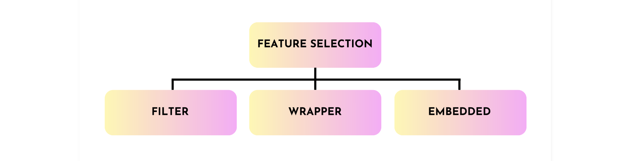
Filter methods
Filter methods in feature selection are like using a magnifying glass to focus on the most important pieces of information in a large dataset. Just like you use a magnifying glass to zoom in on specific details of a picture, filter methods help us identify the most relevant features that have a strong relationship with the target we want to predict or understand.

For example, if we want to predict whether it will rain tomorrow, we might look at how closely the temperature, humidity, and wind speed are related to rain. If we find that temperature and humidity have a strong relationship with rain, we might keep them as important features, while other less relevant features may be discarded.
These methods are relatively simple to implement and can be used with any machine learning model. There are two main types of filter methods:
- Univariate: select features based on their individual statistical properties, such as their correlation with the target variable or their variance.
- Multivariate: These methods select features based on their relationship with other features, such as their mutual information or their redundancy.
Using the rain example above, let's use a code snippet in Python to demonstrate a simple filter method for feature selection using the correlation coefficient.
In this output, we can see that the filter method selected the top 5 features - Temperature, UV_Index, Wind_Speed, Humidity, and Cloud_cover based on their correlation with the target variable Rain. This means the selected features have the strongest relationship with rain and are considered the most relevant for predicting whether it will rain or not.
Wrapper methods
Imagine you are a detective trying to solve a mystery 🤔 by finding the right combination of clues that will lead you to the culprit. Each clue is like a feature in data science, providing a piece of information that may or may not be relevant to solving the case.
The wrapper method is like testing different combinations of clues to see which combination helps you solve the mystery most effectively. You try out different sets of clues and evaluate how well each set helps you catch the culprit. The set of clues that leads you to the culprit is the one you choose to solve the mystery.

These methods are more complex to implement than filter methods, but they can be more effective at selecting features that are important for the specific machine learning task. There are two main types of wrapper methods:
- Sequential forward selection: Begins with an empty set of features and then adds features one at a time, evaluating the model performance after each addition.
- Sequential backward selection: Starts with the full set of features and then removes features one at a time, evaluating the model performance after each removal.
To implement the wrapper method, we'll need to run a sample machine learning model and evaluate the feature importance. Since we are yet to cover machine learning, this code snippet is ONLY to show you how the wrapper method works, hence, you don't need to understand the code snippet.
As a guide, the code first splits the dataset into features (X) and the target variable (y). Then, it creates a Random Forest classifier model and fits it to the training data. The Random Forest model is used as a machine learning model to evaluate the importance of each feature.
The table below gives a summary of the two feature selection methods explored in this lesson, and also include the embedded method.
| Methods | Description |
|---|---|
| Filter | Evaluates the relevance of each feature independently of the model's performance. Uses statistical techniques to rank features based on their correlation with the target variable or other statistical measures. |
| Wrapper | Uses a specific machine learning model to evaluate the importance of features. Creates subsets of features and evaluates their performance using the chosen model. The best subset of features is selected based on the model's performance. |
| Embedded | Incorporates feature selection as part of the model building process. Performs feature selection while training the model, using techniques like regularization to penalize less important features. |
➡️ In the next section, we'll be looking at
Feature extraction techniques🎯.
Feature Extraction
Imagine you have a large collection of colorful pictures of animals, each depicting different types of animals like lion, Gorilla, Hippopotamus, leopard, and polar bear. However, you don't know much about the specific characteristics that make each animal unique. You want to find a way to capture the essential features of each animal so that you can recognize and categorize them more easily.
This can be done by reducing the dimensionality of the data, by transforming the data into a different representation, or by extracting features that are known to be important for the task at hand.
In data science, feature extraction is like finding the key traits or characteristics of these animals that help you identify and classify them. Instead of using the entire image, which can be overwhelming, feature extraction techniques help you pick out specific patterns or properties that are most relevant to the task at hand. These features can be things like the number of legs, the shape of the ears, the color of the fur, or the size of the animal.
Feature extraction vs Feature selection
Imagine you have a basket of different fruits, and you want to make a delicious fruit salad. Feature extraction is like creating a new fruit salad with only a few key fruits that represent the overall taste and flavors. It involves combining and transforming the original fruits to create a simplified version that still captures the essence of the salad.
On the other hand, feature selection is like picking out the best fruits from the basket to include in your salad. It involves choosing specific fruits based on their individual taste and quality, leaving out the ones that might not add much value to the final dish.
➡️ Next, we'll look at some practice exercises... 🎯.
Practice
Car specification
Imagine you're working with a dataset containing information about cars and their specifications. Here's a sample dataset:
Car ID:     [1, 2, 3, 4, 5, 6, 7, 8, 9, 10]
Brand:      ['Toyota', 'Ford', 'Honda', 'Chevrolet', 'Nissan', 'Toyota', 'Ford', 'Honda', 'Nissan', 'Chevrolet']
Mileage:    [25000, 35000, 15000, 45000, 30000, 20000, 40000, 28000, 32000, 38000]
Horsepower: [150, 200, 120, 180, 160, 140, 210, 130, 170, 190]
Fuel Type:  ['Gasoline', 'Diesel', 'Gasoline', 'Diesel', 'Gasoline', 'Hybrid', 'Diesel', 'Gasoline', 'Hybrid', 'Gasoline']
Price ($):  [20000, 25000, 18000, 22000, 23000, 26000, 24000, 21000, 27000, 23000]
- Scaling: Use Standardization to scale the "Mileage" and "Horsepower" features. Calculate the scaled values for each feature.
- Binning: Bin the "Horsepower" feature into three bins: 'Low', 'Medium', and 'High'. Assign each data point to the appropriate bin based on its horsepower.
- Label Encoding: Convert the "Brand" feature using label encoding. Assign unique integer labels to each brand.
- One-Hot Encoding: Perform one-hot encoding on the "Fuel Type" feature. Create new binary columns for each fuel type, where 1 indicates the presence of that fuel type and 0 indicates absence.
- Evaluation: Discuss the trade-offs between label encoding and one-hot encoding for categorical features. Also, mention the potential benefits of adding polynomial features.
Submission
You are required to submit documentation for practice exercises over the course of the term. Each one will count for 1/10 of your practice grade, or 2% of your overall grade.
- Practice exercises will be graded for completion not perfect correctness.
- You have to document that you did the work, but we won't be checking if you got it right.
- You MUST upload your analysis/visuals as a single file to
Practice - Feature Engineeringon Gradescope after the exercise to get the grade for this exercise.
Your log will count for credit as long as:
- It is accessible to your instructor, and
- It shows your own work.
Intro to Machine Learning

Welcome to week 6 of the Intro to data science course! In the third week, we looked at data visualization and different tools we can use for visual representation our data. We went further to understand different ways we can create basic plots and communicate data insight effectively.
This week, we'll begin our journey of machine learning 😍 by looking at what it is, and why it is so important for individual and businesses. Next, we'll look at different machine learning techniques - supervised and unsupervised learning. Also, we'll learn about classification and regresion, and explore some practical applications of machine learning. Finally, we'll build our own machine learning model 😍.
Learning Outcomes
After this week, you will be able to:
- Explain the basics and importance of machine learning in today's world.
- Distinguish different types of machine learning techniques.
- Formulate and apply machine learning to real-world problems.
- Build a machine learning model.
An overview of this week's lesson
Getting to know ML
Machine learning is like teaching a computer how to learn from examples and make decisions on its own. Imagine you have a friend who loves to identifies pictures of different fruits. At first, you show your friend different pictures of red apples. Your friend learns from these examples and starts to recognize the differences between different red apples. Later, you show your friend new pictures of green apple, and they can tell you if it's still an apple based on what they learned from the previous examples. That's how machine learning works!
 Image source: IntelliPaat
For these ML algorithms, the more examples they see, the better they get at making accurate decisions without explicit programming, just like your friend learning to distinguish between different colours of apple. However, unlike humans who needs years of gathering experience in a particular task, such as image recognition, ML learns to do this in just a matter of hours using quality data.
Categories of ML
In ML, the type of data we have and the problem we plan to solve largely determines the type of ML to use. Watch this video from IBM on different categories of ML.
At the high level, we have 3 broad categories of ML.
- Supervised learning
- Unupervised learning
- Reinforcement learning
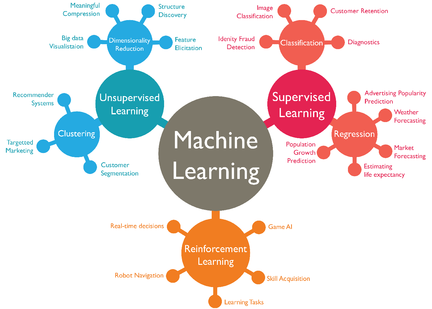
Applications of ML
ML is a powerful tool that can be used to solve a wide variety of problems. As machine learning technology continues to develop, we can expect to see even more innovative applications of machine learning in the future. Here are some other examples of machine learning:
- Spam filtering
- Fraud detection
- Weather prediction
- Medical diagnosis
- Recommendation systems
- Image and speech recognition
- Predictive maintenance.
- Natural language processing
- Self-driving cars
- Environmental Monitoring
Now, let's understand a use case of day-to-day application of ML in solving everyday problems. The video below talks us through finding personal moments in videos and other applications of ML.
👩🏾🎨 Practice: Categories of machine learning... 🎯
There are 3 problem set provided below. Based on your understanding of ML and its categories, classify each of the problem set into one of supervised, unsupervised, and reinforcement learning.
-
You're given a dataset of patient medical records, including symptoms, test results, and final diagnoses. Your task is to develop an ML model to predict whether a patient has a certain medical condition based on their symptoms and test results. What type of ML problem is this?
-
Imagine you're building an autonomous car that needs to navigate through a simulated city. The car learns to drive safely and efficiently by receiving rewards for following traffic rules and penalties for collisions. What suitable ML problem type is this?
-
You have a dataset of patient medical records, including symptoms, test results, and final diagnoses. Your task is to develop an ML model to predict whether a patient has a certain medical condition based on their symptoms and test results. What suitable ML problem type is this?
➡️ Next, we'll look at
supervised learning... 🎯
Supervised learning
Imagine you have a really smart friend who loves to play a guessing game with you. They give you pictures of different animals, like cats and dogs, and tell you what each animal is. Your friend wants you to learn from these examples, so they can show you new pictures of animals you haven't seen before, and you can try to guess what they are based on what you've learned.

Supervised learning is a lot like this guessing game with your friend. In this type of machine learning, the computer is the "learner," and it's given labeled examples as training data. Each example consists of both the picture of the animal (input) and the name of the animal (output). The computer's job is to learn from these examples, just like you did from your friend, so that it can correctly guess the names of animals it hasn't seen before.
For example, if you are training a model to classify images of cats and dogs, the data would be a set of images, each with a label that says whether it is a cat or a dog. But how do we build a model or train a machine?
Building a model means you're training a machine to perform a specific task. To do this, there are dependent steps we need to take as listed below.
- Data collection and cleaning - collection and cleaning of dataset.
- Feature engineering - transforming and structuring the data for analysis or modelling.
- Data Modelling - using algorithms to develop predictive models.
So far, we've covered step 1 and 2 in previous weeks, and the final dataset serves as the input into the modelling phase. Now, let's look at data modelling by breaking it down into ML algorithms, training, validation, and testing.
ML Algorithms
Imagine you have a friend who loves solving puzzles. You give them a bunch of puzzle pieces with pictures on them and tell them to figure out what the complete picture looks like. Your friend starts to put the pieces together, trying different combinations, and learning from their mistakes until they complete the puzzle.
These algorithms form the core of machine learning, as they are responsible for extracting patterns and relationships from the data and using that knowledge to perform specific tasks. Just like your friend uses different strategies to put the puzzle pieces together, ML algorithms learn from data and make smart choices.
There are various types of machine learning algorithms, each designed for different types of tasks and data. Some common types of supervised ML algorithms include:
- Linear regression
- Support vector machines
- Decision trees
- Naive bayes
We'll be using some of these algorithms to perform specific tasks as we move on in the course. To train an ML agorithm, we need to split our dataset into 3 different categories: training, validation, and testing. As a rule of thumb, the percentage of data in each category can be 70% for training, 20% for validation, and 10% for testing.
Training
Suppose you have a friend who loves playing video games. You want to help them become better at a specific game, so you decide to train them by showing them different game scenarios and guiding them through each level.
In ML, model training is a bit like this gaming scenario. The model is the computer's way of learning and making predictions, just like your friend is learning to play the game. To train the model, you provide it with lots of examples, like different game situations, and tell it what the correct outcome should be for each example. This information is called training data.
ML algorithms uses this training data to learn patterns and rules, just like your friend learns from playing different game scenarios. It automatically adjusts its settings and calculations, trying to make its predictions as accurate as possible based on the training data. As the training continues, the model gets better and better at making predictions on new, unseen data, just like your friend improves their gaming skills with practice.
Validation and testing
Model validation and testing are two important steps in the ML process. They help to ensure that the ML model is accurate and reliable. In the video game example, model validation and testing is about making sure your friend's gaming skills are reliable and can handle different challenges, just like how they performed during training.
After the training, you want to check if your friend's gaming skills are truly good and not just based on specific situations they've seen before. In machine learning, this is called model validation and testing. It involves presenting the model with new or unseen data to assess its performance on real-world situations.
The goal of model testing is to ensure that the model is not just memorizing the examples from training but can actually apply what it learned to make useful predictions on new, real-world data. This process helps you assess the model's performance and make sure it's reliable for the tasks you want it to perform.
As a recap, check the video below to get a summary of training, validation, and testing.
👩🏾🎨 Practice: Supervised learning... 🎯
Suppose you want to develop a supervised machine learning model to predict whether a given email is "spam" or "not spam." Which of the following statements are true?
- Emails not marked as "spam" or "not spam" are unlabeled examples.
- We'll use unlabeled examples to train the model.
- Words in the subject header will make good labels.
- The labels applied to some examples might be unreliable.
➡️ Next, we'll look at
classification and regression... 🎯
ML Classification
Classification in machine learning is like teaching a computer to sort waste items into different bins based on patterns and characteristics it learned from labeled examples. It is a techniques used in supervised learning to carry out predefined task. The learning path for the model depends on both the data and the problem we are trying to solve.
Classification
Imagine you have a big pile of waste materials, and you want to organize them into different bins based on the type of waste. You have plastic bottles, glass containers, paper, metal cans, and organic waste like food scraps. Sorting them by hand could be time-consuming, so you decide to use a machine learning technique called classification to help you with the task.
In machine learning, classification is like having a smart assistant that can automatically identify and sort each waste item into the right bin. Just like you might look at the shape, color, and texture of each item to determine its type, the classification model uses patterns and features from the waste items to make predictions.
In classification, the model is trained on a set of labeled data, which means that the data has been pre-classified into different categories, such as plastic, glass, paper, metal, and organic.
Another example of labeled dataset is given in the diagram below. Independent features are all features in the dataset except the feature we are trying to predict, which is called the dependent feature because its values depend on other features. Each row in the dataset is refrred to as a data point.
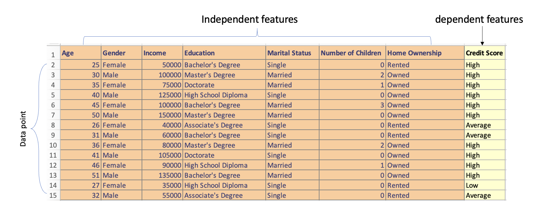
Using the labelled data, the model learns to map the input data to the correct category by adjusting its parameters over time through a process called gradient descent, which essentially involves finding the set of parameters that minimizes the error between the model's predictions and the actual class or label.
Binary vs Multi-class classification
Binary classification is a task where the model is only trained to predict one of two categories, for example, a binary classification model could be used to predict whether an email is spam or ham, or whether a student will pass or fail. In multi-class classification, the model is trained to predict one of more than two categories. For example, to predict the species of a flower (setosa, versicolor, or virginica), or the final grade of a student in a course - A, B, C, D, E or F.
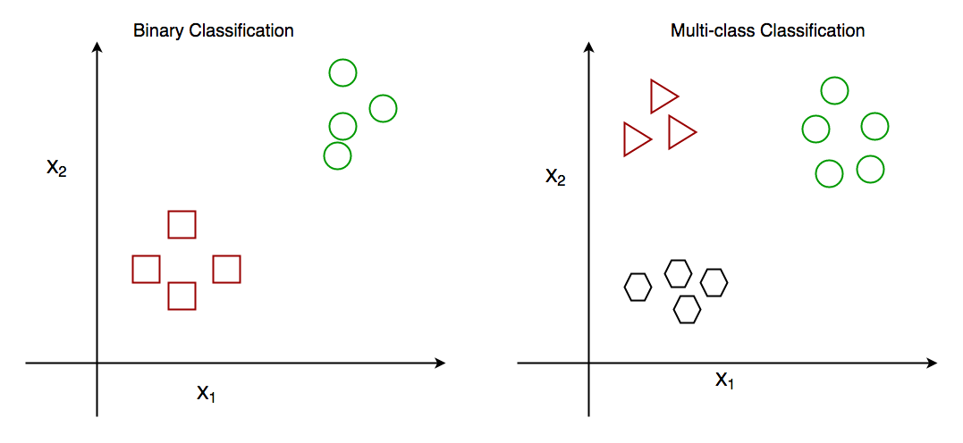
The main difference between binary classification and multi-class classification is the number of categories that the model is trained to predict. In binary classification, the model is only trained to predict one of two categories, while in multi-class classification, the model is trained to predict one of more than two categories.
Here is a code snippet of a binary classification model that classifies whether a student will pass or fail. Play around with the new_student_df to test and see the changes.
In this code snippet, we use the RandomForestClassifier algorithm to build the classification model. It trains on the features such as 'hours_studied', 'previous_grade', 'attendance_percentage', 'test_score', 'homework_score', 'extracurricular_activities', and 'class_participation' to predict whether a student will pass or fail. The model is then evaluated using accuracy.
Finally, we created a new student data who studied for 6 hours, had a previous grade of 80, an attendance percentage of 92, test score of 85, homework score of 88, and participates in class discussions (1). This is simply to test the model.
👩🏾🎨 Practice: Classification in ML... 🎯
-
Suppose an online shoe store wants to create a supervised ML model that will provide personalized shoe recommendations to users. That is, the model will recommend certain pairs of shoes to Marty and different pairs of shoes to Janet. The system will use past user behavior data to generate training data. Which of the following statements are true?
Shoe sizeis a useful feature.The user clicked on the shoe's descriptionis a useful label.Shoe beautyis a useful feature.Shoes that a user adoresis a useful label.
➡️ Next, we'll look at
regression in ML... 🎯
Regression in ML
Imagine you are trying to predict the price of a house based on various features like the number of bedrooms, the area in square feet, and the age of the house. This problem cannot be solved with classification because the outcome you want to predict, i.e, the house price, is a continuous variable, meaning it can take ANY numerical value within a range.
In contrast, classification is only used when the outcome is a categorical variable with distinct categories, like predicting whether an email is spam or not.
Regression
However, unlike classification, the categories in regression are continuous values, such as height, weight, or price. Imagine you want to estimate how much time it will take for you to reach a friend's house based on the distance you have to travel and the average speed at which you drive.

In machine learning, regression works in a similar way. You show the computer many examples of distances traveled and the corresponding time taken to reach a destination. The computer then looks for patterns and relationships between the distances and the time.
Once the computer has learned from these examples, you can provide it with a new distance, and it will predict how much time it will take you to walk there based on what it learned. Hence, regression helps us make accurate predictions for numerical outcomes, just like estimating the time it will take for you to reach your friend's house based on the distance and your walking speed.
Linear regression
Linear regression is a statistical technique used in machine learning to model the relationship between a dependent variable (the outcome we want to predict) and one or more independent variables (features or factors that influence the outcome). It assumes that the relationship between the variables can be approximated by a straight line.
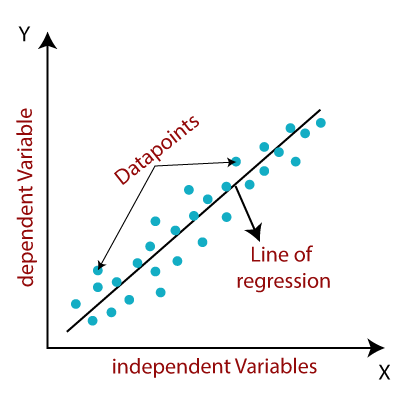
Imagine you have a dataset that includes information about several houses, such as the size of the house (in square feet), the number of bedrooms, and the age of the house. You also have the corresponding prices at which each house was sold.
Linear regression works by finding a straight line (a mathematical equation) that best fits the relationship between the features (size, bedrooms, age) and the house prices. The goal is to find a line that minimizes the difference between the actual house prices and the predicted prices given by the line.
Here is a code snippet of a linear regression model that predict the price of house using a simulated data. Play around with the new_house values and see how the predicted house price changes.
In the code snippet, we used the house_size, number_of_bedrooms, and year_built as the independent variable and house_price as the dependent variable. The model is trained on the data using model.fit(), and we use it to predict the price of a new house with a size of 1600 square feet, 3 bedrooms, and built year of 2008. The predicted_price will give us the estimated price for that new house based on the relationship learned from the training data.
👩🏾🎨 Practice: Regression in ML... 🎯
-
Which of the following statements best describes supervised learning in the context of regression?
- Supervised learning involves training a model with labeled data and then making predictions on unlabeled data.
- Supervised learning is a technique to train models only on numerical data.
- Supervised learning does not involve the use of any training data.
- Supervised learning is only used for classification problems.
-
Which of the following statements is true about linear regression?
- Linear regression is suitable only for categorical data.
- Linear regression assumes a linear relationship between dependent and independent variables.
- Linear regression does not involve any assumptions about the data.
- Linear regression can only predict binary outcomes.
➡️ Next, we'll look at
Unsupervised learning... 🎯
Unsupervised learning
Unsupervised learning in ML is like letting the computer discover hidden patterns and relationships in data all on its own, without any specific guidance. It's a bit like a curious explorer that searches for interesting things in a big collection of objects.
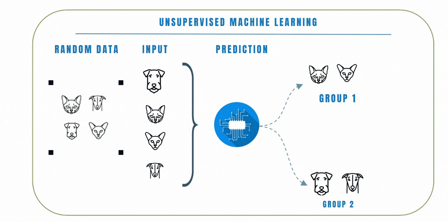
Unlike supervised learning where the model is trained on a labelled dataset, this means that the data does not have any pre-defined labels, so the model has to learn to find patterns in the data on its own.
Clustering
In unsupervised learning, clustering is a popular technique we can use to group similar data points together based on their similarities. The goal of clustering is to find patterns or structures in the data without the need for explicit labels or predefined categories. K-Means and Hierarchical clustering are common clustering algorithms used in unsupervised learning. Let's look at these 2 algorithms by watching the video below.
In a similar scenario, let's consider another example where we have a dataset of emojis that includes emotions such as angry, sad, and happy. Each emoji is represented by certain features like colors, shapes, and facial expressions. Using clustering, we can group similar emojis together based on their features.
For example, emojis with red colors and frowning facial express ions might be grouped as angry emojis. Emojis with blue colors and tears in their eyes might be grouped as sad emojis, while emojis with bright colors and smiling faces might be grouped as happy emojis.
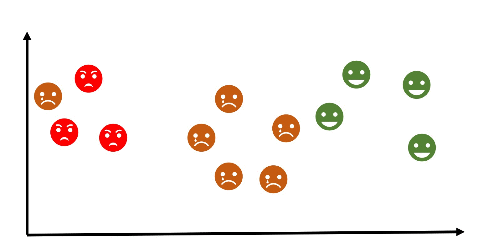
👩🏾🎨 Practice: Unsupervised learning... 🎯
-
Which of the following statements best describes clustering in the context of machine learning?
- Clustering is a technique used to train models on labeled data.
- Clustering involves grouping similar data points together based on certain criteria.
- Clustering is only applicable to classification problems.
- Clustering is primarily used to predict numerical outcomes.
-
Which of the following statements is true about K-Means clustering?
- K-Means clustering is used for text analysis only.
- K-Means clustering aims to minimize the number of clusters.
- K-Means clustering requires the number of clusters (k) to be specified in advance.
- K-Means clustering is not suitable for datasets with a large number of features.
➡️ Next, we'll look at
Reinforcement learning... 🎯
Build your first ML model
In this lesson, we will take the first step into the realm of Machine Learning by building our very first predictive model. Imagine having the ability to predict house prices based on specific features of a house, such as its size, number of bedrooms, location, and more. This is exactly what we will achieve in this session – building a simple yet powerful Machine Learning model for house price prediction.
Throughout this lesson, we will follow a step-by-step approach to understand the core concepts of Machine Learning that has been discussed so far. We'll be using a google colab for this practice exercise.
Google colab
To get started, click on the colab link below.

Practices
Intro to ML Practice Exercises
Part 1: Classification
You are given a dataset containing information about students' exam scores and whether they passed or failed the final exam. Your task is to build a classification model to predict whether a student will pass or fail based on their exam scores.
Dataset: Student Performance
| Exam 1 Score | Exam 2 Score | Passed |
|---|---|---|
| 65 | 75 | 1 |
| 80 | 62 | 0 |
| 55 | 45 | 0 |
| 45 | 78 | 0 |
| 70 | 90 | 1 |
| ... | ... | ... |
Questions:
- What is the target variable in this dataset?
- Exam 1 Score
- Exam 2 Score
- Passed
- Which type of machine learning problem is this?
- Clustering
- Regression
- Classification
- What is the purpose of the classification model in this scenario?
- Choose the correct statement:
- Classification predicts numerical values.
- Classification predicts categorical outcomes.
- Classification predicts time series data.
Part 2: Regression
You are given a dataset containing information about houses, including their sizes (in square feet) and corresponding prices. Your task is to build a regression model to predict the price of a house based on its size.
Dataset: House Prices
| Size (sq ft) | Price ($) |
|---|---|
| 1500 | 200000 |
| 1800 | 230000 |
| 1200 | 150000 |
| 2200 | 250000 |
| 1600 | 210000 |
| ... | ... |
Questions:
- What is the target variable in this regression dataset?
- Size (sq ft)
- Price ($)
- Which type of machine learning problem is this?
- Clustering
- Classification
- Regression
- What is the purpose of the regression model in this scenario?
- Choose the correct statement:
- Regression predicts numerical values.
- Regression predicts categorical outcomes.
- Regression predicts time series data.
Submission
You are required to submit documentation for practice exercises over the course of the term. Each one will count for 1/10 of your practice grade, or 2% of your overall grade.
- Practice exercises will be graded for completion not perfect correctness.
- You have to document that you did the work, but we won't be checking if you got it right.
- You MUST upload your analysis/visuals as a single file to
Practices - MLon Gradescope after the exercise to get the grade for this exercise.
Your log will count for credit as long as:
- It is accessible to your instructor, and
- It shows your own work.
Assignment - Retention Prediction
Retention prediction, also known as customer churn prediction, is a process in data science and business analytics that aims to identify and predict the likelihood of customers or users discontinuing their relationship with a company, product, or service. The term retention refers to the ability of a business to retain its customers over a specific period.
Bank Customer Retention Prediction
In this assignment, you will build a Machine Learning model to predict whether a bank customer is likely to churn (exit) or not based on various features such as credit score, age, tenure, and more. The dataset contains information about the customers, including their demographics, banking behaviors, and whether they have exited the bank (the label to be predicted). The dataset consists of the following columns:
- CustomerId: Unique identifier for each customer
- Surname: Customer's last name
- CreditScore: Customer's credit score
- Geography: Customer's country of residence
- Gender: Customer's gender
- Age: Customer's age
- Tenure: Number of years the customer has been with the bank
- Balance: Account balance
- NumOfProducts: Number of bank products the customer uses
- HasCrCard: Whether the customer has a credit card (1 = yes, 0 = no)
- IsActiveMember: Whether the customer is an active bank member (1 = yes, 0 = no)
- EstimatedSalary: Estimated salary of the customer
- Exited: Whether the customer has exited the bank (1 = yes, 0 = no)
Repository

TODOs
- Load the dataset into a DataFrame using Python's
Pandaslibrary. - Explore the dataset to understand the features, data types, and potential missing values.
- Preprocess the data by handling missing values, converting categorical variables, and scaling numerical features (if needed).
- Split the data into training and testing sets.
- Choose a suitable classification algorithm (e.g., Logistic Regression, Random Forest, etc.) and train the model on the training data.
- Evaluate the model's performance on the testing data using appropriate metrics (e.g., accuracy, precision, recall, etc.).
- Fine-tune the model if necessary to achieve better results.
- Finally, use the trained model to predict customer churn on new data.
- Complete the assignment using the
notebookin the repository.- Push your solution back to Github once completed.
- Submit your notebook on Gradescope
- Look for Assignment - ML under assignments
HINTS
- Load the dataset into a DataFrame using Python's pandas library.
- Explore the dataset to understand the features, data types, and potential missing values.
- For data exploration, you can use Pandas methods like
head(),info(),describe(), andvalue_counts(). - To preprocess the data, consider using the
OneHotEncoderfrom scikit-learn to encode categorical variables. - Use scikit-learn's
LogisticRegressionorRandomForestClassifierfor building the classification model. - Evaluate the model's performance using metrics such as accuracy.
- Visualize the results and explore the important features that contribute to customer churn using matplotlib or seaborn.
Good Luck! 🤝
Model Evaluation Techniques 📶

Welcome to week 7 of the Intro to data science course! Last week, we started our journey of machine learning and its techniques. We started with understanding what ML is and its application in today's world. We went further to explore supervivised learning by looking to classification and regression. Finally, we briefly explored unsupervised learning.
This week, we'll be looking into Model Evaluation Techniques by understanding their meaning and importance in data science. Next, we'll look at different model evaluation techniques. Finally, we'll explore how to select the best model.
Learning Outcomes
After this week, you will be able to:
- Explain model evaluation and why we need it.
- Describe different model evaluation techniques.
- Distinguish between overfitting and underfitting.
- Highlight the factors to consider in selecting the best model.
An overview of this week's lesson
Intro to Model Evaluation Techniques
Imagine you have a friend who loves guessing the outcome of football matches. To see how good they are at predicting, you give them a few past matches to predict the winners. After they make their guesses, you show them the actual outcomes and calculate how many they got right and how many they got wrong. This way, you can tell how accurate their predictions are.

Similarly, in Machine Learning, we use different evaluation techniques to measure the accuracy of our models. We split our data into a training set (like studying) and a testing set (like a test). We train the model on the training set and then use the testing set to see how well it predicts the outcomes. If the model makes accurate predictions, it means it has learned well from the training data.
In this intro video, various evaluation metrics used for ML models was highlighted, including those for classification and regression tasks. It emphasizes the importance of choosing the appropriate metric based on the problem and provides an overview of key metrics such as accuracy, precision, recall, and F1 score among others. For model evaluation techniques, the following point should be noted:
- Evaluating ML models is crucial for understanding their performance and identifying areas of improvement.
- For classification tasks, accuracy is a popular metric but may not always be sufficient.
- Precision and recall provide more detailed insights into the model's performance on positive instances.
- When dealing with multi-class classification, various approaches exist, such as calculating metrics for individual classes and taking their average or applying weights based on class importance.
- The F1 score, a combination of precision and recall, is often used to better evaluate the model.
- Regression evaluation metrics include mean absolute error, mean squared error, root mean squared error, and R-squared (coefficient of determination) among others.
Each of these techniques will be discussed in subsequent lessons, where we'll be see how we can use them in evaluating ML models.
➡️ Next, we'll look at
Confusion matrix... 🎯
Confusion Matrix
Imagine you have a friend who loves playing a game where they have to identify animals based on pictures. To see how well they are doing, you give them some animal pictures to classify, and they tell you whether it's a cat or dog. Now, you have a list of correct answers for each picture. The confusion matrix is like a table that helps you see how many animals your friend got right and how many they got wrong.
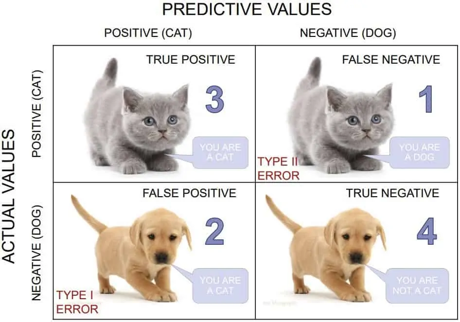
In the confusion matrix, the rows represent the actual animals in the pictures (cats aand dogs), and the columns represent what your friend guessed (also cats and dogs). Each cell in the matrix shows the number of times your friend got it right or wrong. For example, if your friend correctly identified 3 cats, that number would be in the "Cat" row and "Cat" column. If they thought a dog was a cat, that number would be in the "Dog" row and "Cat" column.
It is usually a square matrix with the number of rows and columns equal to the number of classes in the classification problem. The rows of the confusion matrix represent the actual class labels, while the columns represent the predicted class labels. To evaluate a model with confusion matrix, we use 4 metrics:
- True Positive (TP): These are the cases where the model correctly predicts a picture of a cat as a cat. In other words, the model identifies a cat image, and it is indeed a cat.
- False Positive (FP): These are the cases where the model incorrectly predicts a picture of a cat as a dog. In other words, the model identifies a cat image, but it is actually a dog.
- True Negative (TN): These are the cases where the model correctly predicts a picture of a dog as a dog. In other words, the model identifies a dog image, and it is indeed a dog.
- False Negative (TN): These are the cases where the model incorrectly predicts a picture of a dog as a cat. In other words, the model identifies a dog image, but it is actually a cat.
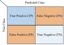
By understanding TP, FP, TN, and FN, we can evaluate the performance of our model in correctly classifying cat and dog images and make improvements if needed.
Precicion, Recall, and F1 Score
Precision, recall, and F1 score are another se of important evaluation metrics in machine learning, especially in binary classification problems (such as spam vs. non-spam emails or cat vs. dog images). These metrics help us understand the performance of our model and make informed decisions about its effectiveness.
Precision: Precision is the ratio of true positive predictions (correctly predicted positive instances) to the total number of positive predictions (both true positive and false positive). It measures how accurate our model is when it predicts positive instances. A high precision indicates that when the model predicts a positive class, it is likely to be correct. For example, in the context of a spam detection model, high precision means that most of the emails classified as spam are indeed spam, reducing false alarms.
                                       TP
                    Precision  =   -----------
                                    TP + FP
Recall (Sensitivity): Recall is the ratio of true positive predictions to the total number of actual positive instances in the dataset. It measures how well the model is capturing all the positive instances. A high recall indicates that the model can identify most of the positive instances correctly. For example, in a medical diagnosis model, high recall means that the model is good at identifying most of the actual positive cases, minimizing false negatives.
                                     TP
                    Recall  =  ---------------
                                TP + (FP + FN)
F1 Score: The F1 score is the harmonic mean of precision and recall. It provides a balance between precision and recall, allowing us to consider both metrics together. The F1 score is useful when we have imbalanced classes, where one class is much more prevalent than the other. It helps find a balance between reducing false positives and false negatives. A higher F1 score indicates a better balance between precision and recall.
                                           TP
                    Precision  =   --------------------
                                         1
                                    TP + - (FP  +  FN)
                                         2
Implemeting the evaluation metrics
Now, let's look at how we can build a classification model and evaluate it using the metrics. Let's use the Breast Cancer dataset from scikit-learn, which is a popular dataset for binary classification tasks. The goal is to predict whether a breast cancer tumor is malignant (1) or benign (0) based on features like mean radius, mean texture, mean smoothness, etc.
In this example, we load the Breast Cancer dataset and split it into training and testing sets. We then create and train a Logistic Regression model to predict whether a tumor is malignant or benign. After making predictions on the test set, we calculate the precision, recall, and F1 score using the corresponding functions from sklearn.metrics.
👩🏾🎨 Practice: Confusion matrix... 🎯
Confusion Matrix Practice Exercise
You are given a dataset containing the results of a medical test for a certain disease. The test provides two possible outcomes: Positive and Negative. Your task is to understand and analyze the results using a confusion matrix.
Dataset: Medical Test Results
| Actual Outcome | Predicted Outcome |
|---|---|
| Positive | Positive |
| Negative | Negative |
| Positive | Negative |
| Negative | Positive |
| Positive | Positive |
| Negative | Negative |
| Negative | Negative |
| Positive | Positive |
| Negative | Negative |
| Negative | Negative |
Questions...
-
What does the "Actual Outcome" column represent in the dataset?
- The actual test results
- The predicted test results
- The true health status
-
What does the "Predicted Outcome" column represent in the dataset?
- The actual test results
- The predicted test results
- The true health status
-
What is the purpose of a confusion matrix?
- To analyze medical test results
- To visualize data
- To summarize a machine learning model's performance
-
Calculate the True Positive (TP) value from the given dataset.
-
Calculate the False Positive (FP) value from the given dataset.
-
Calculate the True Negative (TN) value from the given dataset.
-
Calculate the False Negative (FN) value from the given dataset.
-
Using the calculated values, construct the confusion matrix.
➡️ Next, we'll look at
Overfitting and underfitting... 🎯
Overfitting and underfitting
In previous lessons, we've seen how we can build and evaluate an ML model to be sure of its performance. However, what happens if our ML model performs well during evaluation but fails to generalize (or perform) to new, unseen data? Sometimes, our model can either just memorize the training data or doesn't learn any pattern from it, leading to irregular balance and poor performance.
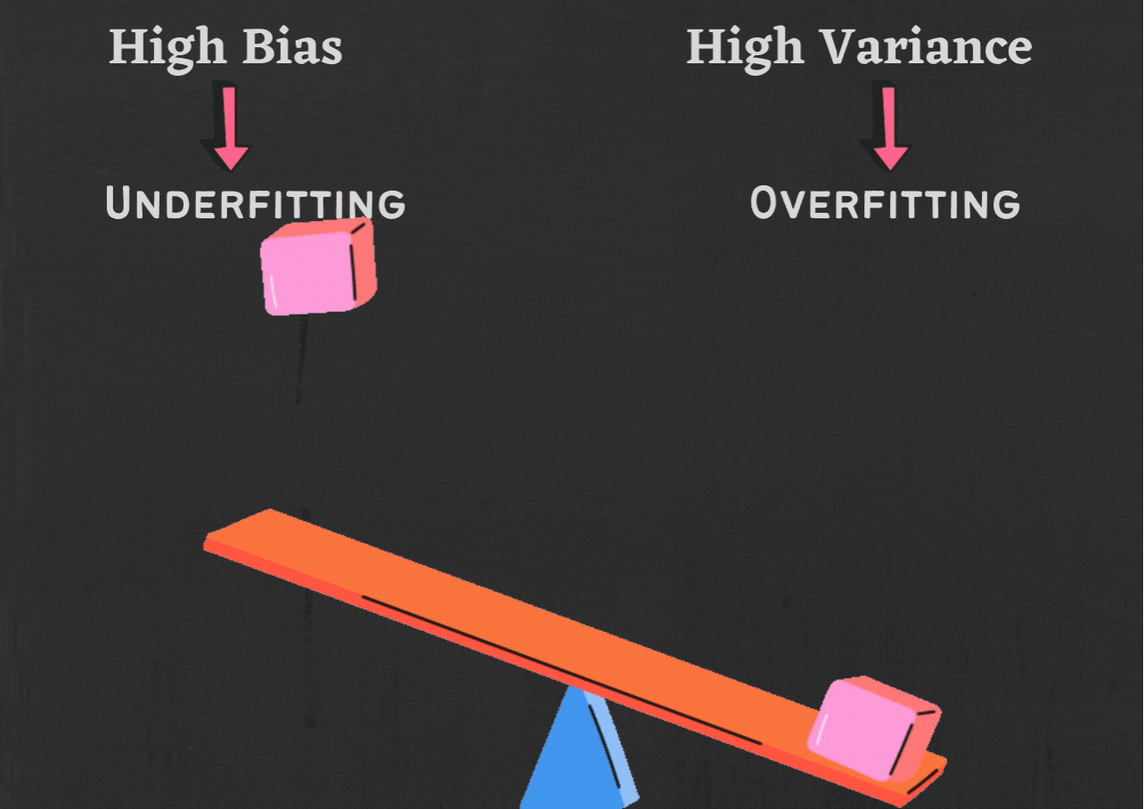
Overfitting
Imagine a student is preparing for a math exam. They have a textbook with several example problems and solutions. The student spends hours memorizing the solutions to those specific problems, hoping to see similar questions on the exam.
When the exam day arrives, they encounter a set of questions that are slightly different from the ones they memorized. Despite their efforts to recall the exact solutions they memorized, they struggle to apply them to the new problems. As a result, they don't perform as well as they expected, even though they knew the answers to the problems they memorized. This is an example of overfitting.
Overfitting occurs when a model becomes too complex and captures noise or random fluctuations in the training data rather than learning the underlying patterns. Some common causes of overfitting include:
- Insufficient training data: When the training dataset is small, the model may not capture the full complexity of the underlying relationships, leading to overfitting.
- Too many features: If a model has too many features, it can start to memorize the training data instead of learning the underlying patterns. This can lead to overfitting.
- Data Imbalance: In classification tasks, when one class dominates the dataset and is significantly more frequent than the others, the model may favor the dominant class and struggle to correctly predict the less frequent classes.
- High variance: High variance means that the model is sensitive to small changes in the training data. This can lead to overfitting, as the model will learn the noise in the training data instead of the underlying patterns.
Implementing overfitting
To demonstrate overfitting due to a small data sample and imbalanced data, let's use a simple example of classifying flowers into two categories: rose and tulip. We'll create a synthetic dataset with a small number of samples and an imbalance between the two classes. Play around with the new test data new_data and observe the changes in the model predictions.
In the code snippet, we have only 12 samples, with 10 samples of rose and 2 samples of tulip. This dataset is small and imbalanced, as rose has more data than tulip. When we train the Decision Tree Classifier on this dataset, it may create a very complex decision boundary to perfectly fit the small number of training samples.
As a result, the model may perform very well on the training data (high training accuracy) but poorly on new, unseen data (low testing accuracy). In real-world scenarios, overfitting due to a small dataset or imbalanced classes can lead to poor generalization and unreliable model performance.
Underfitting
Using same example of a student preparing for a math exam, suppose this time the student is not putting enough effort into studying and is only glancing briefly at the textbook without really understanding the concepts.
When the exam day arrives, the student feels unprepared and struggles to solve even the simplest problems. They might guess the answers or leave many questions unanswered because they didn't learn the necessary concepts in-depth. As a result, their performance is much lower than expected, even on straightforward questions.
Underfitting can be a major problem in machine learning. There are a few things that can cause this, including:- Too simple model: If a model is too simple, it may not be able to learn the complex patterns in the data. This can lead to underfitting.
- Not enough features: If a model does not have enough features, it may not be able to learn enough about the data to make accurate predictions.
- Not enough training data: If a model is not trained on enough data, it may not be able to learn the underlying patterns in the data and may underfit the data.
➡️ Next, we'll look at
Cross validation... 🎯
Cross validation
Imagine the student from the previous example wants to make sure they are well-prepared for the math exam. Instead of relying solely on their practice problems from the textbook, they decide to take a set of practice exams that their teacher has prepared. The teacher gives them several different exams, each covering a different set of problems.

After completing each practice exam, the student reviews their performance and identifies areas where they struggled. They use this feedback to improve their understanding and practice more on the challenging topics. By taking multiple practice exams, the student ensures that they are prepared for any type of question that may appear in the real exam.
This involves dividing the data into multiple subsets or folds and training the model on different combinations of these folds. This process helps the model learn from different parts of the data and ensures that it generalizes well to unseen data.
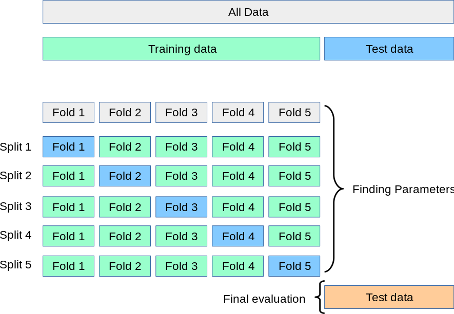
By evaluating the model's performance on multiple test sets, we can have a better idea of how well it will perform on new, unseen data, and we can identify and address potential issues like overfitting or underfitting. This helps us build a more reliable and robust ML model that performs well in real-world situations.
Similarly, it ensures that the model truly understands the underlying patterns in the data, just like the student gains a better understanding of the material by taking different practice exams. To achieve this, let's look at different types of cross-validations:
- K-fold cross-validation.
- Hold-out cross-validation.
- Leave-One-Out cross-validation.
- Leave-P-Out cross-validation.
- Stratified k-fold cross-validation.
In this lesson, we'll only focus on the first three categories - K-fold and Leave-One-Out. For Hold-out technique, this is what we have used so far in this course, which involves splitting our entire dataset into training and testing using percentage split. For example, using 70:30 or 80:20 percentage split.
1. k-fold cross-validation
To evaluate the performance of our ML models, K-fold cross-validation involves splitting the dataset into k subsets or folds. The model is trained k times, each time using a different fold as the validation set and the remaining folds as the training set. This way, each data point gets a chance to be in the validation set exactly once, and we have total control on what the value of kshould be.
The final evaluation is usually the average of the performance measures obtained in each iteration. K-fold cross-validation helps to provide a more robust and reliable estimate of how well the model will perform on unseen data, avoiding overfitting and ensuring generalizability. The general approach to follow while carrying out K-fold cross validation is as follows:
- Randomly rearrange the dataset.
- Divide the dataset into k distinct groups.
- For each group in the dataset:
- Set aside the current group as a test dataset.
- Use the remaining groups as a training dataset.
- Train a model on the training dataset and assess its performance on the test dataset.
- Record the evaluation score and discard the model after each iteration.
- Aggregate the model evaluation scores to summarize the overall performance of the model.
In the example below, we assumed we have 450 data points in a dataset and use 10 as our k (i.e., k=10). Hence, we divided the dataset into 10 equal folds. For every iteration, we use 9 folds for training and 1 fold for testing.

Reveal answer - K-fold cross-validation
After applying K-fold cross-validation with k=5, we would have 5 different splits of the data into training and test sets. Each fold will be used as a test set once, and the remaining four folds as training sets. Here's an example of the five splits:
Split 1:
- Training set: Rows 3, 4, 5, 6, 7, 8, 9, 10, 11, 12, 13, 14
- Test set: Rows 0, 1, 2
Split 2:
- Training set: Rows 0, 1, 2, 6, 7, 8, 9, 10, 11, 12, 13, 14
- Test set: Rows 3, 4, 5
Split 3:
- Training set: Rows 0, 1, 2, 3, 4, 5, 9, 10, 11, 12, 13, 14
- Test set: Rows 6, 7, 8
Split 4:
- Training set: Rows 0, 1, 2, 3, 4, 5, 6, 7, 8, 12, 13, 14
- Test set: Rows 9, 10, 11
Split 5:
- Training set: Rows 0, 1, 2, 3, 4, 5, 6, 7, 8, 9, 10, 11
- Test set: Rows 12, 13, 14
2. Leave-One-Out cross-validation
Leave-One-Out Cross-Validation (LOOCV) is a type of k-fold cross-validation where k is equal to the number of data points in the dataset. In LOOCV, each data point is treated as a separate test set, and the model is trained on all the other data points. This process is repeated for each data point, and the model's performance is evaluated based on how well it predicts the left-out data point.
- For each data point in the dataset
- set aside as the validation set, while the remaining (
n-1) data points for training. - repeat step for each data point in the dataset, so that every data point gets to be in the validation set once.
- set aside as the validation set, while the remaining (
- The final evaluation is the average of the performance measures obtained for each iteration.
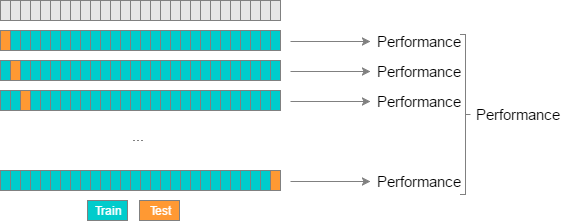
LOOCV is an exhaustive and computationally expensive technique, especially for large datasets, as it requires training the model multiple times. However, it provides an unbiased estimate of the model's performance since it evaluates the model on all available data points, leaving out one at a time. LOOCV is particularly useful when the dataset is small, and there is a need for a thorough evaluation of the model's ability to generalize to unseen data.
Now, try to guess how Leave-P-Out cross-validation cross validation techniques works. You can take a cue from the name.
Reveal answer - Leave-P-Out cross-validation
The total number of data points (n) is used to separate a set of data points that is used for testing. These data points are referred to as (p). Unlike LOOCV, the training data set is obtained by calculating (n-p) and the model is trained accordingly. Once the training is done, p data points are used for cross-validation.
Implementation of different cross validation techniques
👩🏾🎨 Practice: Stratified k-fold cross-validation... 🎯
Read the following documentation to learn what Stratified k-fold cross-validation is and how you can apply it.
Stratified k-fold cross-validation doc
➡️ Next, we'll look at
Regression evaluation... 🎯.
Regression Evaluation Techniques
In previous lessons, we've seen how we can evaluate ML classification models to ascertain its performance and generalization capability to new and unseen data. Now we want to look at how we can evaluate our regression models which deals with continuos variable (i.e., numbers), unlike classification that deals with categorical data. Without proper evaluation, we cannot determine how well the model is performing or how accurate its predictions are.
Regression evaluation
Regression evaluation techniques are methods used to assess the performance of regression models. They can be used to determine how well the model fits the training data, how well it generalizes to new data, and how accurate its predictions are. There are a number of different regression evaluation techniques, but some of the most common include:
- Mean Absolute Error
- Mean Squared Error
- Root Mean Absolute Error
- R-squared (R²)
To understand these metrics, let's use a sample regression model. Suppose we have a regression model that can predict air pollution levels (measured in Particulate Matter 2.5 - PM2.5) in a city based on weather conditions and traffic data. We have a dataset with 10 actual air pollution values (in micrograms per cubic meter or µg/m3) and their corresponding predicted values obtained from our regression model.
- Actual PM2.5 values:
[20, 25, 30, 35, 40, 45, 50, 55, 60, 65] - Predicted PM2.5 values:
[18, 24, 32, 38, 43, 47, 52, 57, 62, 68]
To know if our model is accurate in predicting air pollution, we can evaluate the model using the metrics listed above.
Mean Absolute Error (MAE)
MAE measures the average absolute difference between the predicted values and the actual values. It gives us an idea of how far off, on average, the predictions are from the true values. A lower MAE indicates better model performance. For example, if the MAE is 3, it means, on average, the model's predictions are off by 3 units from the actual values.
Using our pollution prediction model, we take the absolute difference between each predicted and actual value, sum them up, and then divide by the number of data points.
MAE = (|20-18| + |25-24| + |30-32| + ... + |60-62| + |65-68|) / 10
MAE = (2 + 1 + 2 + 3 + 3 + 2 + 0 + 2 + 2 + 3) / 10
MAE = 20 / 10
MAE = 2
This MAE indicates on average, the model's predictions are off by 2 µg/m3 from the actual values.
Mean Squared Error (MSE):
MSE measures the average squared difference between the predicted values and the actual values. MSE penalizes larger errors more heavily, which means it amplifies the impact of outliers. A lower MSE indicates better model performance. For example, if the MSE is 9, it means, on average, the model's predictions are off by 9 units squared from the actual values.
Using our pollution prediction model, we take the square of the difference between each predicted and actual value, sum them up, and then divide by the number of data points.
MSE = ((20-18)^2 + (25-24)^2 + (30-32)^2 + ... + (60-62)^2 + (65-68)^2) / 10
MSE = (4 + 1 + 4 + 9 + 9 + 4 + 0 + 4 + 4 + 9) / 10
MSE = 44 / 10
MSE = 4.4
This MSE indicates on average, the model's predictions are off by 4.4 µg/m3 squared from the actual values.
Root Mean Squared Error (RMSE):
RMSE is the square root of MSE and gives us a measure of the average difference between predicted and actual values in the same units as the target variable.
Using our pollution prediction model, we can calculate the RMSE as follows:
RMSE = √(MSE)
RMSE = √(4.4) ≈ 2.10
R-squared (R²):
R², also known as the coefficient of determination, measures how well the model's predictions explain the variations in the data. It provides a value between 0 and 1, where 0 means the model does not explain any variation, and 1 means the model perfectly explains all the variations in the data. A higher R-squared value indicates better model performance. For example, an R-squared value of 0.75 means the model can explain 75% of the variations in the data.
Using our pollution prediction model, R² is calculated as the ratio of the variance explained by the model to the total variance of the data.
R² = 1 - (MSE of the model / MSE of the mean)
R² = 1 - (4.4 / ((20-20.5)^2 + (25-20.5)^2 + ... + (65-20.5)^2) / 10)
R² ≈ 0.76
This R² means the model can explain 76% of the variations in the data.
Reveal answer - regression techniques
Mean Absolute Error (MAE):
MAE = (|250-255| + |300-305| + |350-345| + ... + |550-560| + |600-610|) / 8
MAE = (5 + 5 + 5 + 10 + 5 + 5 + 10 + 10) / 8
MAE = 55 / 8
MAE ≈ 6.88
Mean Squared Error (MSE):
MSE = ((250-255)^2 + (300-305)^2 + (350-345)^2 + ... + (550-560)^2 + (600-610)^2) / 8
MSE = (25 + 25 + 25 + 100 + 25 + 25 + 100 + 100) / 8
MSE = 425 / 8
MSE = 53.13
Root Mean Squared Error (RMSE):
RMSE = √(MSE) = √(53.13) ≈ 7.29
R-squared (R²):
R-squared = 1 - (53.13 / ((250-425)^2 + (300-425)^2 + ... + (600-425)^2) / 8)
R-squared ≈ 0.89
In this exercise, our model shows relatively low MAE and RMSE and a reasonably high R-squared, suggesting that it can predict housing prices with good accuracy.
Implementation of evaluation metrics
Now, let's look at developing a pollution prediction model and evaluating it using the metrics above. To develop this model, we'll use a simple example where we have actual pollution levels and their corresponding predicted values from the model. Let's assume we have the following data:
- Actual pollution levels:
[30, 40, 50, 60, 70, 80, 90, 100] - Predicted pollution levels:
[32, 38, 53, 62, 68, 78, 88, 96]
In this model implementation, we created a simple linear regression model using scikit-learn, fit it to the data, make predictions, and then calculate the evaluation metrics. The MAE, MSE, RMSE, and R-squared values will give us insights into the performance of the model in predicting pollution levels.
👩🏾🎨 Practice: Regression evaluation... 🎯
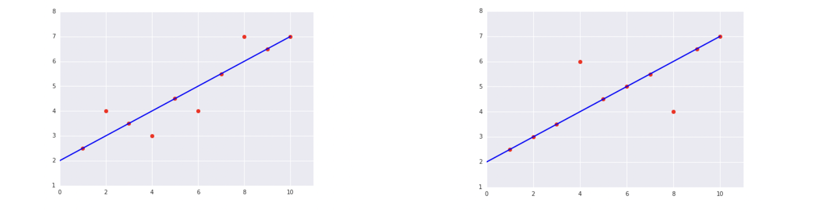
-
Which of the two data sets shown in the preceding plots has the higher Mean Squared Error (MSE)?
- The data on the right
- The data on the left
-
You are given a dataset containing information about houses, including their area, number of bedrooms, and the actual price. Your task is to evaluate a regression model that predicts house prices based on these features.
| Area (sq. ft.) | Bedrooms | Actual Price ($) | Predicted Price ($) |
|---|---|---|---|
| 1500 | 2 | 250000 | 240000 |
| 1800 | 3 | 300000 | 310000 |
| 1200 | 2 | 180000 | 175000 |
| 2200 | 4 | 400000 | 390000 |
| 1600 | 3 | 280000 | 265000 |
| 1400 | 2 | 220000 | 225000 |
| 2000 | 3 | 320000 | 330000 |
| 1700 | 3 | 270000 | 260000 |
| 1300 | 2 | 200000 | 205000 |
| 1900 | 3 | 310000 | 300000 |
- Calculate the MAE, MSE, and RMSE for the given dataset.
➡️ Next, we'll look at
Model selection... 🎯.
Model Selection
Imagine you have a puzzle to solve, and you have a variety of puzzle-solving tools at your disposal. Each tool has its strengths and weaknesses, and you want to pick the one that can solve the puzzle most effectively and accurately.

In machine learning, we have different algorithms like linear regression, decision trees, support vector machines, and neural networks, each designed to tackle specific types of problems.
We do this by feeding the algorithms some training data, allowing them to learn from it, and then testing them on new, unseen data to see how well they can make predictions. Remember, the goal here is to find the algorithm that gives the most accurate and reliable predictions for our specific problem, not for the love of a particular algorithm - no hard feelings 😏.
Considerations for Model Selection
For ML model selection, there are several important considerations to keep in mind to ensure we pick the most suitable algorithm for our specific problem:
| Factors | Impact on model selection |
|---|---|
| Problem type | Some models are better suited for certain types of problems than others. For example, linear regression models for continuous variable and logistic regression models for categorical variables. |
| Data size | If you have a large dataset, you may need to choose a less computationally expensive model. |
| Problem complexity | If the problem is complex, you may need to choose a more complex model. |
| Data availability | If you do not have a lot of data, you may need to choose a model that is less data-intensive. |
| Interpretability | If you need to understand how the model works, you may need to choose a more interpretable model. |
The different factors are interrelated. For example, the type of problem will affect the size of the data that is needed. The complexity of the problem will also affect the complexity of the model that is needed. Since ML model selection is an iterative process, there is no one-size-fits-all approach. It involves trying out different algorithms and comparing performance to find the best model for our particular task.
➡️ Next, we'll look at some practice exercises... 🎯
Practice
Practices
Air Pollution Regression Evaluation
You are given a dataset containing information about air pollution levels in different cities. Your task is to evaluate the performance of a regression model that predicts air pollution levels based on various factors such as population, industrial activity, and traffic. The dataset is as follows:
Dataset: Air Pollution Levels
| City | Population (thousands) | Industrial Activity Index | Traffic Index | Actual Pollution Level | Predicted Pollution Level |
|---|---|---|---|---|---|
| New York | 8173 | 0.87 | 0.78 | 45.2 | 44.8 |
| Los Angeles | 3981 | 0.65 | 0.91 | 55.6 | 56.2 |
| Chicago | 2716 | 0.56 | 0.72 | 38.9 | 39.4 |
| Houston | 2320 | 0.92 | 0.84 | 61.3 | 60.9 |
| Phoenix | 1684 | 0.74 | 0.68 | 48.7 | 48.3 |
| Philadelphia | 1584 | 0.58 | 0.75 | 41.5 | 42.1 |
| San Antonio | 1543 | 0.88 | 0.62 | 53.2 | 53.6 |
| San Diego | 1399 | 0.67 | 0.78 | 47.1 | 46.7 |
| Dallas | 1341 | 0.79 | 0.79 | 49.8 | 49.5 |
| San Jose | 1030 | 0.63 | 0.65 | 42.3 | 42.7 |
| Lagos | 14083 | 0.75 | 0.82 | 58.4 | 58.0 |
| Cairo | 10003 | 0.68 | 0.73 | 49.1 | 49.6 |
| Johannesburg | 9575 | 0.71 | 0.67 | 47.8 | 47.4 |
| Nairobi | 4397 | 0.53 | 0.75 | 35.6 | 36.1 |
| Casablanca | 3350 | 0.62 | 0.74 | 43.9 | 43.5 |
| Accra | 2298 | 0.49 | 0.68 | 33.4 | 33.9 |
Questions:
-
What is the dependent variable (target) in this regression problem?
- Population (thousands)
- Industrial Activity Index
- Traffic Index
- Actual Pollution Level
- Predicted Pollution Level
-
What are the independent variables (features) in this regression problem? (Select all that apply)
- Population (thousands)
- Industrial Activity Index
- Traffic Index
- Actual Pollution Level
- Predicted Pollution Level
-
Calculate the Mean Absolute Error (MAE) to evaluate the model's performance.
-
Calculate the Mean Squared Error (MSE) to evaluate the model's performance.
-
Calculate the Root Mean Squared Error (RMSE) to evaluate the model's performance.
-
Interpret the MAE value in the context of this regression problem.
Submission
You are required to submit documentation for practice exercises over the course of the term. Each one will count for 1/10 of your practice grade, or 2% of your overall grade.
- Practice exercises will be graded for completion not perfect correctness.
- You MUST supply the answers and upload your analysis as a single file to
Practice - Evaluationon Gradescope after the exercise to get the grade for this exercise.
Your log will count for credit as long as:
- It is accessible to your instructor, and
- It shows your own work.
Assignment: House Price Prediction
House price prediction is a crucial task in the field of data science and machine learning. It involves building a model that can estimate the price of a house based on various features or attributes associated with the property. The prediction of house prices is valuable for both homebuyers and sellers

House Price Prediction Model
In this assignment, you will have the exciting opportunity to build a cool regression model that predicts house prices. As a data scientist, your task is to analyze a dataset containing various features of houses and their corresponding prices. By harnessing the power of machine learning, you will develop a model that can ACCURATELY estimate house prices based on the given features and EVALUATE the model.
Task: Build a regression model to predict house prices based on various features and evaluate the model using multiple evaluation metrics.
Dataset
The dataset contains information about houses and their prices. The features included are:
- Price: The price of the house.
- Area: The total area of the house in square feet.
- Bedrooms: The number of bedrooms in the house.
- Bathrooms: The number of bathrooms in the house.
- Stories: The number of stories in the house.
- Mainroad: Whether the house is connected to the main road (Yes/No).
- Guestroom: Whether the house has a guest room (Yes/No).
- Basement: Whether the house has a basement (Yes/No).
- Hot water heating: Whether the house has a hot water heating system (Yes/No).
- Airconditioning: Whether the house has an air conditioning system (Yes/No).
- Parking: The number of parking spaces available within the house.
- Prefarea: Whether the house is located in a preferred area (Yes/No).
- Furnishing status: The furnishing status of the house (Fully Furnished, Semi-Furnished, Unfurnished).
Repository

TODOs
- Load the dataset into a pandas DataFrame.
- Perform data exploration and preprocessing, including handling missing values and encoding categorical variables.
- Split the dataset into features (X) and target (y), where y is the 'Price' column.
- Split the dataset into training and testing sets using train-test split (e.g., 80% training and 20% testing).
- Build a regression model using scikit-learn (e.g., Linear Regression, Random Forest, or any other suitable model).
- Train the model on the training data using the fit method.
- Make predictions on the test data using the predict method.
- Evaluate the model using the following metrics:
- Precision
- Recall
- F1 Score
- Confusion Matrix
- Mean Absolute Error (MAE)
- Mean Squared Error (MSE)
- Root Mean Squared Error (RMSE)
- R-squared (R²)
- Complete the assignment using the
notebookin the repository.- Push your solution back to Github once completed.
- Submit your notebook on Gradescope
- Look for Assignment - Evaluation under assignments
HINTS
- Utilize pandas library for data manipulation and preprocessing.
- Use scikit-learn library to build and train the regression model.
- Since this is a regression tasks, focus on MAE, MSE, RMSE, and R-squared. You can use the
mean_absolute_error,mean_squared_error,mean_squared_error, andr2_scorefunctions from thesklearn.metricsmodule. - Apply k-fold cross-validation by using scikit-learn's cross_val_score function. You can use the
cross_val_scorefunction from thesklearn.model_selectionmodule. - Use the pandas
get_dummiesfunction for one-hot encoding categorical variables. - Consider feature scaling if necessary, using MinMaxScaler or StandardScaler from scikit-learn.
Note: Make sure to properly interpret the evaluation metrics to understand the model's performance. The goal is to build a model that accurately predicts house prices and minimizes the error between predicted and actual prices.
Good luck with the assignment 🤝
Natural Language Processing
Welcome to week 8 of the Intro to data science course! Last week, we delved into model evaluation techniques. We started with understanding what model evaluation is and its importance in today's world. We went further to explore different model evaluation techniques such as confusion matrix, cross-validation, and regression evaluation. Finally, we briefly explored model selection considerations.
This week, we'll be looking into Natural Language Processing (NLP) by understanding its meaning and importance in data science. Next, we'll look at different techniques in NLP, including classification and sentiment analysis. Finally, we'll explore Named Entity Recognition (NER).

Learning Outcomes
After this week, you will be able to:
- Explain NLP and its application in today's world.
- Describe the NLP pipelines individually or as a collection of processes.
- Classify some techniques as part of text preprocessing or representation.
- Build a sentiment analyzer or entity recognizer models.
An overview of this week's lesson
Overview of NLP
The need for Natural Language Processing (NLP) arises from the fact that human language is a complex and nuanced form of communication that machines struggle to understand and process. NLP addresses this gap by enabling computers to comprehend, analyze, and generate human language.

Think about when you type a question into a search engine like Google. NLP helps Google figure out what you're looking for, even if you didn't use the exact words. It's like having a smart assistant that can understand and help you with all sorts of language-related tasks, from translating languages to reading and summarizing long articles, and even having conversations with you.
In essence, NLP is like giving superpowers to computers so they can understand, analyze, and even talk like humans. It's like teaching your computer to understand what you're saying, even if you use slang, different words, or even mistakes. Now, let's look at different techniques that makes up NLP.
NLP Pipeline
NLP pipeline is like a series of steps that a computer follows to process and understand human language. Just like a pipeline in any industry, each step in the NLP pipeline contributes to refining and enhancing the final output, making it a powerful tool for extracting valuable information and insights from textual data.
The idea behind NLP is to take an unstructured data (text) and convert it to something with a structure and make a sense out of it. Let's look at the techniques we need ti achieve this.
Further reading - Text Mining (Optional)
Application of NLP
NLP is indispensable in today's data-driven world due to its ability to harness the vast amount of textual data that humans generate daily. The need for NLP arises from several applications, such as:
- Information retrieval
- Sentiment analysis
- Language translation
- Chatbots
- Text summarization
- Enhanced search engines
- Healthcare insights
- Legal and compliance
- Social media analysis
- Personalized content
➡️ Next, we'll look at
NLP tools and libraries... 🎯.
NLP Tools and Libraries
Text are unstructured data that needs to be structured while carrying out any processing or analysis on them. To achieve this, there are varieties of tools, both libraries and cloud-based applications, that are available for different tasks in the NLP pipeline. Since we can't go throuh all these tools, we'll focus on 2 popular libraries - NLTK and Spacy, and a cloud-based solution - Amazon comprehend.
NLTK
Natural Language Toolkit (NLTK) is a powerful and widely used Python library for working with human language data. It provides tools, algorithms, and resources that enable us to perform various NLP tasks, ranging from basic text processing to more advanced linguistic analysis.
Further reading - NLTK (Optional)
To get more understanding about this tool, you can explore the official documentation using the link below.
Spacy
SpaCy is another popular Python library designed specifically for natural language processing tasks. It's known for its speed, efficiency, and ease of use, making it a favorite among developers and researchers working with large amounts of text data. SpaCy provides a streamlined API for various NLP tasks, allowing users to quickly process and analyze text without the need for extensive configuration.
One of the key features of SpaCy is its pre-trained models that can perform tasks like tokenization, part-of-speech tagging, named entity recognition, and syntactic parsing.
Further reading - Spacy (Optional)
To get more understanding about this tool, you can explore the official documentation using the link below.
Amazon comprehend
Amazon Comprehend is a cloud-based service provided by Amazon Web Services (AWS). It's designed to help us analyze and gain insights from text data in a scalable and efficient manner.
One of the advantages of Amazon Comprehend is that it's a managed service, which means AWS takes care of the underlying infrastructure, making it easier to incorporate NLP capabilities into applications without worrying about the technical details. It can perform tasks such as...
- Sentiment analysis
- Entity recognition
- Keyphrase extraction
- Language detection
- Topic modeling.
This means it can automatically determine the sentiment (positive, negative, neutral) expressed in a piece of text, identify entities (like names, dates, and locations), extract key phrases that summarize the content, detect the language the text is written in, and uncover the main topics discussed in the text.
Further reading - Amazon Comprehend (Optional)
To get more understanding about this tool, you can explore the official documentation by following the steps below.
- Create a free student account using AWS Educate
- Then get started with Amazon Comprehend
➡️ Next, we'll look at
Text preprocessing... 🎯.
Text Preprocessing
Text preprocessing in NLP is like getting the text ready for the computer to understand. It's like tidying up a messy room before guests come over. You remove any extra stuff that doesn't matter, like soccer ball, empty bottles or old newspapers.

Similarly, in text, we might get rid of things like punctuation marks and extra words that don't add much meaning. When computers read and understand human language (like articles, reviews, or tweets), they also need to clean up and organize the words.
Text preprocessing techniques
By cleaning up the texts, the computer can understand it better and do cool things like figuring out if people are happy or sad in reviews, sort news articles into categories, or even translate languages 😍. Now, let's discuss some techniques used in text preprocessing.
1. Casing
Casing refers to the use of uppercase (capital) or lowercase letters in text. It might not seem like a big deal, but casing can have a significant impact on how computers understand and process language.
In general, Kibo and kibo are generally considered to be the same word. However, in NLP, these could be treated as different words if casing is not handled properly. Let's look at an example of why casing is important.
-
Lowercasing: Many NLP tasks, like text classification or sentiment analysis, doesn't need to distinguish between
Kiboandkibo. By converting all text to lowercase, we treat them as the same word. This helps improve the accuracy and consistency of NLP models.- Example: "I want to eat an Apple" → "i want to eat an apple"
-
Maintaining Casing: In some cases, the casing can carry important information. For instance, if you're analyzing tweets, uppercase words might indicate emphasis or shouting. To retain this information, you might choose not to lowercase the text.
- Example: "AMAZING DEAL! Get 50% off today!" - preserving casing to capture emphasis.
Now let's look at code examples of converting a text to lowercase using Spacy.
2. Tokenization
Tokens are essentially the individual words, phrases, or symbols that make up a text. Tokenization is a fundamental step in many natural language processing tasks, as it lays the foundation for further analysis, processing, and understanding of textual data.
For example, let's consider the sentence: I am studying at Kibo. Tokenization of this sentence would result in the following tokens:
"I" "am" "studying" "at" "Kibo" "."
Programmatically, we can tokenize a sentence or document with Spacy using the following code snipppet:
Each of these tokens represents a discrete unit of meaning, and breaking down the text into tokens enables computers to process and analyze text more effectively.
3. Stopwords and punctuation removal
Stopwords are common terms that doesn't contribute much to the meaning of a sentence. For example, is, and, the are stopwords in the English language. Both stopwords and punctions needs to be removed to focus on the more important words in the text.
In the code snippet above, we loaded the English NLP model from Spacy. Then, we define a sample text and process it using the nlp object. We iterate through the processed tokens and use the is_stopand is_punct attribute to check if a token is a stopword or punctuation. If it's not, we add it to the list of processed text.
4. Whitespace trimming
Thiclude removing unnecessary spaces, tabs, and newline characters from a text. It can be useful for cleaning and normalizing text data in NLP tasks to ensure consistency and improve the accuracy of NLP models.
Here's an example of how to perform whitespace trimming using NLTK:
This code snippet will tokenize the input text using NLTK and then join the tokens back together to create a new text without the extra spaces.
5. Stemming and Lemmatization
Stemming involves reducing words to their base or root form. It removes suffixes from words to get to the core meaning of a word. For example, the stem of the words interchanger and interchanging would be interchang. This technique reduces words to their root forms to consolidate variations of the same word.
Lemmatization also reduces words to their base form, However it does so in a more intelligent way by considering the context and part of speech of the word, so that the resulting base form (called a lemma) is a valid word that makes sense. For example, the stem of the words interchanger and interchanging would be interchange.
Stemming might produce words that are not actual words, while lemmatization aims to produce meaningful and valid words.
👩🏾🎨 Practice: Text preprocessing... 🎯
Imagine you have a dataset of customer reviews from an online store. Each row in the dataset represents a customer review. Here's a snippet of the dataset:
Dataset: Customer Reviews
| Review_ID | Customer_Name | Review_Text |
|---|---|---|
| 1 | John | Great product! I love it. |
| 2 | Emily | The product was okay, not very impressed. |
| 3 | Michael | This is the worst thing I've ever bought. |
| 4 | Sarah | Product is good. |
| 5 | David | I have mixed feelings about this purchase. |
Questions:
-
Casing: Convert the text in the "Review_Text" column to lowercase.
-
Tokenization: Tokenize the "Review_Text" column to break it into individual words or tokens.
-
Stopword Removal: Remove common stopwords (e.g., "the," "is," "I") from the tokenized text in the "Review_Text" column.
-
Stemming: Apply stemming to the tokenized text in the "Review_Text" column. Use the Porter Stemmer algorithm.
-
Lemmatization: Apply lemmatization to the tokenized text in the "Review_Text" column.
-
What is the purpose of converting text to lowercase in text preprocessing?
- A. To remove stopwords
- B. To make the text more readable
- C. To standardize text for analysis
- D. To perform stemming
-
What is the result of tokenizing the sentence "Great product! I love it."?
- A. ["Great", "product!", "I", "love", "it."]
- B. ["great", "product", "i", "love", "it"]
- C. ["Great product!", "I love it."]
- D. ["great", "product", "i", "love", "it."]
➡️ Next, we'll look at
Text representations... 🎯.
Text Representations
Since computers can not process text data in it raw form, it becomes inevitable to convert or represent these texts in a format that is suitable for computers. Consuquently, we need some techniques to convert or represent our text for futher processing. Text representation involves transforming raw text data into a format suitable for machine learning models.

Text representation techniques
1. Bag of Words
Imagine you have a bag, and you want to count how many times different types of fruits are in that bag. You don't care about the order or how they're arranged, just the count of each fruit. This is similar to how the Bag of Words (BoW) works in language.
In BoW, instead of fruits, we have words from a piece of text. We don't care about the order of the words or their context, we're just interested in how many times each word appears. So, we count the frequency of each word and create a list of these word counts. This list of word counts represents our text.
For example, let's say we have the sentence: The sun is shining, the weather is nice. In the BoW, we would create a list like this:
The: 2 times
sun: 1 time
is: 2 times
shining: 1 time
weather: 1 time
nice: 1 time
This list tells us how many times each word appears in the sentence, without considering the order or meaning of the words. It's a simple way to represent text for tasks like counting word occurrences, but it doesn't capture the relationships between words or their meanings like more advanced techniques do.
2. TF-IDF
Imagine you have a collection of articles about various topics. You want to figure out which words are important in each article, while also considering how important they are in the entire collection of articles. This is where Term Frequency-Inverse Document Frequency (TF-IDF) comes in. TF-IDF is like a smart way of counting words by considering two things:
-
Term Frequency (TF): This measures how often a word appears in a specific article. If a word appears frequently in an article, it's likely important in that context.
-
Inverse Document Frequency (IDF): This measures how unique a word is across the entire collection of articles. If a word appears in many articles, it might not be as important because it's common.
In another example, suppose you're analyzing articles about animals, the word tiger might have a high TF-IDF score because it's frequently mentioned in an article about tigers, but not as common in other articles about different animals. This way, TF-IDF helps you focus on the words that truly matter in each article and its context
3. Word Embeddings
Word embeddings are like a way for computers to understand words better, just like we humans do. give words meaning by representing them as numbers in a way that captures their relationships. Think of it like a language map: words with similar meanings or related concepts are closer together in this map.
In another example, words like king, queen, prince, and princess would be closer together because they're related in terms of royalty. Similarly, words like dog and cat would be close because they're related as pets.
This technique makes it easier for computers to work with words in more complex tasks, like understanding the sentiment of a sentence, translating languages, or even answering questions from text.
👩🏾🎨 Practice: Text representation... 🎯
Consider the following dataset of customer reviews for a product:
Dataset: Customer Reviews
| ReviewID | CustomerName | ReviewText |
|---|---|---|
| 1 | Alice | This product is amazing. I highly recommend it. |
| 2 | Bob | It's good, but could be better. |
| 3 | Carol | I didn't like it at all. |
| 4 | Dave | Excellent product! I'll buy it again. |
| 5 | Emily | It's okay, not great. |
Answer the following question:
- Perform Bag of Words (BoW) representation on the given reviews. Create a list of unique words (vocabulary) and indicate the frequency of each word in each review.
➡️ Next, we'll look at
Sentiment analysis...🎯.
Sentiment Analysis
Sentiment analysis is like having a machine read people's words and figure out how they feel about something. Just like when we talk to friends and they might sound happy, sad, or excited, computers can also listen to what people write online and understand their emotions.
Imagine if you wrote a message about a movie you just watched, and you were either happy, sad, or just okay with it. Sentiment analysis helps a computer figure out if your message is thumbs up, thumbs down, or somewhere in between. Check out the video below to gain more understanding about sentiment analysis.
To analyse sentiments in a text or document, we can look at it from 4 different levels. To understand these, we'll use a movie reviews dataset.
Document level: This type of analysis looks at the overall sentiment of an entire text or document. It aims to determine whether the document is positive, negative, or neutral. Suppose you have a collection of movie reviews about a recent blockbuster film, Document-level sentiment analysis would involve reading each entire review and categorizing it as positive, negative, or neutral based on the overall tone of the review.
Sentence level: Each sentence is classified as positive, negative, or neutral, regardless of the sentiment of the entire text or document. For example, if a reviewer says...
The acting was great, but the plot was confusing.
The analysis would identify that the first part of the sentence is positive (praising the acting) and the second part is negative (criticizing the plot).
Aspect level: focuses on extracting sentiments related to specific aspects or features mentioned in the text. For example, aspect-based sentiment analysis could reveal that audiences generally liked the acting and special effects but had mixed feelings about the ending.
Entity or feature level: Similar to aspect-based analysis, this analysis identifies sentiments towards named entities, which could be people, places, products, or any other entities mentioned in the text. If the movie features a popular actor, entity-level sentiment analysis would focus on how people perceive that actor's performance.
Sentiment analysis of movie reviews
Let's see how we can perform sentiment analysis on a movie review dataset. The dataset we'll be using comes with the NLTK library, so all we need to do is download the dataset as shown in the code snippet below. Play around with the additional_test_reviews by adding your own reviews and see how the model classify it as either positive or negative.
In this code snippet, we're using the NLTK library to perform sentiment analysis on the movie reviews dataset. We load positive and negative reviews, split the data into training and testing sets, and then use the Naive Bayes classifier to train the model. The extract_features function is used to extract relevant features from the words in the reviews. Next, we evaluated the model's accuracy on the testing data.
Finally, we added three additional test cases (additional_test_reviews). After evaluating the classifier's accuracy, the code will print the predicted polarity, positive or negative, for each of these additional test cases.
➡️ Next, we'll look at
Named entity recognition...🎯.
Named Entity Recognition
Have you ever imagined how computer knows different names of people, places, brands, dates, and so on? Imagine you have a friend who loves talking about different things like people's names, places, dates, and more. When your friend reads a story or an article, they automatically highlight these important things in different colors. Named Entity Recognition (NER) is like your friend's skill, but for computers and text.
There are generally 2 operations we need to perform to achieve NER in a given document:
- Identification: This is where all the entities in a given text or document is identified.
- Classification: All identified entities are classified as belonging to a particular predefined entity group.
For example, if we are to perform NER on a text such as
Ope Bukola is the CEO of Kibo Inc
First, we need to identify all the entities in the text, which are Ope Bukola and Kibo Inc. Next, we classify each entity into a predefined group. Here, we can classify Ope Bukola as a PERSON, and Kibo Inc as a type of ORGANISATION.
Try out NER tool
Check out this NER demo
NER is still a growing a technology which already has manny use cases and wide applications. Some of its applications include:
- Sentiment analysis: NER can be used to improve the accuracy of sentiment analysis by identifying named entities in the text and understanding their context.
- Information extraction: NER can be used to extract information from text, such as the names of people and organizations mentioned in a news article.
- Machine translation: NER can be used to improve the accuracy of machine translation by identifying named entities in the source language and translating them correctly in the target language.
- Question answering: NER can be used to answer questions about text by identifying the entities mentioned in the question and finding the relevant information in the text.
Next, let's look at how we can perform NER with Spacy using some random text. Feel free to edit the text and try it out by opening the code snippet in Google Colab.
In the code above, we first extracted the entities in the text and their corresponding labels. Next we used the .render() function in displacy, the visualizer for spacy, to visualize the entities in the text.
➡️ Next, we'll try some practice exercises based on what we've learned so far this week... 🎯.
Practice
Named Entity Recognition (NER)
You are provided with a set of news articles. Your task is to perform NER on the text and identify different named entities such as people's names, locations, organizations, and dates. Use tokenization, text preprocessing techniques, and NER to complete this task.
Task: Perform Named Entity Recognition on a set of news articles.
Dataset:
| SentenceID | Sentence |
|---|---|
| 1 | Kibo is headquartered in New York. |
| 2 | J.K. Rowling is the author of Harry Potter. |
| 3 | The Eiffel Tower is located in Paris, France. |
| 4 | Google's CEO, Sundar Pichai, addressed the audience. |
| 5 | The river Nile flows through Egypt. |
| 6 | Microsoft Corporation is based in Redmond, WA. |
| 7 | William Shakespeare wrote Romeo and Juliet. |
| 8 | The Great Wall of China is a famous landmark. |
| 9 | Angela Merkel is the Chancellor of Germany. |
| 10 | The Amazon River flows through South America. |
TODO:
- Load the news article dataset.
- Preprocess the text by converting to lowercase, removing punctuation, and trimming white spaces.
- Tokenize the preprocessed text.
- Use a pre-trained NER model (e.g.,
spaCy) to identify named entities. - Extract and categorize the identified named entities (e.g., people, locations, organizations).
- Analyze the frequency of different named entities in the dataset.
Submission
You are required to submit documentation for practice exercises over the course of the term. Each one will count for 1/10 of your practice grade, or 2% of your overall grade.
- Practice exercises will be graded for completion not perfect correctness.
- You have to document that you did the work, but we won't be checking if you got it right.
- You MUST upload your analysis/visuals as a single file to
Practice - NLPon Gradescope after the exercise to get the grade for this exercise.
Happy practicing!
Assignment - Product Reviews
Product reviews are evaluations or opinions shared by consumers who have purchased and used a specific product or service. These reviews are typically written on online platforms such as e-commerce websites, social media, or review websites.
Product reviews provide insights into customers' experiences, satisfaction levels, and perceptions of a particular product or service. In the context of NLP (Natural Language Processing), product reviews are a valuable source of text data that can be analyzed to extract sentiments, opinions, and insights.

Sentiment Analysis of Jumia Product Reviews
In this assignment, you will apply your knowledge of sentiment analysis to analyze the sentiments expressed in product reviews by Jumia customers. You will work alone to preprocess the text data, build a sentiment analysis model, and interpret the results.
Dataset
You are provided with a dataset containing customer reviews. The dataset includes the following columns:
- Rating: Customer rating of each product, which ranges from 1 to 5.
- Title: title of each review (e.g., I like it).
- Review: customer opinion about the products.
Repository

TODOs
- Load the dataset and take a quick look at the first few rows.
- Explore the distribution of sentiment labels in the dataset.
- Engineer a new feature called
Sentimentfrom the Rating column. This takes the values-1,0, and1for negative, neutral, and positive.- Reviews with
Rating > 3is positive - Reviews with
Rating = 3is neutral - Reviews with
Rating < 3is negative
- Reviews with
- Preprocess the text data by converting to lowercase and removing punctuation.
- Tokenize the text data to split it into individual words or tokens.
- Choose a feature extraction technique (e.g.,
BoW,TF-IDF) and implement it. - Split the dataset into training and testing sets.
- Build and train a sentiment classification model using an appropriate algorithm.
- Evaluate the model's performance using
accuracy,precision,recall, andF1-score. - Fine-tune the model and preprocessing techniques to improve results.
- Present your findings in a report, including the evaluation metrics and insights from the analysis.
- Complete the assignment using the
notebookin the repository.- Push your solution back to Github once completed.
- Submit your notebook on Gradescope
- Look for Assignment - NLP under assignments.
HINTS
- Document your code clearly with comments explaining each step.
- Perform text preprocessing techniques such as lowercase conversion, tokenization, and stopwords removal.
- Remove any special characters or symbols that might not contribute to sentiment analysis.
- Convert the preprocessed text into numerical features suitable for analysis.
- You can choose from techniques like Bag of Words, TF-IDF, or Word Embeddings. Remember to explain your choice.
- Utilize libraries like
Scikit-learn,NLTK, orspaCyfor text preprocessing and model dvelopment tasks. - Provide visualizations and tables to support your analysis.
Remember, this assignment is an opportunity to apply your NLP skills to real-world data and gain hands-on experience in sentiment analysis.
Good Luck! 🤝
Deep Learning Fundamentals

Welcome to week 9 of the Intro to Data Science course! Last week, we looked at NLP by exploring different tools and techniques therein. We started with what text data is and how we can preprocess them. We went further to understand different ways we can represent text to prepare them for further analysis. Finally, we delved into sentiment analysis and Named Entity Recognition (NER).
This week, and probably the last lesson week, we'll be focusing on Deep Learning (DL) 😍 by looking at what it is, and why it is so important for individual and businesses. Next, we'll delve into the word of Computer Vision and Large Language Models (LLMs) such as ChatGPT 😍. Furthermore, we'll be building our very own deep learning models. Finally, we'll see how to deploy our ML and DL models.
Learning Outcomes
After this week, you will be able to:
- Explain deep learning, including its tools and applications.
- Describe how computers can recognize different objects.
- Build a computer vision model.
- Break down generative AI into sub-component
- Deploy ML model to cloud to provide accessibility (BONUS).