Insight and reporting
Data insight and reporting in data science refer to the process of analyzing and interpreting data to gain valuable information and knowledge that can be used to make informed decisions. By using interactive dashboards with summary statistics, we can gain insights and present them effectively to help decision-makers understand the data's implications and make well-informed choices.
Interactive dashboards
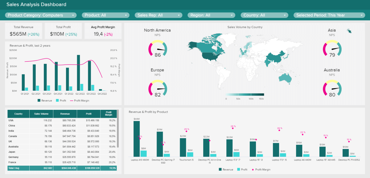
For example, let's say you have an interactive dashboard for the sales data of an online store. You can choose to view the sales performance for specific months, compare sales across different product categories, or filter data to see sales from a particular region or customer segment. With a simple click, the dashboard will update and show you the results, making it easier for you to analyze the data and make important business decisions.
Some popular tools used for creating interactive dashboards are:
These tools help turn complex data into easy-to-understand visuals, enabling businesses to gain valuable insights and make informed decisions quickly. Interactive dashboards play a crucial role in data science by empowering you to explore and understand data effectively, without getting lost in rows and columns of information.
Now, let's look at how we can create an interactive dashboards using one of these tools - Power BI.
In summary, the introductory tutorial has given us a feel of interactive dashboard using Power BI and provides us with other information, such as
- Instruction on how to download the free version of Power BI Desktop
- The video provides a free Excel dataset for practice
- featuring sales dataset
- The steps covered in the video includes...
- importing and transforming data using Power Query
- navigating Power BI's main features,
- creating an interactive dashboard from scratch
- sharing and collaborating with others.
- Various features of Power BI are demonstrated, such as
- manipulating data
- creating visualizations like charts and maps
- utilizing AI tools for analysis.
Unlike static charts and graphs that are fixed and only shows a snippet of the data at a point in time, interactive dashboards allows you to interact with the data and drill down for more insights. However, certain factors needs to be considered before design a dashboard.
Dashboard considerations
The goal of creating a dashboard is to inform a tagetted audience of insights derived from a dataset. To suit this purpose, the follwing are some of the factors to consider.
-
Audience and User Experience: Consider who will be using the dashboard and their level of familiarity with data. Design the dashboard in a way that is intuitive and easy to navigate, even for non-experts. Use user-friendly labels, icons, and tooltips to guide users.
-
Clarity of Purpose: Before creating the dashboard, you need to define its purpose. What insights or information do you want to convey to the users? Clarity of purpose helps in organizing and selecting the right visualizations to present the data effectively.
-
Data Selection and Organization: Choose the most relevant and important data to include in the dashboard. Organize the data logically so that users can quickly find what they need. Group related information together and use clear headings.
-
Appropriate Visualizations: Select appropriate charts and graphs that best represent the data and support the dashboard's purpose. Avoid cluttering the dashboard with too many visualizations, as it can confuse users.
➡️ Next week, we'll dive into Exploratory data analysis 🎯.
➡️ In the next 2 weeks, you'll take everything we've covered and apply it to your
Midterm Project🎯.